
How to recruit your target audience with screener questions

Users are at the heart of what we do here at UserTesting and the UX industry. They tell us the needs that require filling, inform our designs, and identify strengths and weaknesses within our products. You've crafted your UX testing process and identified your ideal usability testing tools—but who is your exact target user?
In a perfect world, usability testing involves users who represent your product’s target market wholeheartedly. Ideally, they’ve adopted the right mindset, speak the right lingo, and have the best insight into an ideal experience.
Though this may not exist, the good news is that whether or not you need to recruit exactly the right target user depends on the nature of your test. Let’s dive in.
What are screener questions, and why are they important?
Screener questions, or screeners, are multiple-choice questions that either eliminate the wrong participants from taking part in your study or give access to the right ones.
Although it would be great to test all participants, it’s not always ideal, especially if your study has specific needs. It’s best to recruit participants who have attributes similar to your existing, or potential users of your product. Asking the right screener questions ensures you’re enlisting the intended participants for your test.
Here’s an example of a screener question designed to target plus-sized users:
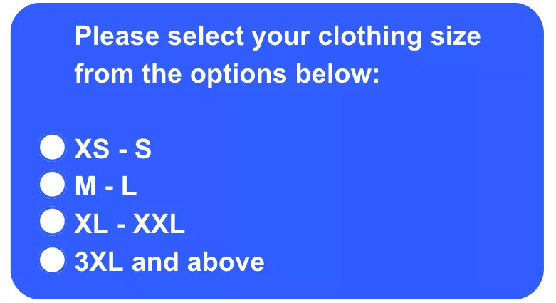
In the above example, only participants who select the third or fourth option will be allowed to proceed to the test, and the rest will be rejected.
Screeners may seem easy, but it’s often quite challenging to craft screeners properly. If a user misunderstands the questions, you could end up with test participants who don’t fit the needs of your study, negatively impacting your results.
How many questions should be in a screener?
It’s important to remember that there’s no one-size-fits-all approach. Some teams may only use one screener question, as they could be doing an initial test for preliminary research that won’t count toward their final results. Meanwhile, other teams may need multiple rounds of screener questions to properly recruit for an ethnography study. This entails finding customers of a tangible product—who also have it nearby and are willing to show how they use it for the study.
We recommend setting up between three and five screener questions. If there are any more, users can get discouraged or even exit before completing all of the screeners because they assume they won’t qualify or find it too time-consuming.
UserTesting’s Research team knows firsthand how important (and challenging) it is to write solid screener questions, and we have a wealth of experience in capturing the correct user group for your needs. Below are some guidelines and examples that can help you get exactly the right participant for your next remote usability test.
How many users do you need to test with?
Recruiting the ideal number of participants for your usability testing will contribute to the efficiency of the data collected from your study.
The number of users you need depends on the usability testing you conduct. Typically, 5-8 users are recommended for qualitative research, while over 30 users can be enlisted for quantitative research (think card sorting or tree testing).
If you’re testing a design where various users can use the platform, it may make more sense to test a larger sample of users. Consider starting off a study with 5 or fewer participants, and based on the results, you can improve your design and test further until your design is as effective as possible. For instance, after reviewing the first few test results, you may have realized that contributors weren’t spending as much time as you expected discussing their feedback—leaving some insight on the table. This requires an edit of the task instructions to be more detailed.
Keep in mind that no number is universally right and that the margin of error will influence what you find acceptable. However, by starting small, you’re giving yourself leeway to make adjustments and address mistakes, saving you time and resources in the long run.
How to write a screener question
Many of the principles involved in writing effective screener questions are similar to those recommended for crafting excellent multiple-choice questions. Here we delve deeper into these guidelines, emphasizing clarity, neutrality, and inclusivity to optimize your screening process.
Always include a "None of the above," "I don't know," or "Other" option
One key best practice is to always provide options such as "None of the above," "I don't know," or "Other." This inclusion is critical for two main reasons:
- Comprehensiveness: It covers scenarios where you might not have listed an applicable answer, ensuring that every participant can respond accurately.
- Avoidance of bias: It prevents participants from choosing answers randomly, which can occur if they feel none of the options apply to them. This is particularly important in screener questions as random selections can lead to unqualified participants inadvertently being included in your study, skewing your results.
Including these options safeguards against these issues, helping to maintain the integrity of your data collection.
Provide clear and distinct answers to avoid overlap
To ensure that every response accurately reflects the participant's true situation or opinion, frame your answers to be clear and mutually exclusive:
- Example: If you're asking about clothing sizes, avoid ranges that overlap like "0-6" and "6-12". Instead, use distinct ranges such as "0-5" and "6-12" to ensure a participant who is a size 6 has a clear category. This clarity prevents confusion and ensures the accuracy of the data collected.
Avoid leading questions and simplify choices
Leading questions or yes/no formats can bias responses, as participants might try to give the answer they believe you want to hear. To combat this:
- Neutral phrasing: Use instructions that ask participants to select the option that most closely applies to them, followed by a list of neutral statements. This approach reduces the likelihood of biased answers.
- Detailed instructions: Explain clearly how they should think about their answers. For instance, if the question involves frequency of use, define what terms like "frequently" and "rarely" mean in the context of your question.
Implementing these practices effectively
- Test your screeners: Before finalizing your screeners, conduct pilot tests to see how real users interpret and answer your questions. This testing can reveal if certain questions are confusing or leading.
- Iterate based on feedback: Use the insights from your pilot tests to refine the questions. This iterative process helps enhance the reliability and validity of your screeners.
By adopting these enhanced practices, you ensure that your screener questions are not only well-designed but also effective in selecting the most suitable participants for your UX testing.
How to check that your screener is capturing the right users
Depending on your needs and what you’re studying, you may need someone with a particular background (like a medical degree) or someone who is going through a particular experience (like shopping for a new car). If that’s the case, we recommend that in addition to screeners, you use the first task of your test to verify this:
Use initial tasks to confirm screener accuracy
In addition to your screener questions, we recommend incorporating an initial task in your usability test that directly relates to the screener criteria. This task serves as a secondary confirmation that participants meet the necessary criteria:
- Example task: If your screener was designed to identify participants who are currently shopping for a new car, the initial task might be: “You indicated in the screener questions that you are currently shopping for a new car. Please describe what kind of car you are looking for, where you have looked so far, and any preferences or concerns you have regarding your new car.”
Listen carefully to participants' descriptions
The responses to this initial task can provide a wealth of qualitative data that confirms whether participants truly fit the profile you need:
- Depth of response: Listen for detailed descriptions and specific language that align with someone actively engaged in the process you’re studying. For instance, a participant genuinely shopping for a car might mention specific models, dealerships visited, and factors influencing their decision.
- Consistency: Check for consistency between the screener responses and the details provided during this task. Discrepancies might indicate misunderstandings or inaccuracies in the screening process.
Providing an exit option
This early task not only helps verify participant suitability but also allows participants who realize they might not fit the criteria to gracefully exit the study:
- Respect for participants: Offering an exit option after the initial task respects the participant's time and improves the overall quality of your data by ensuring only well-suited individuals continue.
Iterative improvements based on initial tasks
Use the insights gathered from these initial tasks to refine your screener questions:
- Feedback loop: Analyze common discrepancies or areas where multiple participants seem to misunderstand the screener. Adjust the wording or structure of your screener questions based on these findings.
- Continuous validation: Regularly revising your screener based on real participant interactions ensures its ongoing effectiveness and relevance, particularly as your user base or product changes.
Screener examples by use case
While your recruitment requirements can be customized, the following examples are four common types of screeners. Look for other usability testing examples to help generate ideas for your questions.
1. Screeners based on familiarity with a product
One of the most common kinds of screener questions that researchers use is capturing users’ level of familiarity with a product or a brand. Sometimes they need fresh users to test out a new tutorial for their app. Other times they are looking for insight from their most frequent users.
Whatever the case, you don’t want to ask point-blank if users fit the mold; people are naturally inclined to say yes just to please you! Instead, ask users to indicate their familiarity, and then define the different levels of familiarity, like in this example:
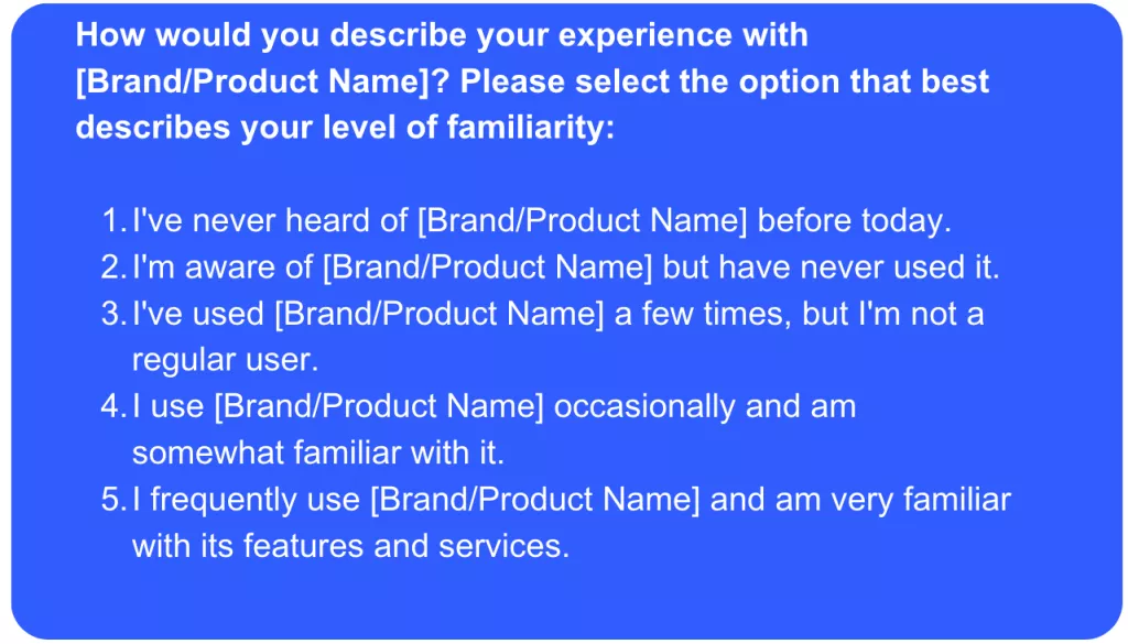
This screener makes it easy for users to tell which category they belong in, and it isn’t obvious which answer the researcher is looking for.
As you can see in the above example, it’s helpful to define the Novice, Intermediate, and Expert levels by a few elements: overall content levels, usage levels, and consideration levels. This keeps a user from overestimating their experience level with your product and accidentally skewing your results.
2. Screeners based on a product's frequency of use
Similar rules apply to the related—and equally popular—frequency-of-use screener. A researcher may be interested in finding users who regularly check the weather on their phones, or users who used to play a game but have given up on it over time.
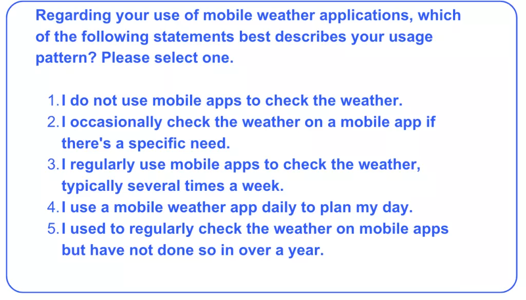
As with experience levels, it’s important to define frequency in solid terms, not just “rarely,” “sometimes,” or “often.”
Another common screener related to the frequency of use might have to do with how recently a user has participated in a certain activity. For example, many ecommerce product researchers prefer to hear from users who purchase items online fairly often. Meanwhile, many travel product researchers want to hear from those who are planning a trip within the next year.
In these cases, it may be wise to create two screeners: one to confirm that they purchase items online or have an upcoming trip, and then a follow-up screener to determine timeframes.
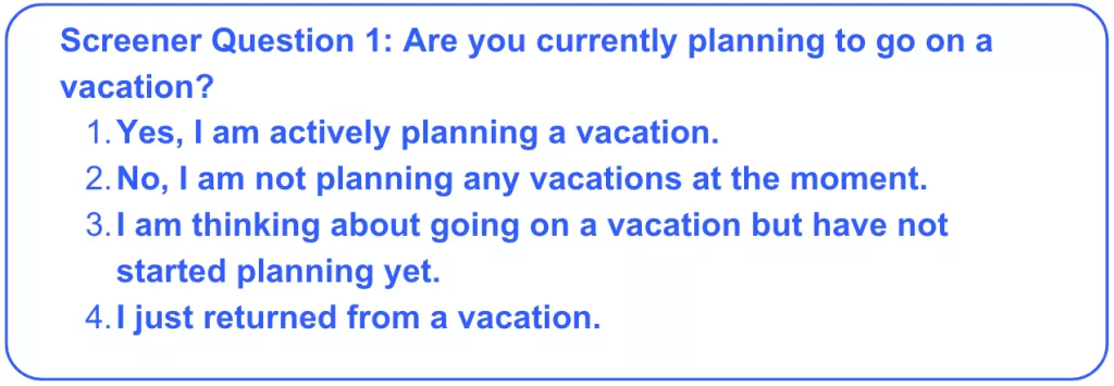
The following question confirms that the user is planning on going on a vacation soon.
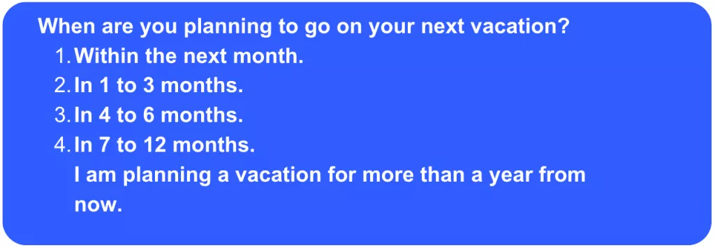
This question filters for users who are planning their trip within four months to a year, and ensures that users’ timelines align with what you’re looking for.
3. Screeners based on industry or occupation
When you need users within a particular occupation, multiple screeners are a helpful way to reveal a single characteristic.
For example, a massage therapy retailer might want to hear from people in the massage therapy industry.
Massage therapy is a very specific profession, and it would be hard to come up with an exhaustive list of options inside of one screener question. But you also want to avoid asking a yes or no question.
Therefore, you might start by listing broader professional categories, including health (which would encompass massage therapy). Then in a follow-up screener, you may have users indicate the role that they occupy within the Health industry. Consider the below example:
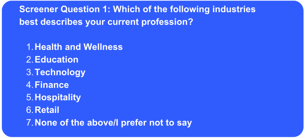
The first screener question gives broad categories to keep from overwhelming the user.
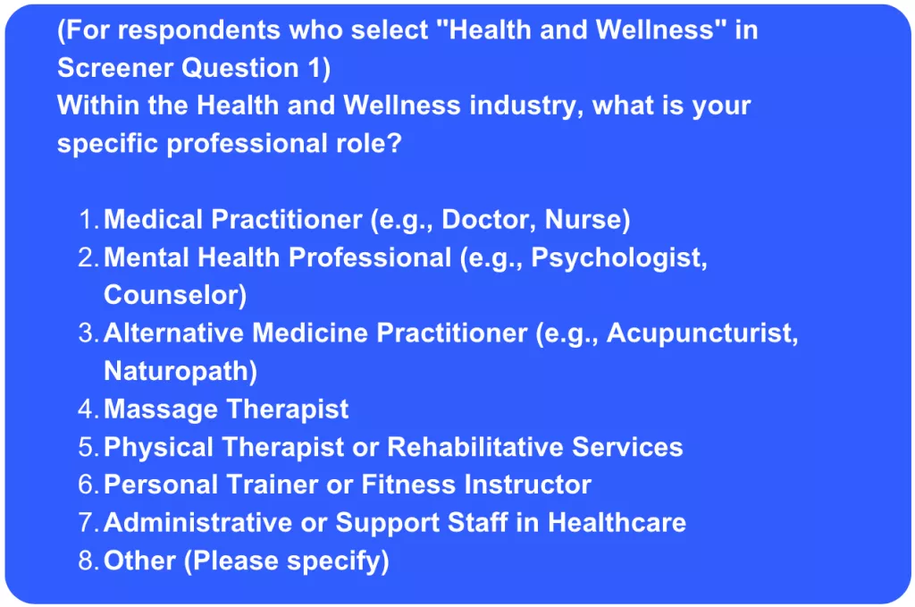
The second question narrows it down to specific industries. As you can see, with each screener question, you’re able to weed out more and more of the contributors that don’t qualify to narrow it down to the ones who do.
4. Screeners that deal with personal information
The last type of screener that the UserTesting Research Team relies on frequently involves users providing sensitive information, including their income, race, Facebook profile, or body type.
For example, there are apps that help couples who’re attempting to conceive a baby determine fertility peaks. Obviously, reproductive health isn’t a topic that everyone is comfortable discussing in a user test. Therefore, it’s important to give users a disclaimer and only accept contributors who’re willing to be open about this personal information.
Here’s an example of how this screener can look:
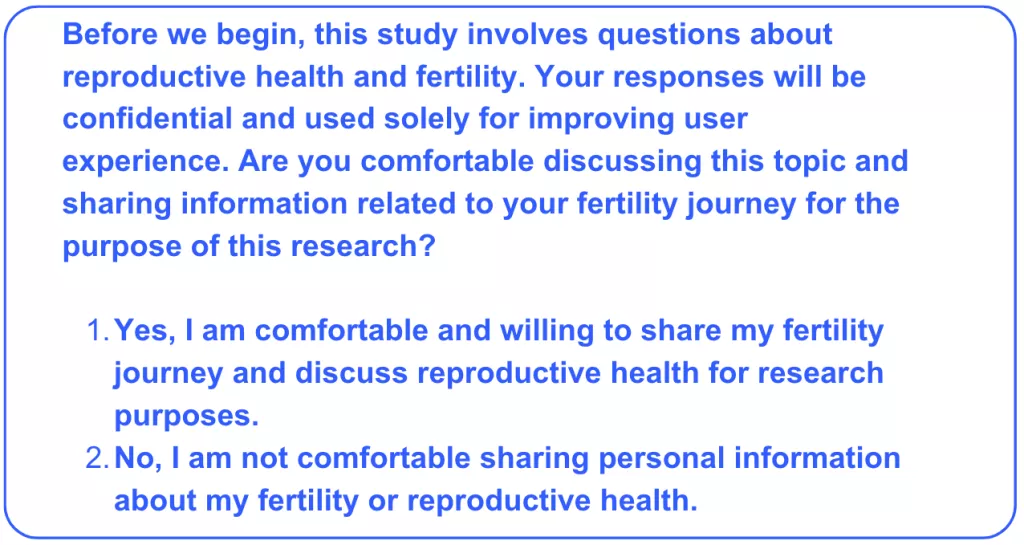
By being transparent with users, you’re giving them an opportunity to opt out of the study if they’re not comfortable sharing personal information—and now you’re that much closer to finding those who are.
For further information on UserTesting’s data protection guidelines and HIPAA, read our help article here.
Start using screeners to recruit your ideal target audience
These examples only scratch the surface of how teams can capture feedback from their ideal users. Often, these are used in some kind of combination, like screening for males who frequently track their fantasy football data but have never heard of Rotowire, for example.
Shaping screeners can be challenging, so we encourage you to always perform a dry run to ensure that your screeners are effective and give yourself room for adjustments. When you use your imagination and leverage best practices, the recruiting possibilities are endless.

Watch a demo
See how easy it is to get fast feedback on a website, prototype, design, or more in this demo.


