In this guide
The complete guide to usability testing
Real-world usability testing examples
By now, you’re aware of the importance of usability testing. Usability studies are essential to determining how users interact with your product and creating a digital experience that the user understands and enjoys.
One of the best ways to get a feel for usability testing examples is to see it in practice. This chapter will discuss practical usability testing examples from some of UserTesting’s customers.
These product, research, and design teams’ success with usability testing offers real-world inspiration for how others might follow in their user testing footsteps.
Example 1: Qualitative usability testing methods help GymShark's app to increase mobile checkouts by 11%
Initially conducting product and design tests, the company partnered with UserTesting to enhance its multiple digital touchpoints, including its app, using various usability testing methods.

The challenge: Identify usability issues in GymShark's app
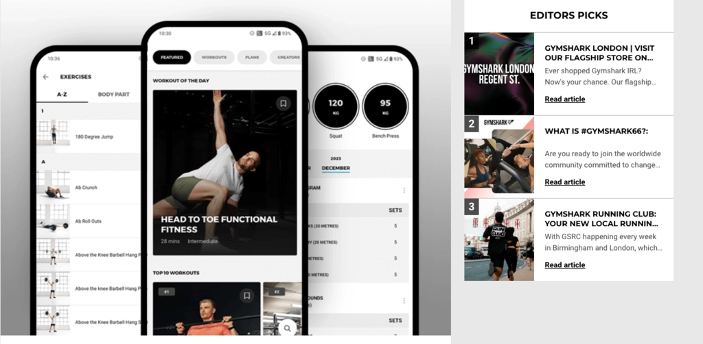
Founded in 2012, UK-based Gymshark has always prioritized customer feedback. Initially conducting product and design tests, the company partnered with UserTesting to enhance its multiple digital touchpoints, including its app.
The initial goal of the collaboration was to align the perspectives of product owners and engineering teams with customer-driven insights on Gymshark’s online strategy. This meant seeking a comprehensive understanding of the purchase process through a structured usability testing process.
Gymshark’s focus shifted to optimizing specific aspects of the shopping experience, such as shipping, payment, and delivery, to improve product findability and facilitate a smoother checkout experience. One way to do this is to conduct usability studies, such as moderated usability testing, to get valuable user feedback.
The usability testing
Gymshark initially conducted user interviews, or in a in-person test, to assess users' perceptions of their digital spaces. This was followed by unmoderated website usability testing through UserTesting’s Participant Network, specifically targeting users of competitor apps.
In addition to unmoderated usability tests, this helped them fine-tune their understanding of how customers view their website elements, banners, and overall brand. Maxwell Petitjean, Gymshark’s Head of Product Insights, noted the significant improvement in test usability and response quality with UserTesting.
Feedback from these tests were presented to senior Design and Product Management teams. Subsequently, the Head of Product Management directed further research into how customers choose sizes during purchase, aiming to boost sales and customer satisfaction.
The usability test results
Petitjean revealed that within a month of using UserTesting, they learned customers often left Gymshark's site to check reviews before purchasing, prompting them to simplify keeping items in carts while browsing elsewhere. This change led to an 11% increase in checkout rates.
Additionally, after A/B testing, Gymshark's main takeaways led to:
- Making its sizing guide more prominent, resulting in a 40% increase in its use within six weeks.
- Improving their training app after discovering users had difficulty creating workout plans, which doubled the app's user base in one month.
Try the website evaluation test template to understand the tasks used for website usability testing.
Example 2: Usability testing methods benchmark American Airlines' digital experience competitively

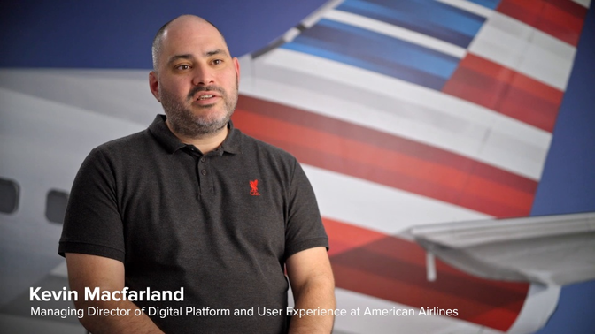
American Airlines utilized remote usability testing to benchmark its digital experience competitively. This approach allowed it to understand user needs and improve its products effectively.
The specific objectives of such testing depended on individual cases and chosen usability testing methods. Researchers also visualized results through various techniques, such as heat maps and screen recordings.
The challenge

Most flyers now book their flights online, making the digital experience crucial for customer satisfaction and retention. American Airlines, transporting around half a million passengers daily and attracting hundreds of millions of website visitors annually, faces a wide audience and has significant UX challenges.
Despite being a large organization, American Airlines needed a better way to measure and improve their digital product experiences. Integrating UserTesting into their workflow provided the necessary tools and a controlled testing environment to quantify, benchmark, and demonstrate progress effectively.
Testing
Lucas Lemasters, UX Research Principal at American Airlines, stated that UserTesting offers essential quantitative and qualitative data for product decision-making.
The effectiveness of UserTesting is especially evident in American’s benchmarking programs, where it collaborates with Research Consultants to utilize the QXscore™ usability testing method.
This proprietary metric assesses the usability and enjoyment of digital experiences, guiding product decisions and success.
American Airlines put its entire sequence of digital experiences for searching and booking flights in front of potential customers with UserTesting. Then, they quantified the usability and enjoyment of their website by QXscoring four essential customer experiences:
- Booking a flight
- Changing and managing a flight
- Checking in for a flight
- The AAdvantage program
For the benchmarking programs, they measured the performance of their digital experiences against the same experiences from competing airlines, carefully tracking every conceivable engagement a customer could have when using the American Airlines website.
The results
American's UX team provides QXscores to the organization's product owners. This gives the teams a common, quantifiable metric to track success over time. The teams share the related data sets and provide standard measures to senior executives to justify their decisions. Kimberly Cisek, VP of Customer Experience, says,
“Without human insight, you may become reliant on static data. What you want to know is how the customers use and engage with the functions you put out there for them.”
Try the competitive comparison template
Example 3: Usability tests increase Calm's research speed by 10x

The challenge
When Chase Clark joined Calm as the company’s first UX research hire, he sought to understand more deeply how the app can help people target more than just sleep and meditation, addressing their stress and anxiety on a deeper level.
To evaluate and anticipate customer behaviors, Calm’s research team had to formulate specific usability testing questions and function like a team of many.
Chase, now Calm’s Lead UX Researcher, shares more.
“I inherited the UserTesting account and was super excited because I had worked with the platform before. I can act like multiple researchers and still be just one person without stretching myself too thin. The research that would have taken me ten business days now takes me two.”
Testing
Chase Clark, Calm’s Lead UX Researcher, capitalized on UserTesting’s platform to efficiently conduct generative research by engaging diverse participants quickly.
This approach allowed the team to transition from basic usability tests to in-depth studies on user interactions with stress and anxiety, significantly reducing research time from 10 days to two.
The insights gained through this structured testing process led to the development of a new progress tracker in the Calm app, designed to encourage users to engage in mental health activities as regularly as physical exercise.
This tracker, tested and optimized through UserTesting, aligns with user expectations and abilities, helping users set and achieve weekly wellness goals.
UserTesting's value extends beyond research efficiency and effectiveness to helping Calm's engineering teams. By testing concepts and prototypes directly on the platform, Calm quickly identifies the most promising ideas.
Receiving feedback early in the product development lifecycle allows the company to avoid investing months of effort into features and concepts that won't resonate with their users.
The ability to quickly iterate and receive feedback from diverse participants helps Calm prioritize data-driven decisions over emotional ones.
Overall, Calm has leveraged UserTesting to understand its users better and fulfill its mission of helping people achieve better mental wellness.
“It really has been a key player in helping us understand the murky but massive field of mental wellness. It's a difficult area for research, especially with a small team. We wouldn't be able to do half the stuff we've done without this platform.”
Next up: The top 11 best usability testing tools
Finding the proper usability testing tools is critical to creating user-friendly products, designs, and digital experiences.
These tools help you understand how people interact with your product and brand, revealing any pain points. With the right insights, make meaningful improvements that keep your customers happy and engaged.
See more customer stories
The stories you just read represent only a small portion of the success our customers have seen with UserTesting. Head over to our Customer Stories page to see more.