Because yourcustomer'sfeedbackmatters.
Transform how you build products and experiences with UserTesting.
There's no alternative to #1
Discover why UserTesting is named the leader in Experience Research Platforms
Because your customer'sfeedback matters.
Transform how you build products and experiences with UserTesting.
There's no alternative to #1
Discover why UserTesting is named the leader in Experience Research Platforms
 Access now
The complete guide to user testing websites, apps, and prototypes
Learn how to plan, conduct, and analyze customer feedback studies
 Watch now
Mastering AI-powered surveys with UserTesting
Learn how to define and deliver stories that drive informed decision-making.
 Learn more
Work smarter with AI-powered experience research
Accelerate everything from recruitment to test planning, feedback collection, and analysis.
 See plans
Transform how you build products and experiences
With UserTesting’s Human Insight Platform, anyone in an organization can quickly get a vivid, first-person understanding of any experience and build greater customer empathy.
Powering over 3,000 of the world’s top brands
How it works
Remove the guesswork and create better experiences
Quickly find and reach your target audiences from any of our purpose-built or partner networks.

See and hear real people share their perspectives as they interact with your brand, products, apps, and prototypes.

Discover insights with machine-learning powered dashboards and visualizations. Validate learnings with higher sample-size studies.

Benchmark your experiences over time and vs. your competitors. Identify areas for opportunity and measure impact over time.


Get the new Starter plan for project-based testing
Do you need to get customer insights on your next project? Check out the new Starter plan that includes capabilities to gather feedback and customer insights without an annual contract.
Boost consumer trust with a frictionless financial experience
Remove purchase barriers and improve the buyer experience
- Remote video URL
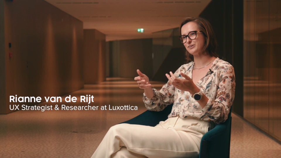

- Remote video URL


- Remote video URL
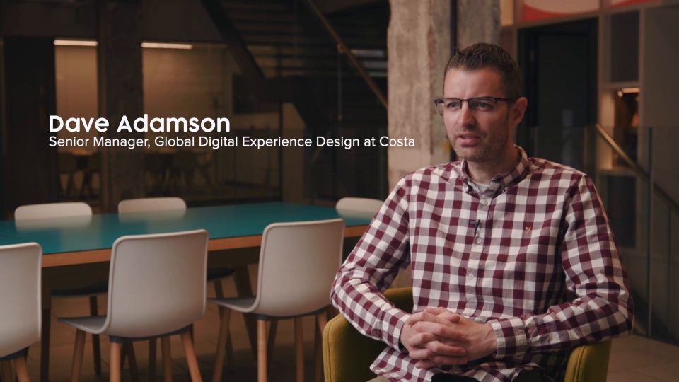

Improve healthcare experiences and drive loyalty
- Remote video URL


- Remote video URL
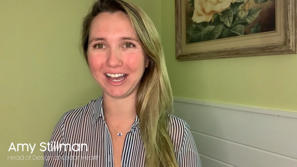

- Remote video URL
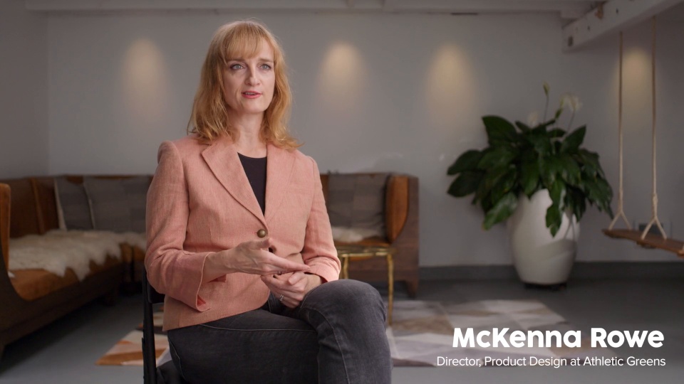

Create binge-worthy experiences with audience insights
- Remote video URL

- Remote video URL

- Remote video URL

Improve your products and services to drive loyalty
We love our customers
Trusted by leading brands

4.5/5

4/5

3/5
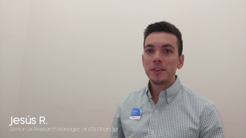
- To help our customers launch the most compelling digital experiences, we partner with UserTesting to bring human insight into our design process, empowering us with a higher degree of confidence.
 Jaime Vasquez Principal Experience Architect & Digital Strategist, Adobe Consulting
 - Our CEO, Satya Nadella, tells us often that the source of innovation comes from having a deep sense of empathy. And it's true, empathy makes us better innovators. Today, Microsoft is stronger than ever. UserTesting helps our entire company get feedback from our customers at every single point in the journey.
 Tom Lorusso Xbox Principal User Research Manager, Microsoft
 - In the race for high quality human insights, nobody beats UserTesting. We recruit target users and complete our tests in hours, not weeks. It's our insight engine -- the power unit behind our momentum -- and a key reason why our remote design sprints are seen as so successful by our business leaders.
 Sam Howard Senior UX Researcher, DAZN
- A tool like UserTesting makes it much easier for us to understand how customers are using our solutions, and negates the need for additional time-consuming research."
 Shamraiz Gul Senior UX Lead, Finastra
 - UserTesting empowers us to have a much more strategic approach than NPS alone because it delivers far richer human insight.
 Grant Yurada Senior Manager, UX Product Design
 - UserTesting has totally changed the perception about user research being an expensive and time-consuming process.
 Harsha Thayi Senior Manager, User Experience, T. Rowe Price
- We had to figure out the ‘why’ before we could get to the ‘how.’ Understanding ‘why’ became our goal…. When we couldn’t ask ‘why’ anymore, we felt like we were getting closer to the answer.
 Travers Korobanik Associate Manager, Experimentation & Research, Walmart Canada
 - UserTesting helped us better understand how our customers feel, allowing us to produce more meaningful experiences for them - ones that not only get the job done, but help them feel good about doing it with us.
 Ki Arnould Senior UX Researcher, The Home Depot
 - UserTesting means we can reach out to customers remotely - at their homes in London or at their offices in New York. Having diverse perspectives for all the products we create is vital to our success.
 Omar Musa Director of Product Design & UX, Burberry
- Talking to patients builds empathy for the patients, and helps us understand the ‘why’ behind whatever we decide we are going to build.
 Frank Rosile Product Development Manager, covermymeds
 - We can co-create digital and product experiences with our target customers on a daily basis with UserTesting. No other solution makes it easier and faster to be Customer First, regardless of what we’re building.
 Jiaqi Mao Growth Hacking Lead, Digital Marketing and Ecommerce, Philips
 - The breakout session on storytelling was amazing! I can't say enough good things about the presenters on their content.”
 Victoria Della Sala Human Factors Design Engineer, Medtronic
 - Human insight helps us create a better customer experience by truly understanding what’s behind the data we have.
 Daniele Catalano UX Designer & Researcher, EssilorLuxottica
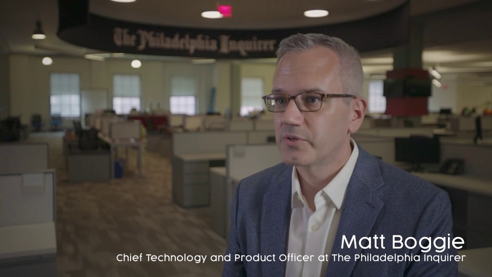
- Moving into digital is an area that we have been doing for some time and are continuing to move forward in. And so learning about how users are using those products and how to best deliver them helps us grow the entire company.
 Matt Boogie Chief Technology Officer, The Philadelphia Inquirer
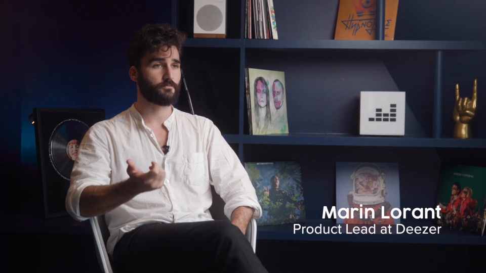
 - People love Flow. They actually use it a lot. And they love the simplicity of it. But sometimes Flow needs a bit more guidance in the way it behaves - and that’s where UserTesting contributors helped us understand how to refine the feature.
 Laurent Pinjon Head of Design Operations, Deezer
 - We're so much closer to the customer now. And that's made our whole company better.
 Margaret Wilhelm Vice President, Customer Insights, Fandango
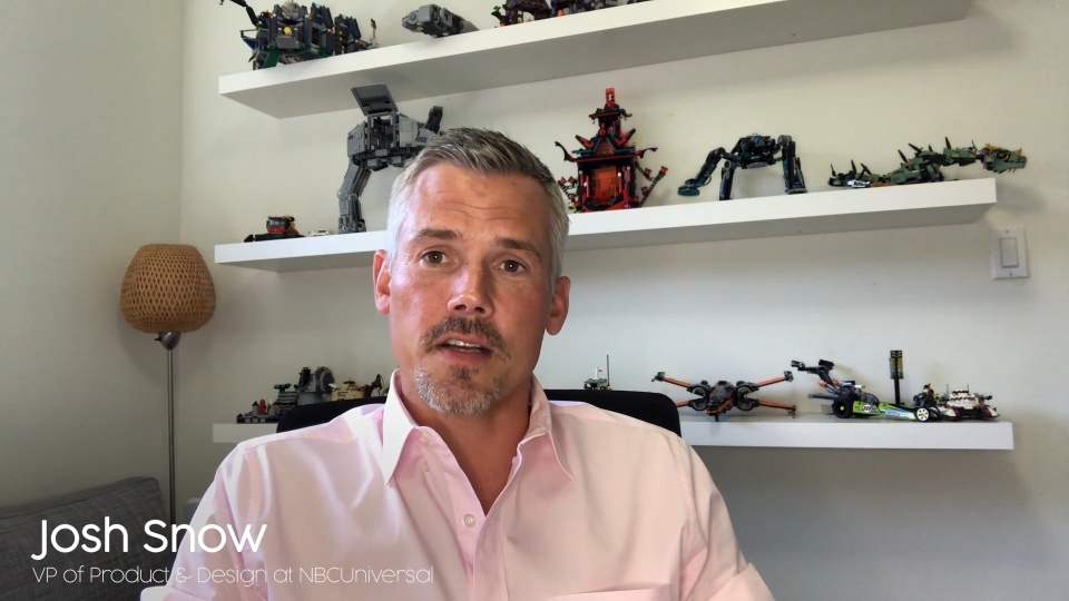
 - With human insight from UserTesting, NBCUniversal's global Identity solution has proven to be the most significant feature launch to date, bringing the widest impact to all our consumer touchpoints across all our network brands.
 Josh Snow SVP, Product and Design, NBC Universal
- We study our users at both the micro and macro levels. UserTesting is an integral component of our development cycle as it helps us scale our products from now to the future.
 Abhijeet Bhattacharya Senior Director - Product and Experience Design, ADT
 - UserTesting helped us understand what our users needed on both a UX and emotional level.
 Melanie Perkins Founder & CEO, Canva
 - UserTesting allowed us to optimize our customers' search experience resulting in increased conversions and bottom-line revenue.
 Hernan Savastano VP of User Experience, Zillow
 - This study has helped our team effectively identify and advocate for changes across the company that prospects and customers actually want based on their journey, which is our ultimate goal.
 Ashley Chinzi CX/UX Researcher, GoDaddy
Solutions for all teams
Customer empathy for every experience
Whether you're focused on UI, UX, CX, or something else altogether, check out these resources to learn more about keeping your customer at the center of the experiences you create.
UI vs. UX
Understand the differences between UI and UX and how human insight can help with both.
Designing for every experience
No matter how you define UX design, keeping your customer at the center is what experts agree matters most.
Testing CX
Customer-centricity is an ever-evolving goal. Learn why testing a holistic view of your experiences is the best way to ensure great CX.
Resources


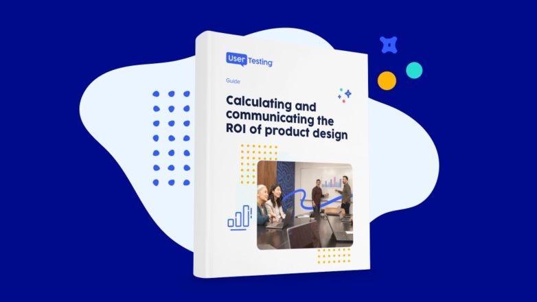
Real human insight, delivered real fast
Watch real people engage with your products, apps, or services, and easily get a vivid, first-person understanding of any experience.


