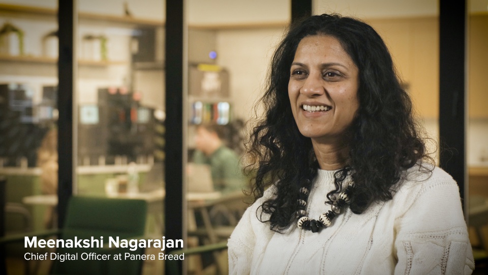
Panera’s Product & UX Team followed a directive from senior management to integrate customer feedback into the new experiences they would build. Meenakshi Nagarajan, Panera’s Chief Digital Officer, says, “We think about every little nuance of when a guest comes in, whether they're checking out as a guest or as a MyPanera member, we want to ensure that their experience is personalized, their experience is frictionless because that is a key part of our growth.”
Pavithra Counsell, Director of UX, Andy Parquette, Lead UX Designer, and other team members worked together to develop design concepts that they could show to customers and prospects to gather their feedback regarding the proposed catering website.
According to Counsell, “Figma allows us to create prototypes that a user can click through in UserTesting and to the user, the prototype looks and feels exactly like the website.”
The team used these prototypes to test usability and perceptions of the order setup process, the checkout experience, and more with a diverse population set. They considered everything from socioeconomic status and gender identity to whether or not test participants were current Panera loyalty customers. Here is some of what Panera discovered:
- Some site visitors got confused as to whether they were on the Panera retail or Panera catering website. Andy Parquette used this information to develop a tab structure that helps customers toggle between the two and recognize subtle differences in brand-approved color schemes on each
- Panera’s design leaders noticed through heat maps that visitors were clicking on a plain text headline. This helped the Product & UX Team understand they should downsize a two-page ordering setup into a single page
- Customers enjoy options for customization and want to see these options clearly visible on screen. This tip helped Panera understand, for instance, that they could highlight half sandwich / half salad orders
- Easier access to seeing the details of their past orders helps customers simplify (and speed up) their order process
- Site visitors (particularly administrators who place frequent orders) love Panera’s popular bundles and sandwich assortments, which now enable them to place larger orders at a single click
Parquette explains the value of having quick access to the human opinions listed above. “UserTesting provides invaluable insight. We watch humans go through our digital experiences and fail or find moments of delight. I treat it like it's another coworker. UserTesting is another member of our design team.”
With a menu of insights from users, Panera changed the entire look and feel of their catering website, as well as the site’s ordering functionality. These changes included the fundamental interactions of how guests start an order, modify or customize an order, and how they manage an order as it’s being prepared.


