10 web accessibility myths debunked

Web accessibility is the name given to the practice of making websites more usable and inclusive to people with disabilities.
On the face of it, most people would agree that web accessibility is a good thing. But a lot of myths and misunderstandings persist about what exactly constitutes web accessibility, how necessary it is for individual businesses, its benefits, and the challenges of carrying out.
We’ve taken it upon ourselves to bust some common myths about web accessibility. Here are 10 things that you might have thought—or heard—about web accessibility that aren’t necessarily true.
1. Accessibility is just for blind or partially-sighted users
Many discussions and resources for web accessibility focus on ways to make websites more accessible for blind and partially sighted users (making them screenreader-friendly, improving the color contrast, making the text larger, and so on).
While these are extremely important considerations, visually impaired users aren’t the only group you should be considering when you think about web accessibility. Accessibility measures are also important for users who:
- Have impaired mobility (including tremors, muscle slowness, or a lack of fine muscle control, making it hard to use a mouse)
- Are deaf or hard of hearing
- Are prone to seizures
- Have developmental difficulties or learning disabilities
- Older users, who may experience a combination of the above impairments, and also have difficulties with parsing technical language.
2. Accessibility is just about adding alt text to images
Similarly, while adding descriptive alt text to images—making them accessible to visually impaired users—is an important step to take to improve accessibility, it’s not the only step you should be taking. A website with great alt text can still be inaccessible in many other ways.

3. Accessibility is just about following the Web Content Accessibility Guidelines (WCAG)
The Web Content Accessibility Guidelines, or WCAG 2.1, are a useful benchmark for assessing the accessibility of a website and have a lot of excellent guidance to offer on web accessibility. However, they also have their shortcomings—they aren’t always able to update quickly enough to match the pace of digital change and on their own. They aren’t a guarantee of usability.
The best way to ensure this, if you’re serious about making your website accessible to all users, is to include users with disabilities in your accessibility UX testing to ensure they can accomplish what they need to with your website interface.
4. Using automated evaluation tools to check for accessibility is enough
There are drawbacks of relying on automated evaluation tools. Handy though these tools may be, they can often be very literal in interpreting issues, without taking into account the full context of the site.
In general you should only use them for a quick, surface-level check—not as a substitute for proper accessibility testing or an audit.
5. Making my website accessible will interfere with its functionality/design
Contrary to popular belief, your website doesn’t have to be incredibly basic or have a boring design to be accessible. It’s completely possible to make a beautiful, functional and accessible website – it just involves working to a different set of parameters.
Don’t buy the argument that having an accessible website and having a nice design are mutually exclusive—that’s just lazy thinking.
6. Web accessibility is expensive and time-consuming
Web accessibility doesn’t need to be expensive or complicated if it’s factored into the website development process from the get-go. Developing an accessible website costs virtually the same as developing an inaccessible website. But it has the potential for more user satisfaction—and increased revenue—in the long term.
If you already have a large, highly inaccessible website that you want to make accessible, this might take more time and money to accomplish, but again, it will be beneficial in the long run. The basic layout and design of your website are unlikely to need changing.
7. My users don’t have issues with accessing my website!
Can you be sure of that? Not every user who has problems with accessing your website is going to take the time to compose you a strongly-worded letter about it.
With so much content and so many available websites for users to choose from, it’s much more likely that they simply went elsewhere without bothering to contact you and ask you to fix the problem.
8. Accessible websites only benefit a small minority of users
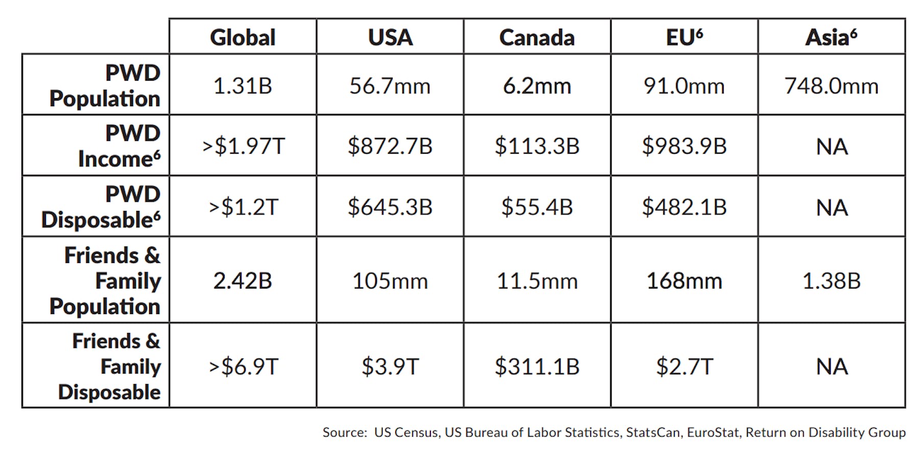
In 2016, the estimated the global population of people with disabilities (PWD)) as 1.3 billion: a market equivalent in size to the population of China.

This works out to more than 17% of the world’s population – with a combined annual disposable income, according to the report, of more than $8 trillion. I think you’ll agree that these aren’t small amounts.
On top of this, Baby Boomers are rapidly adding to this number. If you have a business that caters to older users in any way, you need to bear accessibility considerations in mind. And even if you don’t, a larger percentage of your potential customer base than you might realize will benefit from you making your website accessible.
9. Web accessibility is nice to have, but not obligatory
If you’re a UK business, this may not be the case. Since October 2010, the Equality Act 2010 has made it illegal for anyone who provides a service (in the public, private and voluntary sectors) to discriminate against disabled people.
The government has explicitly made clear that this does apply to websites, so making content inaccessible to someone with a disability could be seen as unlawful. A number of other countries also have legislation which mandates complying with certain accessibility standards.
10. Making websites accessible doesn’t have any additional benefits in other areas
There are a number of associated benefits that come with having an accessible website, including:
SEO
Web accessibility measures and SEO best practices have a nice, big area of overlap. From providing text alternatives to images, video and audio, to giving your site a logical and hierarchical structure, many of the things you can to do make your website accessible will also benefit its search optimization.
Usability and UX
An accessible website is a usable website, and improving the accessibility of a website enhances the overall user experience. Many accessibility guidelines align with usability best practices—such as having a clear and consistent design, logical structure and navigation, a good level of color contrast, and so on.
Revenue benefits and cost savings
Opening your business up to a sizable additional market brings with it more revenue opportunities, and as we saw in point 8, users with disabilities control significant disposable income. With more people able to complete tasks on your website, you’re likely to also save on certain costs over the long term, such as customer support services. Ensuring your business has a website that is usable and accessible has a great return in the long run.

Get started with experience research
Everything you need to know to effectively plan, conduct, and analyze remote experience research.


