Accessible UX design: the one billion user opportunity

Internet adoption in developed nations is at an all time high, hovering around 90%. In some demographics, such as ages 18-29, that number is 100%.
Globally, more people are also using the internet. In 2009, around 22% of the world had internet access. That number has doubled in the past ten years, with 50% of global citizens now accessing the internet. Emerging markets are very quickly becoming the next market expansion. App Annie found that “emerging markets continued to fuel growth in 2018 and represent 3 of the top 5 markets for app downloads.”
There are one billion new users poised to come online for the first time and every single one of them is in an emerging market.
Targeting emerging markets isn’t as easy as making your app available in more languages. The global market is socioeconomically diverse with different educational backgrounds, disabilities and internet access. Success in emerging markets will require a robust strategy and combination of accessibility, localization and overall user experience.
Accessibility recommendations for UX design
As the US population ages and disabilities are increasingly common, UX design and coding practices centered around accessibility are more and more important. Around 20% of consumers in the United States have a disability and this number is expected to increase. When we consider emerging markets, that number rises to a staggering one billion users.
Here’s how you can make your website accessible for these users, right now.
1. Increase your font size
Visual impairments are the most common type of disability, but not the only type of user who suffers when your font size is too small. Small fonts can be hard for anyone to read, but especially for those with older monitors, smaller phones, dimly lit areas or in outside glare. The recommended minimum font size for body text for websites is 14pt. Android and iOS both have built-in fonts that are even larger than this, 17pt.

2. Update your color contrasts
Low color contrasts affect anyone with a vision impairment, in a low-contrast environment and anyone with color blindness. Aim for a minimum contrast of 3:1 for any text and icons. You do not need to update any branding or logos to this contrast since it is part of your company’s identity.
3. Label everything
Forms without visual labels for the text fields can be really confusing. When you’re browsing a website with a screen reader, everything can be confusing. Use alt tags and labels to make sure everything has a purpose described. Buttons, icons, tabs, any anything else with no visible description listed should have a label.
When coming up with your label description, describe the purpose and not the type of control. Screen readers will automatically tell the user if it is a button, a text field, etc. You need to tell the user what the button actually does if they click on it (Submit form? Contact us? Go to next page?).
4. Use a screen reader
There are many websites and apps completely unusable by screen readers. Learning how to use, design and develop for screen reader users will improve your overall design and development quality, increase your SEO and your potential user base. Screen readers work by ‘reading’ what’s on the screen—similar to if you were closing your eyes and had a friend reading everything out loud for you. Most people use a screen reader alongside a mouse or a keyboard.
5. Literacy and reading
The global literacy rate for people 15 and older hovers around 86%, with developed nations (such as the US) reaching close to 100%. Older adults, women, those of low socioeconomic backgrounds and with disabilities are also less likely to be literate.
Despite high literacy numbers, it’s still important to design with limited education in mind. As the world becomes increasingly global, your audience will become more dispersed and less likely to have the same formalized education as you or your peers.
“Despite progress in the long run, however, large inequalities remain, notably between sub-Saharan Africa and the rest of the world. In Burkina Faso, Niger and South Sudan – the African countries at the bottom of the rank – literacy rates are still below 30%.” – Our World in Data
6. Minimize jargon
UX, IA, IxD, UI, PD — all abbreviations in the UX space. If you asked me to explain in detail the complicated difference between each of them, I would probably struggle. Now imagine if you were new to the field or not within the product design space—you’d probably have little-to-no idea of what each abbreviation means.
When we design, we tend to design for our own knowledge and biases, but it’s important to design for a larger audience. Jargon and overly technical language can confuse users. Write in plain, straightforward language. Minimize abbreviations and make sure you use words and definitions consistently throughout your application. Jargon can be hard enough to read as a literate user, let alone illiterate or English as a second language.
7. Keep text succinct
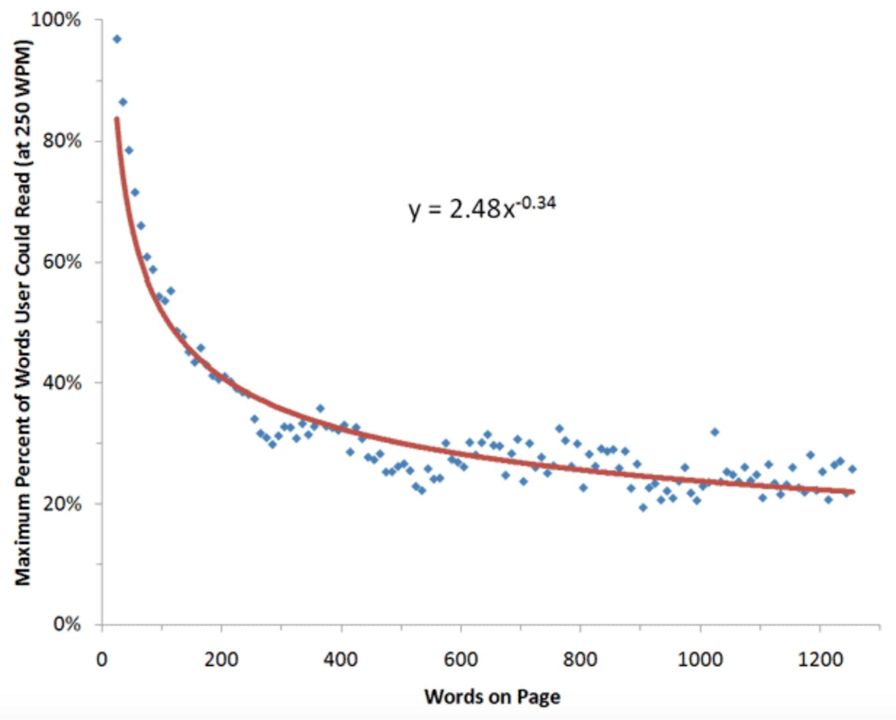
Even if your entire audience is literate, they’re still unlikely to read your entire website. When NNGroup conducted a survey, they found that as little as 20-28% of text is actually read.

Keep your paragraphs succinct and focused on what the user finds meaningful. Break up long sections with headers or images, to make it easier for your audience to scan and skip around.
8. Localization
Localization refers to the creation and display of content on a per-country or region basis. A big part of localization is translating from English into other languages, as well as how that language is displayed on the screen. Localization also can include legal requirements, changing images or media to more appropriately reflect other cultures, writing style and town and even choosing appropriate typography. By localizing content and design, you create more personalized experiences for your user base.
9. Leave room for translations
Languages are incredibly varied in length. Translating from English to Japanese makes text up to 60% longer. When we design solely for English, we may not leave enough room for other languages. It is then up to the developer or the browser itself to determine how to expand the experience. This can result in broken design rules and awkwardly placed content.
Find out what countries your product is commonly used in, then make sure your designs work for the shortest and longest languages. Using a table of expansion and contraction percentages can help you to envision the space you need, even before you get started.
10. Minimize metaphors
Metaphors, idioms and slang do not translate well. “Break a leg”, “call it a day”, and “cut them some slack” might make sense to English speakers, but not to other languages. Even within the English language, there are country and regional differences. US users probably don’t know what “cheap as chips” means, nor would someone from the UK know the complex meaning behind “bless your heart.”
11. Low bandwidth
Our websites are getting bloated. Advertisements, rich media (like video) and an increasing number of framework dependencies means that website file sizes are larger and larger. In a high-bandwidth environment, it might not make too much of a noticeable difference, but it’s causing huge problems in the rest of the world. The average internet speed in Australia is half of that in the US and the UK; the average internet speed in Egypt is less than 15%.
12. Speed is essential
Users on gigabit fiber in New York or limited 2G cellular internet in Kenya still have one thing in common — the desire for speed. In the case of the gigabit user, they’re looking for as much speed as possible. As many as 40% of users will abandon a website if it hasn’t loaded within four seconds. Speed is a luxury, but one they demand.
For our 2G internet users, they may not ever have access to non-cellular internet, let alone gigabit speeds. Globally, 3G is still in more than 30% of markets. If your website is bloated enough that a 2G user has to wait for long periods, they’re just going to find a better optimized product.
13. Opt in to downloads
Data can be very expensive. A 500mb ‘pay as you go’ plan in Germany takes under an hour of minimum wage work. In Brazil, it’s over 30 times that cost, at approximately 34 hours of work. Users have to be savvy about what they consume. If your website or app is frequently a data hog, it will never have high adoption. Allow users to opt-in to downloads when they want to, don’t force them to on your schedule. This includes app updates, images, maps, or any other media.
Conclusion
Designing for your entire audience, across different disabilities, languages, literacy, internet access and localization can seem overwhelming. But many of the above tips apply to good UX, not just specific situations. Start by prioritizing high-impact, low-effort tasks (such as increasing your font size). Work on testing your application in unique situations, such as outside, with users who have limited reading ability or on low bandwidth.
By designing outside of your current echo chamber, you’re creating a more usable, robust product that can be used by an entirely new audience.

Are you an insight seeker?
Join UX, research, and design leaders to push your craft further.


