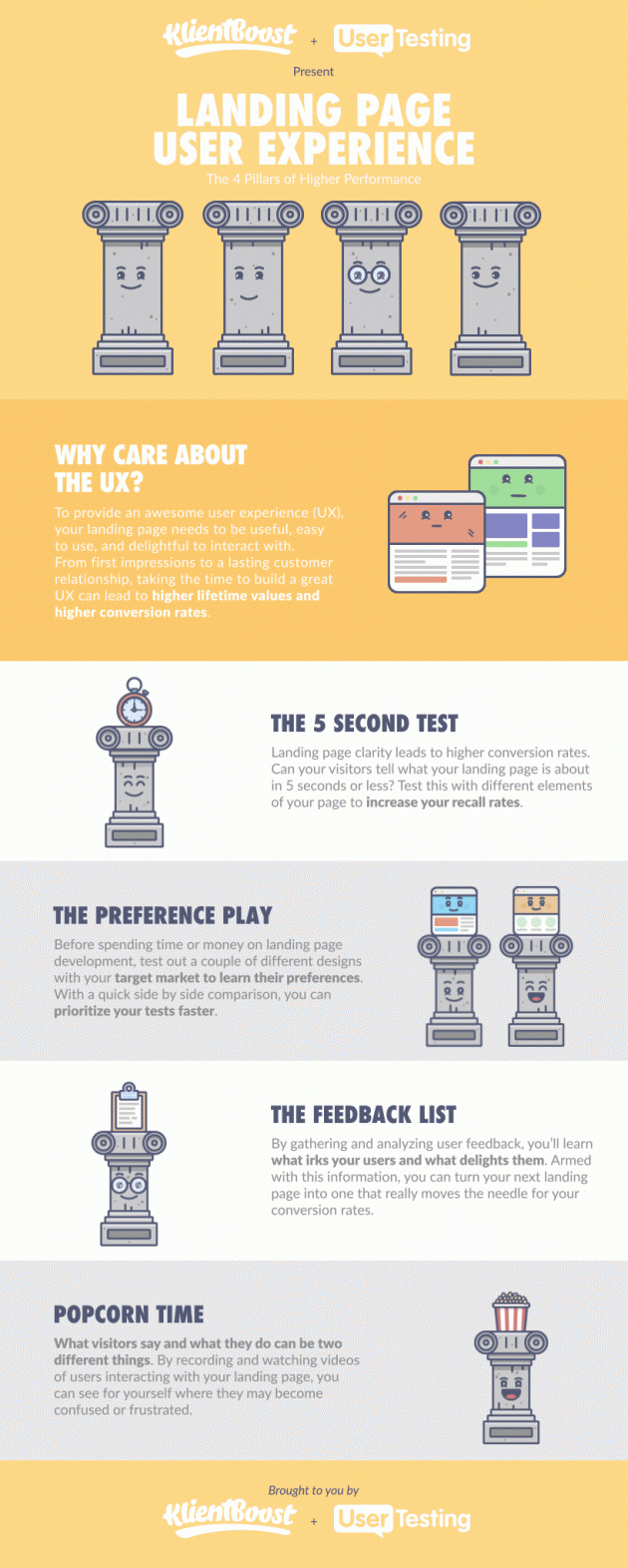
A better landing page experience: 4 pillars to follow

This marketing infographic is part of KlientBoost's 25-part series. We’re excited to partner with them so you can enjoy a new gifographic once a day in your inbox. You can subscribe here to receive the gifographics.
If you’ve ever split tested your landing pages before, then you know how important your user experience can be.
But a landing page user experience isn’t just tied to improved conversion rates—it can increase your customer lifetime values as well.
That’s why we’ve partnered with UserTesting to bring you some quick wins and tests you can run to start improving your landing page user experience today.

Got 5 seconds?
One of the most common user experience tests you can quickly run on your landing pages is the 5-second test.
As we’ve seen again and again from our landing page designs at KlientBoost, clarity almost always beats out cleverness.
This means that the faster your visitors understand what your landing page is about, the higher your conversion rates can grow.
To see how truly clear and easy-to-understand your landing page is to the eyes of your visitor, have test participants look at the page for only five seconds, and then check to see if they can answer these questions with flying colors:
- What’s the landing page about?
- What’s the call-to-action/offer of the landing page?
- Who’s the company behind the landing page?
- Do you find the landing page trustworthy?
- Any other questions you’re curious about
Let’s say that multiple visitors have told you that they’re not sure what your hero image has to do with your landing page, or they’re not clear on what they’ll get after they convert. With this in mind, you can run multiple 5-second tests to see if you can improve the visitor’s understanding so that their friction points and anti-converting questions start to dwindle.
Here’s an example of an A/B test of two different ads. Which performed better? Source: Behave.org
You can run 5-second tests on landing pages or even display ads (like above) to see if your visuals or copy improve your visitors’ contextual understanding.
Which do you prefer?
Another great user test you can run is a simple preference test.
A preference test allows you to wireframe or mock up two different landing page experiences with the goal of getting feedback on which experience your users like the best.

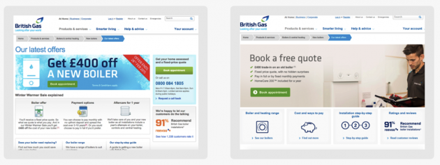
Which do you prefer? Most people said variant B. Source: Behave.org
Armed with the preference results, you can prioritize which landing page should be designed and developed first with the greatest and fastest chance of conversion rate improvements. But keep in mind that preference doesn’t always equate to conversions. Preference testing is a good tool to help you prioritize and make improvements, but you should still measure conversion rates to get a complete picture of your landing page performance.
Through preference testing, you can start understanding a few different preferences from users, like:
- Visual design & branding
- Interaction design
- Copy
- Navigation approaches
- Use of imagery
- Page layout and information hierarchy
- Any other contentious issues at your organization
As you can see, preference testing goes beyond landing page user experiences. It also helps you determine which branding direction to take or which color combinations to use for your website redesign.
The most useful feedback
Sometimes, what your visitors say is different from what they actually do. By running user tests, you can track users' behavior as well as their opinions to get the complete story of why they may not convert.
Keep an eye out for themes of disappointment and excitement that reappear across multiple occurrences.
You can prioritize your landing page tests around the feedback and questions that are most common, like:
- What sizes does this come in?
- I can’t see pricing anywhere.
- How does the security work on this product?
You can also scour your chat or phone call transcripts to find common questions that visitors have and add those to your list of A/B testing opportunities.
Movie time = popcorn time
As the fourth pillar to achieve a better landing page user experience, interviewing, recording, or watching your actual visitors gives you another layer and dimension of understanding that written feedback and analytics alone might not have given you.
Whether you choose to do in-person testing or remote testing, following along on a user’s screen as they interact with your landing page puts you in the user’s shoes and helps you see your landing page through the eyes of your user.
Many marketing teams find it helpful to watch the user testing recordings together and discuss the user’s experience as a group. While the popcorn is optional, sitting down together for “movie time” helps resolve internal disagreements about how users will react to your offer—and it helps your team develop a deeper understanding of the customer’s mindset.
As an added bonus, this customer empathy will also help your team with other marketing initiatives, outside of improving your landing page user experience!
Back to you
Now that you have a solid understanding around simple ways to improve your landing page UX, you can go forth and start researching which areas are your lowest hanging fruits for improved performance.
By asking the right questions in hopes of getting actionable answers, you can start learning more about your visitors on a holistic level that can help all marketing initiatives improve.


