Optimize your website and prototype’s UX with interactive click maps

As your business adapts to meet your customer’s evolving needs, so too must your website and digital properties. Of course, as you change these experiences, you’ll want to be sure users can still find the information they’re looking for and/or complete transactions effortlessly. This means that every mouse click, input, and swipe matters. So if you’re not tracking these interactions, it becomes difficult to know whether or not you’re successfully adapting your user experience to meet your users’ needs. That’s where click maps come in.
Introducing click maps for usability testing
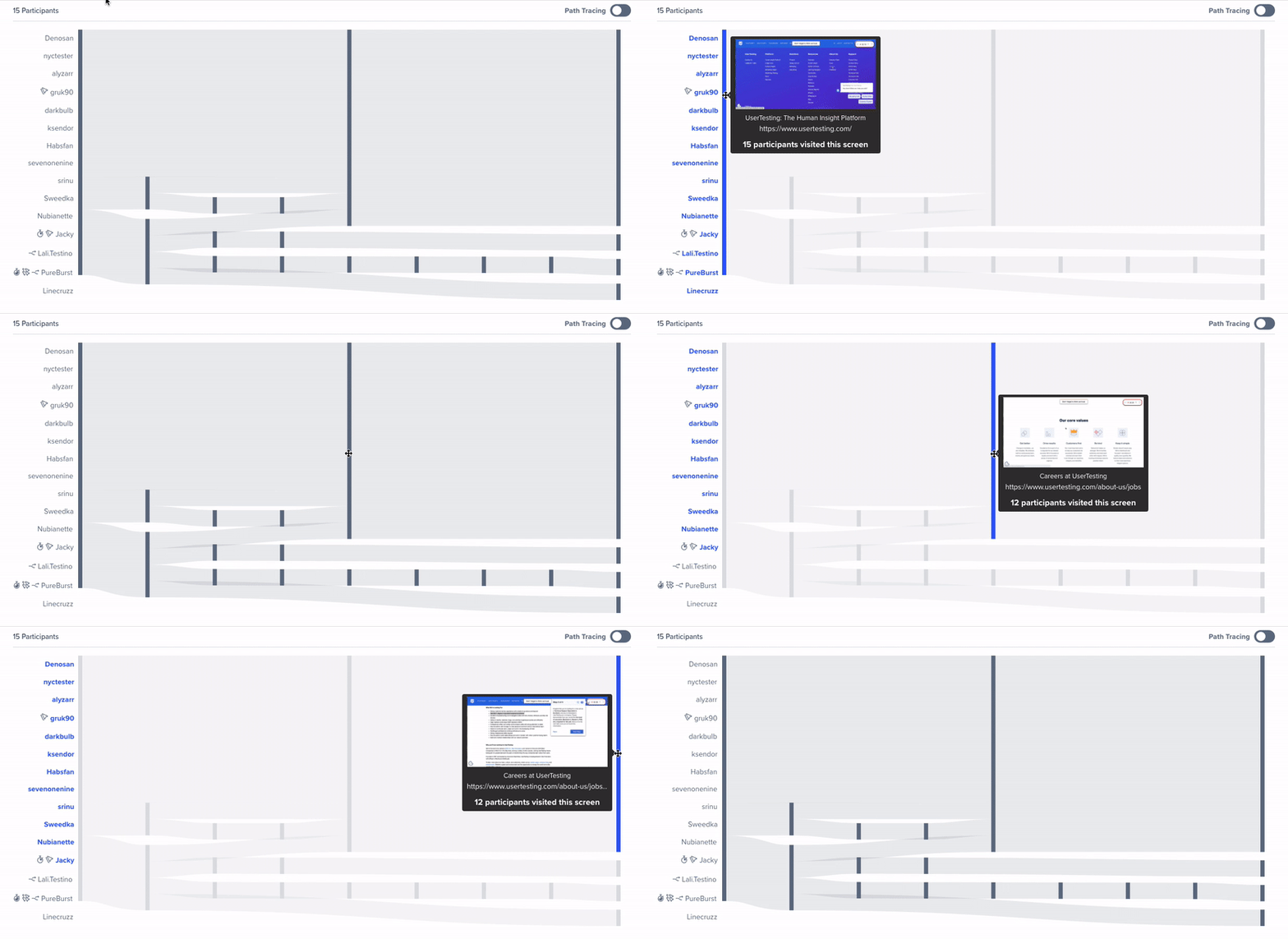
As part of our ongoing efforts to simplify post-test analysis, we’re excited to announce that click maps will join Interactive Path Flows as the latest update in our strategy to aggregate participant interaction data into visualizations.
In October 2020, we introduced Interactive Path Flows—visualizations that aggregate participant task interactions into flows. These flows help users quickly analyze feedback by visually highlighting trends and outliers, allowing them to drill down and explore key findings with ease.

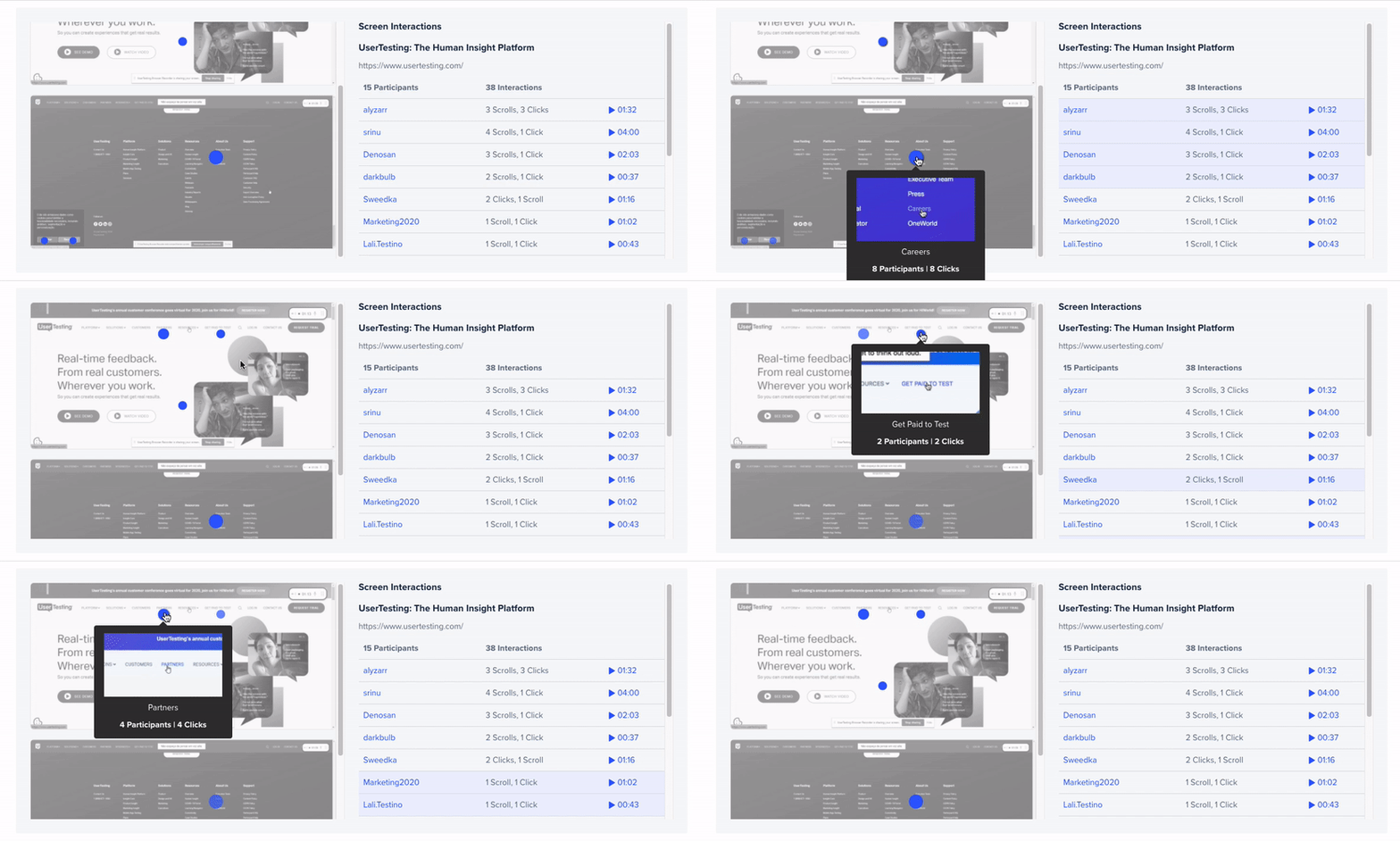
With click maps, we’re taking that concept a step further. A click map is similar to a heat map in that it depicts where participants engage on a specific webpage or prototype. However, unlike a heat map, which only captures what users click on and how often—click maps are interactive. This means they provide an interactive visual representation of all participant clicks and inputs on websites and hosted prototypes.
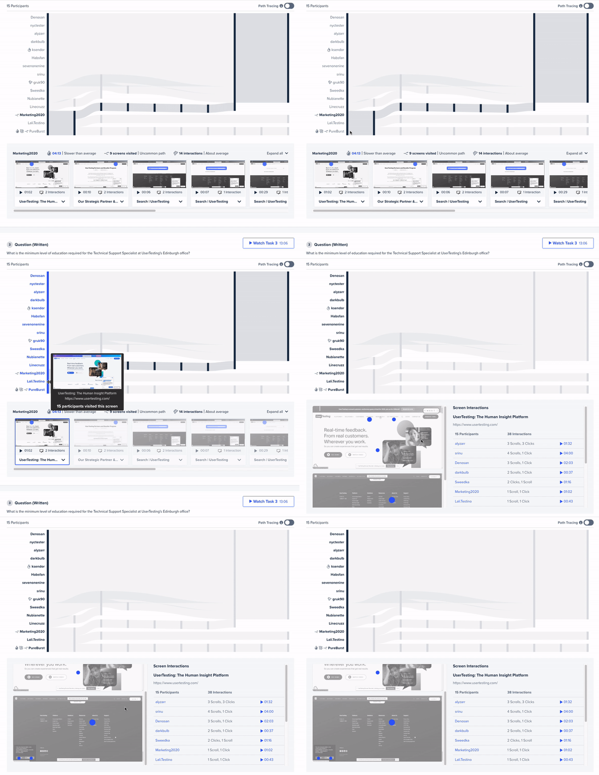
And by combining click maps with Interactive Path Flows, you can now quickly understand how participants complete tasks and how they engage on specific pages.

How do click maps work on the Human Insight Platform?
When a test includes a task to be completed on a website or prototype, the UserTesting Platform will summarize participant behavior (on each screen where an action was taken) using a click map.
Because the click maps are integrated into Interactive Path Flows, which illustrate how users navigate from one screen to another—you’re able to more easily spot patterns and identify outliers across participants. This is especially helpful when tests include many participants and when carefully reviewing hours of video would be time-consuming.
Focusing on a click map within the Interactive Path Flows illustrates how all the participants engaged with a specific screen. The click maps display circles representing interactions over a screenshot of the page. Larger circles represent more interactions with a specific element on the page.
As you review the results, hovering over the circles surfaces additional details—including a small screenshot of the element that was selected and the interaction type. From there you can watch the full video clip to review the participantdescribing the interaction.

From this video page, all video player functionality is available, including creating a note or clip, reviewing the transcript, and seeing suggested tags.
Bridging the quantitative and qualitative with click maps
Quantitative methods are often used to identify “the what” and qualitative methods, “the why”. With click maps, you get the best of both worlds. You can quickly identify what users are clicking on, and then easily drill down to understand “the why” in just a few moments.
Having this additional qualitative data—and a fast and easy way to access it—allows you to really understand why users chose to click on one link versus another. Without this information, you might realize something isn’t working, but have no insights about how to fix it. Qualitative insights help you make sense of user behavior, which makes it much easier to take action and design experiences that meet your customers’ evolving needs and expectations. As part of our January 2021 Product Release, we’re excited to announce that this feature is now available for customers on our Premium, Advanced, and Ultimate plans.


