
A primer to design systems: Making yours in 5 steps

The silos of product development are coming down. Design is no longer an isolated stage in the process handled by a few specialists.
Design systems help solve the problems of scale that come with large and remote teams working together. With the rise of Lean UX and Agile UX, a centralized system gives everyone standardized principles and components for more consistent product development.
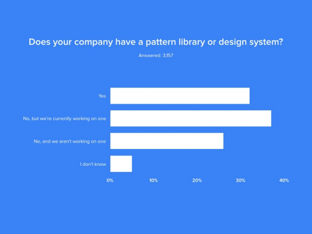
Sounds useful, right? That’s why 69% of 3157 designers surveyed said they were currently building their own design system if they didn’t have one already. It’s not like you can blame them after big companies like Salesforce and Airbnb paved the way.
Before we get into how to build a design system, let’s talk a little more about what they are and why your company needs one.
What is a design system?
A design system contains the principles of design and development and the toolkits for achieving those principles. It’s both living documentation and a robust set of components.
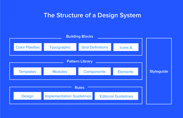
Via UXPin
If you need to know how your brand handles search bars, it’s in the design system. If you forget the color code for the preferred background, it’s in the design system. If you want to copy and paste a bit of code instead of writing it all out, it’s in the design system.
Yes, a resource on this level requires some extra effort to create and maintain. But the benefits are undeniable:
- Faster time to market: Design systems create a Lego-like process where everything is reusable, minimizing the time spent rebuilding the same components.
- Consistent UX across platforms and products: Standardized components create a much more coherent “look and feel”.
- Less version control issues: If you update a component in a design system, the changes populate across all instances. The design system is the final record of truth.
- Easier collaboration and communication: Design systems create a shared general knowledge base and components for designers, PMs, and engineers.
To paraphrase UX speaker and author Nathan Curtis, a design system is not a project, it’s a product that serves other products. Since it’s a tool that increases efficiency, the time spent is more than made up for in the long run.
How to make your first design system
Let’s quickly summarize the milestones in creating your first design system.
1. Get the organization on-board
Design systems, at their heart, are intended to facilitate collaboration. Unless everyone’s on board from the start, they can’t achieve this effectively. So, first and foremost, you want to get everyone involved on board with the project, plus approvals from the managers.
In some cases, decision-makers may need some convincing. Explain to them the benefits listed above, and estimate the number of design and engineering hours that are wasted without one.
And nothing helps get the point across like creating a visual inventory of all the inconsistencies.
2. Audit your current UI
When it comes to actually building the design system, you want to have all your materials ready. Go through your current UI inventory and log all the established stylistic choices—UI patterns, color palettes, typography rules, etc., and their corresponding code snippets when available.
As you go through it all, document all the inconsistencies. An audit of this size can be a big undertaking so it might help to break it down further:
- Go through the interface and code, noting all the colors and text styles you come across, as well as any inconsistencies.
- Go through recent projects and identify recurring UI and copy patterns, as well as any inconsistencies. Take screenshots of each for visual aids later.
- Compile a master list of all the inconsistencies. Outline them all in a presentation to show your team members.
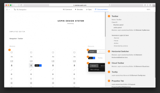
Our UI inventory when building our own design system at UXPin.
A structured presentation comes in handy during the next step.
3. Establish design principles
Here’s when you get to the really actionable payoffs: creating new and improved design principles.
Sometimes your previous design principles won't change, so sometimes you might need to just formalize those principles for everyone.
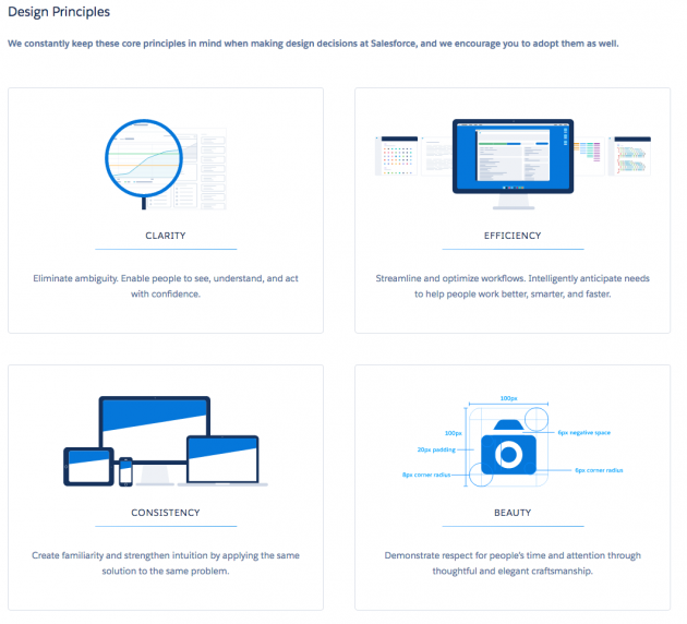
Via: The design principles behind Salesforce Lightning.
4. Make your visual design coherent
Think about the most fundamental and repetitive patterns in your interface.
Colors, text-styles, icons will probably come to mind first. Perhaps also some interactive patterns (hover on clickable elements), border visual properties, or maybe animations? Discuss with the team to decide which version of these elements will be canonical. Then, document them as part of the system.
For example, we started by simplifying our colors. We ended up consolidating 116 different colors into a more focused palette.
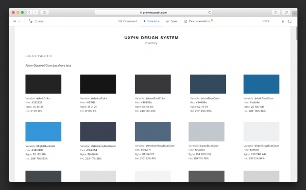
Our own internal design system maintained and used by our product team.
For typography, you can optimize the scale to serve existing styles, or you might try to build a harmonious scale using the golden ratio or major second. When building the scale, don’t forget that you’re not only setting the size of the font but also weight, line-height, and other properties.
Finally, make sure you implement your icon library and other styles.
5. Create Your UI Library
A design system is what we call a “living document”: it continually changes and grows alongside your company.
Once you have the foundation well-defined, start adding your approved interface patterns to the shared library. Keep them updated and encourage the team to use them in every subsequent project - your efficiency and consistency will improve drastically.
On the plus side, periodically updating is much easier once you the first version rolls out.
Conclusion
The properly built design system is living gold standard — from the general building blocks of every piece of design, through the UI patterns, and building up the high-level rules defining the future of the product.
A design system isn’t set in stone, however. It must evolve with the product to reflect the most current truth.
Building and maintaining a design system is definitely a big challenge, but one worth facing. After all, it can break us out of the vicious cycle of unscalable design.
For more technical instructions based on case studies, check out our complete online guide to creating design systems.


