What metrics and KPIs do the experts use to measure UX effectiveness?

What’s the difference between UX metrics and KPIs?
UX metrics are a set of quantitative data points used to measure, compare, and track the user experience of a website or app over time. They are vitally important for ensuring UX design decisions are made and evaluated using fair evidence rather than opinions.
KPIs (key performance indicators) reflect the overall goals of your business – such as revenue growth, retention, or increased user numbers. Metrics are all the measurements that go towards quantifying these higher goals. So when you’re running any kind of UX research, such as UX Benchmarking, it’s important to choose metrics that reflect your objectives and the overall KPIs of your business.
Marketing insights
Discover how UserTesting helps marketers refine messaging, optimize campaigns, and drive stronger customer connections.
Why do we need to measure UX?
It isn't hard to understand that user experience decisions need to be based on human insights.
The challenge for many, however, is measuring the performance of those decisions. What metrics should be tracked in order to prove value?
UX benchmarking isn't as straightforward as many other disciplines. Social media engagement, followers, subscriptions, and page views are easily quantifiable. User experience is more nuanced. But UX measurement doesn’t have to be an intangible mystery. As you’ll see below, there are many ways to prove the value of UX research.
What’s the difference between behavioral and attitudinal UX metrics?
Certain metrics are more commonly used than others for benchmarking (either over a period of time or compared against competitors). We broadly divide these metrics into two categories: Behavioral and attitudinal.
Behavioral (what they do)
In the user research world, it’s critical to understand what people are doing and how they are using your products. Task-based usability testing is a standard method to gather this information across the industry. We don’t mean just ‘in-lab’ think-out-loud studies, but also remote moderated studies, which will help you efficiently access larger sample sizes.
Typical metrics you could capture include these task-level behavioral measurements:
- Abandonment Rate
- Pageviews
- Problems and Frustrations
- Task Success
- Task Time
Attitudinal (what they say)
How users feel, what they say before, during, or after using a product, and how this affects brand perception.
To measure this, you might want to capture these attitudinal metrics:
- Loyalty (using scores such as SUS or NPS – more on these further down)
- Usability (or ease of use)
- Credibility (taking things like trust, value, and consideration into account)
- Appearance
But how do you quantify opinion? How do you take people's feelings and turn them into a simple score that any executive can understand?
Let’s take a deeper dive into these individual metrics, and we’ll see how they can help to form a bigger picture.
Behavioral UX metrics
Abandonment Rate
The abandonment rate is the ratio of the number of abandoned shopping carts to the number of initiated transactions. How many people have come to your online store, added products to their cart, and left without checking out?
AOV: Average Order Value
AOV means average order value, and this is simply your total revenue / number of checkouts. This is a direct indicator of what’s happening on the profits front. If your UX efforts directly tie into increasing cross-selling or upselling, then AOV can be an indicator of improvement.
Conversions
Take for instance a web-form submission, newsletter sign-up, or other task completion: If the site change directly impacts how many people are converting on that specific task, and you can measure that accurately, then you can be confident you've made an impact.
Just remember that having a higher conversion count may also be a result of marketing efforts, so be sure to measure the conversion rate as well (typically Number of Sales / Number of Visits) in order to get the fullest picture.
Pageviews
Website page views and clicks are a common metric. For mobile apps, or web applications and even single-page web apps, some combination of clicks, taps, and steps can be measured.
If you are running an in-lab study, counting these can be extremely tedious. But, if you are using a user research platform like ours, most of these metrics are captured automatically and significantly reduce analysis and reporting time. In most cases, combining these, or at least connecting them to analytics data (from the live site or apps) is beneficial.
Problems & Frustrations
These can be measured as a Number of unique problems identified and/or Number (or %) of participants that encounter a certain problem. We recommend conducting Think-Out Loud studies to identify problems, and then quantify them via a large-sample study to find the percentage of problems actually encountered by a large population (with confidence intervals).
Most of these Behavioral KPIs are collected ‘per task’ and then aggregated as an average for a given study, and/or digital product. These are then compared over a period of time (e.g. each quarter) or compared with competitors’ digital products.

Task Success
Typically, a group of representative users are given a set of realistic tasks with a clear definition of task success. Examples of task success could be: Reached a specific page in a check-out flow, found the right answer on a marketing website or reached a step in mobile app. Having a clear definition of success and/or failure is critical.
If eight out of ten users completed the task successfully and two failed, then Task Success would be 80%. Because of the small sample size of 10, the Margin of Error at 90% Confidence Level would be about +-25. This means that we are 90% confident that the Task Success rate falls somewhere between 55% to 100%.
If 80 out of 100 users completed the given task successfully, then the Task Success rate would still be 80%, but with a Margin of Error of about 8%. Generally speaking, this means that we are 90% confident that the Task Success Rate falls somewhere between 72% to 88%. The larger the sample size, the smaller the Margin of Error.
Task Time
Task time is usually an absolute number. For example: 3 mins. For most task-based studies, where the user goal is to get something done as efficiently as possible, shorter task times are better. There are exceptions, though. If the goal is to keep the user more engaged, then longer Task Times could be better. It really depends on the task.
Organizations often look at both the Average Task Times for only those who were successful and the Average Task Times for all users.
Attitudinal UX metrics
Attitudinal metrics involve quantifying qualitative data such as appearance, loyalty, trust and usability. There are many different ‘scores’ on the market that will assign a number to attitudinal data, using various methods.
CSAT: Customer Satisfaction Score
Customer Satisfaction scores (CSAT) measure customer satisfaction without a strict question limit parameter. Researchers can ask anything from one single question to a full-length survey. Results are measured as a percentage.
NPS: Net Promoter Score
Net Promoter Score (NPS) is a survey you can include at the end of your UX tests. NPS helps measure loyalty based on one direct question: How likely is it that you would recommend this company/product/service/experience to a friend or colleague?
Here’s how NPS works:
- Those who respond with a score of 9 or 10 are called ‘promoters’. Loyal enthusiasts who recommend your services, products or brand to other people and will continue to buy from you in the future.
- Those who respond with a score of 7 or 8 are called ‘passive’. They are happy with your service but have no real loyalty to you therefore will likely stray.
- Finally there are the ‘detractors’, customers who responded with a score of 0 to 6. These are unhappy people who don’t want to see your product again.
The final NPS score is calculated by subtracting the percentage of customers who are detractors from the percentage of customers who are promoters. Promoters – Detractors = NPS.
SUPR-Q: Standardized User Experience Percentile Rank Questionnaire
This is an 8-item questionnaire for measuring the quality of the website user experience, providing measures of usability, credibility, loyalty and appearance.
SUS: System Usability Scale
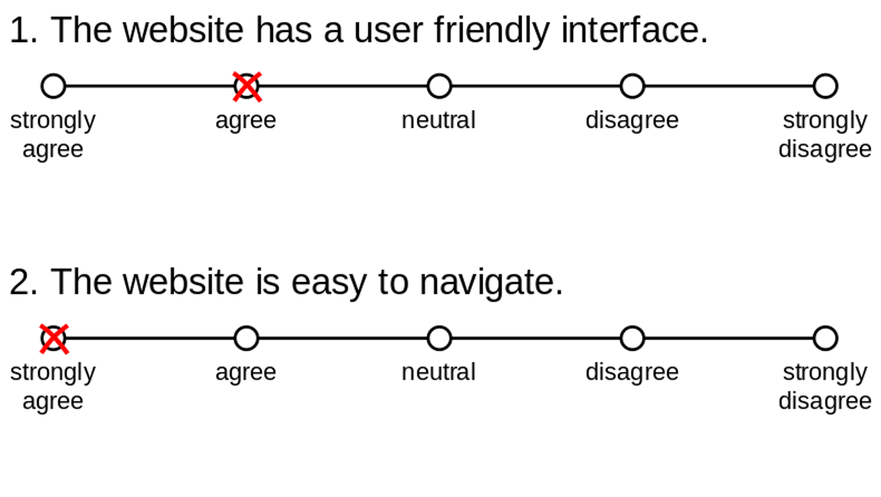
For every website usability test carried out, users complete a short questionnaire and a score is derived from that. It’s on a Likert scale, which helps to ascribe a quantitative value to qualitative opinions.

Example of a Likert scale
This measurement is very easy to administer, can be used on a small sample size, and can clearly indicate whether a feature has improved or not. However, bear in mind that the scoring system is complex. It won’t tell you what’s wrong with your site, but it does help classify its ease of use.
TPI: Task Performance Indicator
With TPI you ask 10-12 ‘task questions’ that are created especially for the ‘top tasks’ you want to test. These tasks should be repeatable, as they’ll be asked again when re-running the test in 6 – 12 months time.
For each task, the user is presented with a task question via live chat. Once they have completed the task, they answer the question. The user is then asked how confident they are in their answer. The theory is that if a task has a TPI score of 40 (out of 100), it has major issues.
Is there just one single UX metric that can make my life easier?
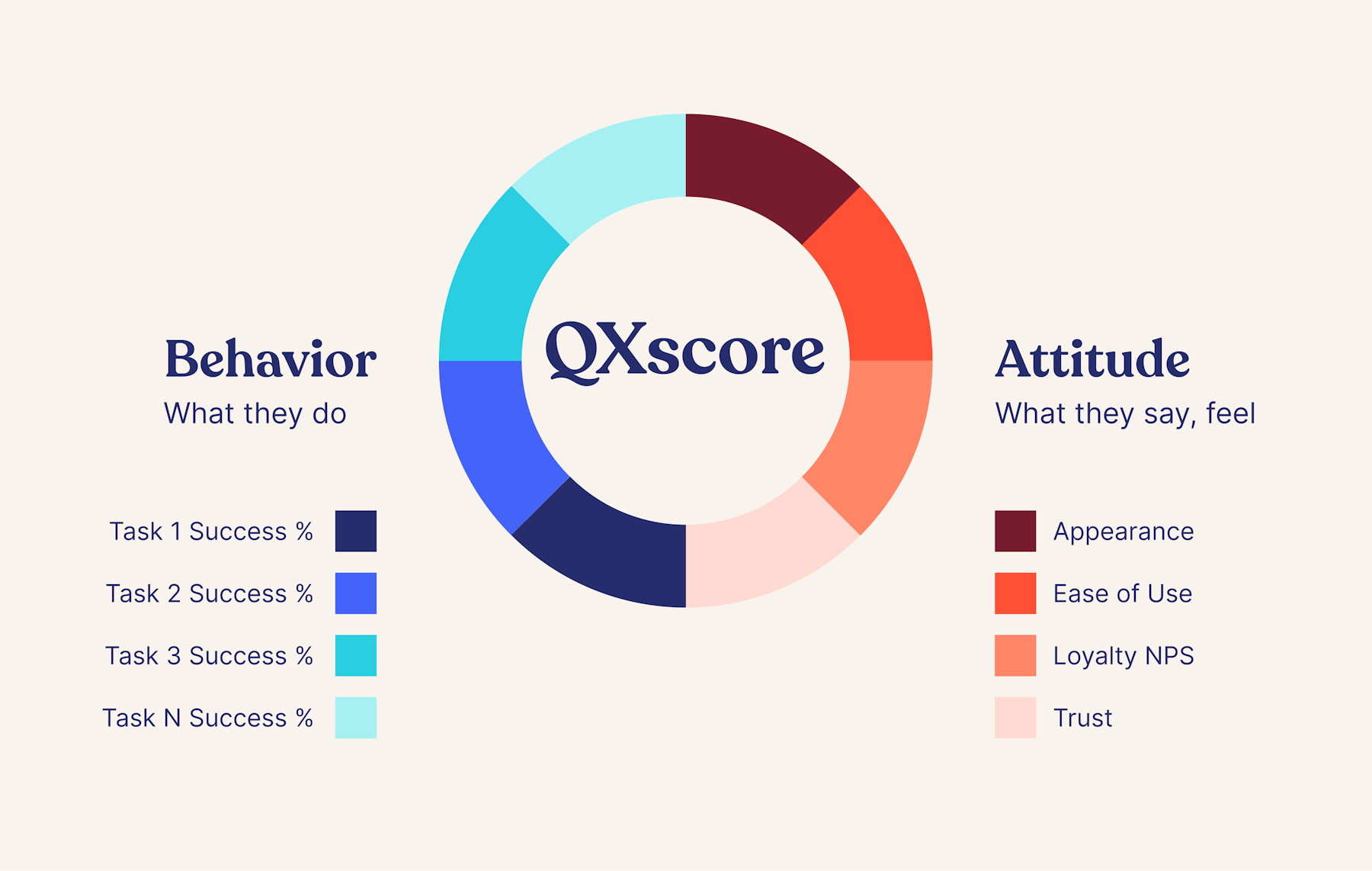
We have our own single UX metric score, called the QXscore. This is a “quality of experience” score that combines various measurements, collecting both behavioral data (such as task success, task time, page views) and attitudinal data (such as ease of use, trust and appearance) – the purpose of this is to create a single benchmarking score for your product.
This single UX score is a simple, clear and persuasive tool for communicating user research results to stakeholders, and should help with getting future buy-in.
Final thoughts
UX researchers use a broad range of measurements that blend both user rating systems with qualitative feedback from usability testing. The choice of testing and metrics depends on your own company goals, and what results your various stakeholders wish to see. The key is being clear on what is being measured and why.


