Good UX is Good Marketing: Brand Affinity Through Delightful Interactions

It’s one of my favorite feelings, and I’m sure you can empathize: the mix of wonder, excitement, and triumph you feel when stumbling upon a UX gem. Suddenly, you’re distracted from your original task, and you want to share what you’ve found with anyone who’ll listen:
“Hey! Do you want to see a really cool website?”
Getting cheesy
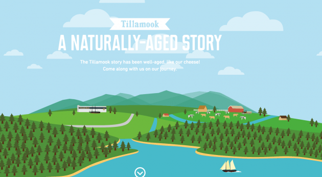
It started this past May. One day while doing some research, I ended up on Tillamook Dairy Co-Op’s website. I clicked on the company’s “Our Story” link, expecting to find some details about the company. But to my surprise and delight, I was met with this beautifully designed page:

Whoa. I just wanted to find out where in Oregon the Tillamook brand is based, but instead, I had come across a whimsical, interactive history of the company!
For once I wasn’t irritated with a seemingly never-ending scroll because every part of the page contributed to a great user experience: it was informative, provided what I expected to find (and more), and was complete with fun and engaging visual elements.
Unexpected animations
Staying true to their rainy Pacific Northwest roots, Tillamook incorporated a scroll-triggered raindrop animation to explain the context of Oregon’s rainfall in comparison to other big cities, which makes for nice green grass and healthy, happy cows!

This animation is just one of many found on the site. By pairing broken-up text with matching animations, Tillamook helps users follow the flow of thought. And although it’s a long page it doesn’t feel that way!
These animations create room for visitors to insert their own dialogue and get involved in the story. Rather than glazing over the text, the animation forced me to pause, explore what it was saying, and think, Wow, if I thought New York was rainy, I can’t even imagine what it’s like to live in Oregon!.
It also brought attention to Tillamook’s context: the company isn’t just trying to sell a product but wants visitors to get to know where they’re coming from. This creates more points of connection for visitors to empathize with, and I warmed up to the attention to detail put in to help users have fun while browsing their site.
Creative content presentation
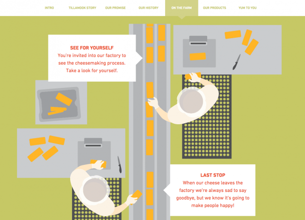
Toward the middle of the page, Tillamook breaks up the pace of their storytelling with a clever scroll animation, which invites website visitors to come to visit the Tillamook factory and “see the cheesemaking process” for themselves.

By mimicking the perspective of a visitor peering into the cheese production room, Tillamook gives its virtual visitors a sneak peek into what a real-life factory tour is like. Unique information presentation creates positive associations, and is a way for information to go from head to the heart and influence decision making! Though I otherwise would never really care to step into a cheese factory, after Tillamook’s website, visiting their factory and sampling on some cheddar bits has made its way onto my bucket list.
Growing visitors’ domain knowledge
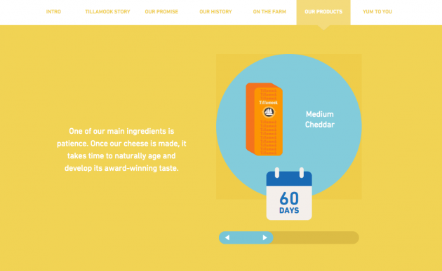
Here’s another delight moment: when Tillamook creates an interactive diagram to explain which kinds of cheese products are created in what amounts of time.

Though this isn’t directly relevant to their personal story, feeding site visitors these fun facts creates a fun user experience while growing brand trust with Tillamook. These fun facts will be advantageous in the long run when visitors associate their cheese-making knowledge to Tillamook’s brand in the future. It works as great implicit marketing!
Delightful user experiences naturally cure(ate) brand advocates
And that’s how I became an instant Tillamook advocate. In reality, I had only ever tasted one of their products: the medium cheddar cheese squares stocked in the office refrigerator. But this didn’t deter me from sharing my love for the brand with friends and family. Their website had great design and provided me with such a great experience that I had full confidence in their brand without having to be acquainted with their products! Since then, there have been many people that have shared my excitement over Tillamook’s website (and I’m guilty of still bringing it up in conversation whenever someone starts talking about websites).
Because here’s the reality: good UX is its own marketing. And just as user-generated content is a powerful tool for getting your brand’s name out there, great UX can automatically create great marketing opportunities.
When delighted, users will become enthusiastic spokespeople for your brand, and create positive buzz through social media and word of mouth.
In my case, Tillamook’s “Our Story” page was such a great user experience, that I couldn’t help but share it with others! Not only did they give the facts about the company’s long history, but they engaged me throughout the whole delivery of their story. Thanks to a positive user experience, the website is not just a way for visitors to learn something new about Tillamook but is also a way to create an emotional link between the brand and site visitor. Great user experience gives brand affinity and loyalty a chance to take root in your users, provides visitors with reason to trust you, and encourages them to share about your product.
Getting better with age
Without launching a specific campaign, good UX creates authentic “check this out!” moments and gives you brand legitimacy, a lasting ripple effect that grows stronger each time someone encounters your website.
Even just a few weeks ago, a friend shot me a text message, asking, “Where did you find the website with the scrolling cows?” He had remembered the fun user experience and himself wanted to show another friend the website, and so the chain reaction continues to this day.
With the great UX on their “about us” website, the bits and pieces of Tillamook’s history that I’ve learned through their website have become strong associations with positive user experience. Good UX is a great investment because it leads to impactful impressions on your audience. Good user experience is good marketing, because good UX naturally promotes sharing and the likelihood that users will come back.
And if you’re curious: it turns out that there really is a city called Tillamook, where the company is based! And you know what? I’m planning to make a stop there next time I road trip through Oregon.


