
IDEO's human centered design process: How to make things people love
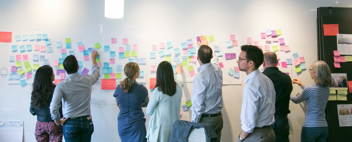
IDEO is one of the world's most innovative and award-winning design firms. They’re like the secret weapon of innovation for companies like Microsoft, Hewlett-Packard, Pepsi, and Samsung, in large part, due to their focus on human centered design.
Over the last few decades, they’ve designed hundreds of products, like the first computer mouse for Apple in 1980, the Palm Pilot in 1998, a school system in Peru, and the 25-foot mechanical whale used in the movie Free Willy, just to name a few.
But perhaps the most interesting thing about IDEO is that Founder David Kelley doesn’t consider them experts in any specific industry or vertical. He says,
We’re kind of experts on the process of how you design stuff.
You could hire them to design a vending machine, an app, a mattress, or a space shuttle, and it would all be the same to them.
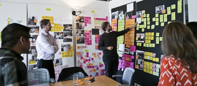
via IDEO
IDEO’s main tenet is empathy for the end-user of their products. They believe that the key to figuring out what humans really want lies in doing two things:
- Observing user behavior: Try to understand people by observing them. For example, if you’re designing a vacuum cleaner, watch people vacuum.
- Putting yourself in the situation of the end-user: IDEO does this to understand what the user experience is really like; to feel what their users feel.
Then, they use the information they gain to fuel their designs.
IDEO designers trust that as long as they stay connected to the behaviors and needs of the people they’re designing for, their ideas will evolve into the right solution. In other words, they let the end-user tell them what they need to focus on building. David Kelley said,
If you want to improve a piece of software all you have to do is watch people using it and see when they grimace, and then you can fix that.
Sometimes the best ideas are so obviously staring us in the face that we miss them. We can’t see them because we’re looking at things from the outside in, instead of looking at things through the eyes of the end-user.
That’s why the folks at IDEO strategically put users at the core of everything they do—a process they refer to as human centered design.
What is Human Centered Design?
IDEO defines human centered design as a creative approach to problem-solving that starts with people and ends with innovative solutions that are tailor-made to suit their needs.
In their Field Guide to Human Centered Design, they say,
When you understand the people you’re trying to reach—and then design from their perspective—not only will you arrive at unexpected answers, but you’ll come up with ideas that they’ll embrace.
This is the central philosophy that human centered design revolves around. Whether you’re designing physical or digital solutions, the process is the same, and it consists of six phases, which we'll outline next.
The six phases of the IDEO design process
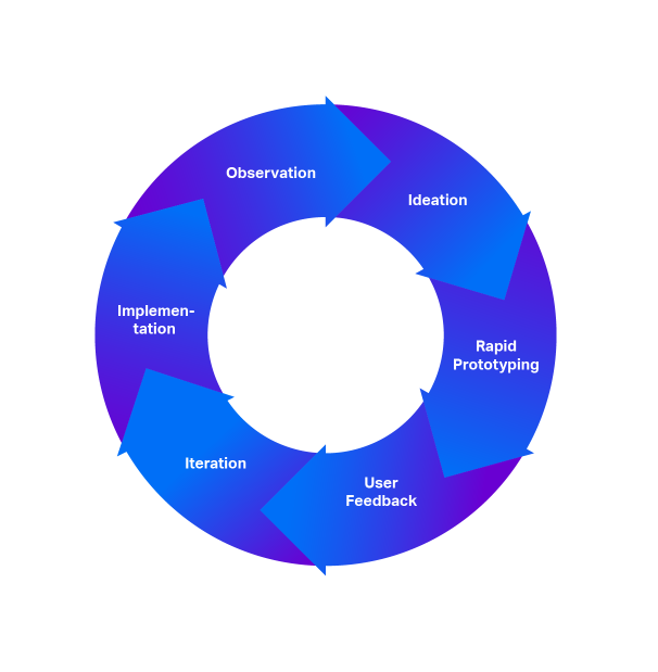
Phase 1: Observation
The first phase is all about observing the end-user, learning, and being open to creative possibilities.
Your goal is to understand the people you’re designing for.
Identify patterns of behavior, pain points, and places where users have a difficult time doing something—these all lend to tremendous opportunity. If you can, put yourself in their situation so you can see what their experience is, and feel what they feel.
Phase 2: Ideation
In this phase, you start brainstorming ideas with your team based on what you learned from your observations and experiences in Phase 1.
Your goal is to come up with as many ideas as you can.
As you’re coming up with ideas, stay focused on the needs and desires of the people you’re designing for. If you do this, your group’s ideas will eventually evolve into the right solution.
Phase 3: Rapid prototyping
In this phase, you’re going to quickly build a simple prototype of your idea. This makes it tangible and gives you something to test with the end-user.
Don’t try to build a fancy high-fidelity prototype right now. IDEO is notorious for creating simple prototypes made out of cardboard.
Ask yourself this: What can I spend the minimum amount of time building that will allow me to get user feedback as quickly as possible? The purpose of this phase isn’t to create the perfect solution; it’s to make sure your solution is on target.
Phase 4: User feedback
Get your simple prototype into the hands of the people you’re designing for.
This is the most critical phase of the human centered design process. Without input from your end-user, you won’t know if your solution is on target or not, and you won’t know how to evolve your design.
Phase 5: Iteration
Once you get feedback from your users, use that information to fuel the changes to your design.
Keep iterating, testing, and integrating user feedback until you’ve fine-tuned your solution. This may take a few rounds, but don’t get discouraged. With each iteration, you’ll learn something new.
Once you’ve got your solution to a point where it’s ready to be used, it’s time to move on to the next and final phase.
Phase 6: Implementation
Now that you’ve validated the usefulness of your solution with the end-user and gotten your design just right, it’s time to get your idea out into the world.
If you’re designing software products, apps, or websites, go back to Phase 1 and repeat this process. With each new update that you implement, continue to observe your users, design for them, and use their feedback to direct your future solutions.
IDEO Human Centered Design examples
IDEO has used this process over and over again to design delightful products and experiences that people love.
You might be wondering how exactly you’re supposed to get started. How do you start observing your users? How do you put yourself in their position?
Let’s take a look at a few examples that illustrate IDEO’s human centered design process so you can apply it to your own team.
1. Designing a medical device for nurses
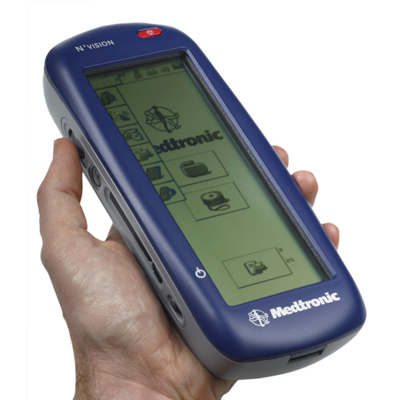
IDEO was asked by a medical device producer to design a device that nurses would use to enter data during a specific procedure. The client had a vision of a sleek, futuristic gadget that the nurses would hold with two hands (picture how someone would hold an iPad) during the operation.

via NEC America
But when the IDEO team watched the medical procedure take place, they noticed something that would make a two-handed device completely impossible.
When patients were going into the operation, they were really nervous and afraid. So the first thing that almost every nurse did was hold the patient’s hand to comfort them—an obvious human element their client hadn’t noticed.
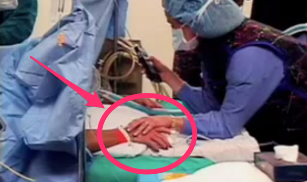
via Paul Bennett
IDEO went back to their office to brainstorm potential solutions, and they came up with a device that had a thumb scroll so nurses could do everything with one hand. That way they could input data and hold the patient’s hand.
It wasn’t as “cool” as the client initially imagined, but it was much more human and practical.
via Paul Bennett
Instead of approaching the project with preconceived notions of what the solution needed to be, the IDEO team started by putting themselves in the position of the end-user.
Then they used that information to direct their ideas, and even though they ended up designing something that was different than what they initially expected, they created a much more human experience for everybody involved.
>>Related Reading: Regional healthcare system leans on UserTesting to diagnose digital pain points
2. Designing a toothbrush for kids
In 1996, Oral-B asked IDEO to design a new toothbrush for kids. And the first thing the IDEO team said was that they needed to watch kids brush their teeth.
As you can probably imagine, the Oral-B executives thought this was a strange request. You want to go into people’s homes—into their bathrooms—and watch their kids brush their teeth? Everyone already knows how people brush their teeth, is that really necessary?
As strange as it sounds, that’s exactly what they did. They needed to see how kids actually brush their teeth, and they didn’t want to make any assumptions.
During their observations, they noticed that the way kids hold their toothbrushes is totally different than adults.

Since adults have manual dexterity in their hands, they tend to use their fingers to manipulate the toothbrush with very fine movements. But kids just grab the toothbrush in their fist.
The problem with adult toothbrushes was that they were hard for kids to hold. Since they were so small, they just flopped around in the kids’ hands and were difficult to use.
That one simple observation led to a new style of toothbrush: the squish gripper.
And it totally innovated the kids-toothbrush space.

via IDEO
If you go into any supermarket or corner store today, you’ll notice kids’ toothbrushes have fat, squishy handles. That’s the power of observing the behavior of your users and integrating it into your design process.
3. Improving a hospital’s patient experience
IDEO was asked by a large healthcare system to describe what their patient experience was like and to help them improve it.
So the IDEO team started by putting themselves in the position of the patient. They had one of their team members pretend to be a patient in the hospital, and they discovered something obvious, yet completely overlooked.
When they presented their findings to the hospital executives, they started by showing a 6-minute video clip of the ceiling in a patient’s room. At first, the executives were confused and didn’t understand what they were watching. Then the IDEO team explained the purpose of the video.
The point was this: when you’re a patient in the hospital you spend all day lying in a bed staring at the ceiling for a really long time—and it’s a really bad experience.

via Paul Bennett
Watching that video clip helped the executives catch what IDEO’s Chief Creative Officer Paul Bennett calls “a blinding glimpse of the bloody obvious.”
Looking at the patient experience from the point of view of the patient—instead of the organization—was a huge revelation to them, and they immediately took action. They realized that improving the patient experience wasn’t about making massive changes to the system. Instead, it’s about doing small things that make a big impact.
So IDEO started brainstorming ideas and prototyping, and they quickly implemented small four changes:
- Decorated the ceilings to make them more aesthetically pleasing.
- Covered one wall of each patient’s room with whiteboards so visitors could write messages for the patient.
- Made the floor of patient rooms a different style and color than the floor in the hallways of the hospital. This signified the transition from public space to private space, making patients feel like this was their own personal space.
- Attached rear-view mirrors to hospital gurneys so that when patients were wheeled around by a doctor or nurse, they could actually see the person they were having a conversation with.
>>Related Reading: The growing importance of UX research in the healthcare industry
Applying IDEO's design process
There’s a long history of innovative designers observing the world around them, seeing things with a fresh eye, and using that observation as an opportunity to create new possibilities. The common thread that ties all these stories together is a design process that starts with understanding the end-user of your product.
IDEO does this by observing the user and putting themselves in the user’s shoes. They know that if they can feel what people feel—what their experience is really like—then they can use that information to fuel their design solutions. And this process has turned them into one of the most influential and award-winning design firms in the United States.
To build a truly innovative and useful product, you don’t need to start with the brightest idea or the fanciest technology. You just need to start by understanding people.
Webinar: How UXR Leaders Can Shape the Role of Research in the Age of AI
On May 20th, explore how leading UX Research teams are evolving from a service model to becoming strategic insight leaders.


