
How insurance companies can improve UX

Insurance companies are spending a lot to attract customers to their websites. Indeed, insurance and related terms are frequently some of the most expensive Pay-per-click (PPC) keywords.
This makes it even more important that insurance sites focus on providing the best possible UX to convert as many of these visitors as possible. The common factor of insurance sites, and the biggest UX challenge, is to make it easy for customers to complete often lengthy and complex forms to provide them with an accurate quote.
This article will look at some of the ways insurance sites can make forms easier to complete and avoid unnecessary friction during the quote process.
Provide an estimate of the time it will take to complete forms
The motivation of the user to complete the form is crucial, and it helps to be clear about the length of time they’ll need to allow.
Here, Confused.com presents time estimates for each of its quote types.
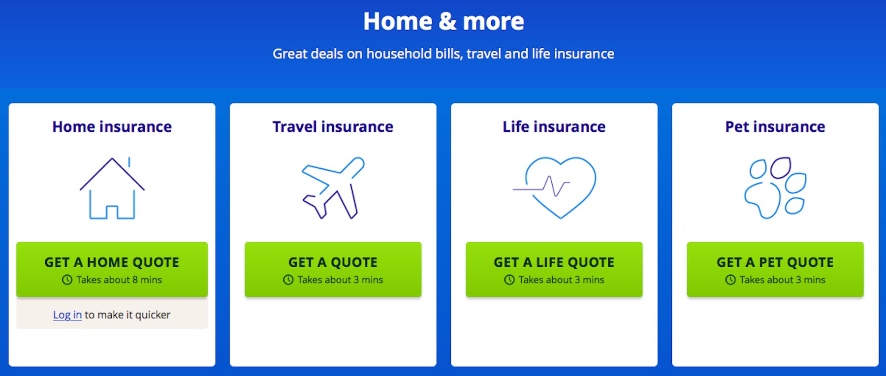
If users get into the form and realize it’s going to take a while, they may abandon the process. When websites are upfront about the time commitment, customers know how long they need and can work out how much time they have. It’s a good way to avoid frustrating customers.
Improve the look and feel of your form
First impressions can make a big difference on insurance sites. If a form looks like it was designed at least a decade ago, is very text-heavy, or just looks like hard work, then it can deter users from even beginning a quote.
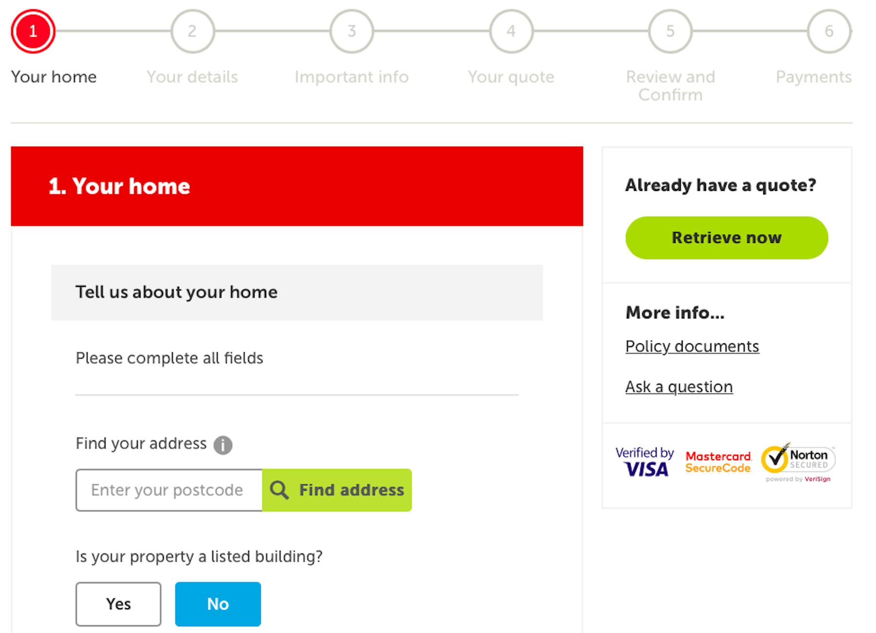
Form design as in the above example from Direct Line looks appealing to users. It sets out the stages on a progress indicator, and looks like it’ll be easy to complete, so people will be more likely to begin the quote.
Break forms up to make them more manageable
Breaking longer tasks into more manageable sections can make it easier to complete, and less daunting for the user.
It isn’t just about breaking forms up though. It needs to be done properly. For example, breaking this life insurance form into 12 sections actually makes it seem worse than it is.
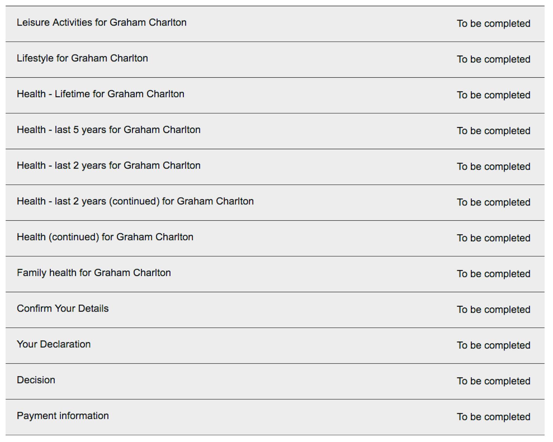
Instead, break it up into a reasonable number of sections, making it clear what’s involved in each, as in the previous Direct Line example.
Visual information
Insurance quote forms are often long simply because they have to be, so it’s important to reduce the workload as much as possible for users.
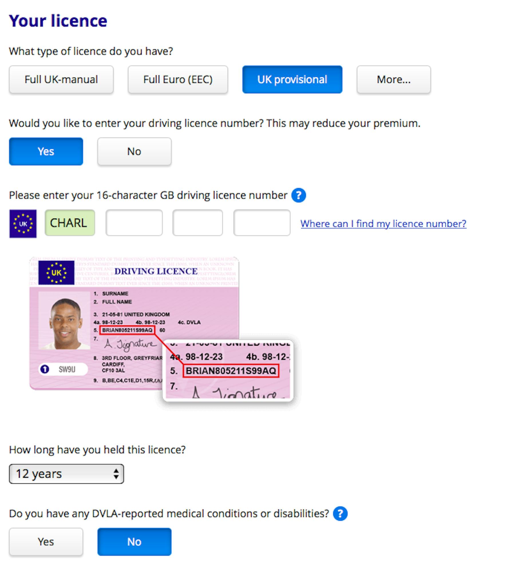
One way to do this is to convey information through images and icons, which can often be a more efficient method than text.
Here’s a great example from a car insurance quote. It tells people exactly where they can find their driving license number with a simple image. It’s faster than trying to explain this through text, and helps the customer to complete this stage of the quote more easily.
Provide copy next to form fields to help and explain
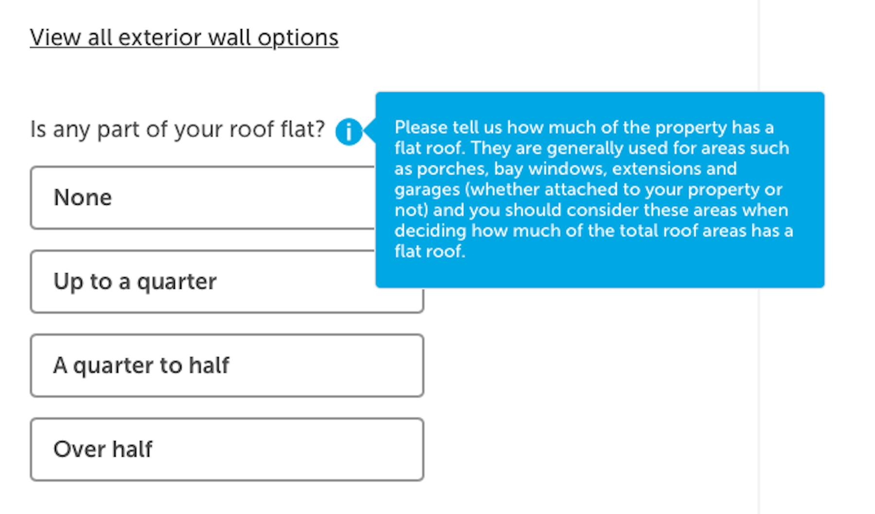
Microcopy (or tool tips) can help to quickly explain form fields, or to answer questions which may occur to customers. This information is delivered contextually, and helps guide users through forms with the minimum of friction.
It could be text displayed permanently next to fields (an option best for very short explanations) or to be shown on mouse over, as and when the customer may need it.
Provide shortcuts where you can
Anything that reduces user effort makes it less likely that people will abandon quotes.
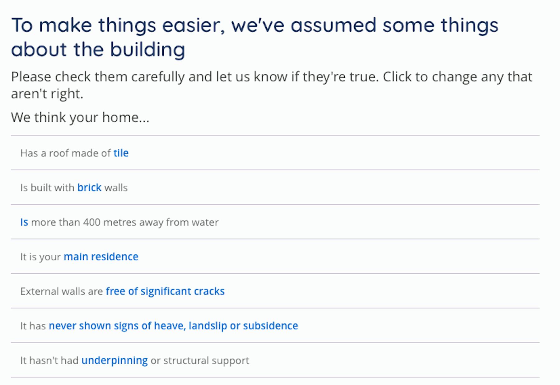
Shortcuts may be as simple as address locator tools, which populate address fields after you enter your postcode and house number.
Other examples include the following, from Moneysupermarket, which makes certain assumptions in relation to home insurance. This saves several extra form fields while doing the same job of ensuring that the information is correct.
Form validation and error handling
Errors can trip people up and make the quote process frustrating for users, so a good approach is to validate information as they enter it, either confirming that information has been added correctly, or that they need to make an adjustment.
Tools and calculators
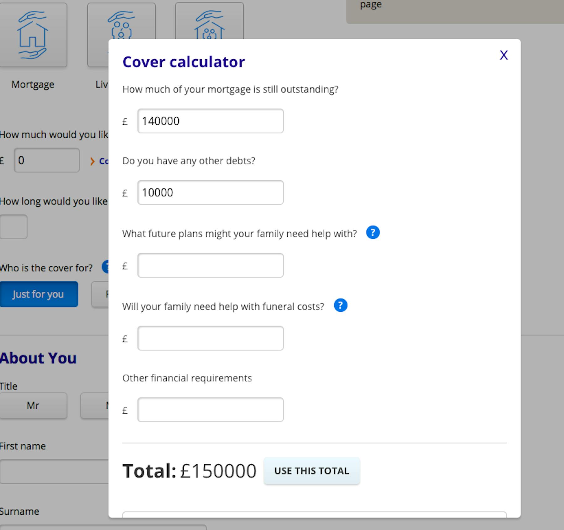
Tools can help customers to complete forms, providing quick calculations which save them from having to leave the process.
Here, for example, confused.com has a life insurance cover calculator which helps customers decide how much cover they’ll need based on key details like mortgage payments and funeral costs.
Keep questions relevant to the quote
It pays to keep the number of form fields to a minimum and concentrate only on finding the information that is required to deliver a quote. Anything else makes the quote longer and risks frustrating customers. For example, some companies try to do some cross-selling for other insurance products.
Here, after answering a question on whether you have pets (which I initially thought might be relevant to a home insurance quote) you can now see that this is just about upselling. They’re also trying the same thing with car insurance.
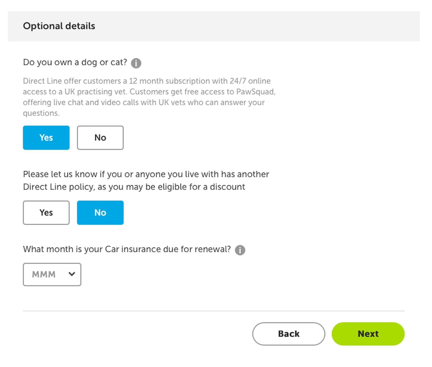
This may be something that the marketing or sales teams are pushing, but it risks annoying the user as they complete the form.
Provide help options
If, despite all of your design and optimization efforts, people still encounter problems, or have questions about the quote, make it nice and easy for them to get in touch.
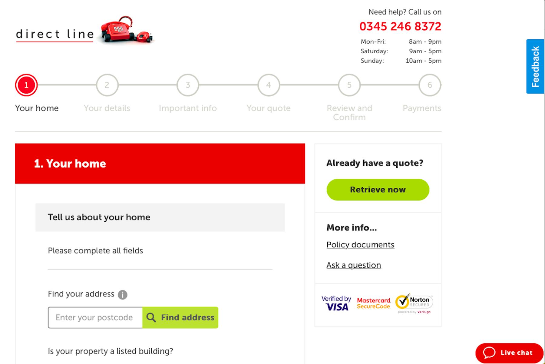
Provide clear contact options on each page of the quote as Direct Line does. It also helps to provide a choice of options where possible, such as live chat.
In summary
Insurance websites do face a UX challenge, simply because they are asking users to invest time and effort in completing quote forms. Some, for things like travel insurance, may be relatively short, but others are complex.
This makes UX even more important. It’s about removing friction were possible during quotes, and of course learning from your users.

Spotlight your great work
Apply for a 2026 illumi Award and showcase how your team is pushing boundaries, driving impact, and shaping what’s next with human insight.


