
How we built the UserZoom GO plugin for Adobe XD
The goals for our Adobe XD plugin
- Streamline building and launching a usability test with UserZoom GO
- Surface the powerful features from within Adobe XD
- Reduce the barriers-to-entry for prospective customers with an in-context 'try-before-you-buy' option
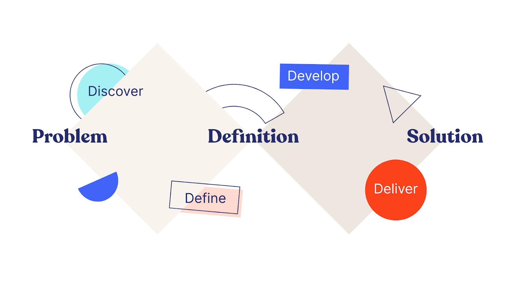
The Double Diamond design process, as used by the UserZoom GO product team
Discovery and definition
1. Discovery research
The first step in the process was gaining an understanding of the problem space. We did this by interviewing customers that used Adobe XD for their design and prototyping needs.
We found that the 'jobs' users wanted to be done from within the plugin were: to create and launch an unmoderated ‘think-out-loud’ usability study.
We also discovered that a templated-study wasn’t enough, that users required flexibility and the option to add their own tasks.
Finally, our research found that specifying a success screen for their tasks was important, customers mentioned that knowing if participants reached the right screen or not on their prototype (and why) was useful.
The most important finding was that creating and launching a study was a job that should be done without having to switch between Adobe XD and UserZoom GO.
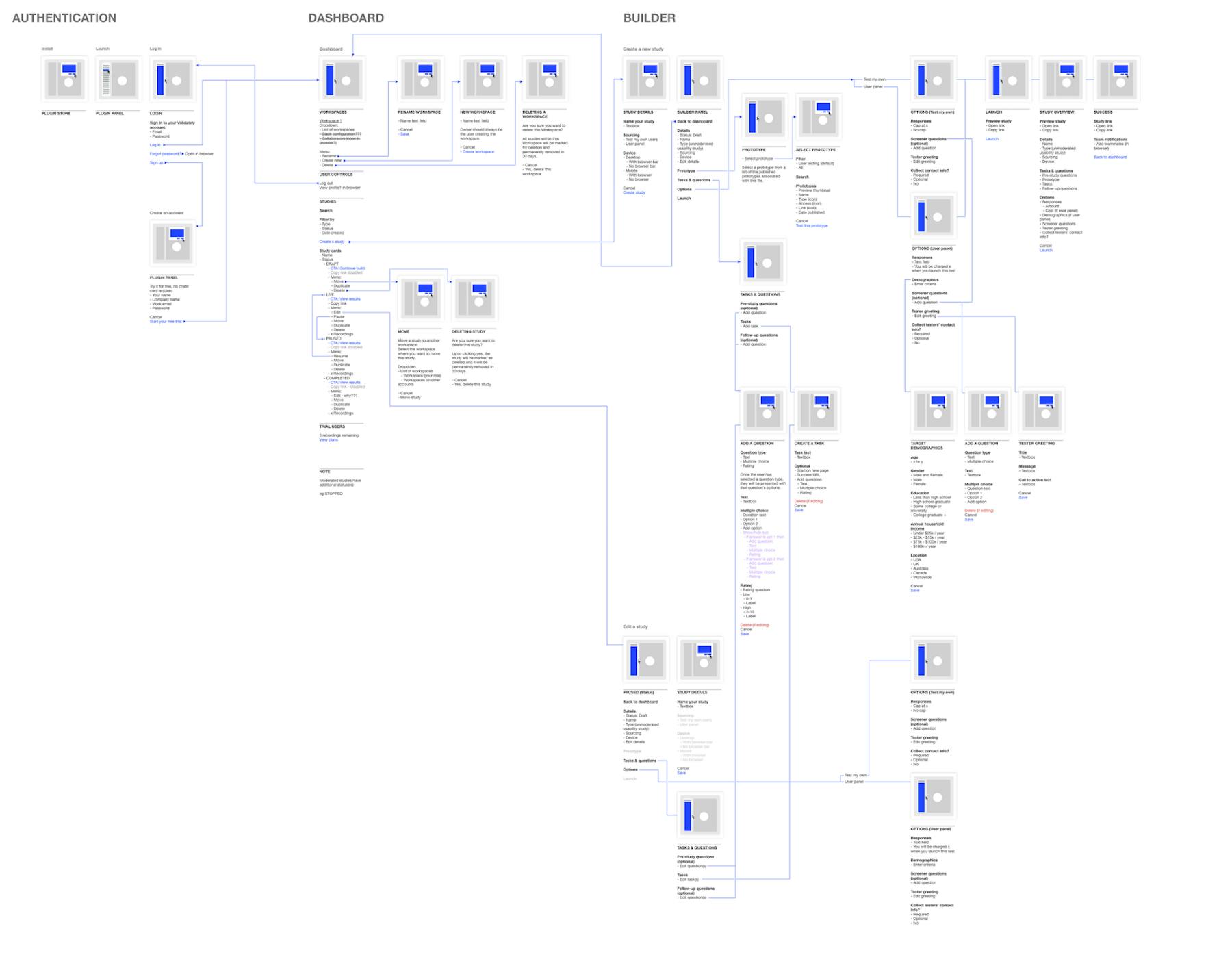
2. Mapping user flows
We then mapped out the user flows, breaking down Adobe XD and UserZoom GO into features, jobs-to-be-done and user stories. Seeing this helped us evaluate what was possible in XD using their APIs and allowed us to define how we’d approach designing the MVP’s user experience.
Prototyping and testing
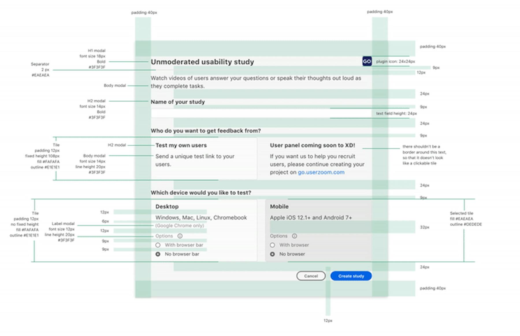
1. Building the UI
Keeping the plugin’s design as native to Adobe XD as possible meant that the user switch from prototyping to creating a UserZoom GO study with the plugin would be as seamless as possible.
This presented some interesting constraints and was a great opportunity to design a deeply-integrated plugin that felt like it really belonged in the Adobe XD ecosystem.
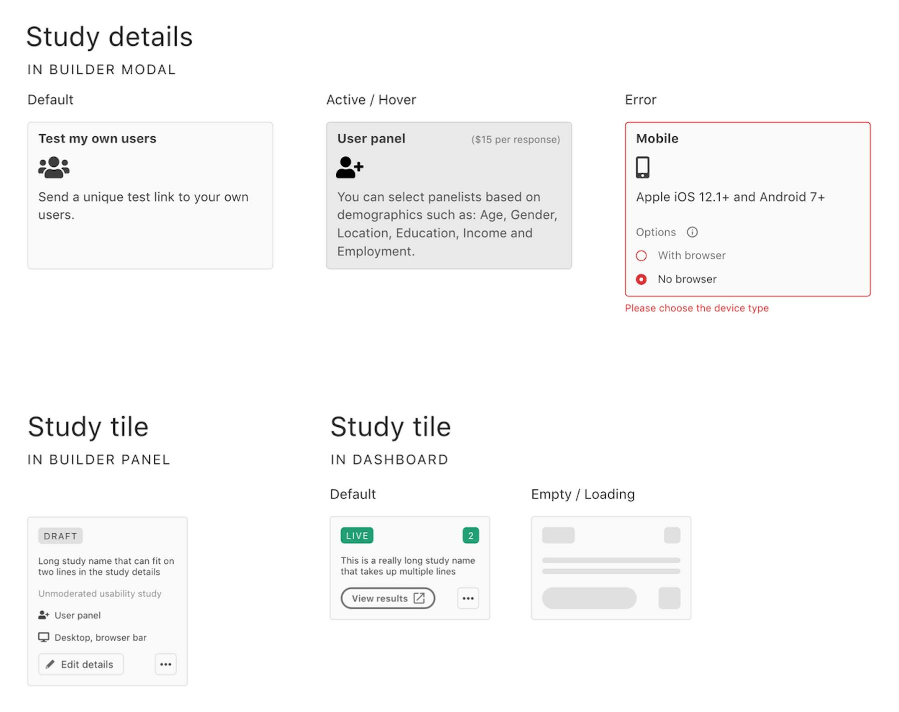
Building the UI components that suited our needs whilst maintaining a look and feel not too dissimilar to Adobe XD’s was an interesting challenge.
Here is some of the work done by the team...
2. Modal or Panel?
Once we had a clear understanding of the problem space and had mapped the user experience, the next step was to begin prototyping and testing. An early problem encountered was how we’d display the main interactions in Adobe XD: in a side-panel, or in a modal?
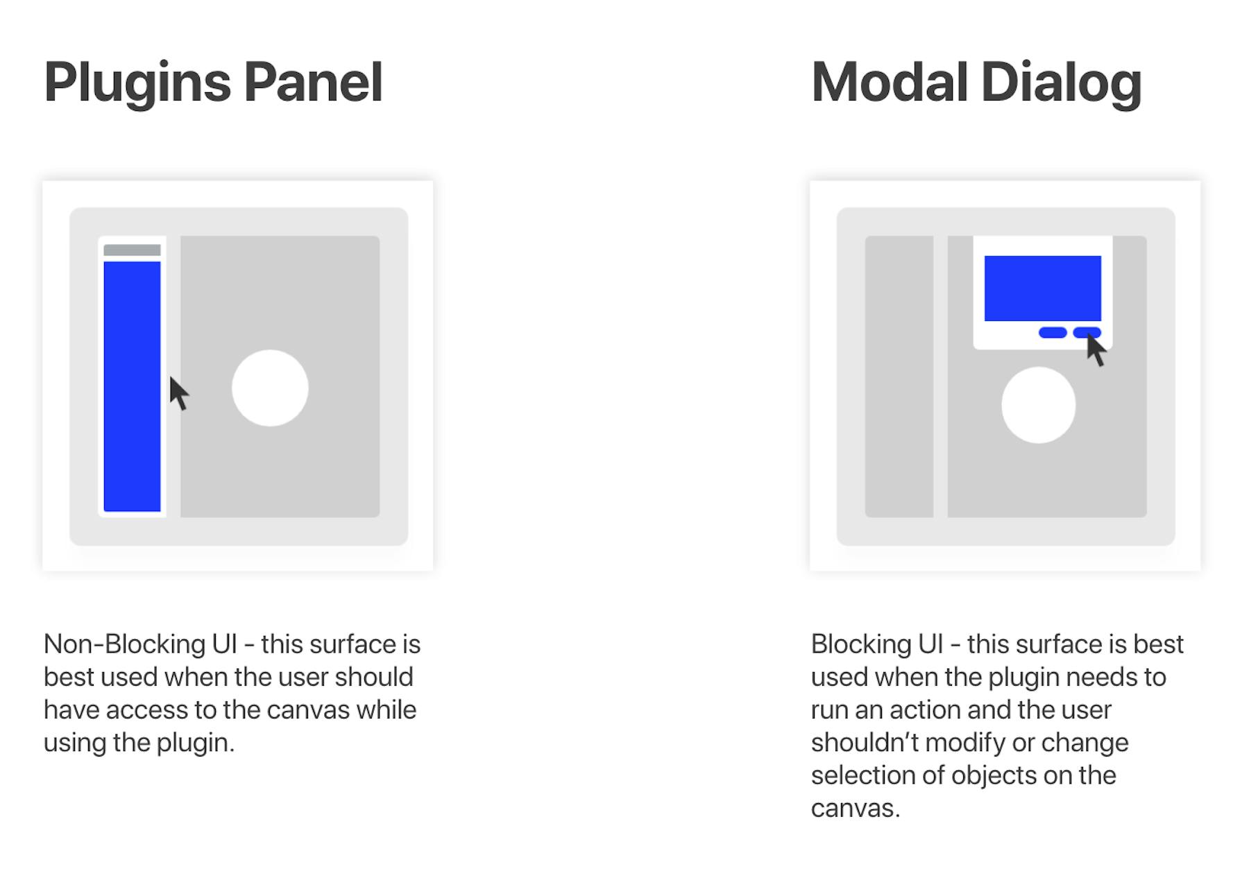
We tested prototypes of both versions with some customers, and asked them to interact with the mockups.
Here are the key takeaways from the first round of research:
- Most participants expected a modal to be used to add tasks and questions
- The extra space was beneficial to writing questions and tasks
- A modal was not seen as severely disruptive to the user journey
3. Expanded panel vs accordion?
We then tested the navigation between the main sections of the plugin (e.g. details, prototype selection, tasks & questions, launch).
Here are some insights from the second round of research:
- The accordion was generally well-received, being perceived as more manageable
- The expanded version (A) meant some participants had “information overload”
The final product
We applied what we learned, and released a first iteration of the plugin. It was an interesting process designing something that would ultimately be used by designers.
Looking ahead, we’re keen to continue to refine it so would LOVE your feedback. Get in touch via the website or leave a comment on our Product Hunt page.
Here are some links to get started and learn more:
- Learn more about Adobe XD
- Install the UserZoom GO plugin from the Adobe XD Plugin Marketplace


