Cognitive psychology for UX: the principle of limited attention

It’s physically impossible for us to pay attention to everything in our environment.
We have access to hundreds of TV channels, thousands of movies and shows on streaming sites, and 300 hours of new video is uploaded to YouTube every minute.
We see about one million marketing messages each year (around 3,000 a day), and spend, on average, 13 hours each week on email.
There’s simply not enough time in the day for it all.

George Markowsky, a Professor of Computer Science at the University of Maine, makes the case that our brains receive about 11 million bits of data per second, but we’re only able to process roughly 50 bits per second.
There’s a huge discrepancy between the amount of information being transmitted and the amount of information our brains have the capacity to process.
And the number of websites, apps, articles, and advertisements trying to get our attention are accelerating. Which means that whether you’re launching a new product, growing an existing business, or trying to spread a message on the web, it’s harder than ever to get noticed in a noisy world.
The increasing scarcity of attention
In his book Permission Marketing, Seth Godin gives an example to illustrate this problem. Imagine that you arrive early at the airport for a flight. As you head to your plane, a stranger walks up to you and asks for directions to his gate. You aren’t expecting this distraction, but you have a few minutes to spare, so you stop and help him find his way.

Now, imagine that you’re late and rushing through a noisy, crowded airport to make it to your gate on time, and you’ve already been approached four times by people asking you for something.
If that same stranger walked up to you and asked the same question, odds are your response would be a little different.
“What if he’s the fourth, or the tenth, or the one hundredth person who’s asked you the same question? Sooner or later you’re going to tune out the interruptions. Sooner or later it all becomes background noise.” —Seth Godin
Most of our lives are like the noisy, crowded airport scene above. We have way too many things vying for our attention, and only a limited amount of time and energy.
As a result, almost everything becomes background noise. And in our current economy, attention is becoming increasingly rare and valuable. So if we’re tuning almost everything out, what do we pay attention to?
What we pay attention to
Psychology researchers Christopher Chabris and Daniel Simons have been studying human attention for over a decade. And they’ve found that what we pay attention to is primarily based on what we want to accomplish.
“In our best-known demonstration, we showed people a video and asked them to count how many times three basketball players wearing white shirts passed a ball. After about 30 seconds, a woman in a gorilla suit sauntered into the scene, faced the camera, thumped her chest and walked away. Half the viewers missed her. In fact, some people looked right at the gorilla and did not see it.” —Christopher Chabris
Let’s try an experiment. Watch the video below (it’s less than two minutes long) and see if you can spot the gorilla yourself.
Did you see the person in the gorilla costume walk across the screen? You probably did.
But did you also notice the curtain change color in the background? Or the player on the black team that just walked off the screen in the middle of the game?
Something strange happens when you watch the video above
Once I told you about the gorilla, you were looking for it. And since you were so focused on finding it, you likely missed all the other stuff that happened. Researchers call this phenomenon inattentional blindness.
Let’s examine this from another perspective. Chabris and Simons designed a different experiment to further demonstrate how focus impacts what we notice and what we tune out.
“In our experiment, we asked participants to jog behind an assistant and count the number of times he touched his hat. As they jogged, they ran past a staged fight in which two men appeared to be beating a third. Even in broad daylight, over 40 percent missed the fight. At night, 65 percent missed it.” —Daniel Simons
Half the participants in these experiments seem to be oblivious to things that are happening right in front of their eyes. But how does this work in digital environments?
How inattentional blindness works in the digital world
When we focus on one thing, we ignore other things around us. And this happens a lot on the web because we’re very task-focused.
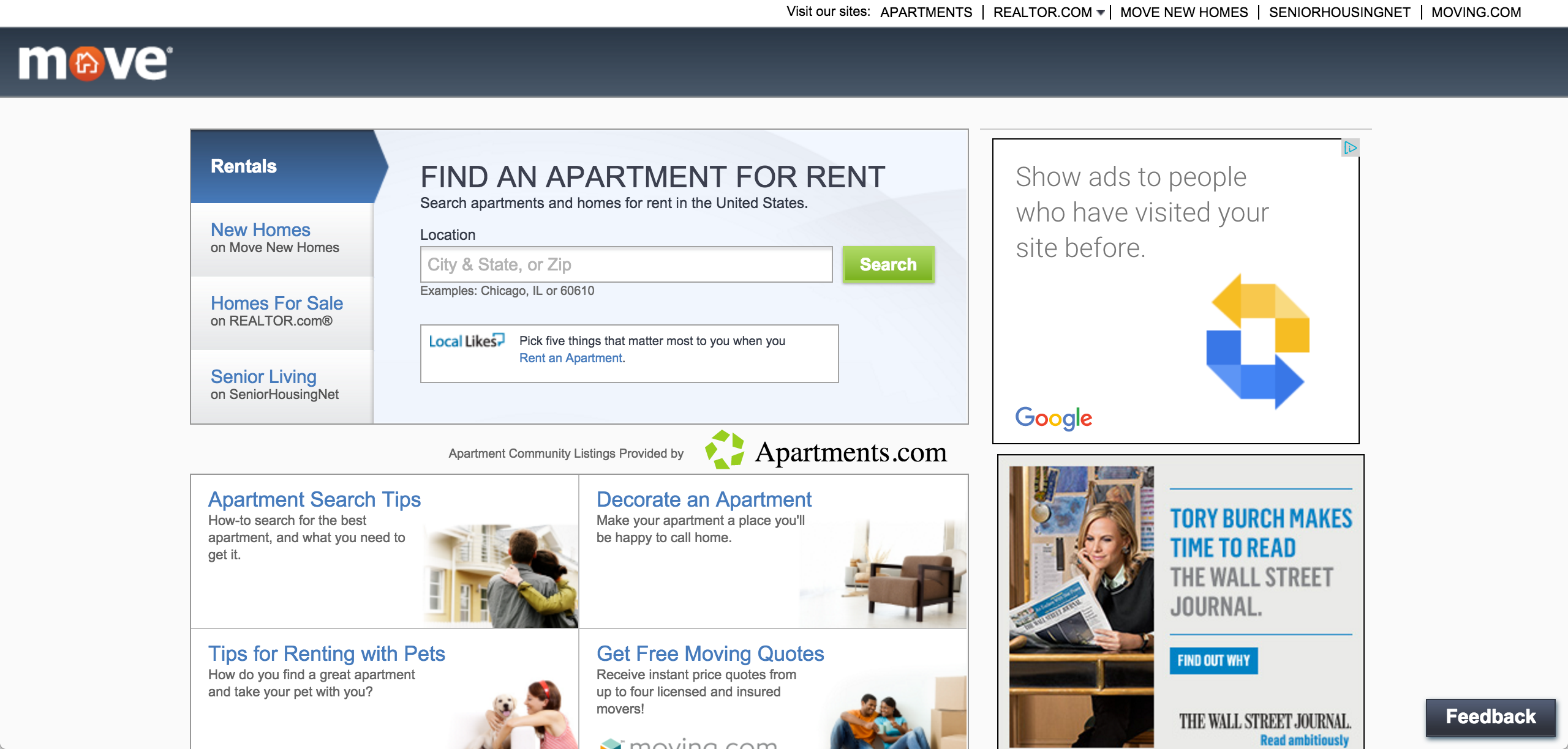
Let’s say, for example, I asked you to go to this site and find apartments in San Francisco. What would you do?

You’d probably go right here and search, right?

Did you notice or pay attention to the advertisements over here? If you’re like most people, the answer is no.

This is known as banner blindness. Based on our past experience, we’ve learned that the right side of web pages typically include ads, and so we ignore them.
As we try to accomplish our task we assess the right side of the page unconsciously in our peripheral vision, and if our brain suspects it’s an ad, we filter it out (and likely won’t look or pay attention).
Now let’s look at another example.
Inattentional blindness within your product
Imagine you spend a couple weeks or months working with your design and development teams to roll out a new product feature.
When you check your analytics you notice that hardly anyone is using it. And after running a couple usability tests, you realize that people are completely missing it, even though it’s right in front of their eyes.
We see this happen all the time in our research at UserTesting.
As Daniel Simons explains, even though it’s in their visual range, “people typically do not consciously perceive aspects of their world that fall outside of the focus of their attention. These events can be dramatic enough that the vast majority of people are convinced that they would notice. In reality, though, many people do not.”
It doesn’t mean there’s anything wrong with your site or app, but because of the way our brains our wired, we’re unable to perceive what’s right in front of us.
How to apply the Principle of Limited Attention to UX design
OK, so now that you know this is happening in the brain of every person who visits your website or uses your app, what can you do to deliver a remarkable experience to your customers (and potential customers)?
First, you have to know what your customer’s desired outcome is. What’s the thing they ultimately want to do? The end result they’re looking for? For example:
- If you run an ecommerce shoe store, your customer ultimately just wants a pair of shoes that fit
- If you have an advertising product, your customer ultimately just wants to buy a customer
- If you run a job board, your customers ultimately just wants to get hired
It’s your job to understand what your customer ultimately wants to accomplish and how they want to accomplish it.
Once you’ve determined what the result is that they require, your job is to deliver an experience that makes it as simple as possible for them to get that result. (And if you don’t know what result they require, then you don’t know them well enough.)
How you apply this principle at your company will depend on your business model, your product, and your audience. But here are three ideas to get your creative juices flowing. Don’t use them as a definitive roadmap. Instead, use them as inspiration to discover what will work best for your company.
1. Only provide customers with what they need
Only provide your customers with what they really need to accomplish their desired outcome.
The question is: what do they need?
Your opinion (or the opinion of the highest paid person in the room) isn’t enough to make a solid decision. As much as we like to think we know what our customers really need, we still need data to inform our decisions and test our assumptions.
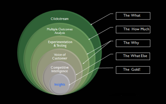
Use data from multiple sources to get a more accurate picture—combining the insights you gain from your experience and knowledge, your quantitative web analytics, and qualitative sources (like surveys, heat maps, sessions replays, lab usability tests, and remote usability tests).

Source: kaushik.net
By providing customers with only the key information they need to accomplish the task they’re currently focused on, you eliminate distractions and increase the likelihood they’ll successfully accomplish their goal.
2. Make your pages easy to scan
Most of the time, visitors glance at the page, scan some of the text, and click the first link that catches their attention or seems to resemble what they’re looking for.
So, if people are just going to scan the page, design for scanning instead of reading.
- Put the most important content or elements where people are most likely to see it
- Make it obvious what they’re is supposed to do on each page
- Make decisions about which elements are the highest priority. And create a visual hierarchy that guides people to them first
- Get rid of anything that’s not making a real contribution
- And format your text to support scanning: use plenty of headings, keep paragraphs short, and use bulleted lists
And keep in mind: people can only read so much text on a page without losing interest. So only give them the information they need in the moment, and let them choose whether they want more details.
3. Make time for exploratory user research
Inattentional blindness also affects user researchers, UX designers, product folks, and anyone else who’s gathering user feedback.
When you’re doing user research, you typically have a specific goal in mind and you’re focused on improving a specific part of the experience for your customers. But like we learned from Simons’ and Chabris’ research, when you’re focused on one thing you become blind to other obvious things that are staring you right in the face.
That’s why it’s important to make space in your process for uncovering those things that you’re not expecting—the invisible gorillas. And exploratory user research is an effective way to accomplish that.
When you’re conducting exploratory research, use open-ended tasks that give your test participant minimal explanation about how to perform them. For example:
“Please spend 5 minutes exploring the app like you normally would.”
The key is to watch people uncover the answer or solution on their own. This can help you figure out how people are using your product and the kinds of problems they’re running into.
Final thoughts
People don’t have enough time in the day (or cognitive bandwidth) to pay attention to everything vying for their attention.
As a result, we filter out almost everything so we can focus on what we want to accomplish. And when we’re focused on that one thing, we ignore other things around us—even things that are right in front of our eyes.
So when it comes to designing your product, remove clutter and make it as easy as possible for your customers to achieve their desired outcome. Rather than trying to fight the inattentional blindness that comes with your customer’s focused attention, help direct it to where it already wants to go.


