Cognitive Psychology for UX: The Principle of Least Effort

Our brains are sophisticated machines. They’re capable of processing complex patterns, and they regulate every aspect of our very existence. Even though we have intricate minds, we don’t want to think too hard—or too much—if we don’t have to.
If there are several ways to do something, we choose the course of action that’s the least cognitively demanding. And this is often done without conscious thought.
Think about it: The experiences that we perceive as seamless—those that are easy to use and don’t require unnecessary thought—are often touted in the UX world a the pinnacle of great user experience.
It’s no surprise that Steve Krug’s famous book on web usability called, Don’t Make Me Think has become the mantra for UX (and a must-have for any UXer’s bookshelf).
Enter: The principle of least effort
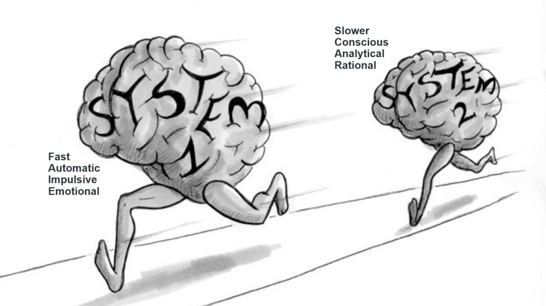
In his best-selling book Thinking Fast and Slow, Nobel Prize winner Daniel Kahneman discusses two systems that determine how our brains work: one that we control and one that we don’t.
System 1 allows us to make decisions with little-to-no mental effort. Most of these decisions are completely unconscious and automatic. For example, quick decisions you make by following your gut or your intuition.
System 2, on the other hand, represents conscious, deliberate thought. This is what we use to analyze data, make big decisions, and solve problems. This system requires more effort and is much slower than System 1.

Illustration by Julia Suits
Human beings naturally prefer to use System 1 because it’s quicker and takes less effort. And we don’t want to engage System 2 unless we really have to, because it’s so cognitively demanding. This is what we call the principle of least effort.
We like it when a product or service helps us find what we’re looking for, easily accomplish our task, and achieve our desired result without making us think too hard. But what happens when we’re forced to shift our brains into System 2 and work a little?
System 2 in action
As user experiences have improved over the years, our expectations have also gotten higher.
And when tasks that should be easy and straightforward (like scanning a nicely formatted news article or finding the price on a product page) become more cognitively demanding than we expect them to be, we aren’t happy.
I’d be willing to bet that at some point in your life you’ve navigated to a webpage that had a large block of uninterrupted text, and then quickly went back to Google to try to find another source with information that’s presented in an easier-to-scan format.
It’s easier to find an alternative source than it is to activate System 2.
How to apply the principle of least effort to UX design
There’s no “silver bullet” tactic that will work for every product or service. The only way to find out what works for your specific product, user, and business model is to experiment and measure the results. Anything less than that is just guesswork.
So rather than giving you a specific piece of advice that may or may not apply to your situation, here are a few questions and exercises to help you think through how you could apply the principle of least effort to your own product:
- What problem are users turning to your product to solve? Or said differently, what's the outcome that your users are seeking?
- Walk through the journey your user would take to use your product, beginning from the time they land on your site (or open your app) to the point where they achieve the result they came for. How does this process compare with competing products and services? How does it compare to the simplicity of some of the most widely used products in the market?
- Brainstorm three testable ways to make it easier for users to accomplish their desired outcome.
- Watch 5 users as they interact with your product, and gauge their reaction to it. You can do this either by bringing users into your office or running a remote usability test and giving users a list of tasks to perform.


