How to use social media psychology in UX

Social media is a powerful medium for sharing information, connecting with people, and advertising your products. However, its critics often draw attention to its addictive nature. People can’t seem to stay away from their social media accounts and often use those platforms to document everything that they do. What if I told you your site can use the same principles that get people hooked on social media to keep site visitors engaged? Enter social media psychology.
Your site’s UX design can employ social media psychology concepts which will help you ensure that people enjoy using your page and keep them coming back. This guide will look at the psychological principles behind our obsession with social media and how you can use them to create a compelling site that will keep your visitors interested.
Why people get hooked on social media: a psychological perspective
Social media has become a vital part of our daily lives. From the moment we wake up to just before we go to sleep, it dominates our day. Popular culture has even attempted to capture the extent of our reliance on social networks through movies and series like Black Mirror and The Social Dilemma. So, what makes Facebook, Twitter, and Instagram—to name a few—such an essential part of our lives?
Psychological studies indicate that social media fulfills more than the basic need to communicate. It’s a way to seek social validation for your actions. By sharing your vacations, achievements, food, pets, and more, you’re seeking validation through likes, comments, and shares.
Social media users also go through a phenomenon called FOMO (fear of missing out). When you have FOMO, you find yourself constantly checking your Facebook, Twitter, TikTok, and Instagram feeds to make sure you don't miss a viral challenge, video, or discussion. This fear might not necessarily be conscious, but it’s at the core of social media addiction. What started as a simple need to be informed has turned into an intense desire to be a part of the latest trends on any social network.
Your social media accounts also give your ego and self-esteem a boost. Your social feeds feature highlights of your life and let you emphasize how well things are going. It also allows you to compare your life with those of others.
6 ways to use social media psychology in your UX design
For many people, social media psychology and user experience design may seem like an odd couple. However, designers agree that using the right combination of function, color, and images on a site can help it make a better impression on its visitors.
Whether you’re shopping online or looking up how to create a new Gmail account, UX plays a key role in ensuring that you’re able to do whatever it is you set out to do.
Aside from improving your website’s functionality, social media psychology principles can also help you boost conversions and traffic. While function helps users perform activities online, improving your site aesthetics will help you use validation, self-esteem, and social comparison to offer your site users an enjoyable experience they’ll want to keep coming back to.
Here are six ways you can use social media psychology to build a compelling website.
1. If it looks good, it must be good
Social media is heavily visual in nature. Image- and video-centric platforms like Instagram and TikTok are very popular among users of all ages, and long-established platforms like Facebook and Twitter are pivoting to visual content. There is a strong emphasis on posting picture-perfect images, cementing the idea that social media users care a lot about the way they (and their lives) look. You can apply the same emphasis on eye-catching social media images to your website’s UX design. Experts call it the “aesthetic-usability effect,” and it’s a form of UX design psychology. Your visitors are more likely to ignore small glitches on your site if your website looks good. They assume that if the website is appealing, the product and service will also work properly.
According to this article by the Nielsen Norman group, a study on the site of fitness tracker company Fitbit (image above) proves this point. Even if many users reported encountering technical issues while using the site, visitors also claimed that the soothing colors and great pictures calmed them down.
2. Use the cocktail party effect to your advantage
Ever been in a situation when you were in the middle of a noisy party but still managed to hear someone calling out your name? This is called the “cocktail party effect”. Because your brain turns on its selective hearing when it hears something important, your name causes you to drown out the noise as your ears and brain focus on finding the source of the familiar sound.
The same thing happens when a visitor is on your site. Even if your site has many visual elements, they’ll all fade into the background if the visitor’s name appears on the page. To build a connection with users, designers may deploy a chatbot or implement a pop-up message that uses the visitor’s name to get their attention.
You may have already seen this in action. Many websites show a chatbot on the lower-right corner of the screen with your name and profile picture the moment you open the site. These sites use data from Facebook or Google to determine who’s currently logged into the computer, and sometimes the chatbots even resemble Facebook Messenger chats.
These small tricks have long-term benefits as they help you increase return visits and boost engagement. By mimicking social media platforms’ connections, you can leverage data related to the customer's browsing habits to provide a better user experience on your site.
3. Make it easier to search and choose
Most social media users are accustomed to finding what they are looking for through search and discover features. Despite having a massive amount of information available instantly, they are happy to scroll through their feed in search of interesting content. They can do this because most social media platforms’ search functions are easy to use and offer targeted results. This pattern follows something called Hick's Law, which states that a user is likely to make a quicker decision if they are given precise choices (it’s sort of the opposite of choice paralysis). When you make it easier for users to search for something, they are more likely to stay on your site and return to it in the future. Ever wonder why, in the battle of Outlook vs. Gmail, the latter wins? It’s because it’s a lot easier to search a Gmail inbox than an Outlook account.

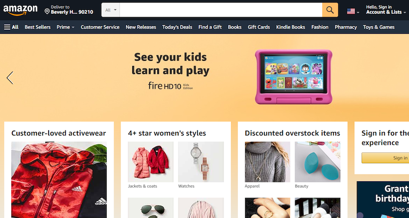
Categorization and search capability become even more critical if you have many products or pieces of content. Ecommerce giant Amazon (above) utilizes a user-friendly search bar that features prominently on the top of the webpage. It also classifies its products based on categories and user reviews, making it extremely easy to browse and shop.
4. Encourage collaboration and competition wisely
Social media sites allow users to feel a sense of belonging by allowing them to join online competitions. Some websites also follow this principle by calling for entries for contests on their site and then displaying the winning entries on their page.
One way to encourage competition to keep users on your site is the "buy now, only a few remaining" principle, which urges users to buy something before someone else takes it. Here, the concepts of FOMO and competition are cleverly packaged together to promote a purchase.
The method is most commonly used in travel booking sites that have a limited number of available seats, rooms, and so on. However, this strategy should be used in moderation as overusing it may drive away potential customers and have negative effects on your conversion rates and overall user experience.
5. Social facilitation
Social facilitation allows users to share their victories and compare their results with their followers. As long as it is done correctly and isn’t seen as undermining other people’s efforts, social facilitation can be a useful tool for designing your website user experience.

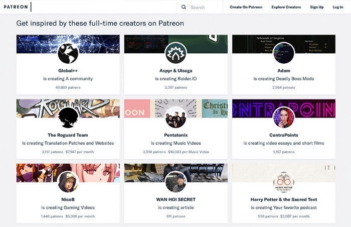
Social facilitation isn't just about competition, though. You may also use it in any context where users can benefit from added influence. For example, the funding platform Patreon (above) allows its members to provide financial support for other members’ projects. It promotes social interaction and helps members get the funding they need to follow their passions and create the content their fans love.
6. Keep your design honest
Your webpage should be honest, even in its UX design. It shouldn’t resort to tricks and gimmicks that emphasize sales goals above user experience. Some webpages employ unfair methods that prey on their visitors’ habits.
For example, they may trick users into subscribing to their newsletter by ticking off a barely-visible checkbox right below the payment options. In a hurry, most people focus only on their shopping cart and move forward, unknowingly subscribing to the email newsletter.
Using similar tactics leads to a loss of credibility. They may cause users to be wary of your site and doubt your brand's intentions. In addition to making you lose customers’ trust, sneaky UX can also have very expensive consequences, as professional networking site LinkedIn found out in 2015. The company had to pay $13 million to get out of a lawsuit over its unethical UX practices. After people signed up for the service, they complained about being bombarded with follow-up emails. In addition, there was no option to sign out or deactivate one’s account.
Your users pick up on such tricks easily and are unlikely to return to your website if they don’t see it’s consumer-centric. A dishonest UX design keeps new users away and pushes away your current users.
A final note on social media psychology
The principles that drive social media users to online networking sites can also help you create an engaging user experience on your site. From color, placement of icons, and function, UX designers can use social media psychology to create a website that attracts visitors and keeps them on your site longer.
These concepts help you create a user experience that takes the best aspects of social media, such as collaboration, personal connection, and ease of use, and applies them to your website. The tips we discussed in this article will help you build a site that engages its users and increases customer loyalty. The best of luck with your UX design!

Spotlight your great work
Apply for a 2026 illumi Award and showcase how your team is pushing boundaries, driving impact, and shaping what’s next with human insight.


