Testing and Redesigning Yelp, Step 3: Analysis

If you’ve been hanging around the UserTesting blog lately, you’ve probably heard that we’ve been working on a UX design exercise with our friends from UXPin and Optimal Workshop. We user tested Yelp’s website and then UXPin imagined a redesign of the site based on our research. In the coming weeks, we’ll be releasing an eBook about the project.
So far, we’ve shared the overview of the process we took, the product definition that guided our testing and design efforts, and the tests we set up to learn how users interact with the site. Now we’d like to share a few of our top findings from that research!
Top 3 qualitative results
Our research began with remote, unmoderated tests that we ran on the UserTesting platform. Here are three of our findings from the user tests. (You’ll be able to see all 7 in our upcoming eBook.)
1. The search bar was the go-to starting point
When asked to find a restaurant with specific parameters, four out of five test participants went straight to the search bar, ignoring everything else on the home page. Only one test participant tried to browse through the categories, but she quickly gave up, saying they were “overwhelming,” and used the search bar instead.
2. Bookmarking took a long time, and no one used lists
We wanted to see how users would save a group of businesses to return to later. In Yelp’s current site, this can be done using bookmarks or lists. Of the three users who were given this task:
- One saved the businesses using bookmarks but complained that the process took a long time
- One started to save businesses using bookmarks but gave up because it took too long
- One was not able to figure out how to save businesses
Both of the users who used bookmarks said that it would be much easier to do if you could bookmark a business from the search results page rather than having to go to each business’s page, as you can see below:
3. Users relied on filters, but they could be improved
After making their initial search for a business, most test participants used filters to narrow their search, but the number of filters was a little daunting. Plus, one user had trouble selecting multiple filters:
The findings from this test inspired us to run a card sorting exercise on Yelp’s current filters to see which ones were actually important to users.
Top 3 quantitative results
Optimal Workshop ran four quantitative studies on Yelp’s site: a closed card sort on the filters, a first-click test, and a tree test and open card sort on the Support site. Here are a handful of our findings. (Again, there’s a lot more to come in the upcoming eBook.)
1. Many of the filters weren’t very important to users
In the closed card sort, Optimal Workshop asked users to sort each filter by importance. We learned that 7 of the 47 filters were considered “not important at all” by 88% or more of test participants. These filters included:
- Has a DJ
- Has karaoke
- Dogs allowed
- Paid wifi
- Has a juke box
- Valet parking
- Coat check
2. 30% of participants commented that navigation was difficult
12 of the 40 participants in the first-click test complained that the navigation was not intuitive, saying things like, “It’s hard to find what I’m looking for quickly” and “It’s a bit cluttered.”
3. It’s very difficult to find advice for business owners on the Support site
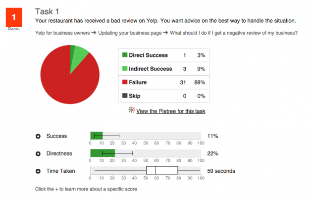
In the tree test of the Support site, one of the tasks asked users to find out what to do if their business received a bad review. Interestingly, only 11% of participants ended up at the correct destination. What’s more, it took an average of 59 seconds for users to complete the task.

Results from the tree test using Optimal Workshop's Treejack tool
Next up: wireframing and prototyping
With these test results in hand, UXPin created some initial wireframes for the redesigned site. Tune in next week for an overview of their process, and sign up for the eBook to get the complete story!


