The Value of Involving People with Disabilities in User Research

Today's post comes from Sarah Horton, co-author of A Web for Everyone.
I am a huge fan of the Web Content Accessibility Guidelines (WCAG) as a means to measure progress toward accessibility. They are thorough and well considered. They are flexible. I have used them to evaluate desktop applications, mobile apps, mobile sites, websites, and web applications. They go far in removing subjectivity from the assessment process—a control either is or is not operable using the keyboard; a text input either has or does not have a programmatically associated label.But I often encounter things in the evaluation process that I believe impact the experience of people with disabilities, but that do not have an associated WCAG 2.0 success criteria I can reference. For example, a complex table where it’s difficult to track across rows, particularly using screen magnification, or an accordion widget that is coded correctly and is keyboard-navigable but contains important information that should be displayed as static content, on the page.Sometimes I will note this type of issue when reporting, but I know without the backing of a standard, it’s difficult to make a strong case for fixing it. Also, the issues that do not directly map to WCAG usually relate to user experience design rather than code.
Generally speaking, it’s more difficult to get traction for fixing designs than it is for making adjustments to code.
So, how to bring attention to accessibility issues that are not backed by an international standard, for which the remedy might require an investment of time, resources, and creativity?
User research to the rescue!
Most of us involved with making digital products and services like to solve problems rather than create them. Technology is a great enabler, and it’s exciting to be involved in a project to make things easier and better for people. Accessibility is particularly compelling in this way, making things easier and better for people with disabilities. But accessibility is not thought of as part of user experience. The question is, how to bring the profession’s natural compulsion to solve problems to bear on resolving issues related accessibility?
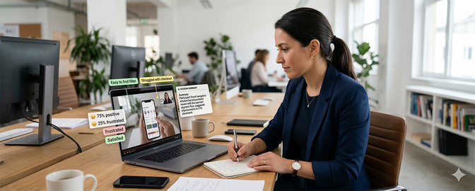
User research activities, such as contextual inquiry interviews and usability testing, are proven tools for focusing attention on otherwise discounted issues with a design or implementation.
Often a project team has one “Lorax” who speaks for users, trying to make a case against designs that are unintuitive, difficult, and frustrating to use. In the end, real-life, first-person accounts or demonstrations of how an interaction is difficult to use or how content is difficult to make sense of have much more weight than the perspective of one lone team member. For a project team, it’s difficult to dispute there’s an issue when you see someone struggling to access content or work a control because of how it’s designed and implemented. User research that includes people with disabilities will capture the attention of designers and developers and bring accessibility forward as a problem in need of creative problem solving.
Accessibility and UX, unite!
Once a product team embraces accessibility, what then? The needs and preferences of people with disabilities are not widely known and understood in the user experience profession. Accessibility is considered largely a technical issue, to be addressed under the surface, in the code. Attention to accessibility typically happens during QA or after a product launches, and the people responsible for the earlier phases of strategy, design, and content do not give much consideration to accessibility—not due to a lack of concern, but rather a lack of awareness of the impact those phases have on accessible user experience.This is another way user research can help. By including people with disabilities in user research activities, designers, developers, strategists, and writers can learn first-hand what people with disabilities need in order to be successful.
Observation and inquiry are the ultimate tools for understanding how people with disabilities use digital products: for example, how someone who is blind uses a touchscreen.
It’s also a way to appreciate the value of digital products for people with disabilities: for example, how text-based notifications can help someone who is deaf receive important travel updates when in transit. And it’s a way to learn how designs can hinder someone’s ability to have a successful interaction: for example, how low-contrast color combinations make it difficult for people with low vision to read text.
User Experience for all users
User Experience focuses on people. Accessibility focuses on a subset of people: people who have disabilities. Including people with disabilities in user experience activities, such as user research and usability testing, is essential for the user experience profession to be true to its purpose: concerned with people, not just "normal" people, providing a good experience for all users, and not just the “typical” user. It’s the most effective way to broaden the definition of “user” in “User Experience” to encompass the diversity of needs and preferences of people—to make a web for everyone.


