UX for kids' products: Designing for the youngest of users

Everyone has had that moment.
Over at the table next to you is a toddler deftly tapping and swiping a tablet, and you think, “What was I doing at that age?”
The “digital natives” of the next generation became consumers of online content at an unfathomably young age, most likely before they could type or even read, most likely before they could even remember.
These users provide a unique challenge for UX designers and researchers, who must account for varying physical, social, and cognitive abilities within each age group.
But there is no need to reinvent the wheel; understanding key differences between how kids and adults interact with websites and apps, as well as some best practices in conducting research can help guide your project to success.
Breaking down age groups
As with any UX consideration, you need to understand who your users are before diving into any design or research. It’s tempting to lump all children as anyone under the age of 12; after all, isn’t that the cut off to get on those “kiddie rides” at theme parks?
Usability for adults is not as dependent on age differences as it is for children, which means it’s necessary to break down the category of “children” into smaller age segments. The four years that separate a 34- and 38-year-old are not as significant to the cognitive, physical or social development as the four years that separate, for example, a 4- and 8-year-old. A 4-year-old’s basic reading level and motor skills will necessitate a different design from their older, more advanced, 8-year-old sibling. That’s why it’s paramount to identify what age group you will be dealing with.
UX specialists recommend segmenting children into at least three distinct age groups: ages 3-5; ages 6-8; and ages 9-12. Each age group has specific traits that need to be addressed in the design.
Ages 3-5
The youngest age group will have less-developed motor skills to manipulate a mouse or use gestures and will rely on larger photos and immediate visual and audio feedback of their selection. Including larger click targets will prevent users of this age group from accidentally tapping something they didn’t mean to.
The Thomas the Tank Engine site navigation below not only uses big, colorful pictures with text, but also includes an animation as well as an audio recording that reads the navigation item aloud. For older children, this may be overkill, but for the youngest age group, it provides the best feedback to convey what that menu item means.

The Thomas the Tank Engine site gives children audio and visual cues for navigation.
Ages 6-8
Older age groups will be able to read, but it’s still important to adjust the vocabulary to reflect their level of education.
A study with children ages 6-8 found that certain terms, such as “sign-in” and “sign-up” are understandable, but “submit” and “username” caused confusion. “Submit” could be replaced by “start” or “go,” while “username" could be replaced by “nickname” to match the language of a 6-year-old.
Just as with any other niche group of users, appropriately matching your site or app’s lingo (as well as reading level) will help to win them over.
Ages 9-12
By the time children reach this age group, they are most likely already veteran technology users. They'll be more comfortable scrolling through pages, selecting smaller touch targets, and understanding call-to-action items than their younger counterparts.
Advanced levels of reading means that this age group is able to scan through content as well. Although they’ll be able to read content, they will still have a harder time than adults differentiating between promotions or ads and real content.

National Geographic Kids uses an intuitive interface and clear copy to guide kids of all ages to the right place.
You are not your user
If you’re tasked with finding out how to optimize your digital content, it’s assumed you’re an adult, not a child, and this UX mantra of “you are not your user” has never been more appropriate.
Designing a site or app for children does not mean throwing out the best practices of designing for adults; but there are a few seemingly counterintuitive points to remember.
Use of color
Simple and minimal design elements are en vogue for websites to provide adults a “distraction-free” environment in which to accomplish tasks quickly and easily. Adults explore a site or app with purpose, while children primarily go online for entertainment. An all-white background with shades of grey text may cause your little user to wander away from the computer or drop mom’s phone out of disinterest.
You will need big, bold, cheerful colors and pictures to hold the attention of children and help them navigate.

Splashes of bright orange and pink on the Sesame Street page would make an adult user cringe, but delight younger children.
Gestures and navigation
Gestures common in adult apps, such as pinching, will have to give way to more intuitive gestures for children, such as tapping.
Icons are wonderful for adults who understand abstraction and can extrapolate meaning from them; but children, especially younger ones, will take these icons in a much more literal sense. Navigation and menu icons should always convey as literally as possible where the child will be taken if they select it.
A clear indication of how to get back home should always be present in case they get lost and need to find their way back.
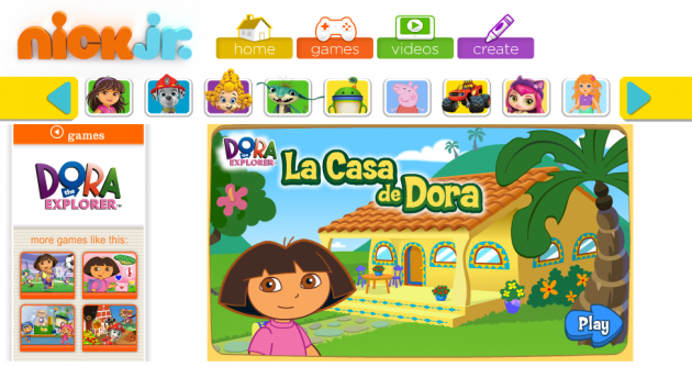
Nick Jr.’s games for children ages 4-6 use images of popular characters from other shows as navigation bar items. Colorful arrows on either side show how the navigation can slide left or right and reveal even more characters. As a result, children can quickly identify and select other shows to explore.

Nick Jr. uses recognizable characters to guide children through the navigation.
Childproofing
In-app purchases should require controls, such as passwords, to ensure a parent is not met with an unpleasant surprises on next month’s bill.
Some products will want to prompt parents (but not kids) to download similar apps or navigating away to a different website. In that case, it's a good idea to make those actions easy for adults but difficult or uninteresting for younger kids.

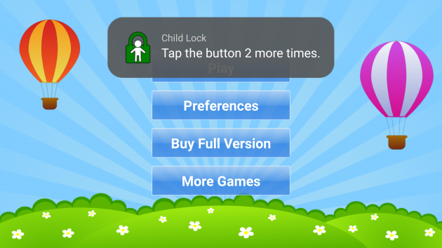
The Kids Numbers and Math app, meant for preschoolers, uses a child lock to keep toddlers from accidentally installing other apps on their parent's phone.
Conducting user research
Conducting research with your target audience can provide invaluable insight into how your young users interact with your product.
Parents and privacy
Keep in mind that strict guidelines exist for designing apps and sites for children under 13 to protect their online privacy rights, and in most countries it’s required to obtain parental or guardian consent before conducting any testing. This means that parents will play an integral role from the start in setting up your research. Making sure that parents understand study objectives will help move the study forward. For children who are too young to give verbal feedback, enlisting the help of parents through interviews may also be an option.
Helping test participants feel comfortable and confident
Creating rapport and tailoring your language to match the young tester’s will help to break through some of the shyness children may feel when speaking to an adult.
In some cases, conducting research in “friendship pairs” can encourage participants to come out of their shell by speaking to their friends about their experience using a site or app, instead of a stranger. Recruiting young users as pairs of friends is especially useful when testing out a game, letting them feed off of each other’s reactions like a real life situation.
Our researchers at UserTesting have found younger participants will often give one-word responses to questions or become nervous when there are probing questions. When they didn’t think they had responded in the “right” way, they would backtrack and change their answers. To coax kids to elaborate on their thoughts, we’ve found it helpful to word questions or describe scenarios in the context of what they or their friends would do in a situation. This helped to take the pressure off of the participant and let them speak with more ease.
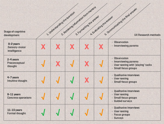
Identifying which research method is best for each age segment will help you gain the insights you need to improve your product.

This chart from UX firm Usabilla illustrates how the development of a child’s ability to understand a questions affects the type of research needed.
There are myriad other resources and research that can help tailor your product for the youngest of users.
And who knows, becoming immersed in the why and how children use your product may prompt you to look with renewed interest next time you see that dextrous toddler swiping away on a tablet.


