Top website wireframe tools and how to test your designs

A website wireframe is the primitive skeleton of your website. It’s not necessarily glamorous or cutting edge, but it holds everything together like a blueprint. Much like building a house, a website should never be developed with eyes wide shut. And with the right wireframe tools in hand, you can be sure you’re building your website with your users’ needs in mind.
Why do you need a website wireframe?
Often, eager designers (and stakeholders) begin building a website with an exact idea of the end product in mind. While making a sleek and beautiful site is fun, a good website is built on the proper framework. Arguably, without a website wireframe, even the best-looking sites can be difficult to navigate and complete essential tasks.
You’ve seen them, the websites with strange navigation, infinite scrolling, cluttered text or images, the list goes on. Website wireframes aid in preventing this and generally focus on:
- Page layout
- Interface elements
- Navigational systems
- Functionality
Once you’ve built your website wireframe, your job is only partially complete. Having a blueprint of your website is great, but it doesn’t ensure that it’s meeting the needs of your users.
Why you need to test website wireframes with real users
If you think about the example mentioned earlier about building a house, a contractor wouldn’t begin building a home for someone without making sure they approve of the design first. For example, you wouldn’t build a single-story home for someone who wants a bedroom on the second floor and you wouldn’t put hardwood floors throughout until you’re sure they don’t want carpet. Whether you’re comparing a website’s page hierarchy to the location of a bedroom, or color and design preferences to hardwood vs. carpet, a website’s design should be customer-centric.
While you may be eager to bring your wireframe to life, it’s vital that you consider the needs of your users first. Why? Because you can save yourself a lot of time and effort building something right the first time.
“You can use an eraser on the drafting table or a sledgehammer on the construction site.” -Frank Lloyd Wright
If you want to deliver the best product in the shortest amount of time, the wireframing stage of development is one of the most valuable stages for usability testing and gathering user feedback on your design.
Not to mention, user feedback, in the form of human insight, is also a great way to settle internal design disputes. If you find that your team can’t agree on a specific design, the fastest and easiest way to choose confidently is to ask your users what they think. You can even have users evaluate multiple designs in a single session, enabling you to continue to iterate on your design direction until you have something everyone can agree on.
How to test website wireframes
It’s important to get feedback on your website wireframe in order to validate it before investing resources to build it out. Does the design make sense? Is it clear and intuitive to the user? Are the images and colors appealing? So on and so forth.
You can test website wireframes using a remote feedback method. However, there are some factors to consider that will help you choose if a moderated or unmoderated approach is right for you. Before conducting your test, ask yourself:
- Do I need to maintain control over the wireframe or prototype, or are there security concerns that would prevent me from sending this to a contributor?
- Will a contributor be able to interact with and navigate the wireframe or prototype without much guidance, even if it’s a complicated design or lower-fidelity?
Self-guided, or unmoderated, tests are best if you know users will be able to interact with your design without much guidance or explanation and if you have an easy way to share your design.
Live interviews, or moderated tests, are best if you want to ensure your designs are only shared with the contributor during the duration of the test. They’re also more effective if you think a contributor may get confused about a prototype or design. (You can still do this during a self-guided test, just be sure to be very clear in your instructions and anticipate any questions or areas that may need additional explanation.)
Questions to ask during website wireframe testing
When testing a website wireframe, you want to make sure that you ask all the questions necessary for building a website that is truly user-centric.
Here are some great questions to get you started in the right direction:
- Before users even look at the wireframe or prototype, what would they expect to be able to do with it?
- How would they expect it to look?
- Once you show them the prototype, do users understand what it does?
- How does it measure up to their expectations?
- What features are missing?
- Does anything seem out of place or unnecessary?
- If you could move one element on this page, what would you move, and where?
- How do users feel when using the prototype?
- If users had a magic wand, what would they change about the product?
- How likely or unlikely would they be to use this product once it’s finished?
Now that you understand why and how to test your website wireframes, you’re probably wondering the best way to develop one.
6 best website wireframe tools
When it comes to building a website wireframe, there are a number of different tools at your disposal. Everything from a sketch on a napkin to a digital wireframe can get the job done and set you in the right direction. Nevertheless, some may be easier to run usability tests on than others.
Here are some of the most popular programs for building a website wireframe:
1. Adobe XD: best all-in-one wireframe tool

Wireframing, designing, prototyping, presenting, and sharing amazing experiences for web, mobile, voice, and more—Adobe XD is your all-in-one app. Adobe XD provides you access to all your assets in one place, eliminates tedious manual tasks, create experiences that are adaptable to any size screen, and integrates seamlessly with the UserTesting platform.
- High-fidelity interactions
- Integration with the other Adobe products you already use
- Real-time viewing, commenting, and sharing capabilities
- Pricing: Free to $23/month
2. InVision: best wireframe tool for interactive wireframes

InVision makes it easy to create interactive wireframes and prototypes. Simply upload static screenshots and create clickable wireframes your users can interact with and understand. The app runs on the web and works well simplifying the workflow between designers and other stakeholding teams.
- Create rich interactive wireframes that allow for rapid iteration
- Seamlessly communicate, gather feedback, and advance projects
- Compatibility with most popular graphics file formats like PNG, GIF, PSD, JPG, and others
- Pricing: Free to $100/month
3. Sketch: best wireframe tool for mac designers

Once viewed as only the top vector graphics editor, Sketch has risen and diversified to accommodate wireframing and prototyping. Its popularity makes it great for collaboration, it’s not overburdened with features, and costs much less than editors like Photoshop.
- Sketch on Mac is a fully native experience
- Pricing: $99 single license with added seat options for teams
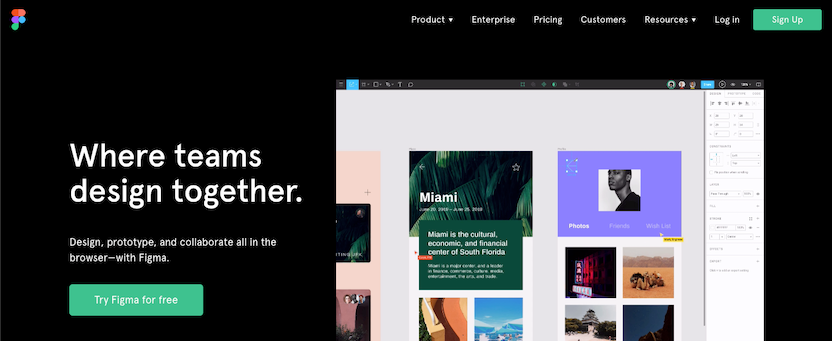
4. Figma: best wireframe tool for designing collaboratively

Figma is truly a one-tool solution for all of your design needs. Thanks to real-time collaboration, web-based functionality, and exceptional price-to-value, Figma is rising through the ranks and gaining traction with design teams.
- Easy switching between design and wireframe modes
- Quick sharing and real-time feedback
- Powerful editing features
- Pricing: Free to $45/month. Some plans are available with annual pricing only.
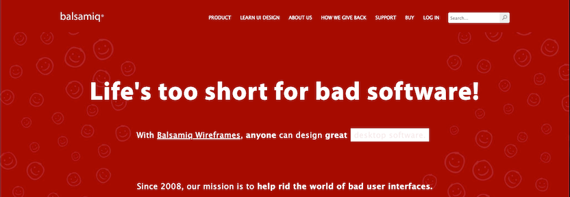
5. Balsamiq: best wireframe tool for all experience levels

Balsamiq helps you quickly design mockups that are great for sketching and wireframing. With excellent ease of use, a great widget library, and its cloud-based software, it makes team collaboration easy.
- Allows for quick wireframing so you can learn fast and fail faster
- Minimal learning curve with powerful technology
- Drag and drop simplicity
- Pricing: $9-$199/month, discounts for annual subscriptions
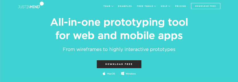
6. Justinmind: best all-in-one wireframe and prototyping tool for web and mobile apps

Justinmind is an all-in-one prototyping tool for web and mobile apps that helps you build wireframes to highly interactive prototypes without any coding. Justinmind lets you design from scratch and leverage a full range of web interactions and mobile gestures, so you can focus on building exceptional user experiences.
- Responsive prototyping that ensures your designs adapt to fit multiple screen resolutions
- Prototype smart forms and data lists without writing code
- Free, ready-made, regularly-updated UI kits for web and mobile
- Pricing: $19-$49/month, discounts for annual subscriptions

Spotlight your great work
Apply for a 2026 illumi Award and showcase how your team is pushing boundaries, driving impact, and shaping what’s next with human insight.


