Non-profit
Kiva + UserTesting
Learn how changes to Kiva’s online lending platform helped fund 7,000 new borrowers
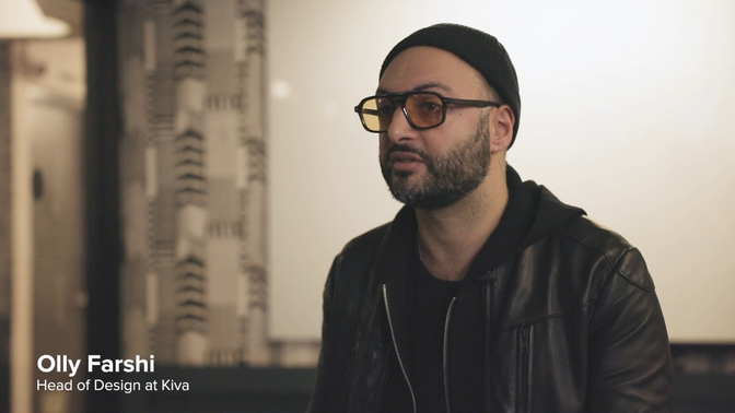
UserTesting is the platform that enables us to very rapidly spin up research studies, get directly in touch with our users and our potential users, find things out, and then synthesize those learnings into product experiences. It's a direct way for us to learn and build products.
UserTesting's OneWorld program is a grant program that lets us access the product and network for free. As a non-profit, we don't have a huge research budget and it is a huge unlock for us to be able to use that without having to find the money for it.
A part of Kiva's lender experience is that intangible reaction a borrower has when they look at the project description. And you can only observe that by seeing their face–and that moment of delight–when you show them the website.

