4 guidelines for writing great multiple choice questions

Behind every great user experience is great user research.
One way to get valuable UX insights on the UserTesting platform is to use quantitative data to supplement the audio and video feedback you get from users.
You can get measurable data by including survey-style questions in your user tests. Multiple choice questions are one type of survey-style questions, and they can make a big impact on your research by allowing you to measure customers' opinions and preferences at a glance.
Multiple choice questions are great for:
- Learning what stands out most to a user on a site
- Determining what users would do when they reach certain points in the navigation
- Gauging preference for specific designs or elements of your product
- Evaluating content
- And tons more - they’re only limited by your imagination.
Now, let’s talk about how to write multiple-choice questions that will get you the most accurate and helpful responses.
4 steps to writing an excellent multiple choice question
1. Provide a “None of the above”, “I don’t know” or “Other” option.
This will prevent your data from being skewed if none of the other answers apply to the user or the user is confused.
2. Provide clear and distinct answers.
If the answers all bleed together or overlap substantially, it will not only confuse your users, but it will compromise the value of the feedback.
3. Avoid asking leading questions or yes/no questions.
When users can easily tell which answer you want from them, they’ll be more likely to choose that answer, even if it isn’t accurate.
4. Ask the user to “Please explain your answer aloud.”
Although most users realize that this is implied, it never hurts to include this small prompt for users to re-articulate any concerns or issues they encountered in previous tasks. Plus, it makes for some excellent sound bites that can be passed along to your team.
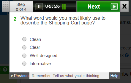
Pop quiz! What’s wrong with this question?
Take a look at this example of a multiple-choice question. Does something seem a bit off to you?

This example violates all four of the guidelines above.
It has no “Other” or “None of the above” option. It includes overlapping answers (what is the difference between Clean and Clear?) It’s blatantly designed to make the site look good. And it does not seem interested in a verbal explanation of the users’ choice.
While the results from this question may stroke your team’s ego, they might not be indicative of the users’ actual experiences. What if users thought the Shopping Cart page was ugly and confusing? They have to select one of the choices in order to complete the test, and with no other options at their disposal, they’re forced to select an answer that doesn’t describe their thoughts at all - or help you improve your site!
Ready to get started with multiple-choice questions?
These questions have proven valuable and versatile tools for the Research Team at UserTesting. You can add them to your UX research toolkit for future studies.
Happy testing!

Spotlight your great work
Apply for a 2026 illumi Award and showcase how your team is pushing boundaries, driving impact, and shaping what’s next with human insight.


