Embedding UX in an engineer-driven organization
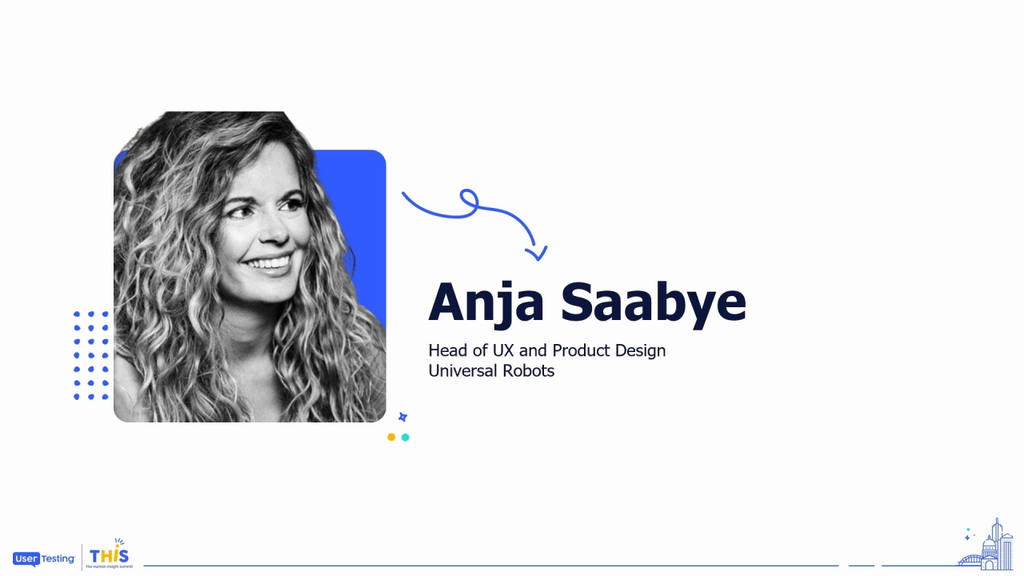
Anja Saabye
Head of UX and Product Design, Universal Robots
Join Universal Robots as they share their journey of transforming a small UX and Product Design team into a critical force within an engineer-driven organization. Starting in the metaphorical "back room," they expanded customer-driven thinking into an engineering process initially resistant to design decisions. Attendees will learn how to leverage UserTesting to document 30,000 customer insights, how Universal Robots created a design system that empowered engineering teams, and proved that even in a predominantly engineer-based environment, UX can drive impactful decisions and innovation.
Thank you so much.
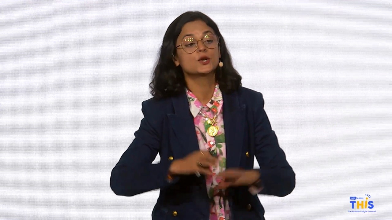
So I guess most of you have not heard of Universal Robots before, or maybe you have. But just to point out, it's a Danish company. So I flew all the way from Denmark to here just to give the presentation for you today. So I've really been looking forward to this.
As Cecilia just said, my name is Enya Sobeu. I'm head of UX and product design in Universal Robots. And I think before we get started, I just wanted to point out what is great UX and design actually for me.
So, just to...
Thank you so much.
So I guess most of you have not heard of Universal Robots before, or maybe you have. But just to point out, it's a Danish company. So I flew all the way from Denmark to here just to give the presentation for you today. So I've really been looking forward to this.
As Cecilia just said, my name is Enya Sobeu. I'm head of UX and product design in Universal Robots. And I think before we get started, I just wanted to point out what is great UX and design actually for me.
So, just to tell you a little story here, in 1960s, even before the tidy UXs was invented, there were some really, really, really cool people developing how the push button phone set should be done.
And I don't have this example. I wasn't born at that time, but I actually got the inspiration here from Nelson Newman Group. So the engineers here, they looked at how they should do the setup. And as you can see over here, they found out that most people prefer the middle solution down the button because that's very easy to to understand.
It's how we normally see the digits.
But then there's one thing that you can always be sure of as a UXer, and that is that your users, they don't know what they want. So you have to be the one asking the right questions and you have to be the one able to do the right conclusions.
And what they did, those UXers, at that time was that they actually tested this and they found out that the fastest solution to put in an eight digit or ten digit number for people is actually the solution up here, number one in line four, which we actually know today on all our pushback phones. Right? And you also know it on your mobile phone.
So, what that is is that if we assume that the push button telephone set has been used forty trillion times, by doing a good UX and a good design, instead of just taking the one that everybody preferred, the world has saved forty billion work years, which is actually quite a lot. So, that is what good UX and design is to me. Imagine what a difference we can do out there if we actually do our job so good. So, this is what the presentation is about here.
So, I just wanted to introduce to you my family here.
This is the robots that we actually design.
And we have, as you can see, some robots' arms over here, and then we have a control box, and we have something called a teat pendant, which is similar to an iPad. We design the physical product, we design the software on the teeth pendant that you actually use to control the robot with, and then we design all the digital touch points that our users have with Universal Robots. So I'd like to ask you, just raise your hand if you both have a physical product and a digital product in your organisation.
Wow. That's good. That's a lot of people here. Great. Okay. So how do we make that come together? This is very much what the presentation here is about.
So, in universal robots, we are guided as designers strategic insight. And you can see the difference here in our product where you have the old products to this side and you have the new products over here. They are a little bit larger, but also the design is different. And the reason for that design being different is that's because when we started to work with insights from real users, we learned, uh-oh, we have an issue in our product, the way that it looks and the way that it's designed, and we need to change that going forward. But you can also see that we have kept some of the branding from our old product range to our new product range. So that's the journey that we have been on for the last four years.
And just to let you know a little bit about it, we are supporting three fifty engineers in our organization. We work worldwide.
When I started in twenty twenty, we were four engineers in a corner of a software organization, only looking at the software for our TP.
Then we have grown quite a lot. In twenty twenty two, we worked twenty UX designers and researchers working across what we at that time called product creation and marketing, and then we have developed even further. And the newest thing is is that in autumn this year, we have actually been part of product management. So I'm now referring to our VP of product management in the organization, which allows us to really provide good insights to our product managers and allows us to be much more user driven than we were before.
If you look at the curve here, the stages of UX majority with maturity, which I hope you also know from Nelson Norman Group, I would pretend that we are between five and six up here.
So when we started, there was, like, the colors were not defined in Universal Robot. There was not a lot of best practices written down and all of that stuff. And that's some of the things that we have been doing working through all the phases here. Now we are there. And now when we are building the future strategy of the company, now when we are looking into what is the next new product that needs to come out, everybody says, hey, remember to ask UX in product design. They might have some information that can help you. So that is a great achievement for me and the team here.
We are a multidimensional role in Universal Robots. It means that we cover those four areas here and then also, of course, the micro and macro trends underneath. We work with design research, we work with interaction design, we work with visual design and behavior analytics.
And in my belief, when those four areas come together, you can actually create good UX. So one cannot stand next to another. And that's actually why I'm here today to present some of the ways that we have been working so I can pass on that knowledge to you guys as well.
All the areas are important when we need to design a new product or we need to design a new experience.
And we have a strong foundation to work as a customer driven organization if we remember to include all the areas here.
Of course, all the areas have different expertise and the objective is to collect cultivate a holistic understanding of our user experience across the products and all touch points within the organization.
In our situation, it's very, very, very difficult because the one that actually buys our products is probably a CTO or somebody else in the company. And the one who actually uses our product is the person working on the production floor with the Cobot every day. And now you maybe think, oh, she called it Cobot instead of Robot? Is her English really that bad? No.
It's not, but I excuse for my for my English. But, actually, the reason why is because Cobot is taking collaborative and robots and putting that together because that is what is unique about our products here, that you can actually come very, very, very close to the robot. And if it should hit a person, it will automatically stop. So it's very, very, very safety proof to be close to a robot. It's not all robots that are like that. Many robots are in big behind big fences and working in there. But our product is very, very, very close to the user, and that means that you can actually stand next to it and maybe do similar work or prepare the work that the cohort actually has to do.
So I thought a lot about what should I bring to you here today. And I decided that I'm going to present ten must haves for building a user driven organization today. This is very much learning from our own journey. This is how we have done it. And you're more than welcome to ask questions in the end as as silly as us because it can seem like, okay, you've been super, super, super busy, which we have. But we also try to work with this in a structured way.
And the reason for working with this in a structured way is because I don't know if I'm putting people too much in boxes here, but we might have some engineers over here, and they think with one part of the brain. And then we might have some designers over here and they think about with the other part of the brain. And when we need to collaborate across, it's very, very important that we meet both the engineers' needs, but also the designers' needs. So we need to have the creativity, but we also need to have the structure that makes it okay for the engineers to actually go in and work with the experience. So, I think a lot of my role has been to also communicate that inside the company.
So, first of all, what you have to do is to build a great relationship in the organization.
We call it that we are divine in universal robots, and it means that we have combined the developers and the designers.
We are not going to use the engineers as designers, and we are not going to use the designers as engineers.
But we collaborate very, very close together. The reason for doing that is also the high difference in numbers of three hundred and fifties versus fifteen people over here. But it actually makes us really, really, really good when working together because it makes it possible that we can see the engineers in the eyes and say, Hey, this is how we should do it. And the engineers feel empowered. They feel like, Okay, I was part of the process as well, which is really, really, really cool in product creation.
So the first thing, be divine.
The next thing is to create a vision. In Universal Robots, we have a vision that we want to create a world where people work with robots, not like robots. I'll just spend two seconds explaining that because what our product does is that it works within production, it works within manufacturing.
And normally when we have it there, you can see that people are doing the same job over and over again. So if they are doing like that with their arm for fifty years, try to feel if they have a little back pain here maybe. So some of them have the risk of actually being worn out, and we don't want that. I'm a mom of three boys.
I don't want them to grow up and have a job where they will actually be worn out. I want them to be able to use their brain and have an intelligent job in the future as well. So that's what we are creating with this vision. We want to take away the jobs that actually is not nice for people to do.
Then you can say, okay, that's the overall vision. And then in UX and practice time, we have created our own vision as well. We want to make everybody fall in love with our brand, our company, our product, and solution.
And we want to do that by creating the amazing design like Apple. Okay. So you might be thinking, hey, Anja, that's easy. I could say that as well.
Yes. It is. But everybody knows Apple, and everybody knows that they are super, super, super gut. So why should we not put the the the the goal up here and say, hey, this is what we want to go do?
So this is the vision for all the designers and they will be challenged by that when we need to go along.
And then give the user experience like Tesla. And that is because three years ago, I actually did a big study of Tesla and how they actually work and what is actually the thing. Of course, they hit a wave for electronic cars. But there's one thing there is for sure.
If you ever sat close to a person in a with a nice dinner or something like that who just bought a Tesla, that person is so annoying because he's trying to sell you the Tesla. Okay? He's so super, super, super happy with his product. So how do we get our users into that mindset as well?
That's my goal, and that's why it's here. And then you can see the last line, be universal like universal robots. Okay. Our product is just an arm.
It's cut off here. It has no hand. But the unique thing about it is that it can work within nearly every environment that you can imagine. We can do nearly everything about it that you can imagine, and we need to keep that because that's a huge strength for our product in the future.
Yeah. So that's a little bit about our vision. And then you can say, okay, design is not just how it looks and feels. It's also about how it works. Of course, it is. And that's why we have to be divine. That's why we have to work closer with the developers as well.
Working closely with the developers and engineers.
So what do you imagine, Anja? Can you add some colors here or what? No. We are not the ones adding in some colors. So, when I started at that, I needed to make sure, okay, I'll build a fundament here that everybody can hook into. I'll build some guidelines that they actually understand. And that's why number three is create a guiding design and experience philosophy.
These are two very, very, very short pages, as you can see here. But this describes exactly what it is that we have to go do when we talk about design. It describes about how we want the future experience to be for our users going forward as well. And it's written in very, very few words, as you can see here.
I can't publish them to you guys. I'm sorry about that. But at least you can see how long they are up here. It's nothing more than that.
And this has been super, super, super effective when communicating to the engineers because this is something that they understand. And now they can make a cross point. Oh, I did this. I understood this.
And then we can build that into the product as well. So guiding them this way is a really, really cool thing as well.
And then number four. Oh, can we go one back, please?
Thank you. Number four, map the customer journey.
So automation is a journey. It's not a destination.
When we first tried to map the customer journey, we did, like, those long, long, long posters that could not even hang on this wall here because there were so many touch points and way that you could get through the customer journey and so on. And every time we tried to present that, some people would be like, okay, falling asleep or something because we're so happy. But what we wanted to do with this was actually trying to create a tool that everybody in the organization understands, that everybody in the organization can use. And this led us to this customer journey that you see up here.
The customer journey goes around in an infinity loop like you see here, and we have put it into different phases. The thing about putting it into phases is really, really good for us because then we can say who's responsible for each phases of the customer journey.
I'll just take you through the customer journey here.
So, in phase number one, we have the automation need. That is exactly the situation that I described before. Okay. So Linda is coming to work every day.
She's done that for the last fifty years, and she's done this for the last fifty years. Eight hours a day. Just like that. It's really, really, really cool.
And one day, she finds out, Okay. My my bag is hurting here. I need to go and see the doctor. She goes to the doctor.
The doctor says, you cannot do that anymore. She goes, she tells her boss, I need to quit my job.
And then the boss, he's really, really, really clever. So he thinks, oh, I'm going to put in a job ad. Maybe also advertise it on social media and so on. Woo hoo. That's really something. But unfortunately for him, nobody wants the job.
So he's in automation now because he needs the job done. But what is he going to do about it? And then he starts thinking about, is there a different way that I could actually react to this? Could I do something differently here?
And that sends him into trigger because now he starts to understand, hey. Other people are working smarter than me. What do I need to do to get to that level as well? And into transform, he understands, hey.
Cobot, that's a collaborative robot. It could be my solution as well.
And then he jumps into onboard. We give him a lot of training. We give him a lot of knowledge about what is actually universal robots, how can he actually use the robot. And not until the end of this phase, we actually tried to sell him the Cobot.
So he's very well dressed now and he's very well on board of what it is that he's going to buy. One of the best features is that it works twenty four hours a day and it doesn't need lunch in between. So it's a really good feature for him as well. And then you can say, okay, he purchases the robot in the end of onboard, and then he jumps in to deploy.
That means that we sent him the robot and he will start activating the robot in his factory board.
We need to make sure that he had a good setup there. And sometimes we are so successful that he would go directly from that phase and into automation it again. Because, whoops, over here is standing Wendy, and she has been doing this for fifty years. And she also has feeling bad in her arm. So maybe we could also replace her job with some automation. And that makes him go into automation need and go the round again.
If there is not an an urgent need for more automation, he just goes into play. And in play, the robot is just running. It's super good. But we know that at some point, he will run into trouble.
That's guidance. That's our full service organization. What do we need to support him the best? If that robot stops working and he needed to do this twenty four hours a day, he's in trouble, and we gotta be there.
We gotta serve him very, very, very fast, and we gotta help him very, very fast. So the guidance space is super important for us here as well. And if we succeed with all of this, he will jump right into advocacy. He will be the one going out telling his friends, hey, I found something.
This is amazing. I've been helped by this. And then you can say he will run into automation meet again or send one of his friends there. Or if he's just happy, he will just continue going around in the loop over here.
So this is how we describe the customer journey. This is actually what we want for our users in Universal Robots. And now we can start building all the touch points along the customer journey. We can start saying who's responsible for it and how should we actually design it.
And then the next thing, measure the customer journey. So we have the customer journey here, and I'm actually able to measure the customer journey. What we have done so far is that we have done a study, a customer journey survey that we send out. And we have, as I said before, customers all around the world. We have twelve hundred people, participating in the survey. And in the survey, there were one hundred and twenty two questions.
That's an effort for people to actually wanting to spend that amount of time and giving data to us. And this data will be our baseline. This data allows us to actually measure all the phases that we have here, but it also allows us to say, Okay, with this little product improvement, have we actually moved something here? And this is where it becomes really, really interesting.
So now we can benchmark against ourselves. We also, of course, use the NPS. We use the QX score. We use benchmarks from user Zoom as well, so we can see how we are doing compared to all of you.
Great guys sitting here. And then, okay, we have set KPIs for all our stakeholders. So, we've told all the stakeholders and all the people who are responsible for different areas of customer journey, This is your problem. We would really like to help you with more insights and so on, but you need to reach this target as well.
And we are being supported by our senior management team here. So this is really, really cool. And it's a cool tool that everybody can understand in the organization.
Yes. Okay. In order to be able to do this, we have created some systems underneath, and this is really something that I would like to share with you as well. We have our Insight system, Polaris.
Polaris is known as the Northern Star. It's used for navigation. So when you're out in a boat in the middle of nowhere, you can actually look at the stars and you can find the North Star and then you can navigate from that. So, of course, that's the right name for our Insight system. Everybody should navigate from insights from our users, right, in order for us to be a user driven organization, a customer driven organization.
So number six is create a research and insight system.
We have created this system four years ago without really knowing that that was the thing that we're doing at that time. We needed a program to fill in all our data, and we choose EnjoyFQ, which we are really, really happy with. We structured all the data in there and now we have more than thirty thousand data points in there from eleven thousand users, giving us a huge advantage when we need to build strategy, when we need to build new products, etcetera, because we can search in there and we can find all the information in there. And then, of course, as I said before, we have our customer experience survey with all the feedback there that is also structured into a GeoHQ, so it also gives us a lot of knowledge.
And then we are using user zoom and user testing now to also add in a lot of knowledge there to make sure that we are on top of everything. And every time we have a prototype, we can go out and test. And if a user says, hey, this is the thing that I don't like, or I like the old software teeth bending or something like that, we can add that into the system and it becomes shareable for everyone in the organization.
So how did we actually build the Insight System? Well, we needed the structure, as I said before. We were probably not one hundred percent aware of what it is that we were doing. I will totally admit that. But, actually, we took all the data we had and we added it into EnjoyHQ, and that took about three months.
But it was under COVID. So everybody was working from home, so it was a good little task to do at the end of the day or something like that. But we got there, and it was a huge, achievement for us. In Enjoy in EnjoyHQ, we used the data.
We structured the data using tax, and also we democratized the system by giving everyone in the organization the unique possibility to go in and read our insights. But what we learned from that is that to make good decisions and to make good insights, you need also good people. So I think it's it's really a thing that you really need to educate your users if you democratize research in the way that we did. So please think about that. It's not the only read only access. It's also about understanding what it is that they actually read.
And then we were so lucky, and it helped us a lot that user zoom user testing in JSQ is now one company. So that was a thing that we can control, but it was really really useful for us.
Okay. Then you might be thinking, what is the outcome actually of Polaris? And that's number seven, get familiar with your users.
So there's been a lot of people here talking about the archetypes. What we have in our organization is that we have something that we call the behavioral archetypes.
We did a research with eighty companies, eighty customers around the world, and we said, okay, what is their behavior when they actually receive Cobalt from us, when they receive the product? What is their behavior when they interact with us? What is their behavior in digital touchpoint? What is their behavior when using the actual product out there?
And then we tried to make those five descriptions up here. And I'll just give you an example with one of them. Here's the yellow one. He's called the scrappy hacker.
The scrappy hacker is the first user of our product because he is on forehand of technology and he can fix almost everything himself. Okay? So when he receives the Cobot, he just rips the box open and he takes the Cobot out and he installs it. He doesn't read the manual.
He doesn't care about security, blah, blah, blah, all of those things. He will just start using the Cobot. And that's so super, super, super cool. That was the first many users.
Now we're seeing a shift in our users as well, more and more getting into the meticulous masters, the purple yeah, the purple one up here. Meticulous masters is a group of people being put together with different expertise.
And the people in that group will use their expertise to know a little bit about the product, each one of them. So, that changes the scenario that we have to do. Now we need to present the manual even before. We need to make sure that when the box arrives, the box looks very, very nice. It has description of how to do it, etcetera, etcetera. So a lot of changes is going on also just by following our users this way.
But the cool thing about this is that we have created a corporate language with this. When we are talking about our users, I will just say that we are one thousand plus employees in our company. When we talk about the users across the world, we now have a corporate language that we can speak to. We can say, he's probably a scrappy hacker. And then everybody knows what it's like. And the reason for doing that is because we have meeting rooms decorated as the different archetypes.
So, we did we took five meeting rooms and we said, Okay, we're going to name them as our archetypes and we're going to design them inside so they look like our archetypes' mind.
So, adding in a lot of visual examples in there and a lot of information about our archetypes have been very, very important to the engineers as well, understanding what it is that they are working with and who it is they are building the solution for.
And then we have a ten minute recorded presentation on the intranet that everybody can go and watch if they have issues with finding out who our users are and so on. But it's not personas. It's behavioral archetypes that we have created here.
Yes.
Then we have our design system. And I guess most of you guys are researchers in here, but I wanted to make sure also to mention our design system because the design system is super, super, super important to be able to send the right signal to our users and all the touchpangs out there.
We want to build a holistic design and ensure a good user experience. And we can only do that if we meet the user the same way in the different touchpoints. And what do I mean by that? I mean that you are not in doubt when you are in contact with Apple. When you see an Apple Store, you know exactly, okay, this is the Apple Store. Of course, it looks like that.
When you are in contact with Tesla, you know exactly what it's like. You know exactly what you should expect from that. And that's the same thing that we want to do with our design language here. So that is why it's important for us to describe some rules.
When we started doing this, there were no rules in Universal Robots. Blue was a color that we used, but we had no code for the color or anything like that. So it's just a similar color that everybody could point at.
What we have done here is that we have defined a new visual language. And I'm from Denmark, as I said before. We are famous for the Nordic design tradition. We are famous for the Scandinavian design. You know that from furnitures as well. And we've tried to take some of that historical heritage and added it into our products.
That's why we are blue.
Blue is the same color as the sky. Blue is not a signal color. A signal color is red, yellow, and green, and it will tell you to stop, pause, or continue.
Blue is the color of the sky and blue is a relaxing color. It also means that when you see our product here, it's very, very approachable. It's safe just because it's using the color blue.
And then you have the friendly landscape of the Danish and the northern nature as well. So, we are protected very much in Denmark from dangerous things.
We have the sand curves here close to the sea protecting the land from the sea. And the most dangerous animal in Denmark is a wasp.
So if you go out, you sleep outside or anything like that, you don't need to be afraid of snakes or something like that because you just need to be afraid of the wasp. That's it. And I think everybody can manage that. We don't have sharp cliffs in our in our nature, so there's nothing that you can cut yourself on.
Most of the beaches are sandy beaches, so it's very, very nice to walk there and so on. And this is some of the things that we have taken into our design as well. And then the curves. You don't see any sharp edges or anything here, but we try to take that into our product.
And that's when you look at our new product, you will see that we have used the shapes. And actually, the blue on our new product is shaped like a water drop. And the reason for that is because we wanted people to think about this. We wanted people to have a more understanding about this.
And isn't that insane when I'm talking about an industrial, cobalt that we actually have thoughts like that? But this is something I think means a lot of the for the people actually working together with the robots. And these are the people who is most interesting for us because they are the cobot champions. And I'll come back to that in a little while.
I already said a lot about the colors here, but you can see that we have the blue color here. And actually, the choice of the blue color was a lucky choice from our founder when he had to do it.
So what we did with all this knowledge is that we built a design system. Does any of you have kids at home?
Yeah. Quite a lot of have that. Okay. So you probably played with LEGO. And you know that it's super, super, super nice playing with LEGO because you can build almost everything in the world. But, goddamn, it's hot on a Saturday morning when somebody wants to build a big van with four wheels, and you can only find three of the wheels. Right?
And you need to go through the whole box and you cannot find it. So that's the same thing. That's the same way that I'm looking at a design system. If you have everything in a mess like the first picture up here, it's super hard to build from a design system. But if you make sure to structure your components in the design system, it becomes so much easy and you can build everything in the world from a design system. That's my thought about a design system and that's what I want in Universal Robots because I want us to be effective and I want us to be able to build products even faster. And then we need the structure.
Our design system looks like this. It's called Sirius. So we are still in the stars as well. We have Sirius Digital First. That actually helps the digital experience. It means it has a lot of knowledge about how you should build a website, how you should look at getting people to interact with you online. And then we have the Sirius Hardware describing how our products should be built and what it is that we set up of rules for building new products.
And then we have serious software, which is describing how our software should work. All of those three things were separate before. Now they are one thing and it relates to each other. This makes us capable of saying, okay, we give a holistic user experience both when people interact with us digital, when they see our product, and also when they use our software.
And then the benefit of this is, of course, also external use. So we can share the design system to other companies and we can say, hey, can you help us build a great marketing campaign? Yes, I can because they can access all our assets here, and they can help do that. So we can use it for that purpose as well.
And that's a huge benefit, by the way.
So it creates a lot of value for us. It creates consistency and cohesion in here. And, yeah, it makes the user recognize and trust us in all the different touch points, which is super, super important.
It creates efficiency and speed so designers and developers can actually quickly find the new the assets that they need to build new products, which is a huge advantage for us as well. And then it empowers collaboration between the designers and the developers.
It creates easier scaling for us because we are only fifteen and they are three fifty. So when we want to do something, it's so much easier for us to actually send them to a system instead of saying, Hey, can you wait? And then becoming a bottleneck. Right?
So really, really easier scaling as well. That's also a huge benefit of our design system. And then also the quality and the accessibility in there. The focus is accessibility, improves the quality of the products, and it meets our legal and ethical, restrictions as well and standards.
And that is something that was not possible before. So this is also something that you can build into a design system and make it really, really cool.
And then in the end, cost savings. Hey, take that to your leaders all over there. It's really, really a cool thing. We can save a lot of money.
We can save a lot of energy by being structured like this. And this is new for designers. And a lot of designers has, a real cool feeling when they hear that I want them to work with a system. But I tell them to leave their ego outside the door if they need to work with us.
Not that they should not have an ego, but they should be able to work within the system because it benefits us all instead of them wanting to have rounded corners or something over here when we decided that we are doing it like this. So this is what they need to put into. And then you can say the last thing, prove the value. Is there a connection between great user experience and company results?
In my opinion, there is. Because, as I said before, those people that I send into advocacy, they will be our COBRA champions.
They will be the ones being so proud working with our product out there. And I love to go around and see them. And that's a huge value for us when we have people around the world being proud to work with our cohort. Right?
So, create, repeat customers. A cohort champion will advocate for Universal Robots and our products. They will advocate for more automation, and they will recommend us to friends, family, and peers. And they will post about us on social media, which is also very, very, very cool.
And then a fun fact for you guys in here. When I go around visiting our customers and I really find a true Copa champion that really loves his new arm standing next to him over here, he has named the arms.
Sometimes he's also dressed But the robot the most common robot name is robot of Roberta. Maybe it's not a big thing, but it's a big thing for me. So if I hear a person naming their cobot, then I will say, okay, you're a cobot champion. It's really, really, really cool.
So how did we do it? We built the great relationship in the organization.
We created the vision. The vision is the same as four years ago, so nothing has changed there. We created a guiding measured the customer journey. And then we created a research and insight system, which we have been truly, truly, truly happy for.
Structuring that information and not having it laying around in thousands of PowerPoints is just the best. So think about that. And then also get familiar with your users. Use a language that everybody in the organization can understand and can know.
And then build the design system. Know what is your color, what is your components, what is everything that you need to build the right touchpoints with your users. And then prove the value. Go to your leadership and say, hey.
This is the value that we provide for the organization.
We should be famous for that. Right? I want to be famous for that. Like, Apple is famous for their design and Tesla is famous for their unique user experience. Hey, we want to be that as well. And then create repeat customers. If you can have people coming back in the infinity loop, it's really, really, really cool.
So work hard, party hard. That's also a thing. And then be patient. That is my best recommendations from you out here. So, yeah.
