Creating the right experiences: integrating content, research, and design
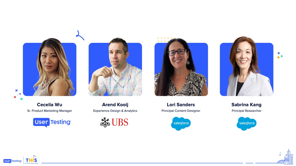
Arend Kooij
Experience Design & Analytics, UBS
Sabrina Kang
Principal Researcher, Salesforce
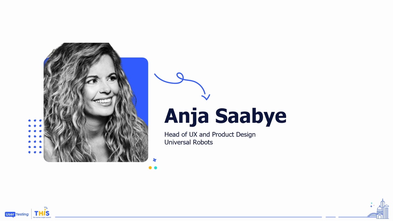
Lori Sanders
Principal Content Designer, Salesforce
Learn how Salesforce rapidly adapts to rapidly evolving markets by integrating customer insights from content, research, and design, and align them with business objectives. Join Lori Sanders, Principal Content Designer at Salesforce, Sabrina Kang, Principal Researcher at Salesforce, as they discuss perspectives from content, research, and design to make customer-focused decisions. This panel will discuss how leveraging qualitative and quantitative data, iterative testing, and cross-functional collaboration can transform your approach to UX.
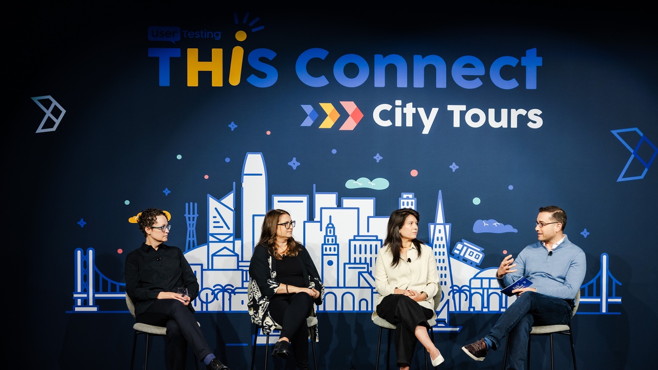
Please help me in, giving all of us a warm welcome onto the stage, and we'll begin the panel.
Woah. It's just a wheelhouse.
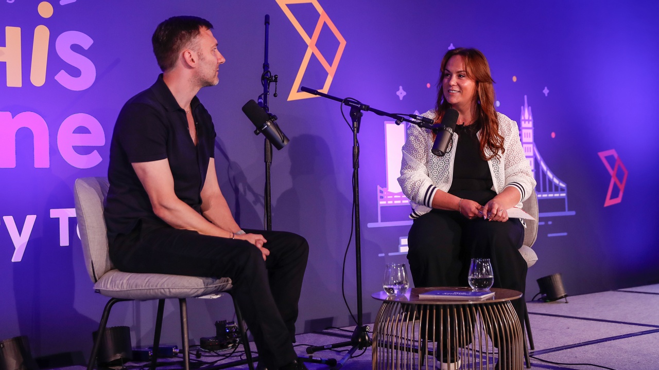
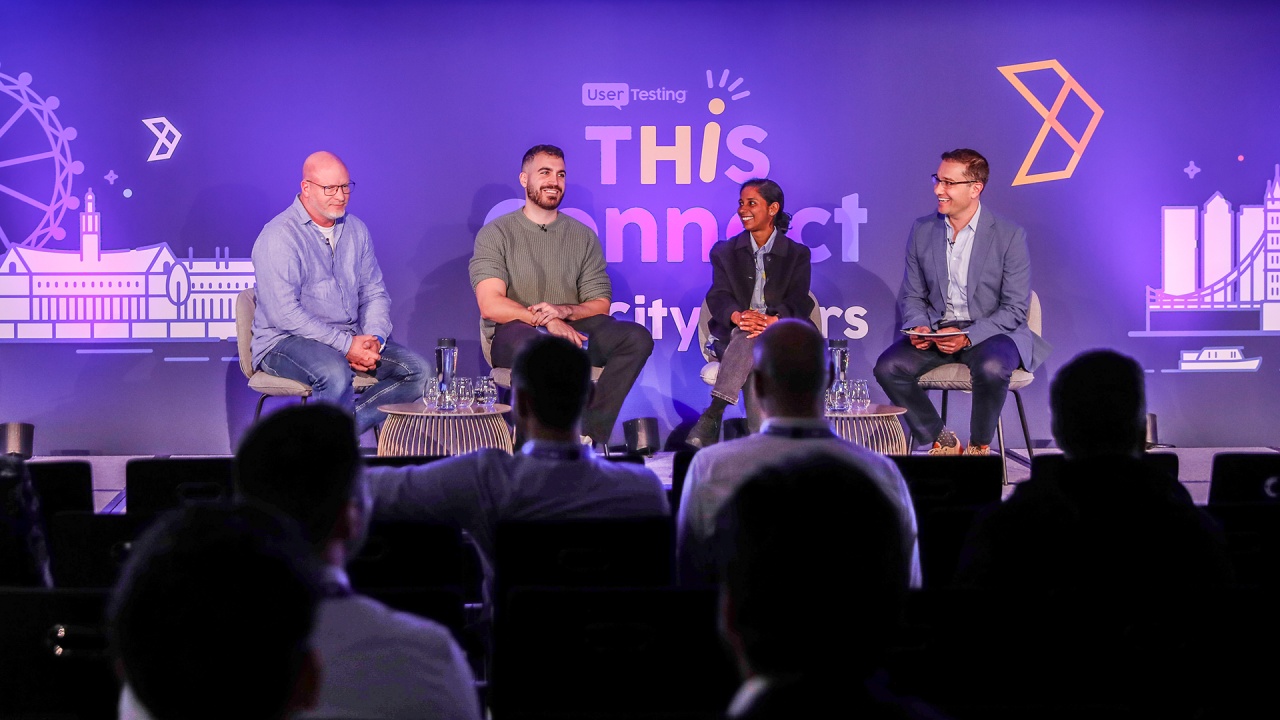
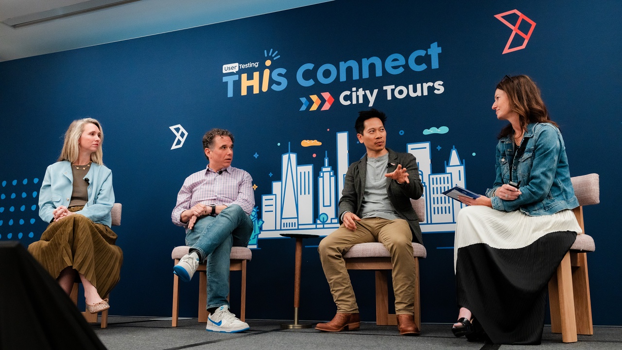
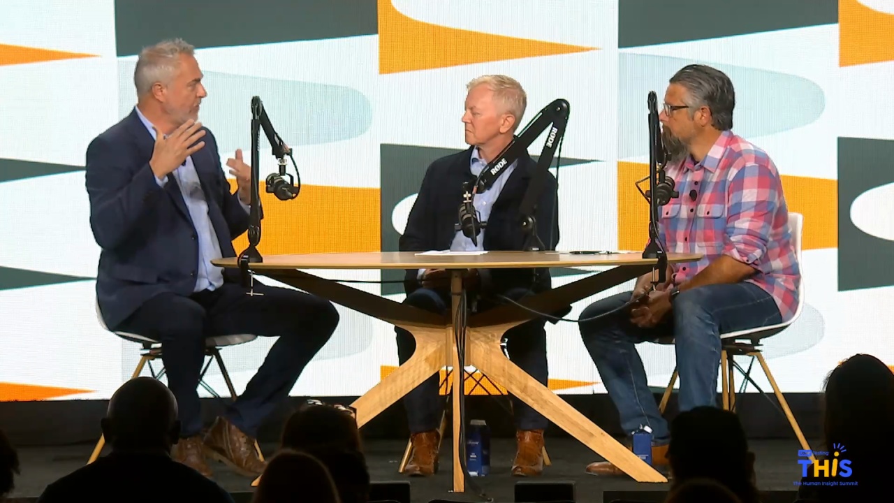
Alright. Thanks, everyone. Excited to be here. In our panel today, I've invited some speakers from UBS and Salesforce to talk to us about their perspectives in what it means to integrate content, research, and design into creating truly personalized and, customized experiences for some of their customers.
To start us off, I'm going to have Laurie share some of her thoughts, on how and why it's become an increasingly important, focus at...
Please help me in, giving all of us a warm welcome onto the stage, and we'll begin the panel.
Woah. It's just a wheelhouse.
Alright. Thanks, everyone. Excited to be here. In our panel today, I've invited some speakers from UBS and Salesforce to talk to us about their perspectives in what it means to integrate content, research, and design into creating truly personalized and, customized experiences for some of their customers.
To start us off, I'm going to have Laurie share some of her thoughts, on how and why it's become an increasingly important, focus at Salesforce to focus on content design. And then we're going to start bringing Erin and Lori Erin and Sabrina into the conversation to share some of their perspectives on what they are doing within their organizations to provide personalized user experiences.
To start us off, I'll, start us off with some introductions, with Aaron.
Hey, guys. My name is Aaron Coy. I'm on the experience and design team, experience design and analytics team at UBS. I have been for about two and a half years. I spend most of my days doing, quantitative and qualitative studies and, digital strategy, for the most part in a banking and investment type sense. Prior to that, I was at a smaller agency who built investor investor relations type websites, stock tools, stock tickers. So I'm really deep in the, digital strategy, user experience, finance world.
Alright. And Lori?
I'm Laurie Sanders, principal content designer at Salesforce in San Francisco.
I design content experiences for our ecommerce and subscription management app. I was a technical writer for many years. And early on in my ten years at Salesforce, I started specializing in UI content, and I found that content is better when it's designed for. So as soon as content design became a role and a function at Salesforce, I made the switch. And user testing is a really important part of what I do, especially thanks to Sabrina for bringing it to our team.
Thanks.
Hi, everyone. I know this is the home stretch, so thanks for your engagement. I'm Sabrina Kang. I'm a researcher at Salesforce.
I've been at Salesforce for about three and a half years.
I have the privilege of leading a content research practice, which is pretty unusual. A lot of companies don't invest in content research.
I feel like this is a dream job for me. I was a longtime journalist before, transitioning into technology. And, the techno the CX, the content experience team, is not a customer experience at Salesforce. It's called Content Experience CX. It's about five hundred plus folks, so it's a big team. It's very healthy.
So I'm excited to be here.
That's amazing.
So to start us off, I know, we'll start with Laurie. And, you know, Laurie, your your title is content designer at Salesforce, and I know that's a title that, you know, we all may have heard of, but not all of us have had exposure to in terms of having access to a role of a content designer on our team or having worked with a content designer before. So I'd love to, you know, start off with asking you to share, you know, why do you think it is that, you know, at Salesforce, you're seeing such a focus on, you know, on doing content validation and content testing, and, you know, some of the tests that you've been running, to test content design.
Well, that's a great question, Cecilia. And I in terms just backing up a bit to quickly define content design, I like to define it as it is UX design with a specialization in content. That's sort of the short answer.
And a slightly longer definition would just be that we design the experiences that our users have with content. We make content decisions that are data driven, and we write content as part of the design process rather than after it. So that that part of it really explains why we started this function at Salesforce. It's not new in the industry, but it started at Salesforce about three years ago.
And the idea is that, the content is going to be better if it's thought of in the beginning during the design process. It used to be that the UX designers would design everything, maybe have some placeholder text in there. Any user testing and research that was done was on essentially placeholder text. It was not actually written by our content writers until later on when our our technical writers were done writing all of their product documents for the release.
We would then jump in and write all the words and sort of fill in the blanks. And that's really not a great way, to provide the content. So that's the idea is that moving it to the front of the process, it's enmeshed in the design. In fact, in some cases, we're writing the content before the visual design is done because it may be a very content heavy interface, and we need to figure out what all the content is first before handing it over to UX to design it.
So it's a very different way of doing things. Also, Sabrina said we have five hundred on our content team. Right now, there's fewer than ten of us who are doing content design, so it's still something we're trying to grow.
That's awesome. And I know that you have some slides prepared to kind of share some of the testing that you've been doing around this.
So whether you're a UX designer running a user test on your design or a user researcher conducting a focus group or a product manager giving a demo, you're testing content, whether it's intentional or not. And that's because designs have words, and humans rely on words when they're asked to review a flow or perform a task. And placeholder text doesn't give you very valuable insights. It can actually distract or derail the user from what you're trying to learn.
And that's why it's so important to make sure that the content in your design is intentional. Ideally, if you have a UX writer or content writer or content designer that you're working with, make sure you have them provide the content in your designs before you put it in front of users. And that way you make sure that any feedback you get on the design is, going to help holistically, the overall design and not just the visual aspects of it.
Words have the power to guide the user to the right actions, such as getting a discount or confuse them into missing out on their savings.
Just the right amount of levity in a message can make a moment like waiting for a a payment to go through slightly amusing instead of irritating.
And an error message for that that will help a user correct the problem rather than just telling them what went wrong helps get the task done.
Sometimes we test CTAs, button labels. So a button for initiating a purchase flow could say buy now or ready to buy.
A button for setting up a feature could say configure or set up.
To apply a promo code, a user could click apply or apply a promo.
Subtle differences in wording can mean big differences in usability.
But when you're instrumenting a test that compares two options, it's important to avoid or minimize order bias, and that is users favoring one option over the other simply because it appears they see it first or last.
And to do that, you can in user testing, you can use group a and group b tasks so that half of your users see one option first, the other half see the other option first.
Also, when constructing a user test comparing two options, avoid asking questions like, which one do you like better or which one do you prefer? I've these are all things I've learned from Sabrina.
And instead ask them more tactical questions like which one helps you perform this task? Which one, makes you more likely to make this purchase, for example? Or which one, makes this task easier to understand?
Or better yet, in some cases, simply ask them to perform the task, watch them, and listen to them talk through it as they go. Because as we know, often the real gold of a user test is in the talk track, just hearing what they say as they're going through it without us asking direct questions.
So instead of asking those questions, we could say things like go to this page and think out loud. Tell me what you're seeing.
So here's, an experience that I tested with promo codes in a checkout flow.
And users were able to hover on that info icon to get information about the discount they'd be getting.
And then we had them add some things to their cart that they'll be getting a discount on.
And they saw a message confirming that it was added to their cart.
And they were able to open their cart and see that they're now able to apply a promotional savings.
And we wanted to test this to make sure they noticed that they could apply a promo code and get a nice celebration moment with confetti at the end of it, and then place their order with a savings message throughout. So part of why I tested this was I wanted to make sure that that savings message of how much they're saving, the whole savings story was seen as reassuring and not annoying or repetitive. And in fact, as it turns out, people can't get enough of hearing how much money they're saving, so that was not a problem.
And it was reassuring to know that they most users did click that apply button to get their discount. Some of them did not, but interestingly, we popped up a message to say, don't miss out on your savings. So we reminded them, and the the the app reminded them as they were going through it, those users who forgot to apply the code but they got a message were just as satisfied with their purchase and their discount because they felt that it was taking care of them and making sure they didn't miss out on their discount. However, like I said, subtle differences in wording can mean big differences, so I did end up changing that button to say apply promo rather than just apply to make sure people didn't miss it.
So simple things can spark delight in an experience like confetti. Of course, it's to be used sparingly, especially at the end of a challenging task. And it's not that this particular flow is that difficult, but when you think about what the users are doing, they could be making a big purchase. It can be very difficult to select products and figure out what they even need, how many users, how many licenses they need.
And then, of course, spending money can be painful. So we wanna reward them for that with a little confetti, a savings moment. And it's important to make sure that the voice and tone of your message matches the visual experience. It would be a little silly to have confetti in a message that says transaction complete.
So this was something I wanted to test as well to make sure it was landing. And in fact, people did like the confetti in that celebration moment.
That's awesome. Thank you so much for sharing some of the tests that you've been running to help us all spark some ideas, as we're going through this. But I think I also really like the focus on how, you know, it's not just about testing the words on the page sometimes. It's about how do you integrate content into into the flow and, you know, into all the way at the beginning of the process.
So Sabrina, I know that you work closely with Laurie, so I'm actually going to start with Aaron to bring him into the conversation first. And, Aaron, the question that I'd like to ask you is, you know, from your perspective working in design and digital at UBS, how are you seeing the role of content in, creating some of the, you know, when you're considering how to create, user experiences?
Mhmm. That's a great question.
In terms of content design, I think my industry, finance, has a few noteworthy aspects that differentiate it from maybe under other industries.
So, sure, we still care about the labels, buttons, things like that that you just showed us in your screens.
But a huge portion of our content is actually numerical or charts and graphs, actually. If you think about account balances or returns on investment, yields, budgets, all that sort of thing, it's really hard to convey properly without numbers and graphs. So we spend a lot of our calories trying to, perform research and workshops, discussions, things like that to ensure that those numbers and those graphs are telling the right story, that our clients have the right are are we giving them the right data so that they can make proper decisions so that they can complete even basic tasks?
That's number one. Number two, you know, it's also a very regulated industry.
I I would imagine everyone in this room has probably logged into their banking app or their brokerage account and seen just a wall of disclaimers and and fine fine font stuff at the bottom.
Is required, but it's kind of a balancing act because we're constantly trying to find a way to display that in a way that's digestible, but at the same time, non intrusive and not, irritating.
And then, I guess, to go, to answer your question about personalization, we usually think about our clients in terms of personas and and kinda bucket them based on characteristics.
I'm sure many of you do the same. In our case, for example, we might have identified a group of users that are particularly financially literate and then others that are maybe not so literate.
I should say financially literate, but they can read, but usually.
And, you know, there's a lot of considerations that come into play with that.
The financially literate group might be looking for something with much more robust data sets that they can actually dig into the weeds.
Maybe they're looking to kick the tires on their strategies, things like that. Whereas the other group, they just wanna check their account balance and get out. So, certainly, aspects like that have to be considered when we're talking about, personalized content.
I think I'll leave it there for the next Yeah.
I love it. Sabrina, any crossovers?
Yeah. I would just say, I'm really fortunate to have Aaron's perspective, and it was, like, wonderful flashbacks. I used to work in financial industry. I have some of my colleagues here from my days working in finance. I also worked in health care. So I feel like what Erin said just hits home, which is at the end of the day, it's just really understanding your customer.
Where we're at at sales sorry. Where we're at Salesforce is such a different, persona base than what Aaron, had shared, right, about the the very sophisticated investor to someone like me who just wants to understand whether their checkbook is balanced.
But if you, as researchers out there, know your customer, you're gonna be successful. Right? I mean, that's the the bottom line. And I feel like the research that we've been doing at Salesforce is a balance. We use user testing. We're constantly doing unmoderated tests to just understand trends, but then we go deep as well doing one on one interviews. And just understanding that breadth and how every industry is a little bit different, it just gets down to the customer.
Fantastic.
Alright. So to follow-up on this, I know Sabrina and Laurie, you two do work very closely together at Salesforce.
I'd love to dig a little bit, deeper into that and, you know, learn about, you know, what are some of the things that you're doing to make sure that, you know, you're integrating both the content design and research perspectives into how your teams and the organization is making decisions?
Yeah. I I can start. I mean, most, if not all, of the user tests that I run, I collaborate. I'm fortunate to be able to collaborate with Sabrina on, and it always, shifts my plan a little bit at least, if not a lot, to make sure that I'm getting what I'm really looking for and asking the right questions.
And so I'll usually start with before I've, started instrumenting a test at all, I'll meet with Sabrina to find out, like, how do I get this question answered? This is what I'm trying to learn and really define that. And then she'll ask me to, you know, make a make a test plan and decide what I'm going to test. And then, usually, I can run with it.
I I would say the the easiest part of it at this point is using the tool. That was kind of a one time thing to get up and running and figure out how to use the platform, tactically, but now it's just a matter of how do I get at what I'm trying to learn.
So there's one of me and five hundred plus content folks. So, I was fortunate enough to get our leadership, the CX leadership to invest in user testing.
Mhmm.
So, so Laurie is one of the most active, users of user testing on the CX team, but we have about half a dozen folks that have access to user testing. Mhmm. I'm part of a larger organization. I'm Salesforce is really interesting in that research does not ladder up to UX. Mhmm. We have research and insights, which I'm part of, which is part of strategy and operations.
So we are helping build the road maps for our different products across Salesforce.
That team, I'm part of a hundred ten plus, team for research and insights. The content experience team, as I shared with you, is five hundred plus folks or so. So I'm doing a mix of managing, supporting the folks on CX to do their own research. We heard that a lot from the US Bank example earlier.
We're doing some of that. And then for myself, I'm doing a lot of, kind of deeper analysis, quantitative, research using user testing and other tools to help, drive the road map for the content experience team. And that's kind of, I would say, the model for, a lot of folks on the research and insights team, but the CX team in particular, I will just do a shout out that they're very engaged and want to do their own testing. And we also have the UX team at Salesforce who also has opportunity to work with user testing, and they're doing their own testing as well.
Perfect. Hopefully, that helps answer that question and how it it it's driving product strategy and also helping the team on the ground do their own testing.
Yes. I love this, you know, two roles that both you and Laurie play to set each other up. Right?
Mhmm.
Awesome.
So our next question, is for all of you on this panel here. So, you know, what I'm hearing through, you know, as a common thread through all of these discussions is, you know, Salesforce is really, investing in content design, and so is UBS. And, you know, companies are really overall stepping up their game to personalize and, you know, create craft, you know, better and better experiences for their customers.
So question for you all, you know, as, you know, you've all become experts in the fields that you're now in, how has how has your approach changed over the years in, you know, designing for the right experiences?
And, Mirren, do you wanna oh, Laura?
I was just gonna say I would say that it's more data driven at this point, so I still rely on my experience and instincts as a designer and as a writer, but I try to push myself to get the data to back it up.
This helps with a lot of things. It can help when, you know, as a designer, we we wanna make a decision and we get pushback, we get, you know, sort of people arguing about it. And it's like, okay, well, let's go dig in dig into the data and find out. You don't have to take my word for it.
It's also things where it's like, I don't know. Let's ask the users. And so I think I I have learned to be more curious and genuinely want to validate and want to know if this is the right approach or not. So that's that's one way that I I've evolved over time.
Like it?
Yeah. And I I, I think the best way to answer this is just kinda describe what I've experienced at UBS in terms of the evolution of our research because I think it's it's actually really awesome, and a lot of companies could probably do well to, maybe leverage some of the ideas that I'll share with you in just a moment.
So we started, if you rewind back several years, like many other companies probably do with essentially zero in house research and using external parties to basically do research for us, and then slowly start building a small in house group of researchers.
And at the time, it was really reactive, and we were basically just taking orders from certain stakeholders and, very, very narrow focus on a very specific objective.
Fast forward to today, and we've expanded the research team to a well, you can tell by my title in the experience design and analytics team, we now combine researchers, designers, analysts, several other other type of, expertise in the same team. So we have many different perspectives, a lot of diversity there that I think have done very well in terms of, the performance of our studies and just the the broad, broadness that we can attack with this level of expertise.
And in particular, one of the changes that that we've seen is we're not so reactive anymore. We're very proactive. And instead of just waiting around for other groups to send us requests for certain studies, we actually have developed our own research agenda. We have our own topics.
We have our own themes. We have things that we think are very important that the company understands. And rather than attacking them one question at a time, we we try to, kinda triangulate on certain answers. So instead of just relying on a single tree test for a navigation exercise, we'll also do a card sort and peer interviews.
I'm looking at what our competitors are doing and, you know, five different sources all playing into the same theme so that we can have a more well rounded, understanding of what's going on here.
So I think that, for those reasons, we're really excited for the future, and, that evolution has been really successful for us so far.
That's awesome. So we're seeing you know, we're becoming more data driven, and we're becoming more holistic and proactive in integrating approaches. What about, what about you, Sabrina?
I don't know. I mean, the the only thing I would add is the elephant in the room, which is AI.
So I think for as a research team, we're thinking a lot about what are the things we wanna offload, and have an AI assistant help us with.
I think that the content team, you know, let's face it. Content is one of the first use cases where so we're we're thinking about how do we best use AI tools to still drive customer success and also drive up productivity, but also make sure that the content team feels like they're still doing their best work. So I would say that's the big elephant in the room. I mean, I think I echo exactly what Laurie and Erin said, but I think it's important to, like, address that because I think that's gonna be the big change when you when the slide is all around, like, hey. What do we see on the horizon? I mean, we can't ignore AI. Mhmm.
It's true.
Alright. And, Aaron, any anything to say upon this, maybe internally or externally for UBS?
Yeah. I guess in terms of of AI, we certainly are we're no strangers to the fact that this is probably gonna be pretty revolutionary in a lot of ways. I think at the moment, we're already seeing ways we can leverage this internally in terms of improving our processes, making things more efficient, at least at least internally. Externally, I think, you know, we're certainly exploring options, as many of the other financial institutions are at the moment. You can imagine, you know, I was mentioning the regulatory and compliance strictness that that we adhere to.
You can you can see how it might get difficult to have AI accidentally suggest to you an improper investment or something like that. Certainly, a no go. So I think they're being a little conservative on that point. It might take it might take this industry a little longer to have front facing or client facing AI applications in that manner for some time still, but, it's certainly coming.
Yeah. I love it. Thanks for sharing all of your perspectives.
And now I think I'm going to turn it over to you, the folks in the room, because I know that we have a few minutes left to spare, and we've come to the end of our prepared questions. I'd love to see if any of you folks have questions for, our panelists here on the stage today.
You can raise your hand, and, we'll have someone come over with a mic.
Thank you all. I was wondering, going back to the point on industry jargon, like regulations, how do you test, what content makes the most sense to your users, and do you test for anything other than comprehension?
I'm happy to start.
I think, like I said at the beginning in my intro, content research, not very many people invest in content research, so I've been able to do a lot of experimentation.
I would say one of the most effective ways is to just have people go through a common task.
And, I love that Laurie referenced that I hate preference tests, especially with content.
I think it's really important to just see if they were effectively able to go through a flow, and testing the the content.
We also, use a tool called Acrolinx, which is supposed to take out some of the jargon. I'm a big believer in heuristics, so making sure that your content is as simple and as approachable as possible. So do that before you even do any kind of testing. But I do think testing a flow and having people go through a task will probably weed out whether certain terminology is jargony and confusing.
Hopefully, that's helpful.
Yeah. We'll do much of the same that you just mentioned. Things like usability tests where we ask them to complete a task, but we'll strategically require them at some point in that task to go through an area that we suspect is maybe problematic. Maybe it uses terms that we're not sure if they're quite gonna get or something along those lines.
Without directly asking them, we'll ask them to complete something that requires them to go through that and then gauge how well or well or not well, they they were able to to do so. Usually, at the end of those, we'll also ask, a number of follow-up questions. What did you think of that experience? Did you happen to notice x y z?
And we do this in moderated studies as well.
Awesome.
Hi. Erin, you talk about, you know, joining your research and analytics practices together at UBS.
We have a huge problem in the data governance. We have four different data centers, including myself with UX research, coming together trying to understand how we can formulate a consistent and, like, single system of record. Can you talk a little bit more about what that process was like in getting stakeholder buy in for just saying, hey. This is something that is gonna save us a lot of time.
Yeah. To be honest, it's probably still a work in progress.
We have buy in from quite a few individuals, but maybe not everyone.
The people we pulled onto our team, like, in particular, we have people who have access to things like, Adobe Analytics and and things like that. And it's still it's still not quite, you know, in one place for everything. We're still having to do some manual checks on, like, reviewing data we get from user Zoom or user testing alongside analytics and then using our own mental capacity to try to decide what's really going on here. It's not quite as seamless as we probably would like it to be in an ideal world. So I don't know if I don't know if I have the right golden answer for you that in in that case. I'm sorry.
I know. I think everyone's going through.
Hello.
I loved your example about the language of apply versus apply promo and how you did the research to to arrive there. As you do that research and you define these different approaches to language, does that make its way into a design system so that as you come across future research, you know, you can you can handle those more com more and more complex questions?
It should. That's a really good question.
Yes. Yeah. We do have design system standards for our UX designers with components that we can drag, you know, in Figma assets, and as well as UI tech standards.
Our challenge is making sure those systems align with each other, but, yes. Yes. We do.
When we find something like that from research that something tested better than the other, it is important to integrate it into our standards. It can depend on context, of course.
Sometimes, like, if the field label were labeled promo code, then maybe the button could just say apply, and that's clear enough. In this case, the the field didn't have a label. So sometimes it depends on context. It's a really good point.
Love it. I think, we have time for one more question. Interesting. Yeah.
Hi there. This is for Laurie.
I'm curious, now that you've started your research journey Mhmm.
What's something you wish you had known at the beginning that you know now?
Let's let's see.
At the beginning, like, when I first started learning how to run How did you do research and do content testing?
I think just being open. That's something I've had to learn more and more over time that I'm not running a user test to prove a point or, you know, to align with what I think the design should be to stay genuinely open and curious. I think that's the challenge because I do have opinions as a designer.
But over time, I have learned to be willing to be surprised.
Like, let's, let's go find out.
Awesome.
Sabrina and Aaron, do you wanna answer that question as well? Any, you know, if you were to start your journey over again, is there anything that you would tell yourself to do differently?
I think maybe when I was still pretty green, I I probably thought that there was an end all be all correct answer for everything and and that a project would be done at some point. And, yeah.
So, you know, the reality is the way I think about websites and apps and that sort of thing now is they're they're really, like, living, breathing organic things that grow over time, and you're never really done with them. You can always be improving. You can always refine something, new features, stuff come out all the time. So, I think I think it took me a moment for that to sink in, and maybe I'm a better researcher for it.
Awesome. Sabrina?
Yeah. What would I do different? There's plenty of things I would do differently.
I guess adding on to what Erin said, I I think that, there's a tendency to be very, hold tight to a methodology or hold tight to, research goals.
And I do think that a lot of folks, that I work with, they don't even understand the power of research.
So so much of it is being very open and being collaborative and being okay with that research plan evolving or your study going a different direction.
So I didn't I think I was so worried about this is a career switch for me, so I was a long time journalist. I've only been doing this for about ten years. So at the beginning was, like, proving myself.
And I think it's really important to have that beginner's mindset and being okay with, like, saying, hey. I need help or, hey. What do you think about thinking about this differently?
Lovely. Lovely answers. Well, thank you everyone for joining this session. Big round of applause.
