Eight succinct examples of beautifully concise product copy

A few months ago, we published our top ecommerce trends of 2018, which featured some of the things we’re seeing (or would like to see) incorporated into online retail sites. In this round-up, we’re going to delve deeper into one of those trends: product copy and the art of giving you just enough information!
As Patrick Foster says in his article on product copy from last year:
“Give them enough of the right information—and not a drop more. Being armed with the information you need takes the effort out of choosing and the stress out of parting with your hard-earned cash.”
So let’s celebrate the art of brevity with these examples of product copy that doesn’t muck about, and by writing the shortest introduction I’ve ever written in my life.
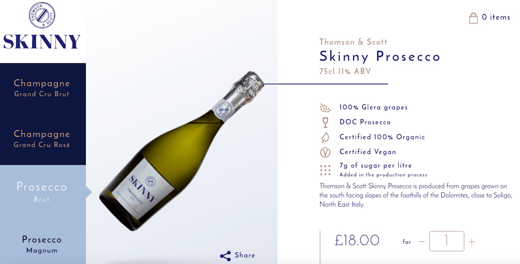
Thomson and Scott
The UK based adult fizzy-drink retailer gives you just enough information about their range of Champagnes and Proseccos, delivered with clarity and a lovely use of symbols. Is this enough to persuade you to part with your cash?
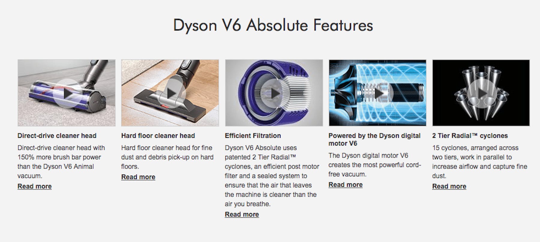
Dyson
It would be very easy to get lost in the technical specifications of a Dyson vacuum cleaner, so their product pages are a model of restraint…
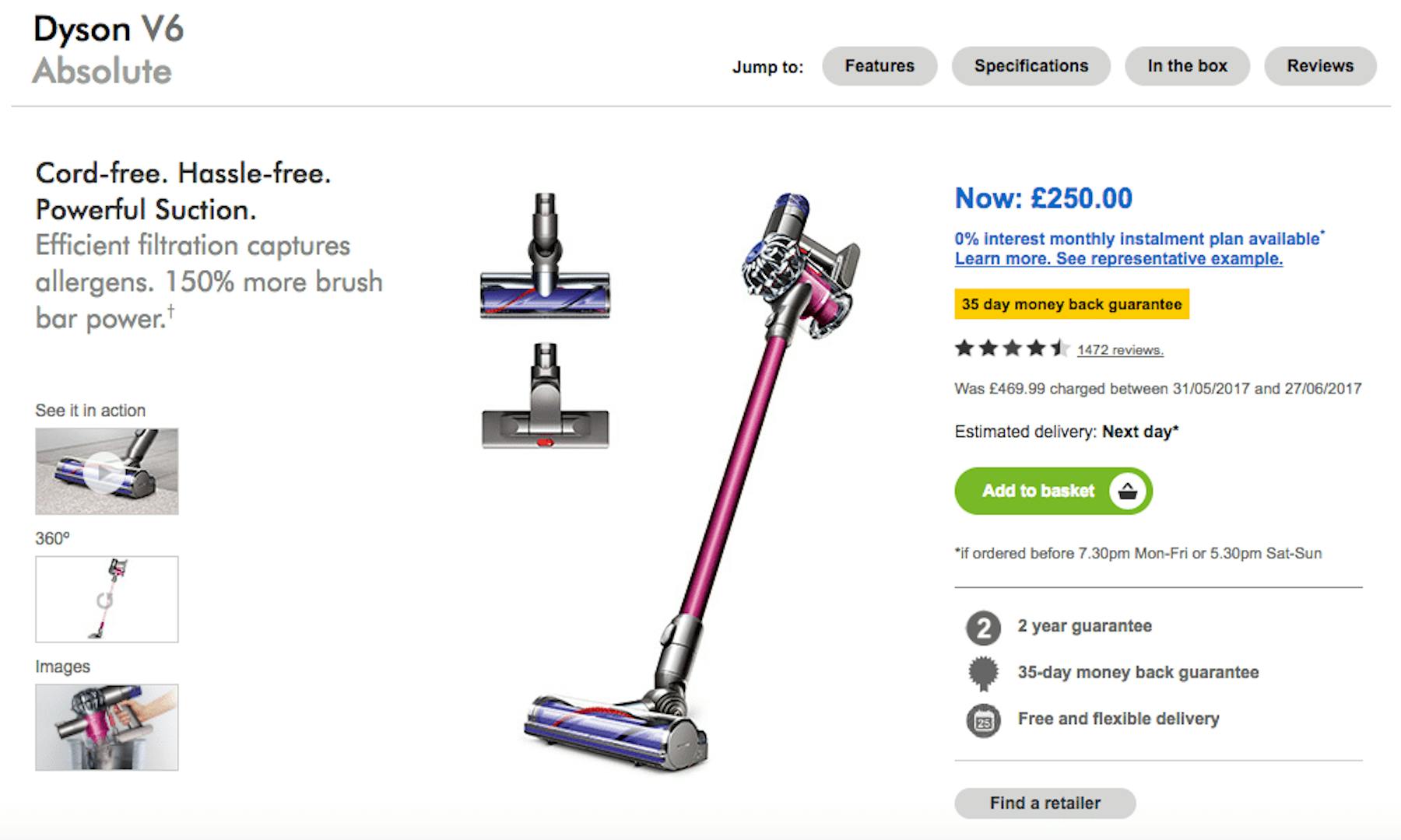
For those of you who demand more info, each technical aspect is highlighted in a series of explainer video.
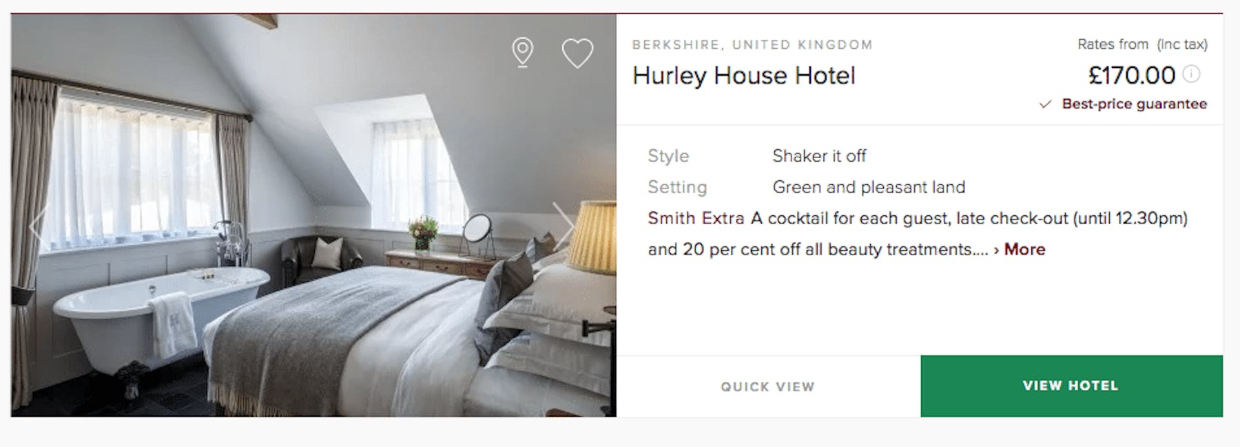
Mr & Mrs Smith
Mr & Mrs Smith strips down its search results to the bare minimum and adds a particularly interesting feature that wouldn’t be found elsewhere – a list of exclusive treats for members. This takes up the most amount of text real estate.
Is this enough to persuade you to click through? I do like free cocktails.
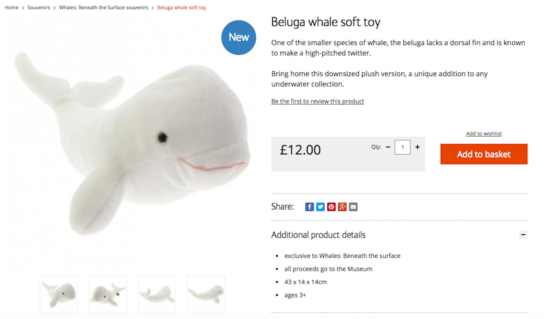
The Natural History Museum
Ben Davis from Econsultancy wrote a brilliant piece about the quality of Natural History Museum’s product copy. It covers in detail how the copy is customer-focused, SEO friendly, fun and yet scientifically accurate.
He’s not wrong… hey, I learnt something.
Firebox
Firebox delivers key-bullet points covering exactly what you need to know about the product at a glance – and these are surprisingly well-engineered to deliver important technical information in a fun and concise manner.

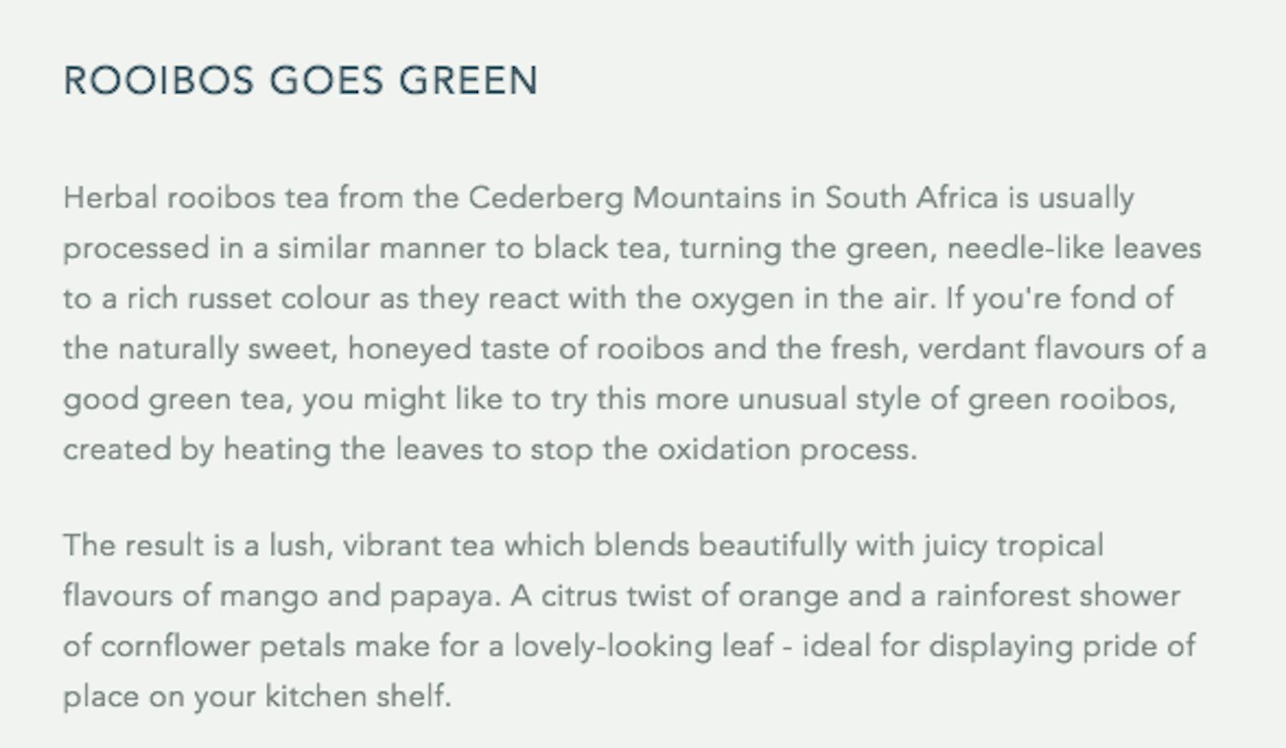
Whittard
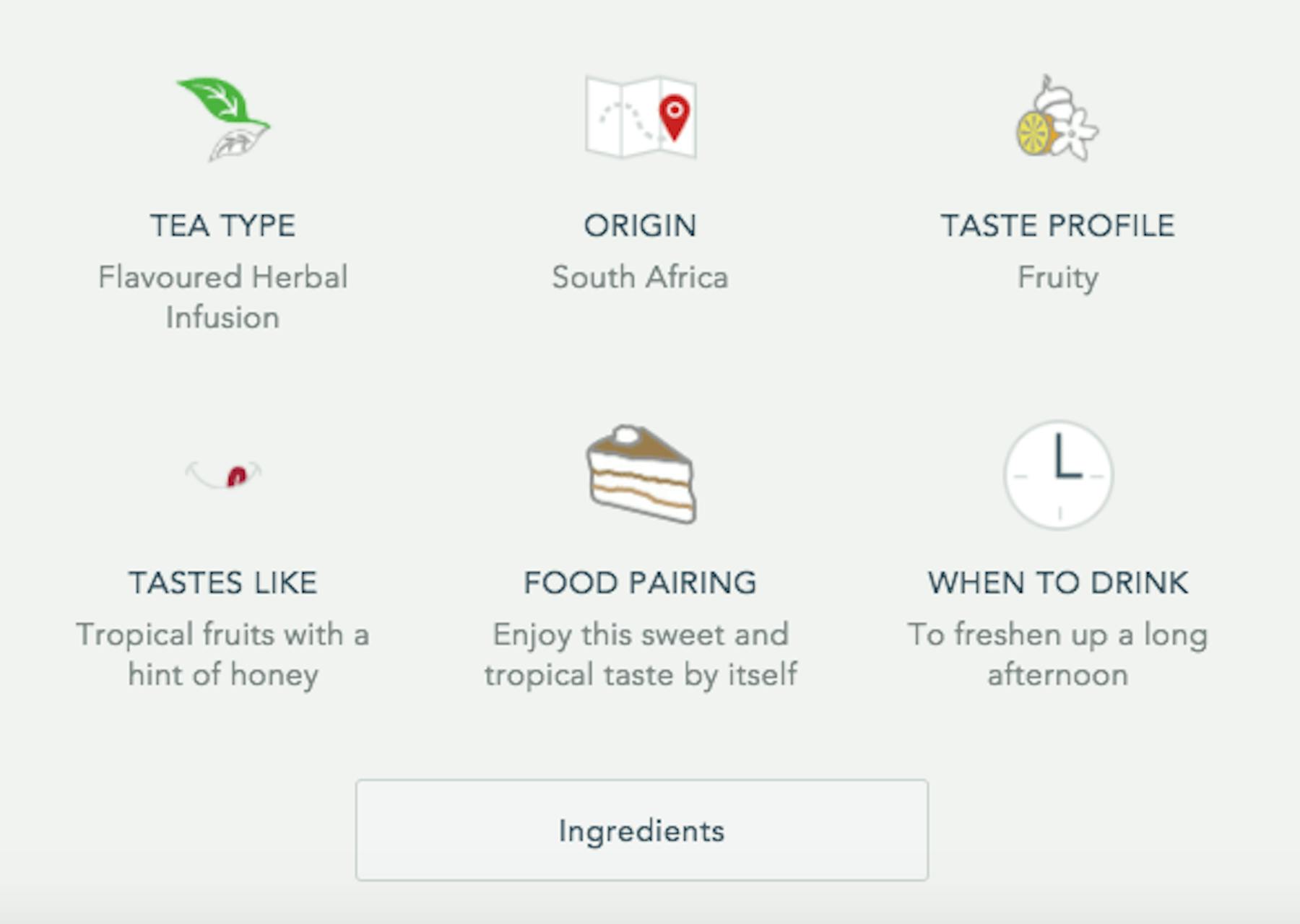
Whittard has a similar problem as Skinny, or indeed any food or beverage retailer, in trying to describe flavour without either getting lost in pretentious, off-putting language or not giving enough detail. However Whittard balances detailed, accessible product copy with some easy-to-glance details lead by consistent symbols across the site.
Creepy Co.
The Chicago-based purveyors of all things playfully-spooky deliver massive product images and all the information you’ll ever need about its pins (size, material, clutch-type). As well as clear information on when this item will ship, and what to do if you want other items sooner.
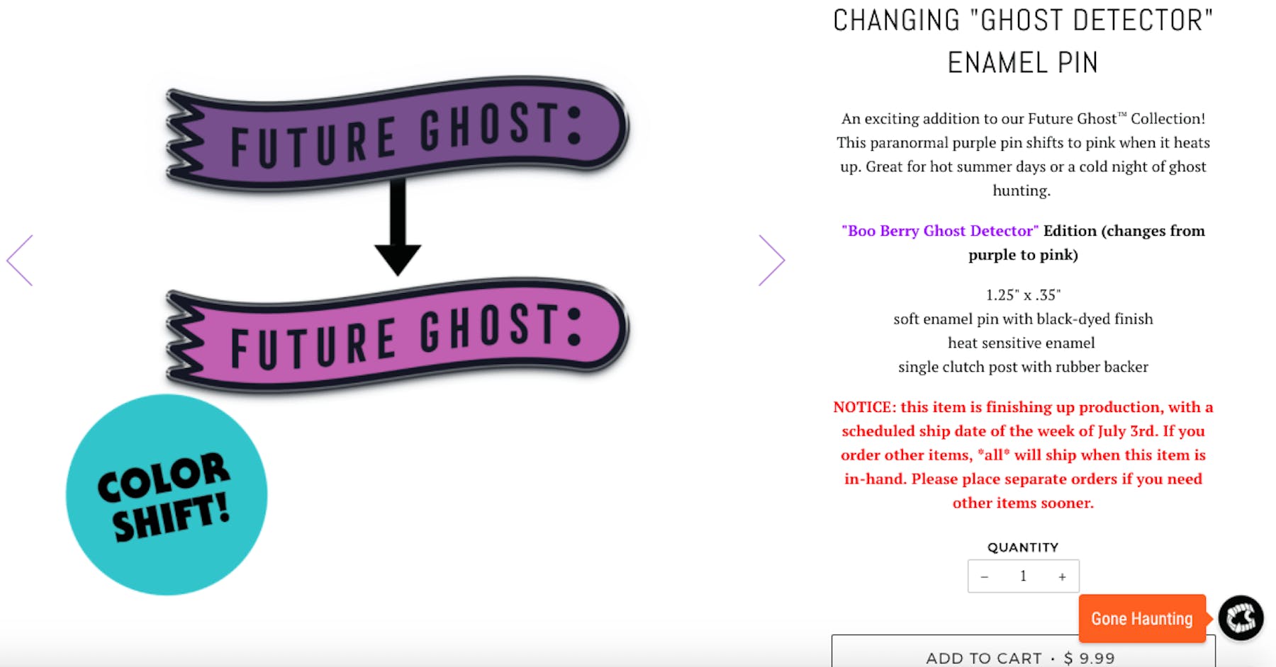
Also they call the shopping cart ‘your coffin’, so bonus points.
Chubbies
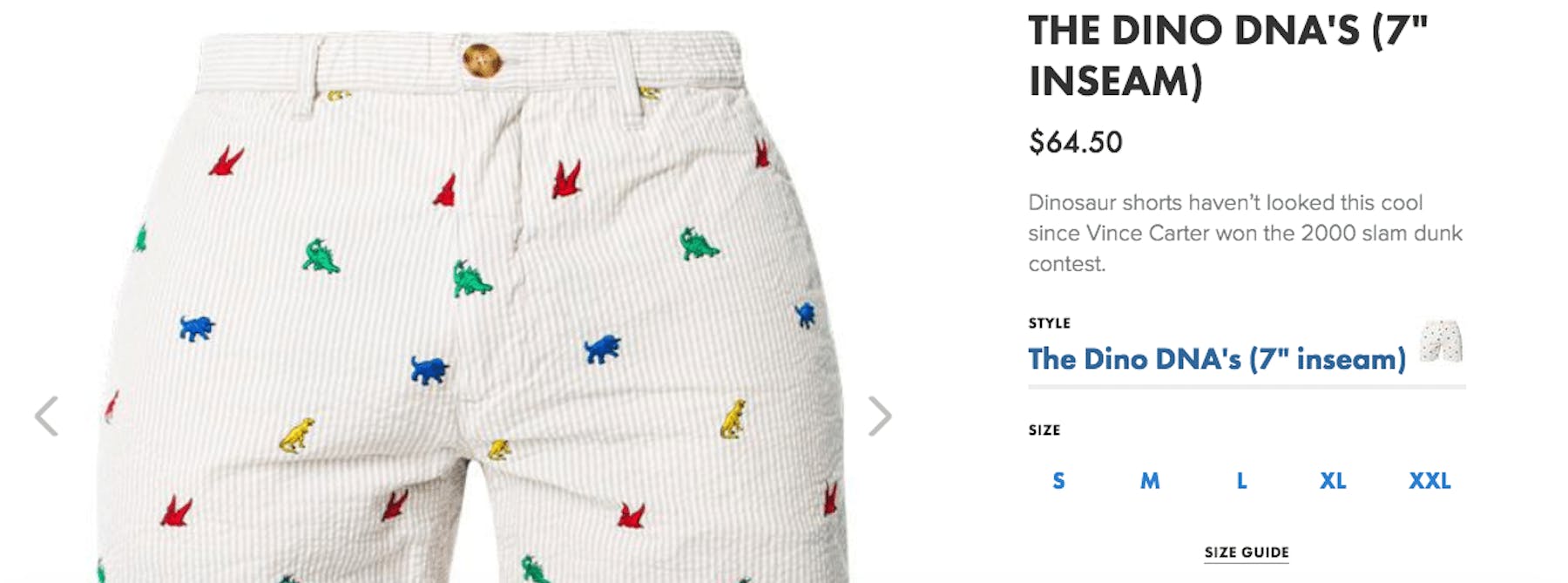
I don’t know who Vince Carter is or why this relates to dinosaurs, but I like it.
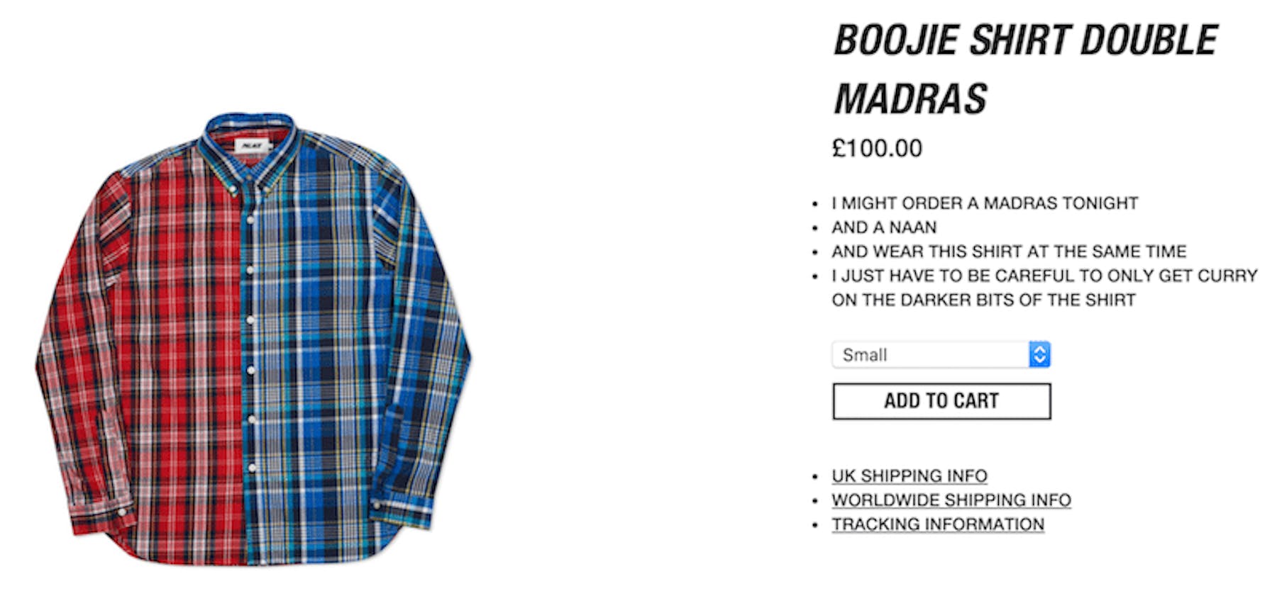
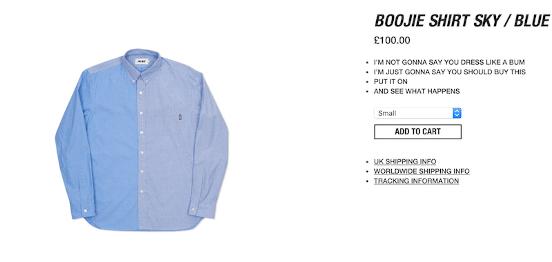
Palace Skateboards
And at the extreme end of the scale, we have Palace Skateboards. I love Palace Skateboards. I would buy these clothes just because of the copy. Copy that doesn’t tell me a damn thing about the shirts, which could be made of old bin bags for all I know. But it wouldn’t matter. I’d still be chuckling to myself.
