Save time with machine learning-powered data visualizations

Analyzing qualitative data can be time-consuming. Typically, we must watch session videos one after the other to find the moments that help us make the right decisions. Visualizations, however, unlock insights by presenting data in new ways—highlighting patterns and anomalies, showing connections, and helping us find meaning in results. UserTesting’s machine learning-powered data visualizations let you see data from multiple participant sessions side-by-side, making it faster than ever to identify the most interesting moments and uncover actionable insights.
Sentiment path and intent path: discover participants’ actions and sentiment at a glance
Interactive Path Flows display interaction data from each participant’s session into a flow visualization, mapping participants’ paths and letting you quickly identify behavioral patterns.
With the addition of sentiment path and intent path, you can also see the sentiment participants expressed and their intent when going from one screen to another layered directly on top of the Interactive Path Flow. Rather than watching videos one after another, you can focus on moments with more positive or negative sentiment, or just on areas with unexpected behavioral patterns.
Sentiment path
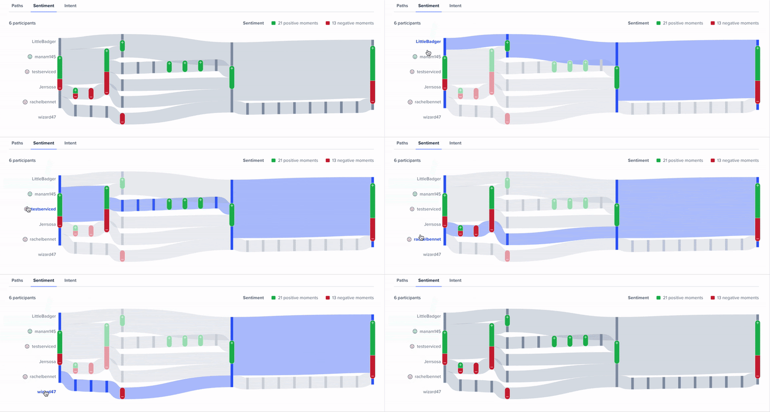
With sentiment path, we can see exactly where participants expressed something positive or negative about their experience. As an example below, we asked participants to explore the UserTesting online store, find something they liked, and add it to their cart.

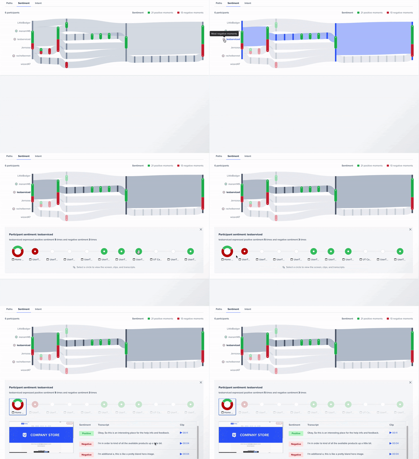
As you can see, we can easily note the areas with positive and negative sentiment (based on the majority green indicators versus red), and see that participants expressed a bit more positive than negative sentiment about the first and last screens. The red in these areas may indicate pain points, and to find out more, we can explore the individual screens by hovering over any indicator:

Diving into the last screen, we see that five participants expressed sentiment about it—two with only positive sentiment, two with mixed sentiment, and one with negative sentiment. Clicking a participant’s donut chart lets us see their transcript and watch their videos, so we can discover why their experiences were positive or negative.
We can also follow individual participants’ sentiment paths. For example, investigating the path of a participant with the most negative sentiment, we see that most of the negative sentiment was around the start of the journey—a potentially important signal for product decisions.

Intent path beta
Similarly, intent path shows what participants were trying to do when navigating from one screen to another. This allows you to discover which participants’ actions and choices—for instance, whether they browse or search, or if they add something to their favorites—correspond to task success, shorter or longer paths, and more.
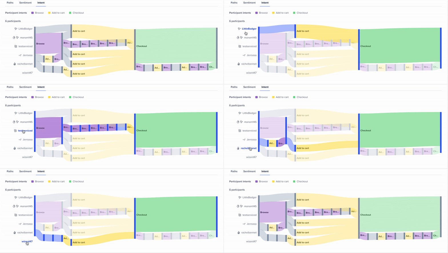
Let’s switch to the intent path for the same task as above.

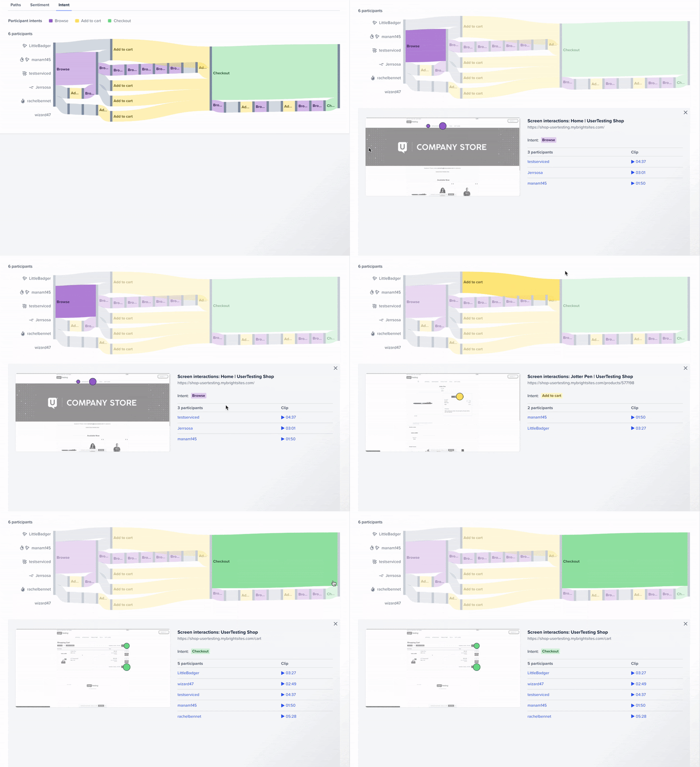
We can see that all participants attempted to find a product by browsing, not by searching. Some participants browsed far more than others. One, in particular, added multiple items to their cart, browsing briefly in between.
In addition, we can dig into each intent and uncover where participants interacted with each screen. This way, we can see which elements drew them to browse or how they added an item to their cart, and then watch the corresponding video clips.

Accelerate your time to insight with sentiment path and intent path
At the heart of qualitative feedback is understanding exactly what your customer or user is experiencing so you can uncover insights that help you improve or enhance their experience. With sentiment and intent path overlayed on top of Interactive Path Flows, you can accelerate your post-test analysis—allowing you to identify patterns and anomalies, connections between participants, and meaning in your results faster than ever before.
Sentiment path and intent path beta are now available with Ultimate and Premium Edition subscriptions.
Related reading: Qualitative heatmaps: how to visualize the frequency of usability issues
In this Article


