
Introducing our holistic score for measuring user experience: QXscore

Nearly three-quarters of digital experience professionals agree that it’s critical or very important to have meaningful UX metrics, but studies have shown that only 57% of them have the quantitative data points to track UX results.
Even though we know the advantages of benchmarking, many companies struggle to identify metrics relevant to user experience and instead rely on indirect measures or outcomes—if they try to measure at all. This lack of meaningful metrics makes it difficult to demonstrate the business value of UX to executives. One study found that nearly 60% of executives admit they don't have the data needed to prove UX's impact on the business.
There’s a need among digital experience teams for a single experience score to share with their team and with stakeholders. Something that would allow teams to quantify experience consistently, in an easy-to-understand way.
It’s a complex challenge: What metrics should be included? How can we create a repeatable benchmarking score? How can we make it meaningful, simple, and easily scannable for the busiest executive?
The solution: QXscore™
We created QXscore, a holistic, easily understood standard for measuring user experience that quantifies users’ attitudes and behaviors into a single score and identifies opportunities to improve.
It can be used to measure user experience progress over time, relative to competitors, or across multiple lines of business, digital properties, and products.

What are the benefits of using QXscore?
Traditional metrics, like NPS or abandonment, only tell part of the story. QXscore offers one score combining behavioral and attitudinal data, with task-level insights.
QXscore is a simple, clear and persuasive tool for communicating user research results to stakeholders and business leaders. Instead of trying to explain multitudes of metrics, being able to simply say, "We had a QXscore of 75 and now it’s an 84 after our latest iteration" is powerful, crystal-clear evidence of UX impact.
It can also be used as a diagnostic tool for improvement. If your QXscore is 75, you can see how it can be improved by diving into specific component areas and their related tasks.
This will help your team and the entire organization understand where to focus and what to prioritize without just using subjective 'gut-feel', and ensure the voice of the customer is used to drive business decisions.
How does QXscore work?
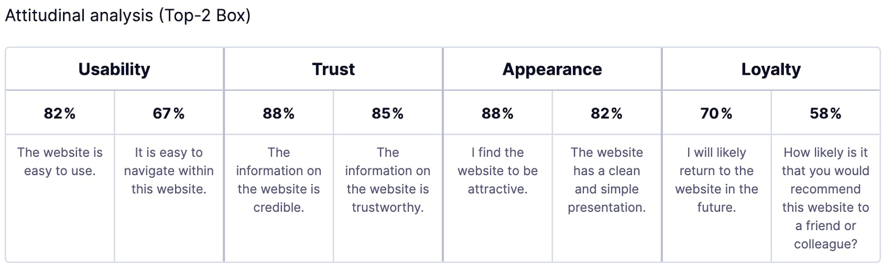
QXscore is the only measure of experience that quantifies both users’ attitudes and their behaviors into a standardized score on a 100-point scale. The attitudinal data includes ease of use/usability, trust, appearance, and loyalty/Net Promoter Score (NPS). The behavioral data measures task success.
What do the results look like?
As the data is collected, we generate a scorecard that looks like this:
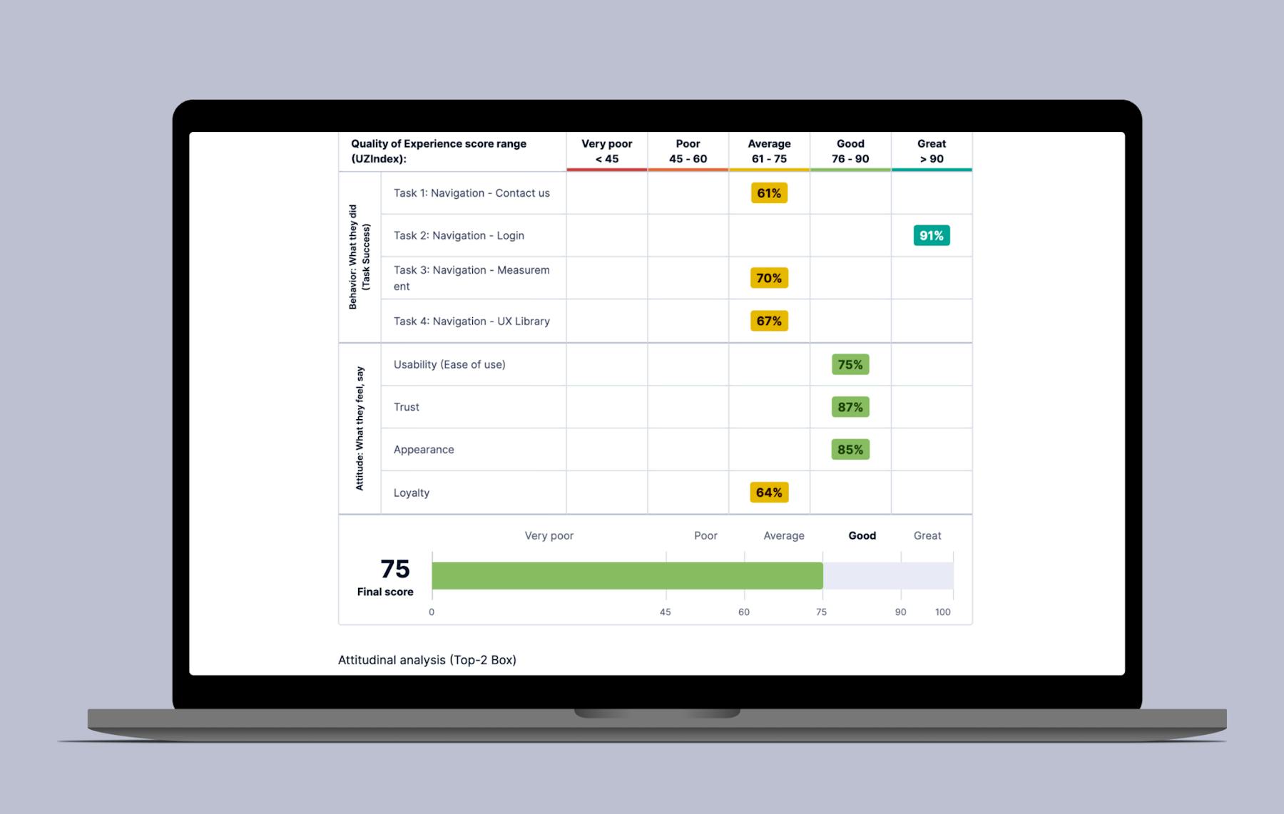
The ‘final score’ of 75 is your QXscore. It’s the single experience score for this particular product. Going deeper, you can see the individual scores for component areas such as trust and appearance. This will help you better understand the overall performance of your product and identify the strengths and weaknesses.
For instance, is your QXscore at the level you expect or is there an area to improve? In the image above, Loyalty could be targeted for improvement. If you've been tracking the score over time, check if it improved or worsened.
Can users complete all tasks successfully or are some more difficult and have lower success rates than expected? Drill into the behavioral data to find the friction points.
After evaluating your data and identifying the key outcomes, start planning your communication to stakeholders and discussions on how the data can inform business decisions.

Get started with experience research
Everything you need to know to effectively plan, conduct, and analyze remote experience research.
In this Article
About the author(s)
Read more


Get the latest news on events, research, and product launches
© UserTesting 2025