12 fascinating UX and user research stats to help your business case

Why does UX matter?
It's a simple question. But even though we in the field know the value, it's easy to find ourselves floundering when stakeholders ask us to "sell" them on it. That's why we decided to pull together as many helpful UX stats as we could to help you build your your case and achieve that all important stakeholder buy-in.
Many of these are from our own UX success studies and our 2019 State of UX in the Enterprise report. The rest are from other respected research companies to whom we are extremely grateful.
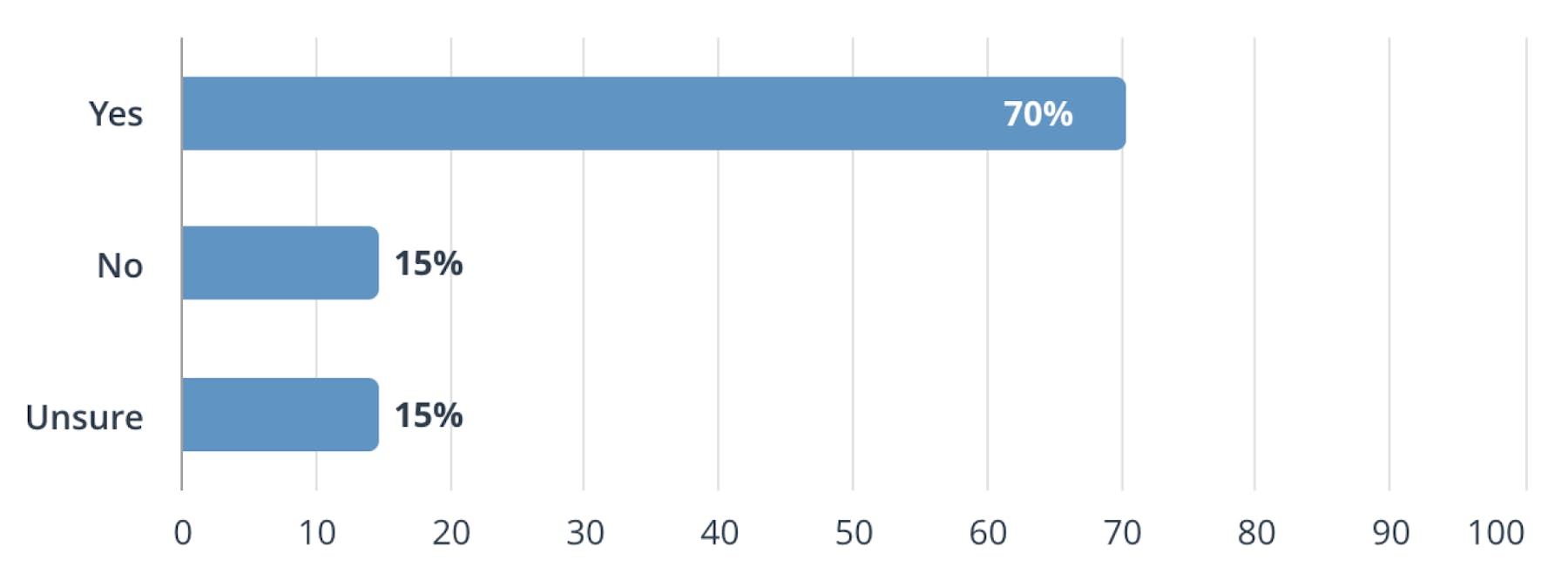
70% of enterprise CEOs see UX and CX as a competitive differentiator
The overall state of enterprise UX is strong and growing stronger, and this is helped by the sudden rise in value of user experience and customer experience within the C-suite. The percentage of enterprise CEOs who see experience as a competitive differentiator has jumped 18% in the last 12 months.

Question: Have CEOs mentioned user or customer experience as a competitive differentiator in the last 12 months?
This is according to our 2019 State of UX in the Enterprise report, in which we surveyed hundreds of experience professionals at some of the largest organizations on the planet to better understand the culture of research and state of UX in the enterprise.
"Mapping customer behavior" is a key differentiator for companies who outperform in customer experience
Of the companies who outperform in customer experience, mapping customer behaviour across all touchpoints is a key differentiator. 88% report that customer mapping had a positive impact on their ability to deliver personalised CX. This is according to Econsultancy’s report, Walking in their Footsteps – The Business Case for Customer Journey Mapping.
Companies who are advanced at delivering personalized customer journeys report the benefits as:
- Improved retention rates (cited by 51% of respondents)
- Increased lifetime value, due to repeat visits, personalized marketing and the trust of the individual (cited by 45%)
- Increased sales (cited by 41%)
Of those companies carrying out customer journey mapping at any level, 87% also said that it helps them identify the gaps between what customers want and what they’re getting.
Information architecture testing leads to less call center burden for ING Spain
A high number of calls to ING’s contact center were from users unable to use the self-service website or app to achieve their goals. This was impacting costs, profitability, and user satisfaction.
By getting feedback from a variety of sources, using web analytics to analyse customer behaviour, and working in Agile, ING was able to quickly add the most pressing usability issues to their design and development stack. ING utilised card sorting and tree testing, to reorder and regroup key product journeys
Now only 0.7% of app users call the call centre to complete their task, and this number continues to fall over time, while a redesigned information architecture and menu structure has reduced the number of calls and complaints related to findability.
53% of consumers feel brands fail to meet their experience standards
Research by Acquia has found a gap between consumers’ experience of brands and marketers’ confidence in their own branding. Although 87% of marketers are confident they can meet the level of experience their target market expects, 53% of consumers feel brands fail to meet their standards.
Most damningly, two-thirds of UK consumers can’t remember when a brand experience last exceeded their expectations and 76% of respondents will switch to a competitor if they have just one bad experience with a brand they typically like.

73% of brands can’t provide a consistent experience across their different digital channels
According to Clicktale’s Defining Digital Experience report, 73% of their respondents say they are currently unable create truly seamless, joined-up experiences across different digital touchpoints, despite being committed to delivering improved digital experiences.
Mobile appears to be the key sticking point here, with 34% of respondents saying they are not effective at uniting data from their websites with data from their mobile sites. This rises to 39% for uniting data from websites and mobile apps.
Fashion e-commerce is the only sector where mobile sales beat desktop
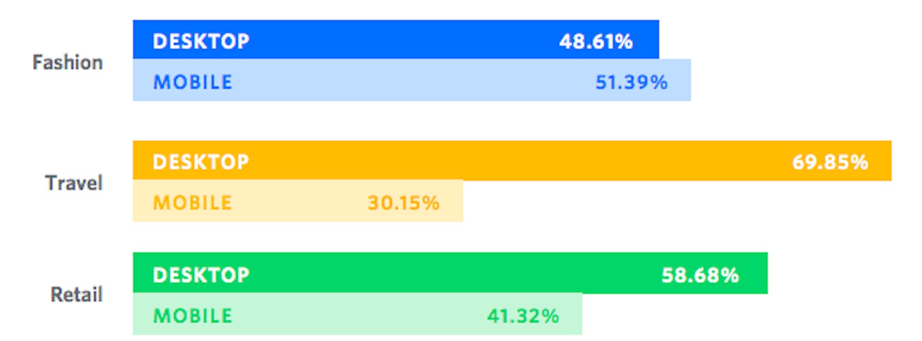
According to SaleCycle’s Fashion Trends ebook, fashion sites attract a greater proportion of sales on mobile. In fact, this is the only sector to attract the majority of its sales from mobile shoppers (51.39%).
The overall retail proportion of sales has grown and is now 41.32% while the proportion of travel sales completed on mobile reflects the relative complexity of the travel booking process.
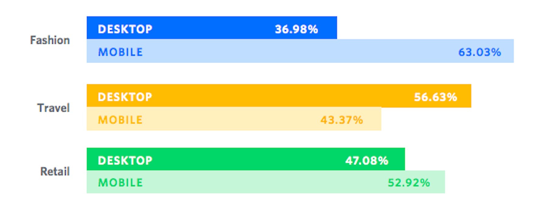
Fashion sites also have the highest proportion of abandonment on mobile (63.03%). Combined with the high proportion of sales, this suggests that many shoppers are switching channels before they complete a purchase. Perhaps if mobile UX was more of a forethought for these companies, these abandonment rates would drop.

Percentage of abandonments on desktop vs. mobile

Percentage of sales on desktop vs. mobile
Enlarging a screen to click is the "most frustrating" mobile shopping problem
A study by Bizrate Insight into the frustrations of shoppers revealed that having to enlarge a mobile screen to touch a link or button is the most frustrating element when it comes to mobile UX, which speaks to a larger concern about poorly optimized mobile sites.
The top 8 frustrations for mobile shoppers are:
- "I have to enlarge the screen first to ensure I touch/click in the right place"
- "Pages load slowly"
- "I have to use the ‘full site’ version to access what I’m looking for"
- "Text is too small"
- "Entering my information at checkout is frustrating"
- "Pictures are too small"
- "Not enough product information available"
- "Data security concerns"
39% of people will stop engaging with a website if images won’t load or take too long
According to the Adobe State of Content report, more than 7 out of 10 (73%) respondents say content “must display well on the device.” If the content isn’t fast-loading and easy consume, you risk losing your audience.
Here are the top reasons consumers switch devices or give up on content altogether:
- Images won’t load: 46% switch devices; 39% stop engaging
- It takes too long to load: 44% switch devices; 39% stop engaging
- Content is too long: 30% switch devices; 38% stop engaging
- The content is unattractive in its layout or imagery: 35% switch devices; 38% stop engaging
65% of website visitors wouldn’t submit a form if too much personal information was required
KoMarketing’s B2B Web Usability Report asked, “What deters you from filling out a contact form if you have a general inquiry?” More than two-thirds of respondents (69%) stated that “excessive form field requirements” would deter them from completing a general inquiry form. 65% would go further by refusing to complete a form if “too much personal information” was required.
If the form included an automatic email subscription, 55% said that would put them off too.
As for the exact personal information buyers would prefer not to give, phone number came top (58%), followed by address (53%), role or title (21%), last name (20%), company (18%), email (16%) and first name (11%).
UX "team of one" blends research types to increase studies 1900% in 2 years
As experience dominates the concerns of the financial industry, a UX Director at Yodlee found that the desire to capture qualitative feedback and quantitative metrics to feed the organization’s development cycles have never been higher.
“I’m an army of one, which led me to UserTesting as a platform. We were using another company before and they were really just focused on think-out-loud and more qualitative research findings and I switched over to UserTesting because you guys have it all – the think-out-loud portion but also the quantitative analysis.”
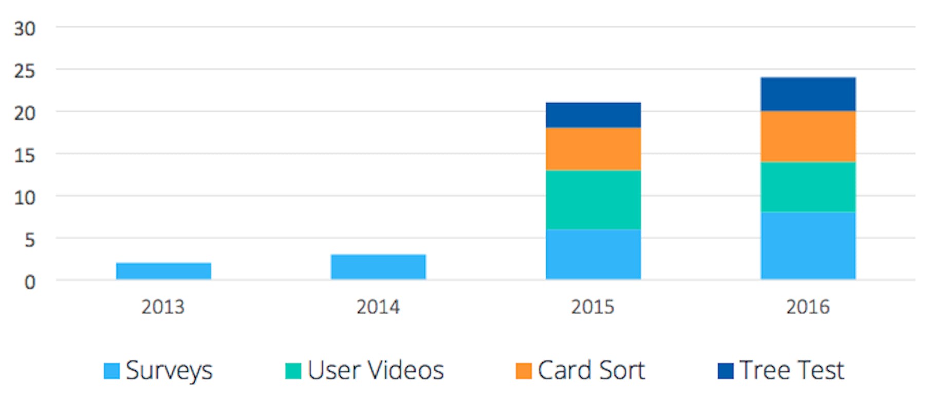
We've not only helped Yodlee get insights from multiple testing methods but also helped leadership scale the number of insights delivered to the organization. Since 2015 there’s been 1900% increase in studies conducted.

Visit-to-lead conversions can be 400% higher on sites with a “superior user experience”
A well-designed user interface could raise your website’s conversion rate by up to a 200%, and a better UX design could yield conversion rates up to 400% according to Forrester.
Only 40% of brands offer personalized recommendations on their websites based on user data
According to a recent Episerver report, while customer experiences seem to be improving across the board, there’s one area where brands are behind the customer expectation curve: personalization. Less than half of marketers are using their websites to make personalized recommendations based on user data, while less than a third (31%) are personalizing their mobile apps.


