
14 ways to leverage psychology in UX design

To design a compelling user experience (UX), it helps to learn the basics of psychology in UX design. If you understand how the human mind works, it becomes easier to design experiences that capture attention and keep it.
Psychological principles are the (sometimes) invisible forces in design psychology that influence people and drive them to action. In this post, we’ll uncover the many different principles that exist, and how you can use them to build better experiences for your customers and beyond.
Why psychology in UX design is important
Unless you’re building entirely automated experiences, there is some element of human behavior that needs to be considered when designing products or experiences. After all, it’s humans that will ultimately be your end-user, and it’s how they interact with your product that will determine its success and usefulness.
By understanding how different psychology principles influence human behavior, you can design products that elicit specific responses, emotions, and actions from your target users. Let’s take a look at some of the design psychology principles.
14 psychological principals in UX design
1. Hick’s Law
Hick’s Law explains that the time it takes for a person to make a decision depends on the number and complexity of choices available to them. So if the number—or complexity—of choices increases the time to make a decision increases logarithmically.

So, as a designer, you’ll want to consider these three things when building products and experiences as it relates to Hick’s Law:
- Simplify choices for your user by breaking down complex tasks into simpler steps
- Avoid overwhelming users by suggesting options rather than listing all of them
- Minimize the user’s cognitive load by providing an experience that’s logical and progressive
2. Cognitive load
Cognitive load describes the mental effort that’s required to learn new information. In UX design, we can think of cognitive load as the amount of thought you need to exercise in order to use a product or complete a specific task. So if the amount of information that needs to be processed to complete a task is very high—or exceeds the user’s ability to understand—the product’s overall success suffers.
You can’t change your users’ actual processing power, but you can begin to understand their limits. By watching your users use your product or complete an experience you’ve designed, you’ll become more familiar with their expectations and ability to process information. Remote usability testing is a great solution to better understand your users.
3. Gestalt Principles
The human brain is wired to see structure, logic, and patterns. It helps you make sense of the world. In the 1920s, a group of German psychologists developed theories about how people perceive the world around them and called them the Gestalt Principles.
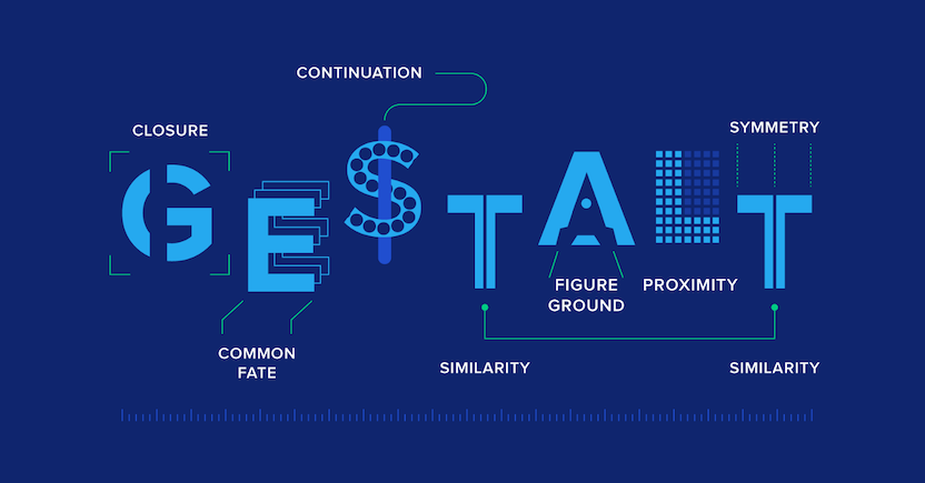
Essentially, the Gestalt principles of visual perception relate to design psychology because they detail how our brains create structure by default. And this is essential for designing persuasive UX. There are seven principles that we’ll detail briefly here, but check out this post for more detail: 7 Gestalt Principles of visual perception.
4. The Isolation Effect
The Isolation Effect (sometimes referred to as the Von Restorff Effect, affectionately named after its inventor) predicts that when multiple similar objects are present, the one that differs from the rest is most likely to be remembered.
In UX, think about a pricing chart on websites.
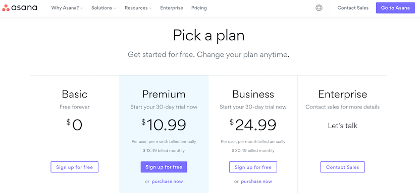
In the example, Asana draws your attention to the Premium pricing plan. The highlighted blue enclosure that it’s placed in ensures the Premium plan is what you pay attention to initially.
5. Aesthetic Usability Effect
The Aesthetic Usability Effect refers to the idea that users often perceive aesthetically pleasing designs as design that’s more user-friendly.
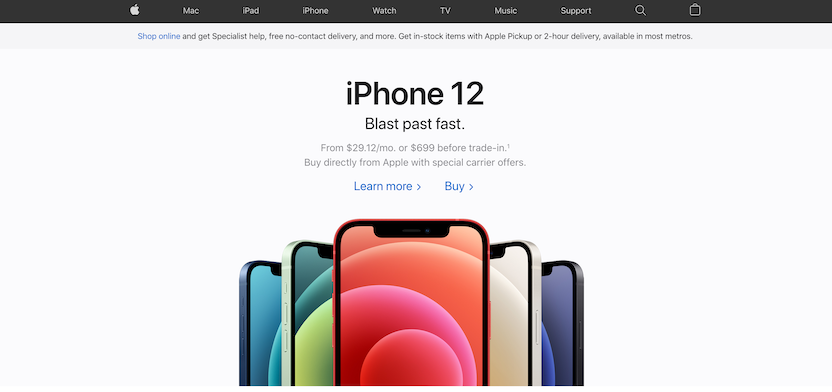
Many argue that Apple’s success can be attributed (partly) by paying close attention to aesthetics because it creates a positive response in the user’s brain and leads them to believe it actually works better. While aesthetics matter, the effect has its limits. A delightful design can make users forgiving of minor usability issues, but certainly not larger ones.
6. Jakob’s Law
Jakob’s Law states that users spend most of their time on other sites—meaning that users prefer your site to work similarly to the other sites they already know. While this might seem like the opposite of innovation, the underlying message is important.
How your experiences and products measure up to the competition is critical. That’s why competitive analysis is key.
Remember that your competition isn’t always your competition. People who use Netflix, for example, have developed high expectations for digital experiences and expect the same from retailers, banks, grocery stores—any digital experience.
So, if you’re developing a grocery store app, it might be smart to mimic some of the things Netflix does with their app—just because it's not the same market, doesn't mean users won't hold your brand to the Netflix standard.
7. Color psychology
Color is one of the most powerful tools in the designer’s toolkit. You can use color to impact users’ emotions, draw their attention, drive conversions, and put them in the right frame of mind to make a purchase.
Ultimately, colors can provoke various emotions for many people. Take a look at the color psychology chart below to see some of the emotions and themes traditionally associated with colors:
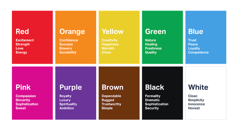
Keep in mind that color associations vary from culture to culture and from person to person. Men and women often have different color preferences, and colors that are en vogue this year might be effective for one group of people today and another tomorrow.
8. Chunking
Chunking is an element of design psychology introduced by George A. Miller, which is why the concept is closely related to Miller’s Law. It states, that the average person can only keep 7 (plus or minus 2) items in their working memory.
Because of this concept, chunking was introduced to UX design as a way to group (or chunk) information into manageable bits of similar information.
That way, people can process information more quickly. Possibly the most recognizable example of chunking is in the classic phonebook or dictionary.

9. Memory limitation
Memory is not always reliable. The way we store information is reconstructed by our thoughts, feelings, beliefs, and surrounding environment. Therefore, by knowing how memory works, designers can create human-centered interfaces that correspond to the users’ natural abilities, save their effort, and boost usability.
10. Reciprocation
The principle of reciprocation tells us that if we do something for other people, they want to return the favor to us. If you give your users something useful before you ask them for anything, they’re more likely to reciprocate by doing business with your company later on.
In 2005, social scientist Randy Garner conducted an experiment to test whether or not hand-written sticky notes could persuade people to respond to a survey.
One-third of the surveys sent out included a handwritten note in a Post-It that asked recipients to complete the survey. One-third had a blank Post-It note, and one-third didn’t have a Post-It note at all.
Not only did the surveys with the hand-written note get double the response rate, the quality of the answers were better too. But why did they perform so much better?
Well, when people received the hand-written letter they felt like someone had done something nice for them. And when people do things for us, we feel like we need to repay them.
Author and psychologist David Straker said, "The inner tension created in the gap between receiving and giving is often so powerful we will give anything in return just to reduce this discomfort."
That’s why Costco gives out free samples. If they give you a free sample of a Bagel Bite, you’re more likely to reciprocate the favor by buying a box. And even if you decide not to buy them, Costco’s still building goodwill between you and their brand.
11. Social proof
The principle of social proof tells us that when people aren’t sure what to do, they look to the behavior of others to guide their actions—especially their peers. If we see a lot of other people doing something, we tend to view it as the correct behavior.
In 1969, the social scientists Milgram, Bickman, and Lawrence conducted an interesting experiment in Manhattan. They had a single actor stand on a busy street corner and stare at a window on the sixth floor of a building for sixty seconds.
Out of all the people who walked by, only 4% of them stopped and looked up at the building. But when the scientists increased the group of actors to 15, 40% of people walking by stopped and looked up!
New York Times bestselling author Robert Cialdini said, “Whether the question is what to do with an empty popcorn box in a movie theater, how fast to drive on a certain stretch of highway, or how to eat chicken at a dinner party, the actions of those around us will be important guides in defining the answer.” That’s why comedy shows have used laugh tracks for such a long time.
12. Scarcity
The principle of scarcity tells us that people tend to want what they can’t have. We place higher value on things that will soon be unavailable to us, and a lower value on what’s available in abundance.
In 1975, researchers Worchel, Lee, and Achewole conducted a study to figure out how people would value cookies in two identical glass jars. Jar A had ten cookies and Jar B only had two cookies. Which jar do you think people found more attractive?
Well, even though the glass jars and the cookies were exactly the same, the participants placed more value on the cookies in Jar B. Perhaps even more interesting, the researchers also found that:
“Cookies were rated as more valuable when their supply changed from abundant to scarce than when they were constantly scarce.”
It’s basic supply and demand: as availability decreases, demand increases. The less there is of something the more valuable it becomes.
That’s why the diamond company De Beers only circulates a limited number of diamonds each year. Diamonds are found abundantly in nature. But since there’s only a small amount available, the demand is higher, which allows De Beers to increase their prices accordingly.
13. Framing
The principle of framing tells us that people make comparisons when they’re making a decision. Not only do users tend to avoid extremes, but they also respond to a particular choice in different ways depending on how it’s presented.
In his book, Priceless: The Myth of Fair Value (And How to Take Advantage of It), author William Poundstone dissects how a New York City restaurant called Balthazar’s uses the framing principle in their menu.

The upper right hand corner of their menu is usually the first place that customers look. They use this prime location to display their two most expensive plates—one for $115 and another for $170.
14. Salience
The salience principle tells us that people’s attention is drawn to that which is most relevant to them at that moment. By identifying these moments, you’ll be able to make additional offers and upsells when your users are most likely to be influenced.
Imagine you’re going to Sears.com to look for a new refrigerator. When you land on their homepage, what would you be more interested in: an advertisement for their financing plan, or finding the right fridge?
In 2002, Jared Spool from User Interface Engineering had a chance to study user behavior on Sears’ website. During his research, he observed that users were typically on a specific mission.
So, while fridge shoppers do want to learn about financing options, he found that most shoppers would be far more interested in this information after they’ve found an item to purchase.
After watching shoppers, Spool said, “There are specific moments when designers are most likely to influence a shopper to investigate a promotion or special offer. Most of the time, these moments come after the shopper has satisfied their original mission on the site.”
A final note on psychology in UX design
While you don’t need to be an expert in psychology in order to be a proficient UX designer, understanding the basic principles of design psychology will help you build better products and experiences for your users.
By taking advantage of psychological principles you’re able to ethically guide user behavior and sometimes persuade them to action.
While it’s true that a successful design today may not be a successful design tomorrow, adhering to the principles above ensures that you’re never missing the mark.

Boost your design team's efficiency
Discover how to leverage user feedback to design experiences customers love.
In this Article
About the author(s)
Read more


Get the latest news on events, research, and product launches
© UserTesting 2025