Choosing the right font: A guide to typography and UX

Anyone who took Graphic Design 101 knows that serifs help readability and black is the best color for text. But, wait! We also know that type for the web is different from type for print. A lot of design experts insist that sans serif, grey text is easiest to read—and much more beautiful, too.
And then there’s mobile to consider. If your font choices work well for your desktop site, is it safe to assume they’re fine for your mobile site, too? If you’re using a responsive design, do you even need to worry about this stuff?
The purpose of any text on your website or app is to help your users accomplish their goals.
Unfortunately, there are a lot of conflicting opinions out there about typography for web and mobile, and there isn’t one strict set of rules that apply in every case. (That would just be too easy!)
But there are several things you can do to make sure the fonts you choose for your website or app are working with you and your users, not against you.
While every designer should strive to create something beautiful and remarkable to look at, don’t forget the main goal of your text. The last thing you want is for your typographic choices to prevent your users from doing what they want to do—whether it’s finding out more about a product, learning how to play a game, or browsing through some entertaining stories.
Size and line length
The size and layout of your text can make a huge impact on the experience of reading something online.
Remember (we’re going to say this a lot): the main purpose of your copy is to help the user accomplish their goals.
Older users or folks with visual impairments especially struggle with small text. Even people with perfect vision experience eye fatigue from staring at screens for too long—and get irritated when they have to squint or zoom in to read text.
For desktop, 50-75 characters per line at 16 pt font or higher is a good rule of thumb for body text. Take a look at this example:

Compare that with a similar page that uses about 100 characters per line in a much smaller font size:

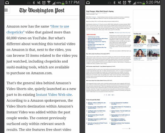
This issue gets amplified on mobile. Tiny type on a small, bright screen can be a real headache for users. A good rule of thumb is to use 30-40 characters per line for mobile. Here are the same two sites from above when viewed on a smartphone. The first site uses the optimal 30-40 characters, while the second uses exactly the same format as its desktop site.

We ran a study on two mobile sites with similar layouts to the ones above: one with optimal type size and one without. Not surprisingly, users preferred the site with the larger text:
Since hard-coded font sizes (for example, 16px) can display differently on different devices, try sizing your fonts using rem units.
Color
We’ve come a long way from the wacky Geocities days, when any given website might have red text on a blue field or illegible stylized fonts.
These days, we’ve swung in the completely opposite direction. Grey text on a grey or white background is in. But it doesn’t matter how trendy your design is if users can’t read your copy.
There are two schools of thought around text color and readability.
- One claims that higher contrast is better, and black on white is the most readable combination.
- The other says too much contrast is actually harder on the eyes, and some shade of grey is more accessible.
The right amount of contrast is a tricky balance. Because of the drastic variation between screens, a grey that seems dark enough on the designer’s monitor could appear much lighter on the user’s.
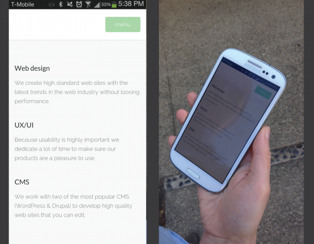
It's especially important have enough contrast on mobile, where users might be outdoors or in bright spaces that cause screen glare.

The gentle greys of this page are pleasant to look at… until you step outdoors.
WC3’s Web Content Accessibility Guidelines are a good place to start. They set minimum standards for contrast so that users with moderately low vision can read your text. You can use a contrast ratio tool to quickly find out if you’re within the optimal range.
But pure black text (#000000) can be more difficult for dyslexic readers, and it can cause more eye fatigue over long periods of time.
Many designers opt for a very dark grey or “real” (as opposed to “pure”) black, like #0D0D0D, #0F0F0F, or #141414.

These dark shades can be easier on the eyes than pure black.
Once you’ve made your color choice, it’s absolutely necessary to test it out with real users in natural environments, on every device imaginable. If any of the test participants have trouble reading your copy, then you can bet your customers are having exactly the same problem.
Serif vs. sans
There are a lot of myths about the legibility and effectiveness of serif fonts as opposed to sans serif fonts.

Serif fonts have small lines at the end of each stroke; sans serif fonts do not.
In classic print typography, common knowledge is that serifs improve readability and reading speed by gently guiding the eye in a horizontal direction.
But studies examining the practical differences between the two font styles are largely inconclusive. We had to test it out for ourselves, so we ran a study with 30 users measuring reading time and comprehension on two pages that were identical except in font.

The first version (left) used Arial 16 pt, and the second version (right) used Times New Roman 17 pt.
Our results? Also inconclusive.
While the average reading speed was 9% faster for the group that read the sans serif passage, that difference was not statistically significant. Plus, the comprehension rates were very nearly identical: The group that read the serif passage had a 1% higher comprehension score on average, which was also not statistically significant.
The only notable difference between the two groups was that the serif group complained about the text twice as often as the sans serif group. (6 members of the serif group and 3 members of the sans serif group said the passage was difficult to read.)
So what’s the problem with serif fonts? A couple of things.
First, serifs alter the outline of each letter, so they can be more difficult to make out for people who have dyslexia or visual disabilities.
Second, because those little horizontal lines are so small, they tend to reproduce poorly on older computer screens, which have much lower resolutions than print. (Retina screens on smartphones, however, have higher resolutions that make serifs easier to see.)
Does that mean we should only use sans serif fonts on the web?
Absolutely not.
It does mean that if you choose to use a serif font, be sure to select a clean and precise web font, and—you guessed it—test your choice with real users.
So which font is right?
We’ll say it once more: the purpose of any text on your website or app is to help your users accomplish their goals.
The fonts you choose are a major part of the user’s overall experience on your site or app. Consider the whole context, rather than just relying on a set of rules when you make your design choices.
What are your users expecting?
Is it something more sophisticated? Fun? Minimalist?
What do users already know about your brand before they come to your site or open your app? What kind of first impression do you want to make?

Font choices can dramatically affect the user's perception of your brand.
What devices are customers using?
Don’t forget that mobile use is continuing to rise year over year. If you aren’t providing an excellent mobile experience now, then your competitors are going to beat you to the punch.
Your customers are reading your text on the train, in front of the TV, and on sunny patios. Make sure you keep their attention, and don’t drive them away with hard-to-read copy.
What are users trying to accomplish?
Shopping? Learning? Being entertained?
Make sure the experience you’re providing matches your users’ needs (and your business goals).
If you want customers to quickly understand your product’s features so they can make a purchase, then choose fonts that can be understood at a glance. If you want to engage readers’ attention with a long and captivating story, then choose fonts that will make it easy for them to keep their eyes glued to the page.
Get feedback on your decisions
Design isn't just for designers; it's for users. Once you’ve made your informed decisions, test them out to make sure they resonate with your target market.
User test to find out how people react to your design choices.
A/B test to find out if changing your font makes a difference in your conversion rates.
If you want to constantly improve your website or app, then you’ll need to continually tweak your design to optimize the user experience. Remember, it’s all about helping users do what they’re trying to do. If you make it completely easy for them to read more, learn about a product, or make a purchase—then you can bet they’ll do it.
If you enjoyed this post, you might also like our article, A Guide to Color, UX, and Conversions!


