How retailers can reduce return rates with better user experience

Returns can be a headache for brick-and-mortar retailers and ecommerce stores alike.
After all, returns are expensive. They also represent a potentially unsatisfied customer. Perhaps the item did not meet their expectations, was incorrectly ordered, or was the wrong size.
While a certain level of returns is a fact of life for online retailers, it’s important to work hard to minimize return rates.
Thankfully, good UX can improve the number of returns you have to process. When information is clear, users are more likely to make the right purchase and less likely to return. Additions such as sizing tools, animation, and augmented reality can help provide the best possible product information and reduce returns.
In this article, we’ll look at how a good user experience can help retailers reduce return rates.
Why are returns such a big issue?
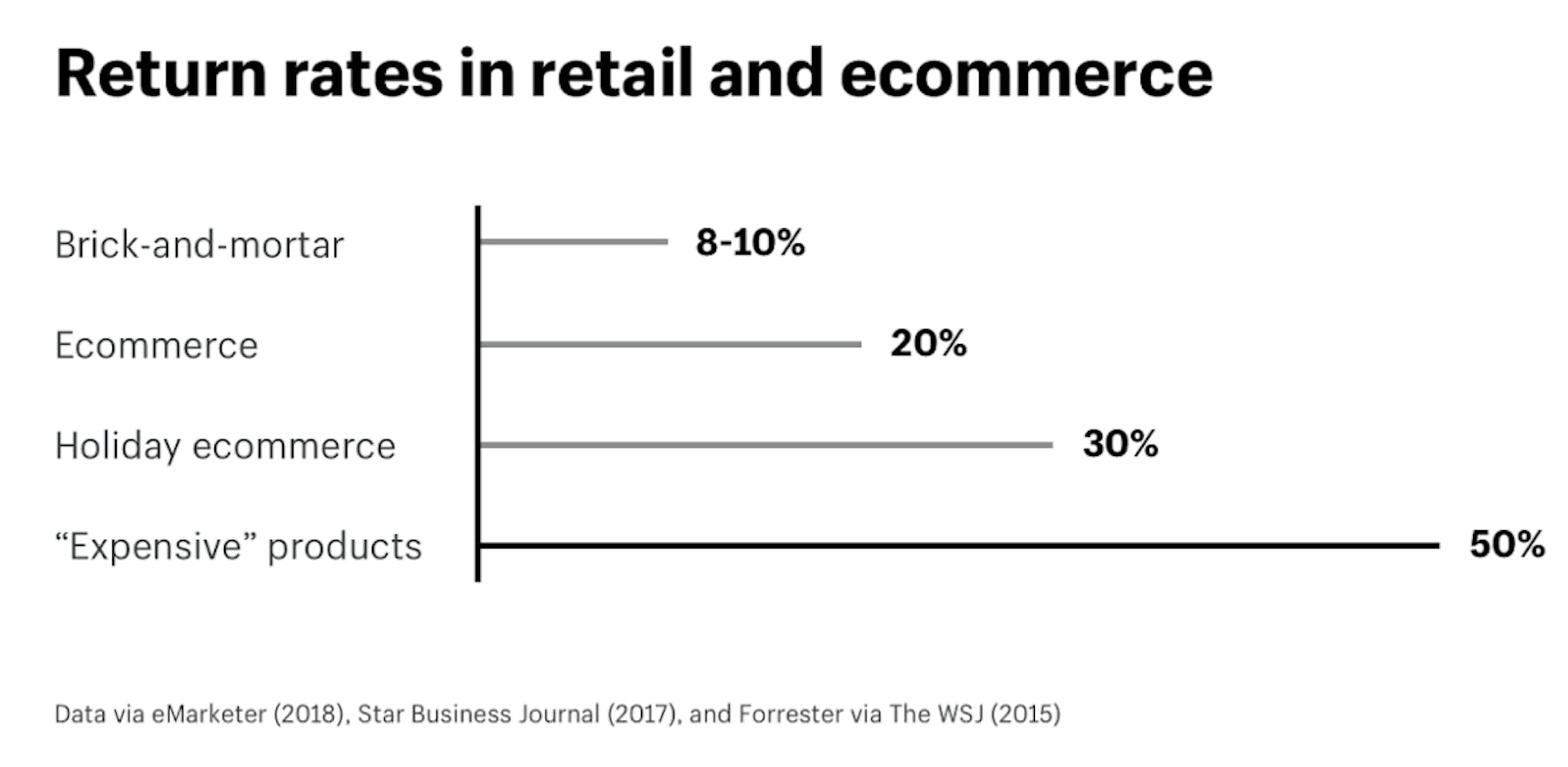
According to Shopify, ecommerce returns rates are much higher than those of physical retailers. The average return rate for ecommerce is 20%, compared to 8-10% for offline retail, while rates get worse for luxury products and during holiday shopping periods, as people return unwanted gifts.

Some types of retailers suffer more than others. Although it's now several years old, Narvar’s State of Returns 2018 report found that fashion retailers have the biggest problem with returns, which will have much to do with sizing and fit issues.

Returns affect retailers in a number of ways:
- Lost sales and costs of refunds.
- Costs incurred when accepting returns. Free returns can mean retailers foot the bill for postage and courier costs.
- Lower margins on returned items. Items that bounce back may not always be suitable for resale, or at least not at full price. Goods may be out of season once returned, or packaging damage means retailers have to discount them.
- Resources dealing with returns. Returns cost staff time – in customer service calls and other interactions to arrange returns, and actually processing the returns.
- Risk of brand damage. Returns can leave customers unhappy if they feel the process has been too much hassle. This can lead to negative reviews.
How UX can help reduce returns
People return items for a variety of reasons, according to stats from Shipbob:
- 80.2% return items which arrive damaged or broken.
- 64.2% return products as they don’t match descriptions, or customer expectations.
- 37.2% because they don’t like the items.
- 7.5% due to poor price/performance ratio.
- 7% return items which are delivered too late.
While some of the reasons suggest that online retailers need to work hard on delivery performance to avoid damage and delays, it’s the second biggest reason that retailers can address on-site.
If goods are arriving that don’t match description and expectations, then this suggests that the retailer hasn’t presented the product well enough on site.
This is where good design and user experience can help. Retailers have a challenge as customers can’t get up close with products, so they need to ensure that retailers can get as good an idea as possible about products before they buy them.
Product images and videos
People can’t try items on, so images and video need to do as much as possible to help shoppers decide on products.
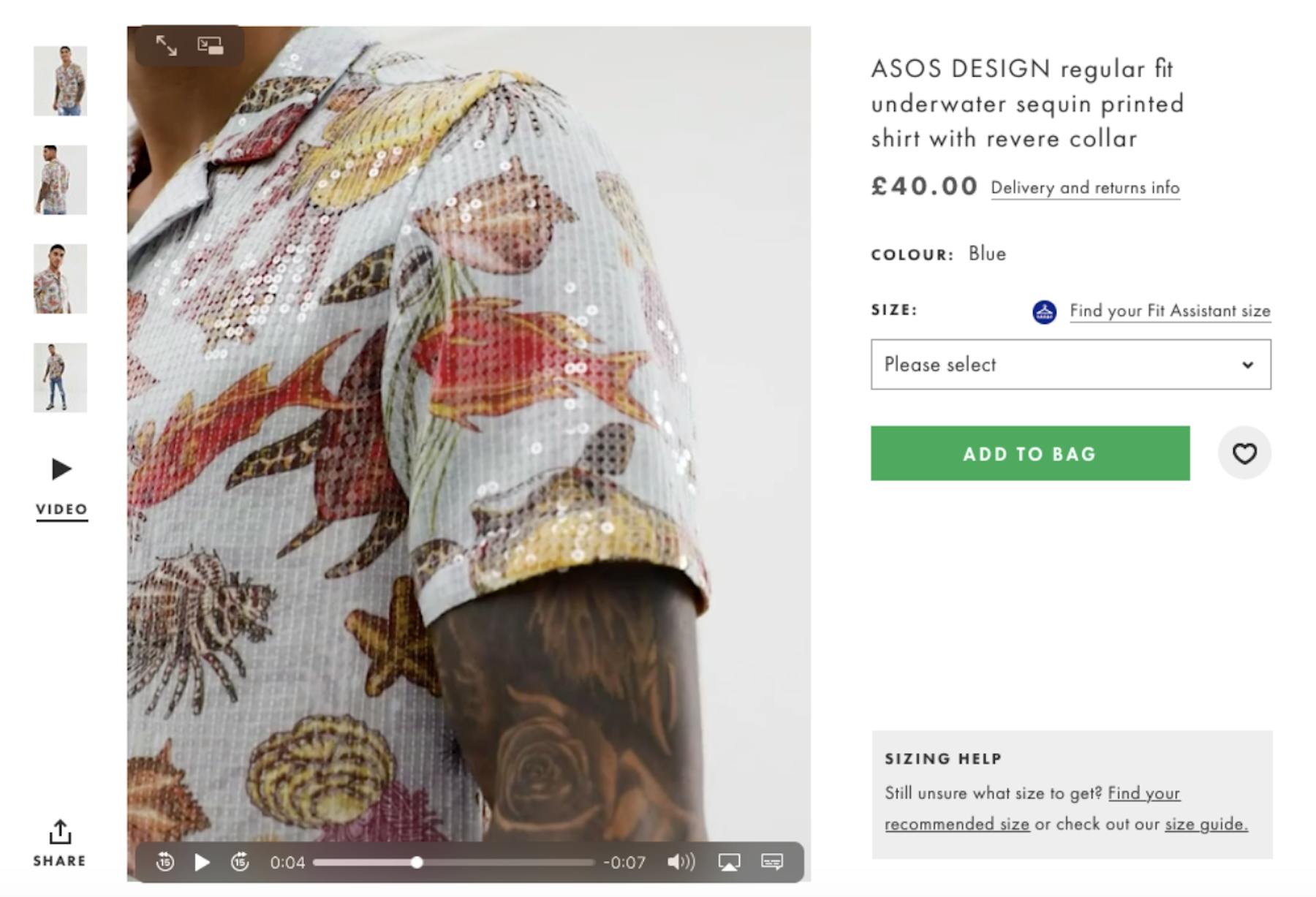
ASOS provides images from several angles, but crucially embeds short catwalk style videos into almost all of its product pages. These videos allow customers to get a greater idea of fit, while close-ups help to show key details.

Images can help with all sorts of products, not only to showcase them, but to answer key customer questions.
Here, AO.com shows a range of images for Smart TVs. This shot shows the back of the TV, which conveys quickly and easily the number and type of ports on the TV.

This way, shoppers can see whether they have the right ports for games consoles, DVD players, etc at a glance. It can be a better experience, which requires less effort than reading through technical specification.
Conveying key product information through visuals like diagrams can be quicker and easier for shoppers to understand key details. Here, Loaf shows a quick diagram with sofa dimensions. It’s simple, but works so much better than text alone.

Fitting tools
Another way for fashion retailers to address returns is through tools which seek to find the best fit for customers.
The trick here from a UX perspective is to get shoppers to take the time to engage with tools and share information, without making the process too time-consuming.
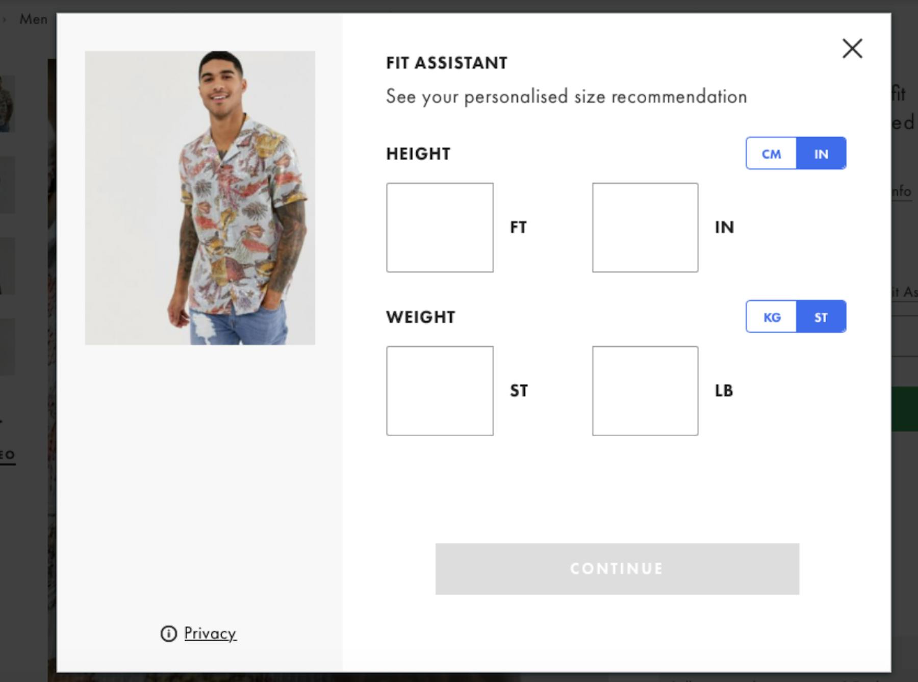
ASOS uses a fit assistant which asks for details like height, weight, preferred fits, and sizes of recent purchases for comparison.

It then produces a recommended size based on this information for the product viewed.

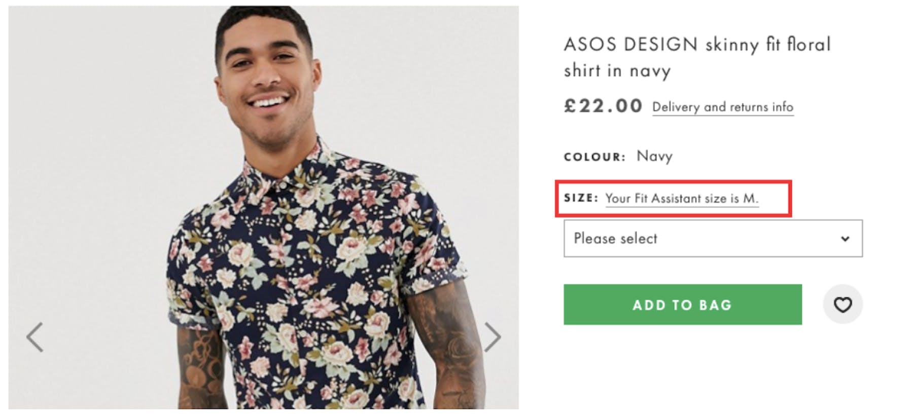
Once shoppers have taken the effort to supply fit information, recommended sizes are then shown for each product page visited. This speeds up the size selection process for shoppers and creates a personalized experience.

Presentation of product information
The key aim, in terms of reducing returns, is that product page images and information helps ensure that customers make informed purchase decisions. If they choose the right product for their needs, they’re less likely to return it.
By presenting product copy clearly in a way that reduces effort for shoppers, they can improve the user experience and get across key product details.
This can be as simple as a few well-placed bullet points. For example, the six lines here describe the product quickly and simply.

For more detailed products, information needs to be presented in a way that is readable for shoppers. AO achieves this by laying out the detail, and also highlight key product specs.
This way, shoppers can quickly review key features, or dive into the detail if they prefer.

Augmented Reality (AR) and other immersive technology
Technology such as AR can offer shortcuts which help customers to choose the right item and get answers to key questions around products.
For example, purecycles offers AR views of its bicycles so people can use their phone’s camera to ensure that the size is right for them.

In a similar way, AR within IKEA’s app allows people to visualize furniture and other items in their homes, to see if they fit in the available space, or how they will look when they arrive.

In summary
Returns are a fact of life, but you can still reduce return rates with good design and user experience.
If customers can view products and find the information they need with minimal effort, this is a better user experience. And, if they’re making more informed purchase decisions as a result, this helps to minimize returns rates for retailers.

Pulse Report: Retail, Q1 2025
Uncover the drivers behind consumer loyalty and how innovative retailers succeed in this quarterly Pulse Report.


