
Tree testing: how to evaluate website architecture

When it comes to designing websites and apps, there’s more to it than just look and feel. A lot more to it, in fact. A pleasing color scheme, interesting content, and relatable imagery are all certainly components of well-designed digital products, but if the content within your website or app isn’t well organized, the rest may as well be for naught. In this article, we’ll unpack how tree testing is your ticket to designing websites that are easy for the user to navigate and make finding relevant information a breeze.
What is tree testing?
Tree testing—sometimes referred to as ‘reverse card sorting’ or ‘card-based classification’—is a research technique that helps you understand where people get lost finding content or information on your website. In general, it provides feedback about site navigation and content labels.
Think about the last time you were visiting a friend or family member’s house and needed to find something. Like a spoon, for example. You start in the kitchen because that’s where we’ve all been trained to find things like spoons. But where do you look next? Some may look in the drawer near the dishwasher, while others may look to the drawer that’s by the cabinet with dishes and bowls. The point is, people use context clues and other points of reference (like familiarity and habits) to find things that they’re looking for.
The same goes for navigating a webpage or app.
However, unlike the spoon example, there’s much more variation in website structure than kitchen layout. Websites vary from industry to industry, ranging in purpose from ecommerce to digital portfolios and everything in between. So when someone lands on your website to find something or complete a task, is it obvious where they should go to get things done?
Your gut might tell you that it is. The people on your design team might tell you that it is too. But what really matters is what happens when actual users land on your website. Whenever you’re building a new website or optimizing an existing one, it’s important that you build it with quality user insights. That starts with user experience (UX) research.
And before you ask if we mean qualitative or quantitative research—the answer is both.
When to use tree testing
Organizing content is foundational to building effective digital properties—regardless of your business objectives. However, many teams don’t have easy access to the tools they need to test their information architecture. Through tree testing, you’ll be able to:
- Optimize your navigation for the most critical tasks, whether that’s to improve engagement or conversions
- Test alternate labels for the same tree category by setting up two tree tests and comparing results (useful to get insights on findability based on label names)
- Test alternate locations for the same category by setting up two tree tests and comparing results (useful when adding new features within an existing site, i.e. where does this fit in?)
- Recreate a competitors navigation to compare solutions and get insights about customer preferences
It’s also important to mention that tree testing can be conducted with little to no effort from your design and dev teams because it’s based on a text-only version of your website. This means your tree testing strategy can be as simple and quick or robust and iterative as you need without having to rely on multiple teams to get it done.
Tree testing vs. card sorting
One of the most common misconceptions of tree testing and card sorting is that they’re synonymous and get you to the same results. While card sorting can help define new or updated hierarchies, tree testing is necessary to test how easily customers can find information within said new or adjusted hierarchies. While card sorting is invaluable for understanding how your audience thinks, it doesn’t necessarily produce the exact categorization scheme you should follow.
Let’s take an example. Pretend you ask your card sorting participants to group and label a bunch of different types of B2B content. They come up with categories like case studies, infographics, white papers, and webinars. These are all great, and will certainly help you create your architecture. However, other participants grouped some content into a category called ‘miscellaneous’. While this helps you to understand how your customer interprets your content, you’re certainly not going to label something in your site navigation ‘miscellaneous.’
That’s why, in most cases, it makes sense to run a tree test after a card sort. The tree test will be an effective method for evaluating the proposed structure(s) you’ve settled on from your card sort.
Now that we understand when it makes the most sense to run a tree test, let’s dive into how you actually do it.
How to set up a tree test
Tree tests provide extremely powerful results and are fairly simple to set up. To conduct a tree test, you don’t need to sketch any wireframes or write any content. All you need to do is prepare two things: the tree (hierarchical menu) and the tasks (instructions that explain to the study participants what they should attempt to find).
Here’s how you do it:
1. Build your tree
Your tree is a text-only version of your website hierarchy (similar to a sitemap). If you don’t already have access to a sitemap, you can build the tree from the labels and structure of your website.
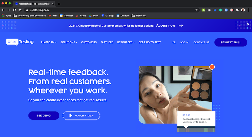
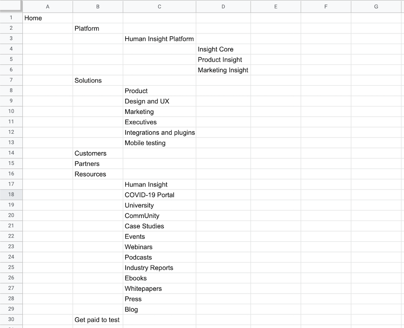
If you were performing a tree test on the UserTesting website, it might look something like this:
Text-only version:
Which in the UserTesting Human Insight Platform would look like this:
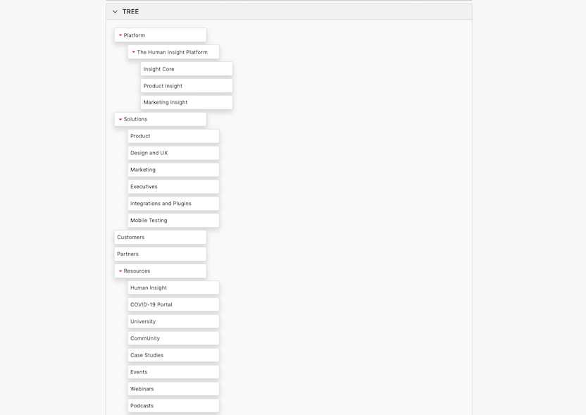
When building your tree, it’s important to include a complete list of all your main categories and all their subcategories. Even if you’re only going to test a specific category, excluding others will bias your results. For example, on the UserTesting home page, there’s both a Platform and a Solutions category. In this example, if you choose to only test the Platform tree, you may miss out on finding whether your audience understands the difference between these two categories.
To go one step further, your tree may need to be three or more levels deep—depending on your site’s architecture. That’s ok, but it’s important to include all of your page’s subcategories or you’ll run the risk of eliciting unrealistic behavior. Users often evaluate link labels by comparing them with nearby alternatives.
Pro tip: exclude labels like ‘Contact us’ and ‘Search’, because they may provide easy ways for people to find information on your site outside of its natural hierarchy.
2. Write your tasks
Simply, your tasks should reflect what you want to improve. Perhaps your support team has received feedback that people can’t find a specific form on your website. In this case, you’ll want to create a task that instructs participants to find where the form is located within the tree you’ve provided.
3. Recruit participants
The quality of participants taking part in your test will directly influence the quality of your data, so it’s important to take the time to fully parse out who it is you should be testing with. You want people who are as close to the right demographics as possible, and who are willing to take the activity seriously. See how the UserTesting Participant Network ensures high-quality feedback.
As a general rule, the Nielsen Norman Group recommends 50 participants per tree test—though patterns will emerge with fewer participants per test. We recommend 30-50 participants and even studies of just a few participants will yield valuable insights about how easily users can find content within a tree—especially if you watch the video feedback to understand the source of the participant's confusion or struggles.
Gone are the limitations of tree testing
Typically, tree testing is executed as a remote, unmoderated study. This means that after your participants are recruited, you would simply send them a link to the study, and the testing tool would then walk them through the process of completing the tasks using their own computer.
However, there are pitfalls to this format. Because the test is unmoderated, it doesn’t capture the full context of user behavior, like delight, frustration, confusion, and so on. Not to mention, you can’t ask personalized follow-up questions during or after the tree test is complete. That is, until now.
Pair your analytics and qualitative insights by tree testing with UserTesting
In our April 2021 market release, we announced that the UserTesting Human Insight Platform now supports tree testing. This is a continuation of our commitment to providing qualitative insights that support the analytics data tree testing and card sorting provide.
Within one solution, you’re now able to get quantitative data on success paths, failures, and time to completion that tells you what needs to be adjusted within your site hierarchy. This is extremely valuable information, but it’s limited. It leaves you wondering why something is so confusing for participants.
When conducting tree tests with UserTesting, you’ll be able to see and hear your participants as they complete their tree test. Additionally, you can add tasks to the unmoderated study, like verbal response questions, for example, to uncover the information you otherwise wouldn’t have been able to capture.
Perhaps most compelling, you can even run moderated tree tests through our Live Conversation solution.
How to analyze the results of tree testing
Tree tests performed on the UserTesting platform provide you with both qualitative and quantitative results.
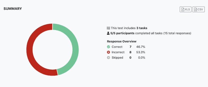
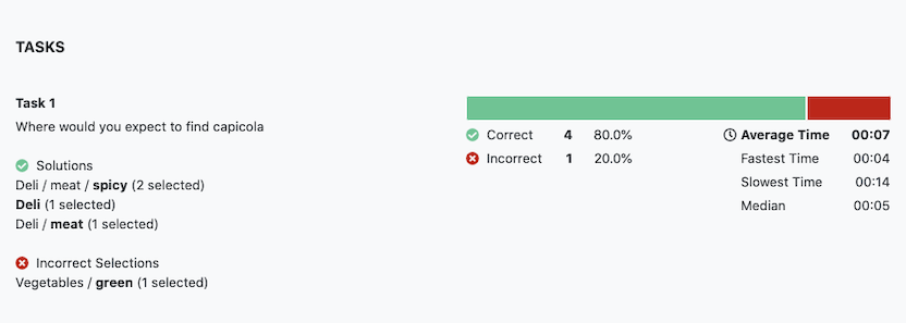
At a glance, here are the most relevant metrics you’ll encounter when analyzing the results of a tree test:
- Task success rate—measures how often the right category was selected by participants for that task. Arguably, this is the most important metric because you want customers to successfully find what they’re looking for.
- Path taken—measures the paths taken to the right or wrong selection—especially useful for understanding if there are patterns in the wrong responses
- Time spent on task—can be very telling of where users struggled
- Video feedback—helps you understand the source of confusion, struggle, delight, and other sentiments felt during the test—great for identifying actionable improvements
Although tree testing provides you a wealth of quantitative data, the inferences you may draw from them are not conclusive. Task success rates and time spent on tasks help you to identify what’s going wrong, but it doesn’t explain why exactly it’s happening. This is where the video feedback comes in handy.
If you use analytics as a starting point for identifying problem areas and pair them with the moments they happen in the video, you’re much more likely to gain a holistic understanding of the problem. From there, you should be able to draw some conclusions for improvements, or at least set yourself up for further testing.

Watch a demo
See how easy it is to get fast feedback on a website, prototype, design, or more in this demo.


