Interview: Veronica Bogdacenco, Conversion Rate Optimisation Manager at Buzz Bingo

We recently chatted with Veronica Bogdacenco, Conversion Rate Optimisation Manager, about her role in optimizing the journey for Buzz Bingo’s customers and the wider role that experience design plays throughout the business.
After working for years on various digital marketing channels, Veronica Bogdacenco realized that the thing she loved the most is optimization: for search engines, for conversion and for improved user experience.
As Veronica states, “Rather than chasing the next big thing in marketing or technology, I think the focus should be on doing the basics as best as possible.”
Despite her specific Conversion Rate Optimization Manager job title, Veronica focuses on improving everything that can potentially impact the end-user experience and revenue.
To discover the practicalities of how this is achieved, let’s first dive into how the customer experience is viewed by the whole company.
Where do UX and CX fit in the digital business?
UX is at the heart of the product! In my view, it has a direct correlation with conversions, customer satisfaction and revenue. It is, therefore, imperative that the CX and UX teams work as closely as possible to provide not only experiences that delight but also that support business goals.
To achieve this, there needs to be a shift from ‘what looks great’ to ‘what looks and works great for our audience’.
We have developed a joint CX and UX feedback process using feedback from Customer Service, Affiliate Websites reviews, Google reviews, social media, etc. and we categorize, sort and prioritize this insight to create UX testing roadmaps and hypotheses to gain insights.
From that, we dig deeper, and for example, recently ran a usability study on our Diamond Customer Segment (VIPs). We observed them on key journeys, and got over 20 UX ideas from a single UserZoom study, from bug fixes to copy changes to user journey improvements.
There is a lot of UX transferability assumed in our industry, but we’ve seen that it is much less effective than we thought: things that our product team has seen work very well for brands they worked at previously (or even a comparison against different segments within Buzz Bingo) might not work. This is why usability testing is crucial.
Can you tell us about the current CX/UX design process? When is testing involved?
We have great designers that keep up to date with all the best practices and closely follow the design leaders like Apple and Google for example, however, we see that best practice doesn't always work for us.
Our designers are focused on what looks beautiful and not so much on the behavioral responses to those designs, or ultimately, whether a new design will make us more money or not! For example, the three horizontal dots you often see in the top corner of websites were completely lost on our audience (who are mostly over 50). They just didn’t understand that feature.
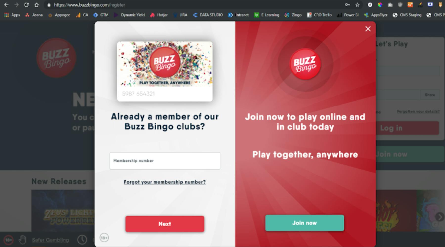
A more significant change was when we developed new designs for the registration page. The designers were sure they had a great design, which looked incredible, however when we tested it through UserZoom it was clear it wasn’t ready yet, and some iterations were needed.
The registration page is so important to the business, a small decrease in CR would potentially lead to hundreds of thousands of pounds in lost revenue, so we had to get this right.
We have two journeys in the registration flows. One journey is for members of our brick-and-mortar clubs that have been members since before the Buzz Bingo name took over. This is a single-step flow and encourages an upgrade to Buzz Bingo digital. The other registration journey is for brand new customers which is a 2-step registration flow.

We see different conversion rates per registration flow per traffic segment and by persona, so we have a big project we are developing to deliver one best-of-breed registration experience, to simplify the acquisition flow for all users. The design, CX, and UX teams are collaborating closely on this project, and UserZoom will take a key role in how we develop this, test the concepts, and make the right decisions.
Our goal is to start testing from concept to the live product. Unfortunately, the team isn’t that big, so it is impossible to validate at all stages. The very minimum is validating the designs before sending them to the development team.
How does your team work with other teams, such as product, research, development and design?
As one would expect, the CRO team works very closely with the product, development and design teams. We do not have a dedicated research team, so we split research between CRO and product: my team is responsible for all web insights, and, alongside the DX (digital experience) team, we do UX research.
We tagged the site to get behavioral data and we see where the overlap is with the insights, we get from the feedback loop described above. If there is data but no feedback, we’ll do some additional research, but where there is an overlap, we’ll usually prioritize that for research and testing out hypothesis.
How do you manage disagreements within your team and across teams?
We test! This saves time and, if done correctly, doesn't leave room for interpretation.
There was a situation where the data was challenged because we only had 10 participants providing feedback. When we are making big decisions we need to validate with more scalable data, so in this example, we followed up with a click test to 90 participants to verify where we were, and that was enough to provide the comfort necessary to the stakeholders that the data was correct.
Another way to validate the bigger bets with a volume of data is to capture site traffic from a Hotjar intercept and send that traffic into a UserZoom study. The best way to solve disagreements is to test with an appropriate participant volume and let the data lead us to an informed decision.
What are the major challenges you face?
One of the significant challenges I used to face was testing on areas of the website with little traffic. Waiting for a split test to conclude to figure out if people prefer one thing over the other can be inefficient and discouraging. I think that testing as much as possible upfront and using split testing for crucial elements is the way to go.
Now that we have UserZoom, we can see which design or user-journey provides the biggest impact in just a few hours, as we are not limited by traffic constraints. This approach also means we can A/B test very early-stage designs, so we get data much earlier on, which in combination with the results coming in hours rather than weeks, means we have significantly accelerated our capability to make decisions on challenger experiences,
What do you think of the concept of ‘evidence-based design’?
Design should be informed by customers, so if your web or DX data team highlight a potential change, then it should be considered and validated. We know we are so biased. We see our site every day and we are not the target demographic. We are very cognizant of confirmation bias where we think we have the right thing, but we don't.
For example, our club pages were initially set up to provide opening times, games information etc to visitors, but when we looked at the data, there were some odd behaviors we were seeing. So we did a complete overhaul of these pages based on the data, rather than what we thought was right.
How do you prove the business value of UX?
CRO is one of the most data-driven disciplines in digital marketing, so we must be able to prove the value in everything we do. It’s not always easy to have it down to a T, but sometimes all you need is a loss/gain impact: X test saved X development hours.
What UX trends do we need to look out for?
I think that behavioral economics will start playing an increasing role in UX design. Those designers who understand that we are all fundamentally biased and use that to inform their work will stand out.
Design thinking will become the standard. People are becoming more aware of confirmation bias and eventually, everyone will be building a user’s perspective into their products from the earliest stages of design.
Most designers understandably focus on aesthetics, but visual anchoring and users behaviors in reaction to designs will become more understood, so too will design thinking.
For example, with the option page for the two registration flows we discussed, we really thought the messaging “already a member of our club” was crystal clear, but the user did not understand what that meant and caused confusion. We discovered some users thought it was an existing customer sign-in flow (which is currently separate) or that they had visited a club (but not become a member) when it was targeting members prior to Buzz Bingo’s ownership.
We'll be increasingly relying on behavioral economics and design thinking to solve that challenge for Buzz Bingo.

Get started with experience research
Everything you need to know to effectively plan, conduct, and analyze remote experience research.


