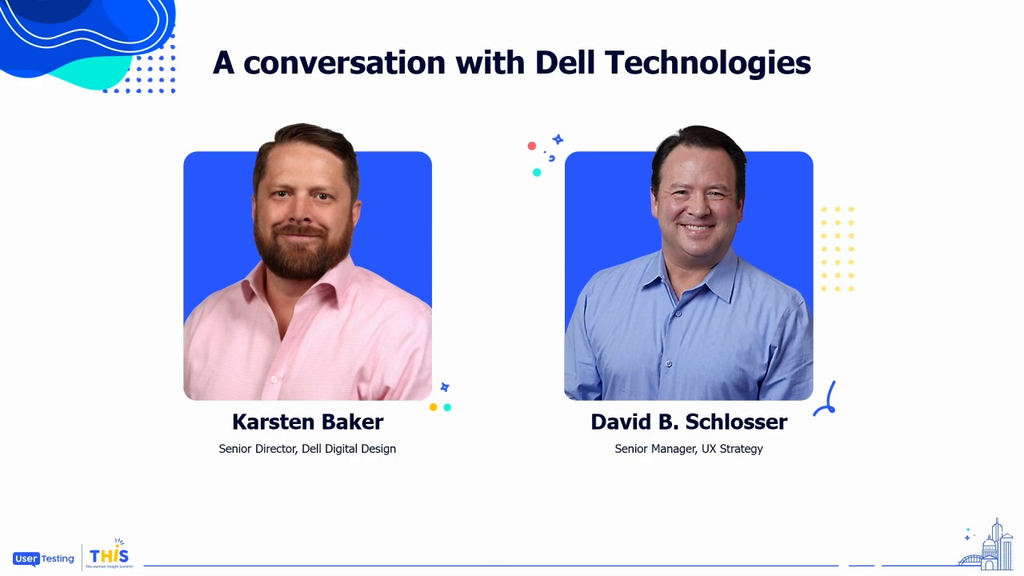
Human-centered ecommerce: how to use insights to drive business results
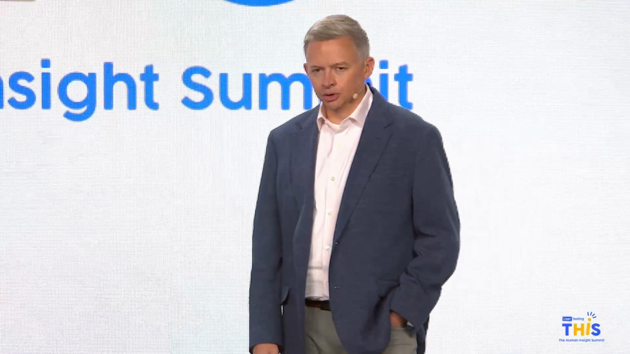
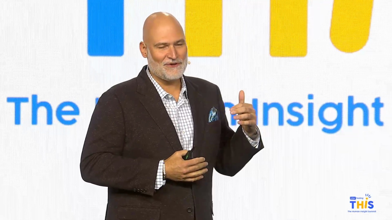
David Schlosser
UX Strategy Team Leader, Dell Technologies
Karsten Baker
Head of Dell Digital Design, Dell Technologies
People decide emotionally and justify rationally. Paradoxically, successful design reverses that approach: rational design produces emotional connections. Creating experiences to show users that they can find solutions to their problems makes humans feel known—and they are more likely to buy what you’re selling. In this session, the team from Dell will discuss the human-centered design transformation of a global consumer and enterprise technology powerhouse. Learn the importance of understanding people’s needs, motivations, and concerns to make a more efficient and flexible design process. You’ll leave this session understanding the value of qualitative data to drive real business results.
Hello, everyone. Welcome for our first session of the last day. Well, it's getting technical now. Right?
So, the title of the session, human centered ecommerce with some, gentlemen from Dell.
But first off, I wanna introduce myself. I'm Amy Wigdahl. I'm the host of this room.
And, I wanna take a moment to introduce our speakers of the day. So we have Karsten Baker, director of Dell Design.
And fun fact, about Karsten is a light he's a lifelong Texan. He was born and raised here. He currently lives in Austin, but he has one...
Hello, everyone. Welcome for our first session of the last day. Well, it's getting technical now. Right?
So, the title of the session, human centered ecommerce with some, gentlemen from Dell.
But first off, I wanna introduce myself. I'm Amy Wigdahl. I'm the host of this room.
And, I wanna take a moment to introduce our speakers of the day. So we have Karsten Baker, director of Dell Design.
And fun fact, about Karsten is a light he's a lifelong Texan. He was born and raised here. He currently lives in Austin, but he has one exception, and he had a very memorable time living abroad in India during that time.
And then we also have David Schlossler from the UX strategy team lead. And fun fact is he's an only child, but he married, a woman that has the twelfth child of thirteen children. So that must be interesting.
Alright. Help me give a well welcome to our team from Dell.
Go again.
Hello. Good morning, everybody, and welcome to our discussion today on human centered commerce. So I'm Carsten Baker, and, have the honor and privilege of leading our digital design organization at Dell Technologies. And I have David Schlosser with me here today, who leads our UX strategy team.
So we'll move into, letting you know some of the the topics we'll be covering today. So, the world is changing and Dell Technologies is changing with it. So we're transforming into a digital company and we're delighted to share with you, our journey today and and what we've been going through on this transformation.
So we'll start off with the revelation that, human centered design actually isn't about design. So we'll get into a conversation about that.
We will talk about, the importance of having a process that your team follows. And so, for us that's learn, build and measure.
We'll talk a little bit about Dell's journey into a digital first design led business.
Transitioning away from a Marcom driven approach.
The the importance of having purposeful animations and ensuring that those experiences are responsive and accessible.
We'll also share our experience with three d and augmented reality, content. And then, we'll talk about, a new approach that we've, been experimenting with in terms of, experience measurement. And it's called Deluxe. And then we'll hopefully have time to wrap up with a little bit of Q and A.
So, a little bit about myself. So I've been with Dell for twenty one years and my experience has been pretty broad.
It's led me to this journey into, UX design and and research. And so I actually have a background. I I, got a management information, systems degree and started programming straight out of college and realized that wasn't, the track for me and necessarily what I wanted to go down. So I started exploring other opportunities inside of marketing, inside of IT. I've done content marketing, product management, like I said, online web application development.
And, you know, going back to kind of the roots and and going back to where, the creative background within my family. My father was a commercial architect. My mom is a artist doing a lot of abstract art. And, my both of my grandparents were deaf. So I also got exposed at a very early age to communicating with folks, and other methods besides voice.
And so I had this wonderful opportunity to take my background in content and technology and my passion for accessibility and start these practices within our digital design organization at Dell. So we started a generative content team, our accessibility center of excellence. And then a few years later, I got the opportunity to to lead the organization, and I couldn't have done that without surrounding myself with wonderful talent and folks like like David. So over to you to intro yourself.
Thanks, Carson. I I'm David Schlosser.
As Carson mentioned, I joined the team, when we were developing Dell's first digital UX experience, program about five years ago. Mhmm. And, my background, I, did a first career in politics, and, when I got too old for that, I I transitioned that, which is really, you know, communications. It's all about communicating.
And so from there, I, started into a career in technology with PR, marketing, and advertising.
A lot of that really is writing. And so when this new discipline of content strategy emerged, I was well positioned to to find myself in that space.
And so, I was relating to my wife the other day. I I've now worked for ten percent of the Fortune fifty, but I've also had a great opportunity to work with a lot of start ups, that none none of which made it. You know, they were all dot coms, and they all went dot bomb. But, I lot lot of great experiences, both with small organizations and big organizations. One of the real pleasurable things about working with Dell is that we have the resources to really deeply understand human needs, and respond to them. That that's what our team does. We we respond to those needs.
Carson mentioned his creative outlet, my creative outlet, and my secret superhero identity. I write and edit crime fiction.
So anybody wants to talk about, publishing or your favorite BritBox mystery series, I'm up for that. But, thanks so much for coming, and, well, we hope we'll have a great conversation.
Great. Thanks, David. Well, let's jump into it. So, our products and and applications are more sophisticated than ever. And as a design organization, we're discovering new ways and and better ways to create. And, ultimately the emphasis on collaboration and outcomes and the design of great human experiences is what will set our teams up for success in the future.
Design is really more than how a product looks. It's really about how the product works and the emotional connections that we make as humans, that that that's created as as customers use the products that we that we're designing and and putting into the market. So human centered design is the Dell digital way.
People aren't always rational, but the solutions to their problems lay, in a rational approach to design that connects them with them as humans.
And to accomplish that, we need to start with understanding who we're designing for, learn about their experiences and synthesize those into meaningful insights so we can arrive at solutions tailored to meet their needs.
All of that to say that human centered design isn't really about design. It's really about humans and how we're designing solutions to meet their needs.
For us, this transformational journey started with the Dell dot com homepage.
And where we set out to design for a modern, premium product first experience.
And with the new homepage experience you see on the right, engagement went up significantly. So revenue per visitor, and conversion went up. Exit rates and bounce rates, went down double digits, and the page loaded significantly faster. So we're really proud of the work, you know, that we did here. And, it was it's it's been a great start for us on this journey.
We also recently launched a new, visual brand ID, just, like, a couple months before we put the new page out. So that was really exciting opportunity for us to to work on the first digital implementation of that new visual visual ID language.
Hey, Carson. Yeah. If you don't mind, I Yeah. We didn't talk about this in our dry run, but it occurred to me as I was looking at this page.
Use a user testing dot com is a platform we, are big advocates of. And one of the things that we learned, it was a light bulb moment for me. I'll share it with you, because we discovered it through user testing dot com.
When we were testing this home page, we would give people a task, and we would say, hey, you know, go, you know, buy a laptop, go buy a a keyboard, something like that, and try to understand how they used it. And one of the really interesting things that we learned, if you've if you're familiar with the term marketing fluff, when somebody's on task when someone is on task, they're like, I am here to buy a laptop, which is the top, top left thing there.
Everything else on the page, they consider to be marketing fluff, which is really interesting because, you know, like, if they were there to buy a desktop, they would think that was relevant and everything else was marketing fluff. But, that was a like I said, it was a light bulb moment for me, and I was thinking about it as as we were looking at this. And we would not have discovered that if we hadn't been using the platform to understand, like Carson said, the irrationality of our oh, you know, what what what's marketing fluff today might be really relevant content tomorrow.
Yeah. That's right. Great.
Thanks, David, for sharing those additional insights. That's wonderful. So, as I mentioned in the the agenda, you know, one of the things that's really important is finding that process that works for your organization and for your team. And for us, we follow a learn, build, and measure, process.
And so, if I really break that down into the individual steps, so learning, it all starts with understanding the business problems, which typically includes things like stakeholder interviews, value stream mapping, and then really getting to understand the needs of your end users, right? So often going into user interviews, you know, journey mapping, and as I mentioned, we'll we'll talk a little bit about the, the Deluxe framework which are which is our experience measurement framework. And so we definitely include that there. When it comes to, building, you know, that's the the next step of the phase.
We have to to go into synthesizing a lot of those those insights that we learn from all the interviews that we had with our stakeholders.
We typically get into process flows, ultimately wireframing, and then, the the high fidelity prototype that everybody can't wait to see.
It's like, when do we get to the prototype? And it's like, oh, hang tight. We're still learning and making sure that we're we understand what the problems are that we're we're trying to solve. And then when we get into measure, you know, that's the, kind of the last step of our our process. But, we do a lot of user testing, right? And this is where we leverage, usertesting dot com and the platform to do a lot of our validation to make sure that we are actually meeting the needs of our end users.
Going into AB testing, that's great. We actually have, our organization supports a pretty broad portfolio of topics anywhere from or sorry, broad portfolio of experiences that we care for. So everything from dell dot com to our authenticated b to b site, which is called Premier. We also support the seller experience, so we have a really broad range.
Supply chain is another example. But when it comes to commerce, it's it's, you know, the AB testing is is really fantastic to understand how these experiences perform out in the real world as we're throttling traffic to those to to get an understanding. How are they performing? Are they actually meeting the business objectives that we set out to accomplish?
We also have a customer sentiment team and so we're working very close to understand and measure CSAT, ease of use, people's ability to complete, their purpose of visit. And then of course the the famous deluxe framework that we'll get into here here in a little bit.
And so, one of my favorite quotes that I love is is from Mark Twain and I feel like he said it best himself. I didn't have time to write you a short letter, so I wrote you a long one instead. So if you've I'm I'm sure all of you have been there where, you know, you're filling out a form and you understand that that uncomfortable moment of you've exceeded the character limitations and you have to go back and and really force yourself to look at what can I cut what can I cut out, what can I take out?
It can be really challenging to to to be concise since it's not always an easy task. But that definitely plays into our content strategy and our approach to, how we create, human centered content. And so, the focus is always on being clear, concise, and useful.
Eliminating, you know, unnecessary words that don't add value. As, you know, David mentioned, a lot of folks, we get tons of comment coming in from our, customer sentiment team about remove the marketing fluff. People view a lot of marketing fluff.
And prefer more straightforward messaging, to to make things like, product differentiation much easier to to, to understand. I mentioned with Amy yesterday, you know, Dell has a lot of products. I would say we have a product for everybody out there, but it can also be challenging at times to understand which one is right for you.
And so David will give some great examples of of how we've shifted away from a Marcom approach into more of a, straightforward language approach.
And so we also believe, you know, one of the things, you know, when when working with our marketing organization, you know, we have UX writers inside of, our design organization, and our marketing teams have copywriters. And so, you know, a copywriter is trying to market and sell a product. The UX writer is really trying to help the end user understand which product is right for them. And we believe we've found a a really good balance between the two, as we've been partnering closely with our our marketing colleagues.
So I think from from here, I hand it over to to David to talk about, our our journey.
Yeah. Well, yeah. This journey really is, something that has been going on for years and it continues to go on every day. You know, Carson mentioned, you know, that form is too long.
I haven't even told him about this one, but we're we've run into a problem where we have a form and the, amount of space is thirty k. It's not characters. Yeah. It's thirty Okay.
But thirty bytes. Thirty bytes. Yeah. So we gotta figure out how do we explain that to people?
And explaining stuff is hard. What you see here in this old experience, you know, when you come to Dell, we have a lot of choices. As Carlos said, we'll build any kind of computer that you want, but the choices can become overwhelming. Everybody, I'm sure, is familiar with this concept of paralysis of choice.
And so one of the things that we've tried to do instead of saying to users, hey. What kind of processor do you want? What how much memory do you want? How much storage do you want?
What kind of keyboard do you want? Backlit or this or that or the other thing, is to make it very efficient for them to choose, as you see in this new experience, hey. Here's some preconfigured models. It's very high likelihood that somewhere in this good, better, best segmentation of this product, you're gonna find what you need.
If you if you don't, obviously, hey, it's okay. You can customize, in any way that you want. But reducing the amount of cognitive load that users have to take on when they're making these decisions has been a major difference maker for, for Dell in terms of helping people through the process of, finding the PC or the server or the keyboard or the headset or anything that that matches, their needs.
So, I think we can go on to this next one because this is a this is a really terrific example of how we use user testing dot com to help, both our negotiations with our colleagues in the marketing department, and our users. So our marketing colleagues are terrific at getting people interested in Dell products, what, you know, we would normally would refer to as top of the funnel. We can really do a good job getting people to come to the website. But when they get to the website, we confuse them because we have so many different products.
We have, as you can see over there on the under the label, it says LOB. Those are all the different product groups that we're product segments that we offer. And they're designed for very specific purposes, for big business, for small business, for school, for home, that kind of thing. And we want to people to understand, hey, this is the computer for you.
But what we discovered through user testing was that the descriptions that got people to the website were not the descriptions that were helping them through the experience.
And, in fact, it they were so confusing that, we discovered through through user testing that people were choosing the wrong product. They weren't getting the product that we made for them. So we, worked to come up with what we call a more straightforward approach, and we tested, a, b, c, d, e. These were just very different styles or approaches to more straightforward content to help people understand, hey. This is the computer. This is the mainstream laptop computer. This is the high performance workstation.
And so these descriptions did a we tested them a variety of different ways, and, we discovered very clearly with user testing dot com, and I think, Kirsten, we can go on, that, for example, our mainstream consumer product, Inspiron, which our marketing, advertising described as connect to your world, was, in the red box over there.
Really, what our users said to us over and over and over again was, I just want a computer that for my everyday computer tasks. And the big fight that we had with our colleagues in the marketing department, it was a a good natured fight, obviously. Like, they don't they, you know, they firmly believe nobody wants an everyday computer. Everybody wants a really special computer.
Well, they don't. You know? They they think of computers as commodities, and they think of them as largely interchangeable. And so they told us very, very clearly, explicitly, I would just want an everyday computer.
And so the solution for everyday access. And it was a big, big, big win for us. So and I we have a a short video here, from user testing dot com that shows a little bit of that experience.
The first one, let me just so we're on Dell. Laptop computers, two zero one PC, shop the best laptops and notebooks from Dell. Great image.
Okay.
XPS laptops and two in ones for creators and creativity.
Oh, for creators, that stands out. Okay. Well, I'm not interested in that. That's not for me, so I'm gonna move on. Latitude laptops and two in ones enter for enterprise computing, for business performance and collaboration.
Yeah. This is better, and that's what I want. I want that for business performance and collaboration. Yeah.
That's me. And then I go small light and stylus laptops in two in one designs for ultimate productivity. I'm in on this one. Okay.
Inspire laptops in two in ones for everyday access.
Now I want more than everyday access, so I move on. Yeah.
These are very So, you know, just you couldn't ask for a better user test subject than than that woman.
And I would, just, again, just a kind of a light bulb moment for me as I've used this platform to understand our our users. One of the really interesting things when you get people into this scenario where there's a chance of a paralysis choice, they're actually more likely to exclude a product. Like and you heard her say that. I'm not interested in that. That's not for me.
And and so these very straightforward descriptions of our products that that we explored really gave people an opportunity to not only to say, oh, that is the right thing for me, but also to say that's not what I'm looking for.
Absolutely.
Great.
Well, let's see here if this is gonna move on. Great. So next, I want to spend a little bit of time talking about purposeful animation and, you know, what that means for us. So we very much don't like to create, motion in an experience for the sake of having motion. We wanna make sure that it's achieve achieving an objective.
And so one of the things that we really want to do with these modern experiences we've been working on is making sure that we're really, creating these premium web experiences.
And we've been following this notion of show, don't tell. And, you know, really what that means for us is making sure that we're actually showing all showcasing all of our product features to our users and really letting copy, be there as a supporting element. And, you know, I think you can see the difference between the before and after. You know, I think it's a much more immersive experience and, you know, you can you can learn about this product within a matter of seconds as opposed to forcing someone to to read.
And, of course, with all these animations, it's really important, that they are performant.
You know, Dell has a very large ecommerce presence with our whole, direct model that that this company was built off of. And, you know, so everything has to perform on on dell dot com. And also just ensuring that these experiences are accessible. That's really important to us in terms of inclusivity and making sure that we're designing for people of all abilities.
And so, you know, this is just a couple of examples that you'll see around, you know, how we made some of these experiences responsive in terms of desktop and mobile.
And so just, just a quick example here that we'll we'll go through. And so, we'll jump over to, to this this video. I think it will, start playing here in a second.
There's there's no sound, so I can kinda talk over it as as we go through this. But this is an example of what, you know, one of those premium experiences looks like, where we're we're really showcasing a lot of those features versus telling.
Much more immersive, much more engaging and exciting.
And you'll see here in a minute, there you'll notice the icon on the top left.
We wind up going with a with a different design, but ultimately, this provides the option for a user to come in and turn off animation for folks that are sensitive to to animations.
So again, just really making sure that this is, inclusive and it works for folks of all abilities. So, great. So moving on. Talk a little bit about our experience with with three d content and augmented reality.
So, you know, a lot of people may ask, hey, Carson, this is great. This is cool. But but does it actually work? Do people get excited about this? Well, the answer is yes. So when we did user testing, this was one of the features that we had on our site that generated the most excitement and and really that wow factor.
And I think, for me, we couldn't have timed this any better. We actually started piloting this in January of two thousand twenty, right before COVID hit. And so we already had our vendor lined up. You know, we had the process. We're we're operationalizing this with our marketing team. And you can see, you know, based on the number of of products and models, three d models that we have out there, we we did a lot.
And, you know, we've had over a hundred and forty live on on dell dot com. But in terms of some of the the results, not only did folks, you know, find this to really be visually engaging and, and a an innovative tool to help them understand and get to know the product, but we saw a double digit increase on, on engagement.
And, dear double digit increase on mobile. And, you know, when it came to AB testing, you know, when compared to video, it had lower exit rates and higher conversion with new customers. So really, really exciting. And the great news is not only does this work for a lot of our clients, you know, our consumer goods, but was really helpful when it came to our enterprise products. You know, leveraging this technology and this capability allowed us to get views into our products that were not previously capable without leveraging three d and CGI.
So really, really helpful when it when it came to our enterprise product portfolio as as well.
And, hey, Landon, would you mind rolling that back for just one?
Yeah.
Because, it was I I don't wanna claim credit where it's not due, but it was it was our our team that did a lot of development on this experience.
And it it's probably hard if you're not a server IT person, who works in data centers. It's probably hard to really appreciate what this means, but we can build virtually the exact server rack that our customers have. And, using three d, using AR, we're not quite there yet, but being able to put on the goggles, You know, an IT professional who's working in that kind of space can literally visualize, hey. This is the equipment that I have, and here's the space that I have available.
I can put this kind of rack in it. I'm gonna need this kind of cable. I'm gonna need that kind of power supply. And so, because this is virtual, we can take it to trade shows.
We can do all kinds of stuff with it. So, I'm just really proud of of of our of our team, being able to to create something like that for our users.
Wonderful. Yeah.
And now we're gonna talk about, this is a a new, you guys are the first people to really hear about this.
This is a a quantitative and qualitative survey of our user experiences that's, totally empowered by, user testing dot And we, you know, we were charged with, continuous improvement of our experiences.
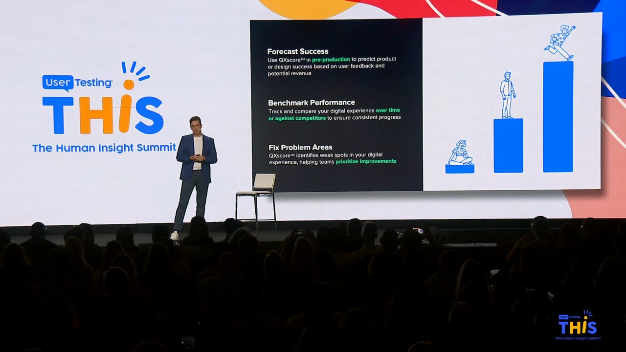
And the quality of experiences, as I'm sure all of us are aware, is really, really hard to measure. So similar to the QX score, the the user testing dot com has has offered, We developed our own internal proprietary, testing tool that we call Deluxe, the Dell user experience evaluation.
And it's a series of questions that we ask through the platform about how easy it is to use, how easy it is to navigate, how confident the users are that they get the information that they need to make good decisions, how much do they trust the information, the text, and the images that that we are providing for them?
And so we, have right now, this is new and we're still experimenting a little bit, but we took representative user experiences from our website. What we know people most commonly do on our website, shop for a laptop, try and find a brow an update to a to, now I'm getting old. Try and find updates. Try and find try and find an update to their system, you know, look for a peripheral, learn about some of our AI offerings.
And those are very representative tasks of the majority of the traffic on our website. And so we task a set of test subjects to accomplish that goal, and we launch them off. And from the qualitative side, this lets us they start with a blank screen, and so it lets us see how do they get there. Do they type dell dot com into their URL bar?
Do they go to a search engine? Do they go to a review site? How are people getting into our site? And then do they go there directly?
Do they get there deep into an experience? How do they navigate? And then, like I said, we can ask these questions, and get a very, very standardized response that gives us pretty hard data, around whether we are living up to our expectation of continuous improvement. And that lets us talk to our stakeholders in terms that they're very comfortable and, and understand in terms of value, in terms of return on investment.
And like I said, we're still experimenting a little bit, but we are doing enough testing. We are putting enough subjects through here that we have statistical rigor. So we do have margins of error. We can say, hey. This is more or this is how likely it is that if you did this test a hundred times, you'd get the same results.
We just added a new question that has, I think opened up some real opportunities for us. We ask the net promoter score question before we go through the experience, and then we ask them after they go through experience. And we can measure, hey. How did your evaluation, of this work you know, how did this affect you?
And then we also, ask the the c same CSAT question that we ask on our website.
And so that lets us explore a very, very highly quantitative test that we have a very, very high level of confidence in and say, hey. Are we getting you know, are samples the same? Are the people that we're talking to representative of the people who are visiting the website? This has been a big success for us, mostly in the fact that it's new and we have over the quarter three quarters that we've run it, developed a very, very high level of confidence that the methodology is right.
We still need to learn a little bit more about how to use it, how we can most effectively use it, but we're coming up with new ways to use it. Most recently, we use this for competitive analysis. And we did, we asked users to follow the tool, the same questions for our competitors, in the laptop space. And it lets us understand how does our experience compare to our competitors' experience.
So it's just been a a a really, really powerful new tool for us to understand how people are are using, our website.
And this is breakthrough for us. Like, y'all are y'all are the first to get exposed to this. This is really exciting because there's not a canned approach to to how you go about doing this. And so, we just wanted to share with you some insights in terms of how we're looking at experience measurement.
So we do have just a very, this is actually kind of a long video. We'll start it, and, go through just part of it. Happy to share it, with anybody who's really committed, but this video, shows a a user test subject going through our deluxe test.
You would interest enter to your phone and enter to your okay. So laptop.
The the task here is to buy a laptop within a certain price range.
Laptop.
I like ones that are super light. So, Okay. I don't want exit.
Latitude.
Oh, that's the law. It was pricing. I wanted to believe it's a little bit thousand.
Eight, fourteen inch. I don't need that much. That big.
So, interestingly, one of the things that we've learned is that people really don't like the way the page reloads when they use the filters. And so we're trying to get that fixed.
This is a great example of Mhmm.
A big go get that we identified because we're doing the qualitative testing.
K. I want that less than a thousand RAM. Let's see. Sixteen gig. K. Storage size.
So at this point, she's getting to to, a a place where she has put in enough filters that she can narrow this, choice to something that's manageable.
And that goes back to the experience that we showed earlier where we're trying to let people bypass that and just pick a preconfigured setup. So, Atlanta, I think we're probably good on that on that video.
Thank you. Thanks.
Great.
So, you know, we just want to, wrap up. It looks like we've got some time left for q and a. We're happy to visit. But, really, what we wanna emphasize is that design is about humans.
It's not about design. You can have the most clever design that you possibly imagine, the most beautiful, the most elegant, the most sophisticated, whatever. And if it doesn't help your humans make a good choice, it it doesn't matter. So we use this user testing platform to really understand the the customers that we're serving and their needs, and then determine from that how do we best approach designing a solution that gets them where they need to go.
And, the we have a number of measurement tools. And like I said, this deluxe that we just introduced is, the latest quiver in our in, the latest error on our quiver. So thanks so much. We're really, grateful that you joined us here and, grateful to user testing dot com for letting us share it with you.
K.
Great. We wanna open it up to questions real quick. So take a raise of hand.
Hi. I'm Liz. I'm with DISH Network. I was wondering, you talked a lot about negotiating with your marketing team over the research results that you found. What are your communication tips if you find yourself in a similar situation where you're at odds with another significant statement?
Who wants to touch this third rail?
Yeah. I I know.
Well, I think, you know, one of the things I learned early on in my career is ninety percent of your outcome is based on your approach. Right? So we're always there to help them better understand and, really the the the user needs.
You know, and so I think, you you know, a lot of folks were we wanted to make sure we approached them in a way that was helpful and and useful and not, you know, obviously condescending or, hey, you're not doing a good job because if you if you head down that path, people are gonna be resistant. Right? And they're just gonna walk away and I don't wanna work with you.
So I think, you know, we we used a lot of data, right? I think that's a lot of what we fell back on was the data and the insights to show and back our findings.
And that that proved to be really helpful because we're not we're not being subjective. We're not judging. We're not, you know, trying to be condescending in terms of the work. We appreciate all disciplines and everyone's we're all working together to try to achieve a common set of outcomes. So I think really leveraging the data and the insights from the user testing that we did, was was super helpful in terms of helping them understand the the reasons why.
Yeah. My TLDR on that is, when we run-in when we achieve an impasse, which happens sometimes, we've we're very comfortable saying, hey. Let's test it.
Let, you know, let the best solution win. We're we're not invested in a particular outcome other than the success of the business.
Sure.
So in that example, did the marketing end up changing the language they use in marketing material, or did they continue to use their language and then you changed the language, the copy on the site?
You know, the the answer to that question is there's material that works in one domain and it doesn't work in another domain. Our our advertising and marketing colleagues are very successful at building a brand, at driving people's interest in our products. And so the you know, I think the biggest challenge that we have successfully overcome is that, we don't have to be a hundred percent consistent.
You know, we don't have to use the same language that's in the ad when people get to the website. Because people have different expectations when they go from advertising to, in print or online, or on radio. Their expectation is different when they get to a website and they're trying to achieve a task.
And to answer your question, we did update the content on the website. Yeah.
So so it was it was, it was a success.
Great. Well, Amy, I think we're a little bit over on time. I don't know if we have time for one more or, Yeah.
We probably have time for one more.
Yeah. Okay.
Hi. How many users do you typically test with? Do you find contradictions between what the users are saying, and how do you deal with that?
I'll let David take that one.
For most tests that we do, we usually are looking at between eight and eleven test subjects.
And if we find that there's a a very high level of divergence there, We, usually, what we'll do is say this design is is probably not the right design, and we'll adapt and do another test.
But very frequently, what we find is, you know, you do test eight people and seven of them prefer option a, you know, you have pretty high level of confidence that that's gonna be the right approach.
We test more than that in deluxe.
We use both, the qualitative samples around twenty five and the survey tool that's new to user testing dot com at the basically, a hundred and twenty five. And so we have two different approaches. And, like I said, one of the methodology questions that I had was, hey. Does this, like, is this legitimate? Does this work?
And, using those two together makes it very clear that, that approach is the right approach to understanding people's quality experience.
Yeah.
Thank you so much. Let's give one more round of applause for speakers.
