Product Keynote: Designs that Deliver
Jason Giles
Vice President, Product Design, UserTesting
Discover the latest product innovations from UserTesting in this dynamic session. Learn how our evolving platform empowers organizations to access fast, actionable feedback, accelerate time-to-insight, and measure customer experiences. Join us to see how these advancements are shaping the future of experiences and helping businesses make smarter, customer-driven decisions.
Next up, I'm going to introduce Jason to talk about designs that deliver. Thank you.
Hello, everyone. It's, amazing to be here. As, Michelle mentioned, I'm Jason. I run our internal design and research team.
And it's really exciting for me to enable my PMs, my designers to make better faster decisions with more confidence.
And by us simplifying the test creation experience within our own product. What I'm seeing when we look at like the design thinking continuum is I seeing our teams are avoiding blind spots when they're looking at behavioral data usage and I'm seeing my designers...
Next up, I'm going to introduce Jason to talk about designs that deliver. Thank you.
Hello, everyone. It's, amazing to be here. As, Michelle mentioned, I'm Jason. I run our internal design and research team.
And it's really exciting for me to enable my PMs, my designers to make better faster decisions with more confidence.
And by us simplifying the test creation experience within our own product. What I'm seeing when we look at like the design thinking continuum is I seeing our teams are avoiding blind spots when they're looking at behavioral data usage and I'm seeing my designers create better solutions that are working right the first time.
With navigation tasks that we're now introduced, we're testing our live products at much higher sample sizes which allows us both to have more confidence in the decisions, but it's not just about significance. It's also about the diversity of who we're testing with now.
And by assigning success criteria to those navigation tasks.
What it does is it ensures that the results are really focused, which is super important for my designers and my PMs. They are so busy.
And coming soon with our new Figma integration.
Designers are going to be able to directly connect their prototypes and get actionable feedback with heat maps and AI generated summaries.
Now to see how these new capabilities work hand in hand with our think out loud tests to you all know and love.
Let's return to our friends at Carefair Travel.
So this is Riley. She's a PM. She's responsible for driving bookings and activity sales on the company's website.
And what she's looking at as she's looking at the data is she's seeing travelers are tending to purchase one activity at a time.
And this is a little bit suspect. The reason why isn't super clear.
So to better understand get a better clearer picture, Riley uses a think out loud template that her UX team has created for her. In fact her research team has created a whole suite of templates to enable PM's like Riley to understand why users are doing what they do.
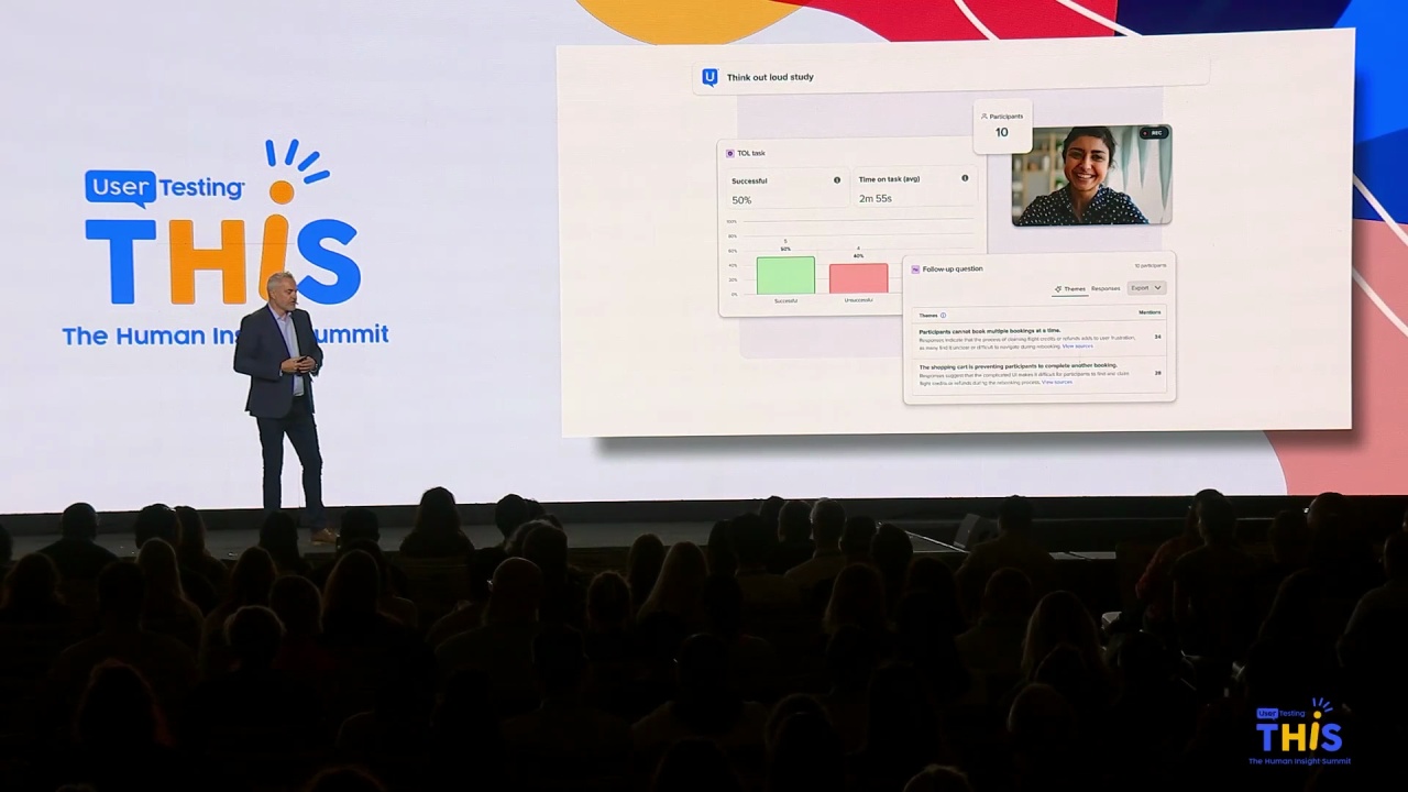
So she decides to run a test on the live booking site and what she gets back is she sees user behavior and express sentiment that as travelers are going through this this flow.
It seems like the UI itself is forcing them into this sequential behavior.
And in fact, with the a I generated summaries of the open ended questions.
She's hearing sentiment that folks actually want to book multiple activities but frankly the products not letting them.
So clearly Riley is thinking about, jeez. We're probably losing a lot of opportunities due to abandonment, but she wants to really understand what's going on.
So to get more clarity, she runs an interaction test And with no expectation to watch a ton of videos, Riley increases the sample size. So she really gets a sense of how how broad widespread this issue is.
She applies a success rate to the navigation task so that the results that she gets back are super clear and within hours, she's got answers back and the test results prove that in fact it's a it's a broad issue across all the participant groups and the ai themes that were generated from those open ended questions indicate that within the u I itself there's actually portions of it that are effectively invisible. People aren't even seeing it.
So with that insight, she hands it over to her trusted design partner Drew.
Ask him to explore some solutions.
Now what is often the case as drew drew drills into the interaction details and looks, there are actually multiple viable options to solve the, this particular problem.
And while his intuition is pushing him in one direction with a couple that different these options.
It's not it's not there's not not consensus on the team. In fact, there's a lot more debate and discussion than Drew would prefer. And so frankly just to expedite decision making. He decides to get some quick customer feedback and he uses user testing's new Figma integration.
He drops in a couple of these Figma tasks.
He attaches his account and ensures that all the participants can access the prototype.
And then he configures these two tasks by assigning success days, success flows for the two different, prototypes. So that he can actually compare them against each other.
It's not long. Drew gets test results. It's clear indication proper test or path to pursue and as he sits down and reviews the results with his teams. He really appreciates that these AI generated summaries of the the open ended parts of the questions.
They give us nice human language description that describes all of that more detailed interaction.
And so now the team is unified on a direction as Drew is drilling in looking at those heat maps, optimizing the design. The engineering team, they're already mobilized and they're going for implementation.
And what about Riley?
Well one, she's super confident about the solution that the team is about to deploy, But more so she's really excited about the fact this team has unlocked some real value that's going to impact the company.
