Product keynote: Unveiling new innovations in proactive customer experience
Michelle Engle
Chief Product Officer, UserTesting
Hanna Zhong
Senior Director - Product Management, UserTesting
Jason Giles
Vice President - Product Design, UserTesting
Lija Hogan
Principal - Customer Experience Consultant, UserTesting
Christopher Schmidt
Global Accounts Director, UserTesting
Discover the latest product innovations from UserTesting in this dynamic session. Learn how our evolving platform empowers organizations to access fast, actionable feedback, accelerate time-to-insight, and measure customer experiences. Join us to see how these advancements are shaping the future of experiences and helping businesses make smarter, customer-driven decisions.
Invite Michelle back up to the stage.
Okay. Thank you, Leah and Chris. So I hope you guys are all pumped and excited about the things coming into the platform.
And what we wanted to do was just wrap up with a few, comments and preview of twenty twenty five.
So as we look ahead at twenty twenty five, our focus is gonna stay on all of you and your roles, your organizations, and how we can help you as we build insights and expand them out across the organization.
So we, obviously, at our core...
Invite Michelle back up to the stage.
Okay. Thank you, Leah and Chris. So I hope you guys are all pumped and excited about the things coming into the platform.
And what we wanted to do was just wrap up with a few, comments and preview of twenty twenty five.
So as we look ahead at twenty twenty five, our focus is gonna stay on all of you and your roles, your organizations, and how we can help you as we build insights and expand them out across the organization.
So we, obviously, at our core, believe it's more than this individual test methods, more than connecting to that audience. It's about the the insights that we produce.
So in twenty twenty five, we're really focused around how to unlock that for all of you as well as your friends working in other departments and across the organization.
So before, collaborating on insights meant maybe you posted it in a Slack channel. Maybe you, sent it over email to someone. We really wanna change the game on what that collaboration means across your organization.
So when you think about Insights Hub, it's about how do we bring everyone into that shared and common view.
Why lock all of that understanding away in a virtual filing cabinet? How do we share it and more broadly across the organization?
So in twenty twenty five, we're really focused in sort of three main areas from a roadmap perspective.
The first is obviously always going to be ensuring that you have everything you need to do your jobs, all of the methods, the audiences, the insights to really understand what your customers and your prospects are saying.
The second is about how insight can be used by researchers, but also designers, product managers, marketing to get to that shared understanding.
And then lastly, how to scale, how to unleash all of these superpowers across the organization and getting from a single point in time to understanding trends and analysis across time.
So when we talk about making impactful decisions, we know that as an industry, we're not standing still. So in twenty twenty five, we're going to be continuing to add capabilities into the platform, things like being able to run max diff and other prioritization studies, expanding out our survey capabilities with new features, and then continuing to build on integrations. So getting the Figma integration to be able to have more and more functionality and Atlassian and other types of integrations.
It also, as ever, means our commitment to help you recruit the right participant.
So that's investments into our panel and our partner strategy to make sure that we can find those hard to recruit audiences.
It also includes being able to better vet a participant before they take a test and adding things like video screeners and test reservations.
And lastly, moving to great faster means moving from an individual test mindset to programs and longitudinal studies.
So being able to run things like diary studies, but also test analysis and comparative reporting.
So at twenty twenty five, we're really excited about all of the core capabilities being added.
And then when it comes to insight generation, Hannah previewed and talked about the Insights Hub. But in twenty twenty five, we will continue to be building out those capabilities so that your friends and other departments can also expand their usage and their understanding of that data. That goes across design, product management, marketing.
And it includes not just building up role specific solutions, so what is right for a product manager versus what is right for a marketer, but it's also about the integrations that go along with those roles, so things like integrating to product road mapping solutions, integrating to marketing tools, all in the plan for twenty twenty five.
And then lastly, we will continue to expand the Insights Hub. The Insights Hub is sort of our core for shared understanding, and you'll see more and more data integrations coming into it so that you can intersect data together from a usability study as well as with, Zendesk tickets and other sources of customer sentiment.
And then how we share that data. So getting to curated experiences across your organization, having a stakeholder view, having a way for those in marketing coming in and looking at that shared learnings.
So with next year, with Insights Hub, we'll be adding things like trending alerts, analysis over time, and even more integrations.
Okay. So I hope you guys are excited. We wanna hear from you as always.
I have the same QR code to sign up for betas, to learn more, to be a part of all of our testing, all of those conversations that we have.
And the product booth is still open, so I encourage you to come out there and get early access and see what, we have to offer.
Okay.
So thank you for all of the attention. That's gonna wrap up the product keynote. And as we prepare for the next session, which is an amazing fireside chat with the founders and hosts of Design Better podcast, we have a quick video to share. We're gonna take a look at how Wells Fargo designs for beauty. So let's take a look.
Wells Fargo is a bank with a heart.
Wells Fargo has tens of millions of customers, and our app is moving billions of dollars through it each month. But at an individual level, you have to go back down and say that's people's households. That's people's families.
We are customer obsessed.
We wake up in the morning and we read app store reviews for breakfast. When you start to look at customers as people, you think about all the things that matter to them.
When they come into the app, they have this whole life around them.
Over eighty five percent of our customer interactions happen in our app. We have to connect with our customers and understand them given the enormity of our responsibility.
We test the entirety of the needs our customers have, and we're leveraging user testing to do that.
The user testing platform enables us to turn around the kind of insights we're providing to our client teams at scale and really super fast.
The faster we can do it, the faster we can meet the timelines of our product teams.
It helps us streamline and simplify experiences for the customers to make sure that what we are building actually is the simplest it can be.
We've been able to increase the size of our sample from manually looking at and and talking with thousands of customers to going into tens of thousands of customers.
Our visual appeal index helps us measure how people feel when they use our digital experiences.
The score allows us to understand in a rank order phenomenon what's going to outperform others. Our CSAT scores have gone up over twenty percent on our digital app since we began our relationship with user testing. It takes millions of five star ratings on the App Store to move from four point eight to four point nine. Since we've been working with user testing, we were able to do that.
That is a huge achievement. And I think it's really because we have focused so much on the customer, what the customer wants, but also delivering something that's different from other banks.
User testing is the platform that connects the human heart to the human mind.
So without further delay, it's my pleasure to welcome to the stage Hannah Zong, our senior director of product for insights and analytics.
Hi.
Hello.
Hi.
How's it going?
You're excited about Insight Hub? I'm really excited. Well, just a little bit about me. As Michelle mentioned, name's Hannah, director of product on insights, integrations, and AI.
I'm actually from Chicago. Anyone from Chicago here?
Awesome. Awesome.
I also have two dogs, named Cookie and Biscuit. He was a little bit of theme going. And I have a two year old who hates, hates, hates eating vegetables. It drives me nuts. And the only way he will eat vegetables, if I mix it in a pancake.
So I don't I don't know why, but he likes the pancake texture. So before come to this, summit, what I do is that at home, I prep the vegetable, clean it, chop it, mix it, blend it, put it into the pancake mix, then I'll adjust the pancake mixture for the right texture. Right? So a lot of trial and error and all that stuff. So a lot of work. So it'll be very disappointing if I go home and it does not eat the pancake.
So sometimes when I'm mixing that, it makes me think about the problem with insights.
When you go through all the troubles of generating them, right, you want to make sure that they're being used, drive impact, and get the most out of them.
This is why I'm super excited to talk about insights hub. As Michelle mentioned, it is a powerful set of capabilities designed to help you get the more value from the insights that you generate on user testing.
And this is not just about increasing the ROI of your research, but also helping your entire organization align around insights, build common understanding of your customer, and create exceptional experiences.
So before I talk about Insights Hub further, though, I do wanna take a moment to talk about what led us to build Insights Hub, what we were hearing from many of your customers, what we are hearing from many of you here.
There are a few challenges around insights.
One, a lot of your customer insights are scattered across your organization.
Right? A lot of data, but they live in different systems, and different people have different access to it. So it's really hard to create a complete picture, let alone alignment.
The second challenge is that you you do consolidate all that data in one place.
Summarizing and analyzing, that is too hard. That is still time consuming.
Third, let's say you did summarize all that, you surface insights. It is hard to ensure that insights are accessed by the people, they need them, get connected, and drive impact.
And lastly, when you're trying to collaborate around insights, there's not an easy or good place to do so.
I see some of you here nodding your head, so some of those pain points track.
Well, to address these pain points, I wanna highlight a few key capabilities for Insights.
Insight Discovery for that powerful insight, cross test, cross studies, fast and accessible.
Data integrations for integrating your third party customer experience data into insights hub for that holistic view.
And, of course, insights reports for compiling insights into reports to enable you to collaborate, share, and drive alignment.
So I'm going to deep dive into each of that capability, starting with insight discovery.
Like Michelle mentioned before, this is a very exciting capability.
And I'm hope that, you know, you'll find it too because it's a real game changer.
But let's first talk about how insights are analyzed and surfaced. Right? And in here, I'm not talking about just individual studies. I'm talking about over time, cross studies, cross tests done by different people in your organization.
So even with the best tagging, the best note taking, the best analysis, it's still hard. It still takes time.
So think of insight discovery as your personal assistant, someone who has the time and ability to flip through all of the user testing studies, and then able to, say, identify the trend, surface insight, and then summarize it back to you in easy to understand language.
So today, Insight Discover summarizes data over, say, think aloud transcripts and survey themes. In the in the future, we'll be adding more.
The other cool thing about insight discovery is the focus parameter.
It enables you to select data set, say, a set of tests, as well as, say, time frame you want, the insight to be summarized over.
So that enables you to do comparison and analysis over time as well. And that's pretty cool.
And unlike some AI, we understand the importance of traceability.
So insight discovery points you back to the source.
If you're curious about some of the conclusions it's drawing, well, you know exactly where to look for the raw source with the link citation.
The last thing that is super exciting about Insight Discovery is that anyone can access it.
Anyone can query inside discovery, and it's based on all the research that many in this room are driving. So that's really cool.
Powerful analysis, fast and accessible.
Now I do recognize that not everyone spend their day in user testing. I would love that to happen, but not there yet. And for many of the insight consumers, people who consume insights to make decisions, they don't spend a lot of that time in user testing.
Let's say the product folks, many of you collaborate with them. Right? So product managers use customer insights to make decisions.
Or I hope they do. Right? And what they do is, like, for example, they use insight to IDA, prioritize, define product requirements, all that good stuff.
Many of them spend their time in Confluence and Jira.
So to bring insight to where insight consumers work, like the product folks, we are integrating the same insight discovery capability in Atlassian.
And we're oh, sorry. Sorry, a different screen for some reason. And we're calling that basically the Insights Assistant.
So as a product manager, working the requirements in, say, Confluence or Jira, They would easily assess all of that user testing insights in Confluence or Jira just a click away.
So the next capability I want to talk about is data integrations.
So how many of you here feel like your organization have too much data?
I know it's a silly question. Like, why am I raising my head? This is obviously true.
And it's a silly question. But the reality today is that we have a ton of customer experience data, and they live in many different places. Right? And different teams have access to different data set and from that drawing different conclusions and then from that applying that to customer experience, which could be more connected and cohesive. Right?
So starting in January, you can bring some of that data right into the Insights Hub, starting with Google Play Store and App Store product reviews.
That means that you will also get AI themes from product reviews, and you'll be able to query with insight discovery.
What that means is that you will get summarized insights about the studies in user testing, but also reviews what people said about your brand, your product, your apps, and even your competitors.
So that's pretty cool. And then in twenty twenty five and beyond, we're gonna be adding more integrations to it. For example, an integration with Zapier to unlock more data sources quickly, say, with Zendesk or, say, customer support tickets, all that good stuff.
This is a very exciting capability, not just because it's about centralizing all data, but it's also about making it possible to summarize and analyze with other data sources with just a few clicks off the tech keyboard.
The last capability I wanna talk about is insights reports so that in user testing, you can create tests, you could do surveys, You could create highlight reels, all the stuff that you love and enjoy.
And then you can create reports and collaborate through concurrent editing of reports all in one place. That means one integrated workflow, one integrated user experience.
You can add clips, charts, and images to the reports. You can collaborate with your team and stakeholders, share and leave comments. You can tag the reports. You can present your report directly in user testing with presentation mode without having to build a deck.
So that's pretty cool too.
So I want to paint a more concrete concrete picture of Insight Hub. So I'm going to give you a preview of what all of this looks like with a demo.
And in this demo, we'll explore how Inside Hub helps Care Fair Travel collaborate to track down the cost of a recent drop in CSAT, customer satisfaction score, something that perhaps many of us have to deal with, you know, once in a while. Right?
So for the context of the demo, this organization, Care Fair Travel, helps travelers find and book discounted events and activities around the world.
And let's meet Taylor. She is the head of business for Carefair Travel.
So she wants to understand what's causing that drop in CSAT.
So she wants to know what are the top complaints for the past three months. And using Insight's help, specifically Insight Discovery, Taylor can easily and quickly do so to kick off her investigation by just entering a question in Insight Discovery.
And then insight discovery will pull and summarize data from multiple data sources, say an ongoing NPS survey, including open ended responses, customer interviews, and app store product reviews.
Based on the Insight Discoveries response, Taylor quickly spots recurring themes, such as long wait times, confusion around the cancellation policy, not enough activities to do, and pricing.
Okay.
So Taylor copied the findings into your insights report, and then she shares it with other relevant teams like product and support. And all these teams can help dig deeper into the issues and remedy.
And throughout this entire process, the teams collaborate by commenting in the report and adding new findings.
And as the teams investigate, it becomes clear that the long wait times have been an issue for some time, so not related to the seaside drop.
But but the confusion around the cancellation policy, that is new, stemmed from a recent update to the mobile app. So, Right? There's something we can do there. So Taylor and the team go back to the report, detail the issue and the next steps.
And the product manager responsible for the mobile app is able to leverage those findings to improve the app. She creates a product requirements doc to define the improvements, and she adds insights specifically about where the cancellation policy should be surfaced in the app just by querying user testing's insights assistant within Confluence.
And after that, the product manager is able to report the progress back to Taylor and review the findings with her joiner one on one.
And Taylor is pleased and can now collaborate with other teams to address other issues as well.
So as you can see from this demo, Insights Hub and its capabilities enable multiple teams to access the same insights, collaborate, and make better informed decisions faster.
So that's Insight Hub in a nutshell. You want to learn more about it or try it out? Come find us at the product booth, and then we can sign up for the beta as well.
Next up, I'm going to introduce Jason to talk about designs that deliver. Thank you.
Hello, everyone. It's, amazing to be here. As, Michelle mentioned, I'm Jason. I run our internal design and research team and it's really exciting for me to enable my PMs, my designers to make better, faster decisions with more confidence.
And by us simplifying the test creation experience within our own product, what I'm seeing when we look at like the design thinking continuum is I seeing our teams are avoiding blind spots when they're looking at behavioral data usage and I'm seeing my designers create better solutions that are working right the first time.
With navigation tasks that we're now introduced.
We're testing our live products at much higher sample sizes, which allows us both to have more confidence in the decisions, but it's not just about significance. It's also about the diversity of who we're testing with now.
And by assigning success criteria to those navigation tasks, what it does is it ensures that the results are really focused, which is super important for my designers and my PMs they are so busy.
And coming soon with our new Figma integration designers are going to be able to directly connect their prototypes and get actionable feedback with heat maps and AI generated summaries.
Now to see how these new capabilities work hand in hand with our think out loud tests to you all know and love.
Let's return to our friends at Carefair Travel.
So this is Riley. She's a PM. She's responsible for driving bookings and activity sales on the company's website.
And what she's looking at as she's looking at the data is she's seeing travelers are tending to purchase one activity at a time.
And this is a little bit suspect. The reason why isn't super clear.
So to better understand get a better clearer picture, Riley uses a think out loud template that her UX team has created for her. In fact her research team has created a whole suite of templates to enable PM's like Riley to understand why users are doing what they do.
So she decides to run a test on the live booking site, and what she gets back is she sees user behavior and express sentiment that as travelers are going through this, this flow.
It seems like the UI itself is forcing them into this sequential behavior.
And in fact with the a I generated summaries of the open ended questions.
She's hearing sentiment that folks actually want to book multiple activities but frankly the products not letting them.
So clearly Riley is thinking about jeez. We're probably losing a lot of opportunities due to abandonment, but she wants to really understand what's going on.
So to get more clarity, she runs an interaction test And with no expectation to watch a ton of videos, Riley increases the sample size. So she really gets a sense of how how broad widespread this issue is.
She applies a success rate to the navigation task so that the results that she gets back are super clear and within hours, she's got answers back and the test results prove that in fact, so it's a broad issue across all the participant groups and the a I themes that were generated from those open ended questions indicate that within the u I itself there's actually portions of it that are effectively invisible. People aren't even seeing it.
So with that insight, she hands it over to her trusted design partner Drew.
Ask him to explore some solutions.
Now what is often the case as drew drew drills into the interaction details and looks, there are actually multiple viable options to solve the this particular problem.
And while his intuition is pushing him in one direction with a couple that different these options.
It's not it's not, there's no not consensus on the team. In fact, there's a lot more debate and discussion than Drew would prefer. And so frankly just to expedite decision making, he decides to get some quick customer feedback and he uses user testing's new Figma integration.
He drops in a couple of these Figma tasks.
He attaches his account and ensures that all the participants can access the prototype.
And then he configures these two tasks by assigning success days, success flows for the two different prototypes. So that he can actually compare them against each other.
It's not long. Drew gets test results. It's clear indication proper test to or path to pursue and as he sits down and reviews the results with his teams. He really appreciates that these, AI generated summaries of, the the open ended parts of the questions.
They give us nice human language description that describes all of that more detailed interaction.
And so now the team is unified on a direction as Drew is drilling in looking at those heat maps, optimizing the design. The engineering team, they're already mobilized and they're going for implementation.
And what about Riley?
Well one, she's super confident about the solution that the team is about to deploy, but more so she's really excited about the fact this team has unlocked some real value that's going to impact the company.
Now to talk more about measuring digital experiences, whether it's over time or against competitors, I'd love to introduce Leah and Chris.
Yay. Hi. Alright.
Good to see you all here. Another day.
Kind of the last day. Getting ready to wrap things up. But as we go through our, product keynote today, I get to talk to you about something that I am very, very excited about. So been at this company for almost a decade, and I've worked with hundreds, if not thousands, of companies.
And one of the things that I think I am most excited for is the QX score because I think it is gonna have a massive, massive impact on all of your roles and your companies.
So let me tell you a little bit of the reason why I believe that.
So one of the things that I found, and and we see this all the time with many, many of our customers, is there's kind of three problems that I think every organization experiences.
One is fragmented data.
We see it all the time, where your analytics team might be looking at some of that behavioral data. Right? They're looking at what's going on on the website.
Our UX research team and our design team might be looking at the attitudinal data. And so they're out there looking at, you know, how do people feel about the experiences and designs that we're creating?
But a lot of times that's coming from different organizations, and we've talked a little bit about, you know, never any silos at organizations. So obviously, all that data is all sitting together at once, which we never actually see.
Mhmm.
The other thing that we see all the time is unclear insights.
So a lot of the insights and data that we're looking at can be subjective.
There's a lot of voices, a lot of stakeholders, a lot of people kinda looking at, you know, hey, here's the information that we're seeing, but everyone might have a different point of view on that.
And we're all kind of talking in different languages.
For somebody that's not familiar with qualitative research, right, they might be a little bit confused about, you know, hey, you only did this research with ten people. What do you mean that's that's good enough? Right?
And the last thing that we see, and again, almost every organization that we work with, is there are benchmarking inconsistencies.
It can be really, really challenging to look at competitive benchmarks.
We see it all the time where you might have somebody like JD Powers who's saying, hey, you're doing a really great job.
Right? And we're just looking at the widgets and things that you've built into your system.
But we don't actually know if people like that, but we know that our competitors have it, so we should be building it too.
And again, that might be managed and and held by different organizations within your company.
So again, those three areas are are things that we see consistently causing problems.
And the other thing that Johan was talking about yesterday morning is we are still in a position where we are still we're actually seeing a decline in the overall experiences that our customers are feeling. Right? We're seeing this almost everywhere.
And one of the things that we've seen, obviously, in in two thousand eighteen, we started to see a lot more investment in UX and design and creating really amazing experiences.
COVID hit, and organizations started dumping money into UX and design.
But a couple years later, when your CFO gives you a call and he goes, hey, we just gave you everything that we've been asking for for nearly a decade.
What do you have to show for it? It can be really, really challenging to go and show what is the impact that we have made to our products and our experiences and design.
A lot of it is intangible.
And so we started to see a decline in the investment that was made in the experiences, and we see this directly when we ask customers, how do you feel about your overall experiences?
So one of the things that, you know, I again, this is where I think we have a massive, massive opportunity to make an incredible impact on our experiences and our designs.
A lot of organizations, again, that we've worked with over the years, we see that measurement is typically done at the very, very end of the process.
Right? We've all gone through the product development life cycle. We've all seen this process unfold where we get a bunch of, you know, I call them HIPPOs, highest paid person's opinion. Somebody says, hey, we need to go build this.
And we see them, you know, we come in, we build a concept, we kinda create on it, and then they say, hey, design. Go go design this. Right? Go figure this one out.
And then they go, okay, well design's just, you know, following their orders, and they're following their instructions because somebody said that we have to build it.
So then once it's done once we're done designing it, then we go send it to the development team and they actually build it, and then we go and launch it.
And up till that point, we have no idea if this design or this product is actually gonna be effective, if it's gonna work, is it the right thing to even be building?
So what I wanna pose to all of you is a challenge. Can we flip that script?
Can we take that insight and that information that we get once we actually launch a product where it takes a lot of money to make changes at that very end of the process? Can we flip the script? Can we start getting that kind of information, that intelligence, and that data in that early, early phases of design?
Well, I think we can, and I think we can do that with a QX score.
So if you're not familiar with the QX score, this was something that we've been working on for many, many years. We've got hundreds and hundreds of customers that are doing this. We've got a lot of incredible data.
But where it really started was through a couple of, people way, way smarter than I. I think one of them sitting in the room over here.
Really developed something that I think is an amazing, amazing data point. Again, one of the challenges we're talking about, fragmented data.
So one of our customers, about five years ago, they were working on some designs, and they found they were running NPS on those designs. And NPS is obviously kind of an indicator of their attitudes. Right? How do they feel about that experience?
And what we found is they were getting really, really high NPS scores.
But when they were actually looking at the designs, the task success metrics, nobody could actually use it. Nobody liked it. And we found that the attitudinal data that we were looking at was really just an indication of the brand, had nothing to do with the actual designer experience that we were looking at.
But we understood, though, through that attitudinal data, how people felt about our experiences and how their brand how their brand was impacting them.
Then we look at the flip side. We look at the behavioral side.
In behavioral side, we can see if somebody can do something. Right? We can see if it has high usability, but we don't know if it has utility. Is it something that people actually even want? Is it worth our time to go through and develop and engineer that?
And so one of the things, again, when we talk about that fragmented data, so many organizations, we're only looking at one piece of the piece of the puzzle.
But with the QX score, what we've done is we're able to take the attitudinal data.
Right? We're able to take the behavioral data and combine that into a single score that now becomes a leading indicator for our overall experience that is capturing both, you know, how do people actually feel about it with the attitudinal data, and can they actually do what we want them to do.
If we're only looking at one side, it becomes really really challenging to understand the full picture. But with the QX score, we can actually now understand the entire picture and understand, does it have usability and does it have utilities? Is it something that's even worth building?
So again, we are really really excited to introduce you to the q x score. Right? Because there's a lot a lot of application to this.
And so again, when we're taking that attitudinal data, right, we can see that, on the bottom there on those four tasks, and we can see the task success, and we can actually start to understand, is this something that actually people wanna do? Do they like it? Is it something that they can use?
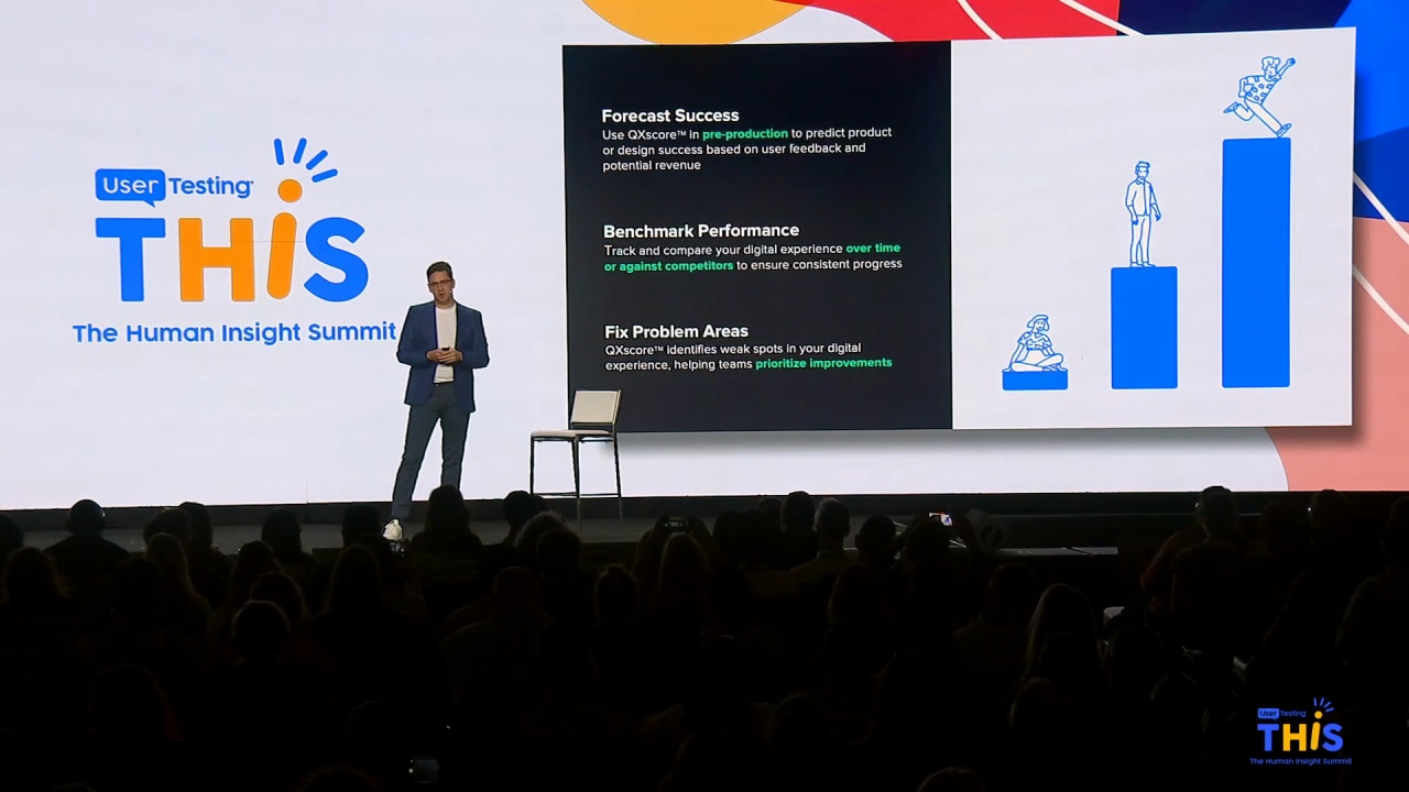
And so when we look at the QX score, one of the again, one of the things that I'm really, really excited about is it's got three amazing, amazing applications.
So the very first application, we kind of look at this on a crawl, walk, run. Right? We're not expecting you to come in and, like, start building out the QX score, and all of a sudden it's completely changed your organization.
As with all good things, it takes a little bit of patience and time to build this out.
And so the very first spot that we really look at the applications for QX scores in a diagnostic fashion.
So in a minute, Lee is gonna talk about kind of how this whole process will unfold with our friends at care fair travel.
But in the diagnostic phase, what this is really allowing you to do is in a very simple manner, look at the QX score and be able to identify where are our bottlenecks? Where are the areas that task success is really low? What are the parts that people can't actually get through that don't allow them to complete that task or that journey that they're trying to go on? And so now you can start to work as a UX designer or a researcher with your product team. You can really start to understand, you know, these are the challenges. These are the areas that we need to focus on.
The second phase that we start to look at is, well, it's great to start to understand, you know, where are the challenges and where are the bottlenecks, but what we're really excited about is its potential as a program.
Right?
So now what we can start to do is we can start to take those QX scores over time, and we can start to show, hey, this is the improvement that we have been able to make on our digital experiences in our in our designs. Right? This is where we start to see a massive, massive ability to be able to go in and answer that question of what have you actually done for me in design? How can you prove that you are making better experiences?
And the other part to this is it starts to become it starts to really solve that challenge of rework.
So a number of organizations that we've been building out these programs with have started to implement this in a position where we might say, in the design process, we are not gonna send designs to engineering anymore unless it meets a minimum threshold.
It's gotta be above our baseline on the QX score.
Otherwise, what are we doing here on the design team if we're actually gonna send the engineering something that's not gonna be significantly better? And then obviously engineering gets really frustrated when you start sending designs over to them, and they you start to make changes to it while they're in the middle of developing it. But once we actually implement this as a program, we can see that it's we've had the proof that it is better than the experience we've already been working with today, and we don't have to worry about changing all those all those iterations once it actually gets development.
And the final phase that we really see a lot of value in is when we start to look at the QX score in conjunction with some of your other systems. We've talked a lot about the integrations that that user testing is developing, But I think one of the most exciting parts here is when we can start to look at the QX score as predictive.
When we start to look at AB testing data and we have our QX score on those AB tests, and we can see how QX score is actually impacting our conversion rates, our call center volume. So that now, in that design phase, we don't have to guess anymore. We know that if there's a five point increase in QX score, that it should lead to a three percent reduction in call center volume.
And so when your CFO comes to you and says, hey, as a UX organization, what have you done for us? You can now definitively tell them, we've just saved you thirty million dollars in call center volume, or we just increased conversion rate by seven percent, which leads to another eighty million dollars in bookings, a massive amount of value.
And so when we look at the QX score, right, we're really trying to solve kind of three main areas. We wanna see you all become a little bit more data driven. We have a metric that now we can start to share throughout the organization.
We can start to be a lot more consistent with the benchmarking using a single score and everyone using the same language. And we see a massive, massive opportunity with its predictive power. So to share a little bit more about the journey, I'm gonna pass it over to Leah Hogan, to come back to our care fair friends and talk a little bit about how this process unfolds.
Alright. So Okay. I'll let you clap first. Yay.
Yay.
So, I hope by the end of my presentation you're out of your seats and clapping and yelling because, as a researcher, I'm really excited about this because the power of QX score is partially that it helps to automate some of the things that take us so much time to do right now. And so by walking through this real life scenario and actually, I was watching the news this morning and, there was a little bit of a different light on it.
I wanna be able to show you, just a little bit under the hood what this looks like and how the QX score can be a programmatic tool, but also something that's very actionable from a design standpoint as well. And so imagine that we've got Sarah, who is a product manager again, but has a team of researchers and designers who have really been tasked with increasing or actually decreasing the percentage of calls that come into the call center that are about rebooking future, well, existing travel reservations.
And so how many of us flew here? A lot?
Okay. Yeah. A lot of us. Did any of you have to rebook your flight?
I see. Yeah. Couple of hands there. Was it easy? Yeah. I see head shaking. It's not easy.
And it's not easy for a variety of reasons. I think one is sometimes very much about the experience itself. Sometimes it's about the payment options. It can be about a lot of different things, but you're not gonna know until you dig deeper into the problem.
So let's say that they've got a goal to, really like, right now, the calls that are coming at about thirty percent, and we all know that call center calls are expensive, so we wanna deflect people to that online channel. And they wanna reduce this to only five percent and then also deliver a great experience.
So with her team, they leverage what I like to call kind of like a quad, quad, quad strategy. So over time, what you're doing is looking at quantitative data from a performance standpoint on your operational experiences. It could be digital. It could be service.
Whatever. Right? And then you can use a quantitative strategy around the attitudinal piece as well. So that really is what were people's intents, like, as they came to visit the site today and whether or not they were successful.
And you complement that information with empathic data. And this is where the QX score comes into play.
And so they run an a test, a usability test using QX score on the live experience.
What happens?
So essentially, what they're able to do is launch a test to a very large pool of participants that have a variety of goals and needs and expectations, but then also have the common goal of, needing to rebook an existing reservation in the situation where there's been a cancellation.
This changes a little bit nowadays.
So, they launch this test, and what the QX score enables you to do is really focus on, again, the behavioral separately from the, like, attitudinal information here. I think I was yelling too much last night at the bar, so hopefully, some of you guys heard me well last night, and I can carry through.
So, I think one of the important things to think about is core usability is first around task, success, and time on task. You get that data with the QX score. And you get that for each one of the tasks, and you get a sense for whether or not there are specific areas where there are barriers in your experience. Right? That all boils up into that overall score, but this is where it's really helpful for design teams.
Then you pair that with this, like, well, what did you think?
And while this particular test shows that people fall find that call to action to book a new flight quickly, The problem really is there's a lot of uncertainty around how to manage refunds or compensation in this situation.
So what happens?
I think there are a couple of things to really think about. One is the super cue, I guess, model is used to understand the experience. So that underlying those those constructs of appearance and loyalty, ease of use, usability are things that you can really get a sense for for that overall experience.
And when you go, hopefully, to spend some time at our product demo booth, you'll get to see that you can add on additional questions on a per task basis to dig a little bit more deeply into what were your perceptions, not only of this entire experience. That's what SuperQ is really about. But also, like, those individual tasks, if that's interesting.
So when Sarah's team looks at the data, a couple things become clear. Like, look. The QX score is not awesome.
Not awesome. And usually, we find that in those situations, it's usually one area of the experience that really is dragging down that overall score.
And in this case, they're finding that only about sixty five percent of people are successful. So two out of three, that's not awesome.
It could be better. But, specifically, select payment method is an issue.
And sometimes that's something that's really hard to pick up on. Like a missing control is difficult to pick up on because you don't have analytics around it. So the best way to surface that is using a usability test.
So Sarah's team, using design best practice of iterative testing and redesign, decides to use the QX score test to run, some tests against Figma prototypes. So, again, you can test during all across the product development life cycle.
And you'll notice that there are only four payment methods here. And none of them directly say, here's how you spend your refund, right, or if you've got travel credit.
So what they do is essentially add a control.
And essentially, what they're able to do is really understand what's the was is. How is that impacting the experience?
And as you can see, adding that makes it super clear what you're supposed to do and how you're supposed to apply those travel credits. And, again, being able to use the QX score to get an understanding of how does it perform now and how does it perform with that improvement is really helpful.
So they launch with, the improved, or they take that information back to the team.
And they can launch and then see that improvement in analytics. But they can also see that the QX score predicts that change in analytics. They have confidence because they've used data to make the decision to make those improvements to the experience.
So what is really powerful and that's also coming in tandem with this automation is the fact that to tie this story all together, instead of having to generate separate reports over time, you'll be able to create a a report that pulls together that data for you over time so that you can see that movement in the QX score and get a sense for when did we see these improvements happen in terms of performance and how does that relate to some of the product launches that we've been doing informed by research. So it helps you to really surface the connection between your work and what's happening in your digital experiences.
So I think, really, to just sum up again the story that we're both telling this morning this morning, Chris and I, It's important to understand that the QX score and benchmarking in general is a really powerful way of both understanding what you are where you are right now, helping both your team and executives understand where you can prioritize improvements to the experience, and also tracking improvements over time.
So there's a real strategic as well as tactical value to doing quantitative user research.
